Music WIP: Comments Appreciated
-
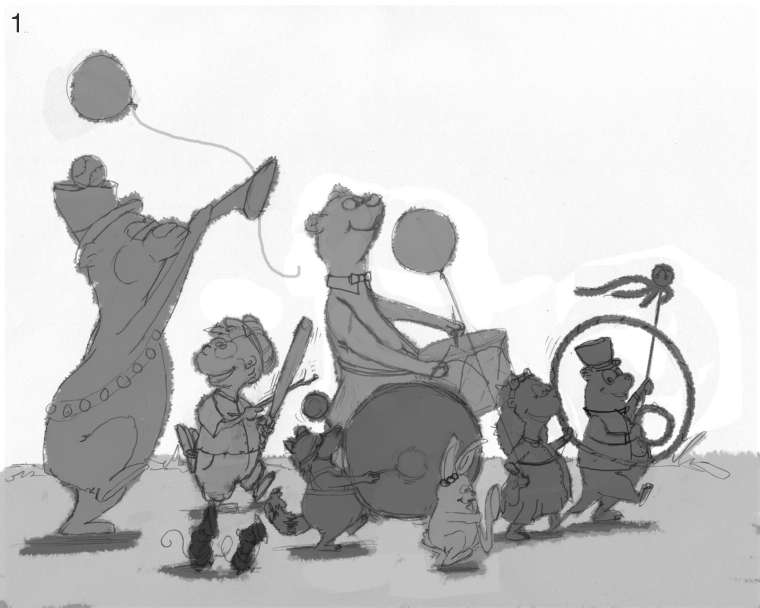
That's too funny. I literally had the same thoughts about the post @Lee-White put out for someone and am following his advice too. I personally like the depth the characters in front add. You might for balance's sake put a tall character on the other side of the girl to lend even more depth. Or alternatively, you could add another short character near the front of her feet. I really like your concept and your drawing is great.
-
@burvantill That is a fun idea, while you are moving the characters around be careful with your tangents like the drum is following the same curve and touching the girl in front. Looking forward to seeing where this goes.
-
I'm looking forward to seeing the progression of this. I like the idea of keeping the background white. Watercolor (I'm assuming you're doing watercolor?) on a white background? Yes please! If you are going with a more graphic piece, instead of the little characters in the front, why not all in a row? That will really accentuate their size difference and I think that's a lot of fun to see such different characters in a sort of lineup.
Website: www.tessawrathall.com
Instagram: www.instagram.com/tessawrathall_art/
-
@chrisaakins We are sooo lucky that those guys started SVS.
Thanx for the advice! -
@chip-valecek Thank you for pointing that out. I was going for an overlapped/ girl in front thing. I will watch out for that tangent when I do the next sketch.

-
@tessaw yes watercolor! Thank you for the white background thumbs up!
I thought about leaving it simple with them all in a row, but I wanted a more chaotic feel. Just crazy fun happening! lol! No rules. So I really am going to have nail down my composition. -
If you are going for chaos, try some birds in flight or ticker tape raining down. Btw I love the repeated motif of the round circular shapes. I don't know if you intended it but it makes all the characters cuddly and friendly. It's even repeated in the drum. Points for unity! (Can you tell I'm teaching principles of design in my classes right now...?)
-
Thank you for all of the advice!
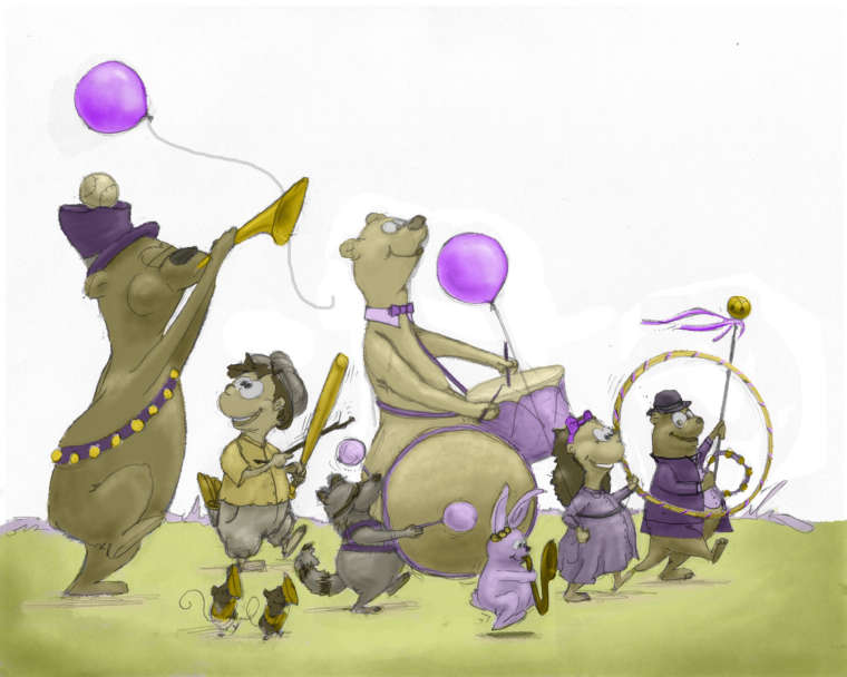
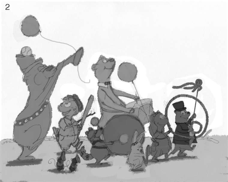
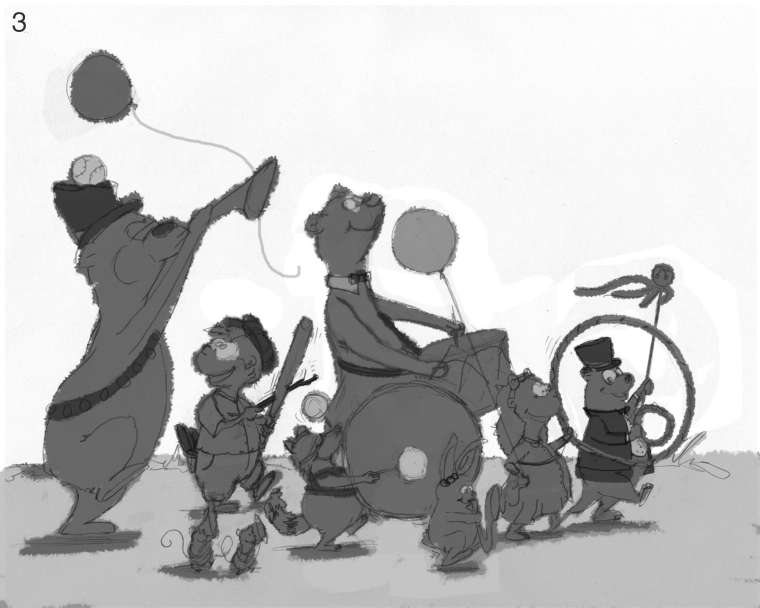
@chrisaakins I'm glad you liked the circles cuz I added more. Lol.
Here are two more versions. We'll call them 2 and 3.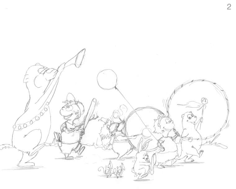
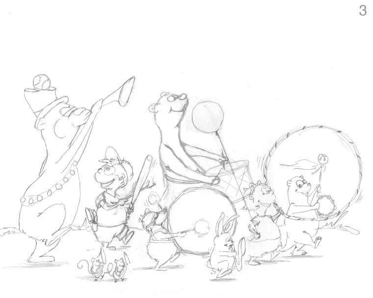
After seeing them together like this I'm going to add another balloon to both. One above the horn blowing bear. So the design gets larger as it goes back(towards the left side).Lisa Burvant
www.lisaburvant.com
Instagram & Twitter & SVS: @burvantill -
@burvantill I love the bottom one! The top one is odd with the characters competing with the drums.
-
I agree about the two large circles competing in the latest versions, but I like the two left characters in the top one because I feel like they're having a moment. It depends on what you want to emphasize though. I'm also wondering about adding some opportunity for depth with some different angles, opposed to everything in profile. I can see this happening on my street with the neighborhood kids, so that cute factor is spot on.
-
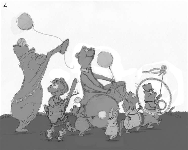
@chrisaakins & @Laurel-Aylesworth , The circle next to the girl and otter is a hula hoop. She’s shaking because it makes a SHH SHH sound
 . Is that not registering? I may have to change that
Lisa Burvant
www.lisaburvant.com
Instagram & Twitter & SVS: @burvantill -
@burvantill said in Music WIP: Comments Appreciated:
The circle next to the girl and otter is a hula hoop. Is that not registering?
I think it will when you add color.
-
@eli
That’s what I thought at first too but I’m wondering though. I’m going to leave the background white so maybe it will still be lost. I’m going stare at it and see if it changes. 

-
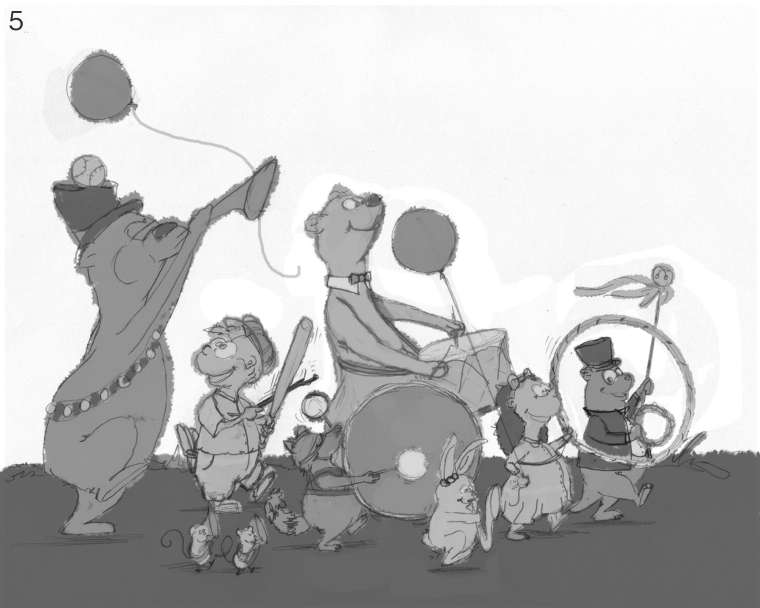
@burvantill, To be honest, I didn't see that until I looked at it on my laptop. Maybe turn it so that it is more of an ellipse?
-
@burvantill I thought it was a bass drum for a couple seconds, but then I saw the hula hoop. Great idea there.
-
It took me a moment, but the hula hoop indeed registers as a hula hoop. Like others have said once colour is added it should pop more.
Overall I think it's much improved from the initial sketch. The raccoon with the bass drum and the second bear in the background with the snare have some real nice movement to them.
-
Thank you all so much for your critiques. They are definitely helping. I am now on to the next stage of Lee White's recommended process, Value. I did several value sketches and they are all slightly different. Let me have it. I will not cry and I won't get mad. I am ready for it. I have a favorite but I'm not saying in case it totally bad. LOL. PS. this is my first time doing value sketches like this so its possible I'm doing it wrong.
Lisa Burvant
www.lisaburvant.com
Instagram & Twitter & SVS: @burvantill -
This is coming along nicely!
My vote's for numbers two or three.
Remember that you're trying to make it so that everything reads with value alone. So if you have two figures with the same value overlapping each other I'd think about changing it (#3: the rabbit sax, girl and hoop all have the same value and overlap).
Imagine you only have black and white tiles and you can't have a white next to a black. Light on dark on light on dark on light, etc.
I would also hunt for tangents before you go much further.
Great work so far!
-
@burvantill I like numbers 2 or 5. I would say you are doing it right. There are a few different ways about doing it. Every artist has their way and no way is wrong. What ever works best in your process is the right way. I have done values then color and I have done local color with out values first. Usually when I go with local color first and then check values while I work my piece looks better. When I do values first and then add color it gets muddy. But that is just my opinion.
-
Okay, I looked at your favorites and blended what I thought were their best parts. These are my color sketches. They are almost the same , the raccoons drum was bugging me so I messed with it. Looking at this, there is no real focal point, at first I thought that would be bad, but since the idea was chaotic fun I thought again. I'm going to take @chrisaakins advice and add some nature confetti falling all around them to add more chaos. Anyway, here is my color scheme. Let me know what you think.

.ps. Thanx for the tip on tangents. I have many to remove in my final piece. Lol! FYI, am using a tip that Lee White talked about in one of the podcasts, flipping the art. Doing that really makes the mistakes pop out. You just look at something so much you can't see them without a new perspective. Totally works.
6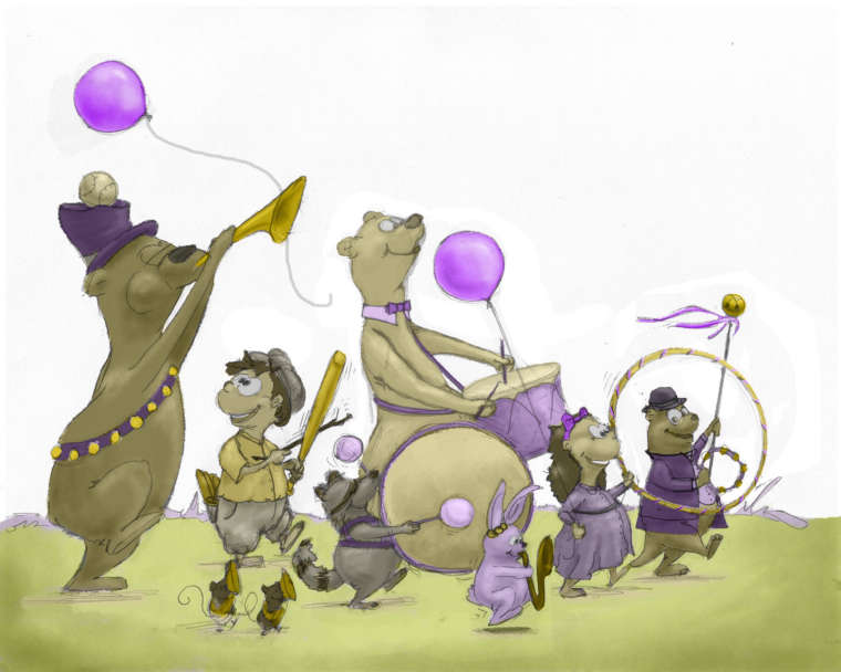
7