Music WIP: Comments Appreciated
-
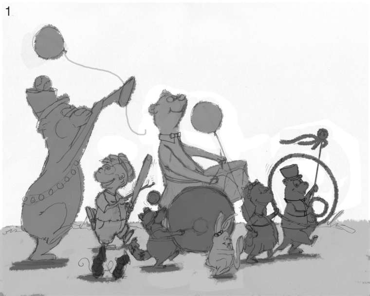
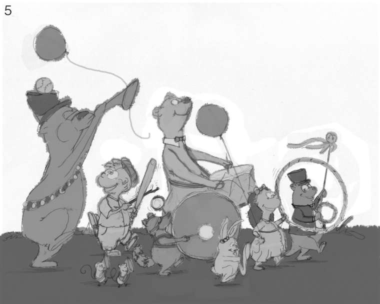
@burvantill I thought it was a bass drum for a couple seconds, but then I saw the hula hoop. Great idea there.
-
It took me a moment, but the hula hoop indeed registers as a hula hoop. Like others have said once colour is added it should pop more.
Overall I think it's much improved from the initial sketch. The raccoon with the bass drum and the second bear in the background with the snare have some real nice movement to them.
-
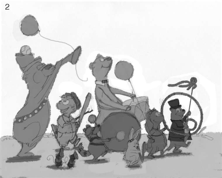
Thank you all so much for your critiques. They are definitely helping. I am now on to the next stage of Lee White's recommended process, Value. I did several value sketches and they are all slightly different. Let me have it. I will not cry and I won't get mad. I am ready for it. I have a favorite but I'm not saying in case it totally bad. LOL. PS. this is my first time doing value sketches like this so its possible I'm doing it wrong.
Lisa Burvant
www.lisaburvant.com
Instagram & Twitter & SVS: @burvantill -
This is coming along nicely!
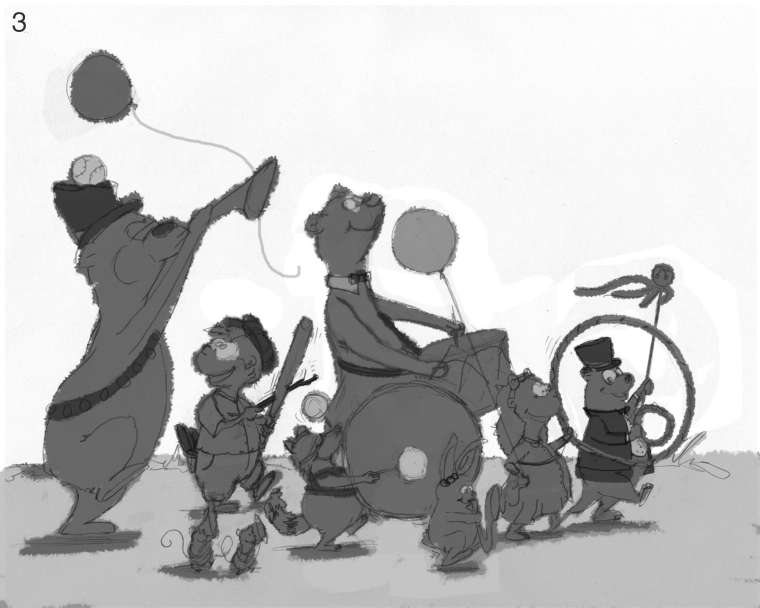
My vote's for numbers two or three.
Remember that you're trying to make it so that everything reads with value alone. So if you have two figures with the same value overlapping each other I'd think about changing it (#3: the rabbit sax, girl and hoop all have the same value and overlap).
Imagine you only have black and white tiles and you can't have a white next to a black. Light on dark on light on dark on light, etc.
I would also hunt for tangents before you go much further.
Great work so far!
-
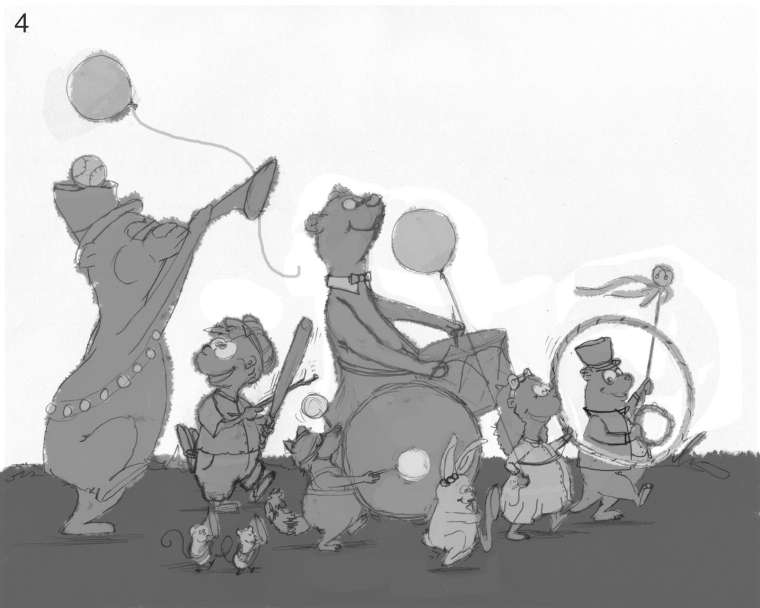
@burvantill I like numbers 2 or 5. I would say you are doing it right. There are a few different ways about doing it. Every artist has their way and no way is wrong. What ever works best in your process is the right way. I have done values then color and I have done local color with out values first. Usually when I go with local color first and then check values while I work my piece looks better. When I do values first and then add color it gets muddy. But that is just my opinion.
-
Okay, I looked at your favorites and blended what I thought were their best parts. These are my color sketches. They are almost the same , the raccoons drum was bugging me so I messed with it. Looking at this, there is no real focal point, at first I thought that would be bad, but since the idea was chaotic fun I thought again. I'm going to take @chrisaakins advice and add some nature confetti falling all around them to add more chaos. Anyway, here is my color scheme. Let me know what you think.

.ps. Thanx for the tip on tangents. I have many to remove in my final piece. Lol! FYI, am using a tip that Lee White talked about in one of the podcasts, flipping the art. Doing that really makes the mistakes pop out. You just look at something so much you can't see them without a new perspective. Totally works.
6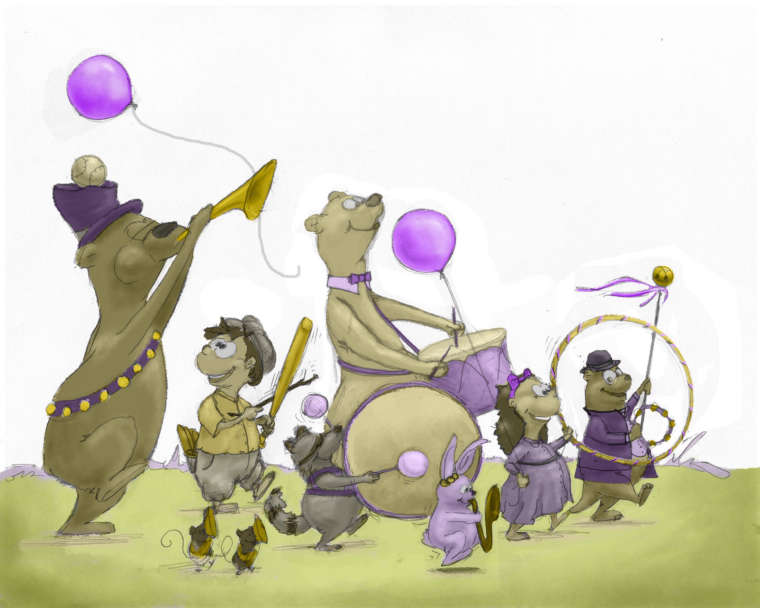
7

-
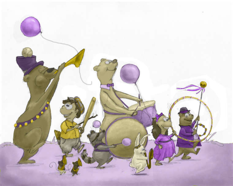
I like how this is developing; it’s a great picture. Of the two that you just posted, the first one read more easily when I was looking at it on my phone because the contrast was slightly higher than the second. Can’t wait to see the finished piece!
-
After a night away from these last pics all I see are balloons. Lol. I’m going to tone those waaaay down. Put some brighter colors in to the crowd.
-
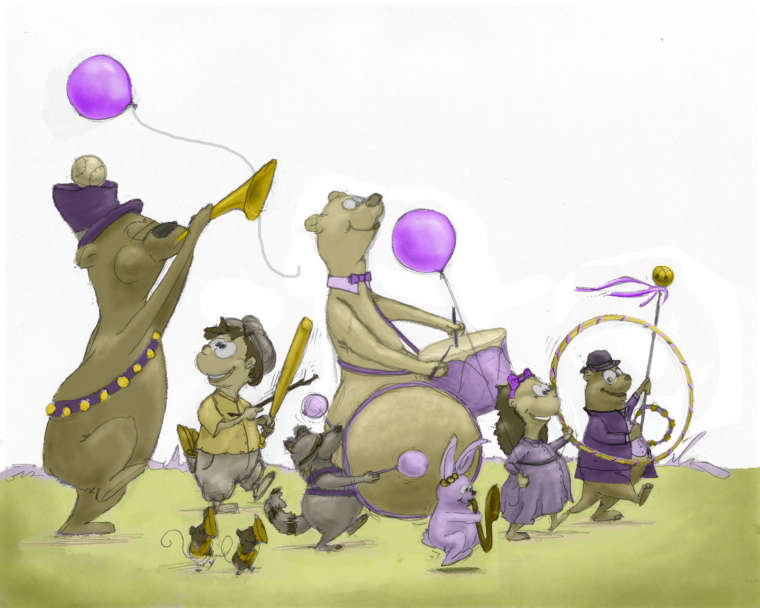
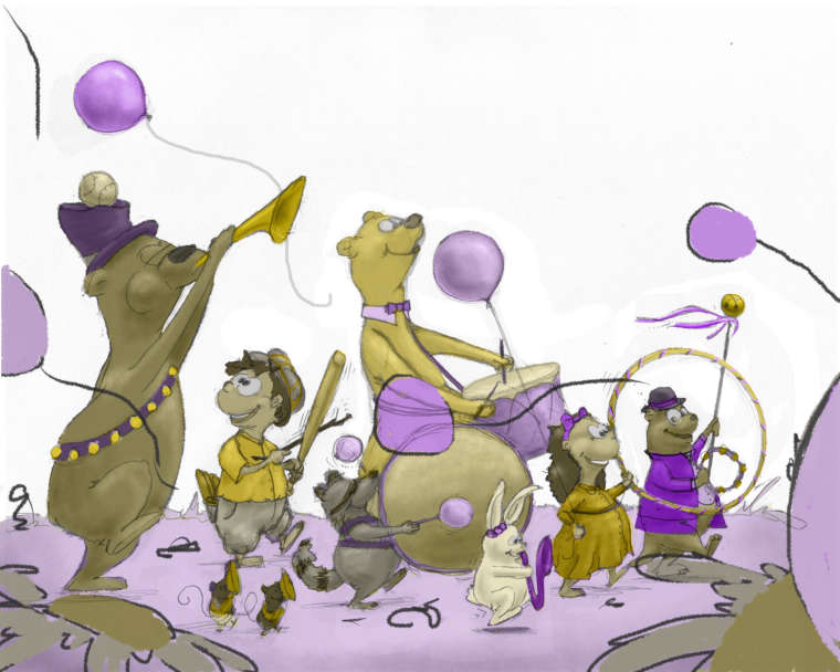
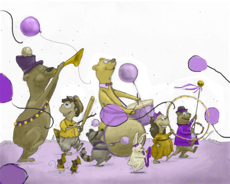
Okay, here is my latest version next to one from above.
Lisa Burvant
www.lisaburvant.com
Instagram & Twitter & SVS: @burvantill -
@burvantill I love it! I assume you are going to saturate your colors more? I think the eyes of the critter with the bat call my attention as a focal point. I think it is a wonderful composition, I can't wait to see the finished project.
-
@chrisaakins thanx! That’s good to know about what you see as the focal point. I’ve stared at it too long it’s hard to tell.

-
Love the concept. I think you need to vary your sizes more and create more of a fore middle and background. I love your line work.
-
Sorry I posted after just looking at the sketch. As I scrolled down I see you have done that in you finals. Look very nice!
-
Oh man, these expression are great! Loving seeing the process (thanks for taking the time to share) and your work is really coming along quite well!
I definitely have a preference between the two images you've shared, being the bottom one, but if you're leaving the background white I think the purple ground ties the image together much better. Furthermore, the whiteness of the rabbit in the first serves as a focal point by virtue of contrast. In the same way, however, the boy with the bat also stands out quite a bit, and I wonder if changing the girl's dress (or some other element in that vicinity which fills a similar volume of visual space) to the same yellow would balance that yellow out and make it so the white pops out more. I see the hula hoop there is yellow, but I'm not sure it's going to spread the balance of the boy's yellow shirt from left to center. Does that makes sense? Feeling a little unable to articulate what I mean, so please let me know if that was a bit difficult to understand.
Again, you're doing so well with this process! I'm excited to see what comes next!
Pax
-
@jabbernewt Thankyou for the tips on focus. The feedback from everyone is so helpful.

-
So the other day after I post the two above I walked away from it for a while and when I came back I changed a couple things and added a bunch. It's really rough and loose because I wasn't sure if I was going to keep it. Kinda a quick "let's see what this looks like" kind of thing. Now today I'm reading the posts from @imrush and @Jabbernewt and started laughing because you guys justified my thoughts. Lol! THANK YOU! Like I said it's really rough, but I would still like your comments. The daisy and balloon on the far right bottom will be adjusted, FYI.
Lisa Burvant
www.lisaburvant.com
Instagram & Twitter & SVS: @burvantill -
@burvantill Ahhh. I hate to say it, but I liked it better without the closest foreground elements. That is just my two cents. I feel like that is all my eye is drawn to. I do like the balloons though.
-
@chrisaakins good to know, thanx! I appreciate the honesty.

-
The foreground elements are a good idea in theory. I agree with @chrisaakins that in this particular way they don't seem to work, though. I may play with it a little before discarding the idea entirely.
-
How bout this?
Lisa Burvant
www.lisaburvant.com
Instagram & Twitter & SVS: @burvantill