Music Wip- Update- Color Help
-
I like 2 for your lazy concept.

-
I think 2 fits your description best too. The fan and drinks give the impression that it's hot, which explains why the musicians are so wilted. Maybe the drinks could be in glass cups with ice cubes? I also wonder if something that would make the piece a bit less symmetrical might add to its strength. Maybe something large in the foreground?
I really enjoy all of your sketches.
 So much excellent emotion.
 -
Thanks for your feed back everyone. Good suggestions @KathrynAdebayo !
-
P.S. I edited my first post to clarify that I'm willing to go against my initial idea, if more people like #5 best.
-
I Love how dynamic 5 is! Definitely 5.
-
I agree with @Heidi-Ahmad. You can certainly make great images with the first group but 5 is without doubt all about the music which is key for the contest. The others are simply using music as an element to the other components. Love the energy of the girl rocking out on the right, though the pose of the keyboardist has me confused. Is she laying down or is she jumping off the furniture to play the notes with emphasis? Overall it's a really cool concept and pushes the level of competition in the contest!
-
5! It's fun! I figure go for it.
-
I like them all but I like the groove of number 4.
-
@tessaw Five stands out to me - i think it would make a very nice portfolio piece!
-
Thank you everyone. I think that I'll go with number 5. @Jon-Anderson they are all supposed to be floating, kind of like they're in an anti-gravity situation. I'll explore that specific thumbnail with a few more iterations so I can play with poses and getting it to read clearly.
You guys are so awesome and really keep me on track. So grateful for your insights.
-
These look really good. I like #2 & I agree @KathrynAdebayo's comments. The candles and mugs make me think of wanting to be cozy & warm, so drinks with ice would really help convey the concept.
-
Hi Tessa,
To me #5 has more frenetic activity and wimzy. So naturally it will atract attention.
But #2 has a sort of rising and falling motion like a sine wave, or melodic music. More of a quite appeal.
Will
Pardon typos
Sent from my iPhone -
I like 5 the best too. It seems the most fun image to look at, it has a ton of crazy energy!
-
I love the energy of 5. But you nailed it with lazy playing in 1. Maybe you can go back to one some day. Can’t wait to see the finish!
-
I'm probably late to this party! 5 for the contest, but several of these would be awesome to work up later! I like them all.
-
I am also for number 5, or you can give the lazy one some joints in their mouths and turn the whole thing into a chill session

-
@Miriam True true. You and Kathryn are totally right about that.
@W-Coats Thank you, that was a really beautiful description. You're good with words. #5 and #2 were my favorites, so it's nice to see people responded well to those 2.'
@TianLian Thank you!
@lmrush Thanks, I do plan to go back to one of the lazy ones, if I can.
@Eli Thank you. Yes, I'd like to paint one of the other ones!
@Chip-Valecek lol. The heat was supposed to be the thing that was making them loopy!!!
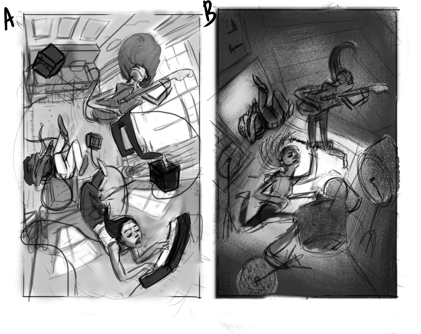
Ok, I played with some ideas and these are two that I liked the best. These are still very rough, so I haven't settled on the values, lighting, or worked through tangents yet, just trying to get down the basic composition, poses, and setting. A. is supposed to be a livingroom and B. is supposed to be a garage.
1.Which one do you prefer?
2. If you like the drummer instead of the piano player, do you like how the drum set is breaking apart?, or should I keep it more like a traditional drumset, and just tweak the shapes to be more dynamic?
Any other thoughts welcome and appreciated.
-
@tessaw One vote for "A" - i really like the the keyboard player
-
I like sketch A. The point of view really helps with the floating concept, and the guitarist's hair (upper right) looks cool and sells the idea as well. I also like the values.
I know this is just a sketch, but I don't think the expression on the keyboard player's face fits with the whimsical concept. I want her to look happy, excited, or peaceful, but I'm seeing it as extreme concentration, really intense, or unhappy.
The image looks balanced, and even though there's a lot going on, everything is clear & has enough space.
-
@tessaw I vote for A as well.