Music Wip- Update- Color Help
-
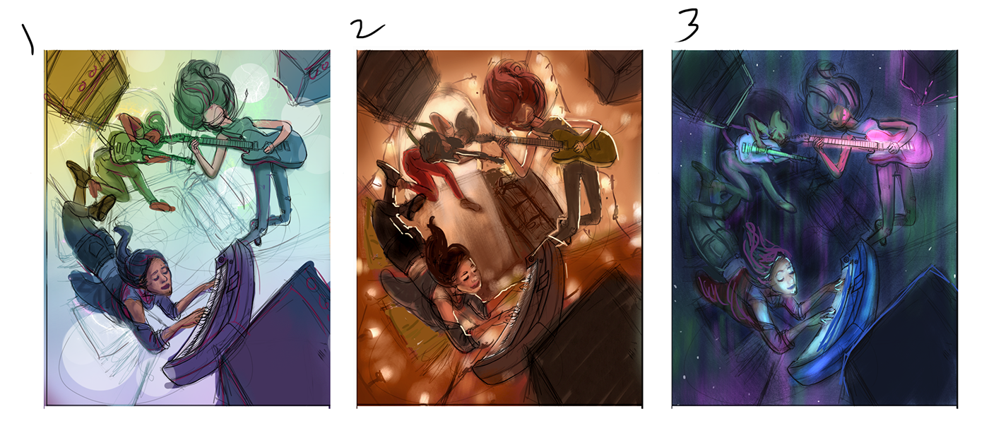
I choose 1
-
@tessaw My choice of 1 may have more to do with value than color 1 reads instantly where the other two made my brain work more to understand what was happening
-
@jabbernewt Interesting point. Thanks for the analysis!
@rcartwright Good point. I have to remember that others can't see the potential I'm seeing in my head. I should be more careful that my roughs are reading well to others. I was more focused on establishing a color palette and overall mood, but it would have been better to sort it out more fully for presenting it here.
-
I really like the etheral feel of number 3. Looks great.
-
Very conclusive results so far

-
@jason-bowen Thank you!
@Jabbernewt lol, I know.
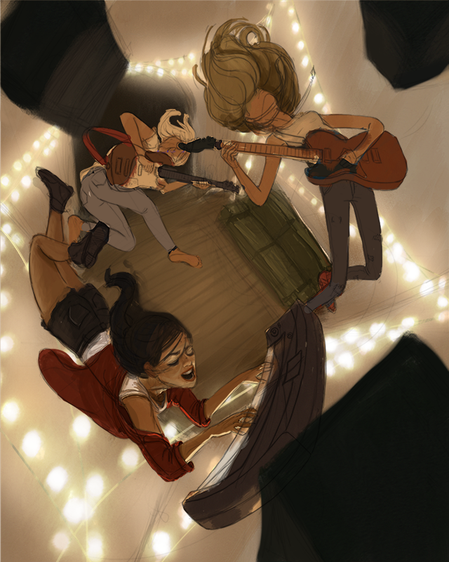
I tried to make 2 and 3 a little more clear to read. Don't know if it's better. It's hard for me to get it to read well without putting in a lot of time, so hopefully you can see a general idea of where they might go.

-
I agree with @Jabbernewt about number 2
-
I like 2 also.
-
I’m on team 2 but like 1 a lot also.
-
2 is my favorite, 1 is also nice. 3 just doesn't have great silhouettes.
-
@tessaw Can't wait to see where this one goes. You can feel the energy. The perspective, the characters are very dynamic.
I see everybody is leaning towards the second one and I see that that one has the most specific mood and atmosphere. However, to me there is a slight disconnection between the warm colors, the cozy Christmas lights and the energy in the characters. I would further emphasize the characters' imagination with lighting and colors. I would merge somehow the cozy room interior with harsh lighting and futuristic colors of a grandiose concert.
I am rooting for this one
-
I like #2 the best. I can see how #1 would be a lot easier to pull off, though.
Either way, it's gonna look awesome!
-
@art-of-b said in Music Wip- Update- Color Help:
I like #2 the best. I can see how #1 would be a lot easier to pull off, though.
Either way, it's gonna look awesome!
Agreed!
-
@tessaw 2! I liked it before and now I like it more.

-
@TessaW I like #2 and #3. #3 feels more like a dream to me where #2 feels more real.
-
I like #1. It has more of a surreal feeling. Which helps sell the floating. When I look at #2 I find myself trying to figure out if they are jumping or how they are laying on the floor or what is going on in general, just because the colors feel more real.
-
Guys, thanks so much for the feedback. It's really pushing me to get this done. I've decided to go with #2 and I am also going to attempt to bring in a hint of concert lighting at the very end, to see if I can get a little bit of a combo of #2 and #3 going on. If it doesn't work out, I can always just delete the layers. This made me realize I didn't even look at concert photos when I was trying to figure out the lighting of this piece. Duh.
Here's a work in progress. Still a lot to be done. My main focus right now is figuring out the local colors of things and building up the light and shadow and cleaning up the forms. Then I'll probably add the wires to the amps/instruments (which I'm hoping will sell the idea that they are floating better), and figure out the hair a bit more. Last will be playing with hints of concert lighting.

-
Wow. @TessaW this is looking great. I really like the lights in the background. This is so creative.
-
@tessaw really nice!!
-
Exciting Tessa! you rock!
