Society of Visual Storytelling

    SVSLearn Forums

    • Register
    • Login
    • Search
    • Recent
    • Tags
    • Popular
    • Users
    • Groups
    • Search

    Fall WIP

    Artwork
    9
    24
    2254
    Loading More Posts
    • Oldest to Newest
    • Newest to Oldest
    • Most Votes
    Reply
    • Reply as topic
    Log in to reply
    This topic has been deleted. Only users with topic management privileges can see it.
    • jasonandroosmith
      jasonandroosmith last edited by

      I like her smile. She looks content.

      1 Reply Last reply Reply Quote 1
      • Johanna Kim
        Johanna Kim SVS OG @Jonas Zavacky last edited by

        @jonas-zavacky I like this a lot, the energy of your lines, the feeling of the fall wind. Your idea to have her holding her hair is good, but you can also emphasize the wind by showing even more movement with her hair and skirt. You might also consider adding fall leaves being blown. I also like the way her eyes are closed against the wind. It lets us focus less on her eyes and more on the signs of the season.

        http://www.johannakim.com
        http://instagram.com/johannahkim/

        Jonas Zavacky 1 Reply Last reply Reply Quote 1
        • Jonas Zavacky
          Jonas Zavacky @Johanna Kim last edited by

          @johanna-kim Thank you! great points.

          1 Reply Last reply Reply Quote 0
          • PoppyK
            PoppyK @Jonas Zavacky last edited by

            @jonas-zavacky Nice! I like the looseness and the smile, it’s like a secret smile. I love a windy illustration, you can have so much fun with movement, which I think you’ve done really nicely with the hair and the plants. The only thing that’s throwing me off is the hair and plants are flowing one way but the skirt seems to be pressing into her the other way..?

            www.instagram.com/poppytshayakay
            www.facebook.com/inkypops

            Jonas Zavacky 1 Reply Last reply Reply Quote 1
            • Jonas Zavacky
              Jonas Zavacky @PoppyK last edited by

              @poppyk Thank you!! Hmmm, that's true... I did that mainly because of appeal.. but it doesn't makes much sense (maybe if the wind goes all over the place)

              1 Reply Last reply Reply Quote 0
              • Jonas Zavacky
                Jonas Zavacky last edited by Jonas Zavacky

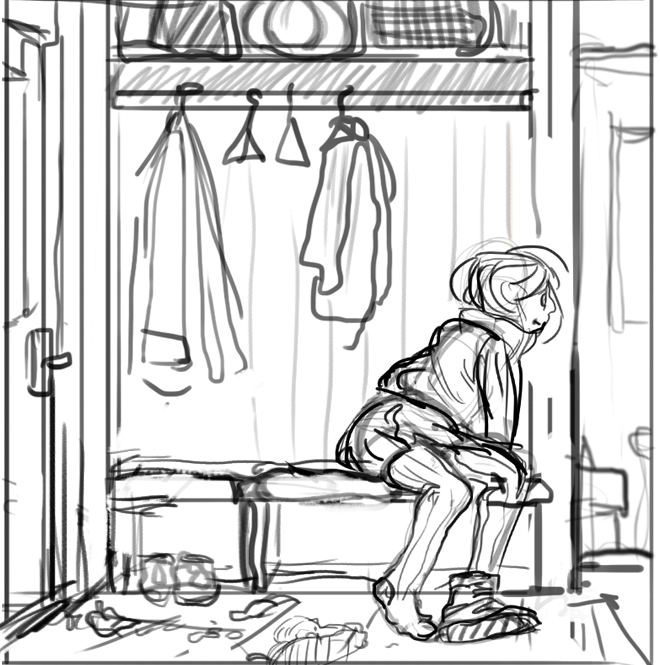
                another sketch! I am thinking about making this one or the girl on a windy day. Normally I would go with the one I posted first, but I want to go outside my comfort zone and draw something more towards children books. I am thinking about children books for quite a time now, but I never really drawn children stuff.

                the idea behind this is that Julia comes from outside where is windy weather and she is cold and cant wait to get warm tea so she is in rush to get off her shoes
                0_1536431687664_1.jpg

                1 Reply Last reply Reply Quote 2
                • Jonas Zavacky
                  Jonas Zavacky last edited by

                  Pushed it a bit further. Made linework and value layout. What are your thoughts on that? I am not sure by the values much. Thank you for any comment

                  0_1536437647242_linework.jpg
                  0_1536437700510_values.jpg

                  1 Reply Last reply Reply Quote 0
                  • Elizabeth Rose
                    Elizabeth Rose last edited by

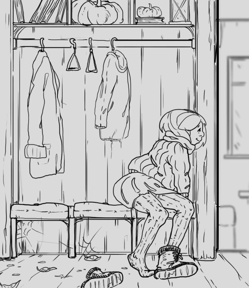
                    Love that you are trying to challenge yourself. I Also love the description you put for this one.

                    Would be neat to somehow extend the drawing to the side and add a scene of a cup of hot tea on a table or a kettle on the stove or something like that. Just an idea

                    Can’t wait to see where you go with this!

                    https://elizabethrosehoffman.com/
                    https://www.instagram.com/elizabethrosehoffmanart/
                    https://linktr.ee/elizabethrosehoffman

                    Jonas Zavacky 1 Reply Last reply Reply Quote 1
                    • Jonas Zavacky
                      Jonas Zavacky @Elizabeth Rose last edited by

                      @squirrelsize Oh yes, that can help with clarity in the picture! Thanks a lot 🙂

                      1 Reply Last reply Reply Quote 1
                      • JudeKillory
                        JudeKillory last edited by

                        I like how the pumpkins are stowed away. Makes me want to see more gourds hanging out. I like that you’re challenging yourself too. This forum is a safe space to throw your art out there and get constructive feedback, I think it may be my favorite thing about svs.

                        https://www.instagram.com/jude_killory/

                        1 Reply Last reply Reply Quote 2
                        • Jonas Zavacky
                          Jonas Zavacky last edited by

                          Thank you for so much feedback! I love this forum. @Squirrelsize yes I think extending it a bit helped it and @JudeKill I add 3 more gourds to the bottom, but maybe there can be more hehe.

                          anyway, what do you think about where it is heading 🙂 Open to any feedback.
                          0_1536513985115_next.jpg

                          1 Reply Last reply Reply Quote 2
                          • Elizabeth Rose
                            Elizabeth Rose last edited by

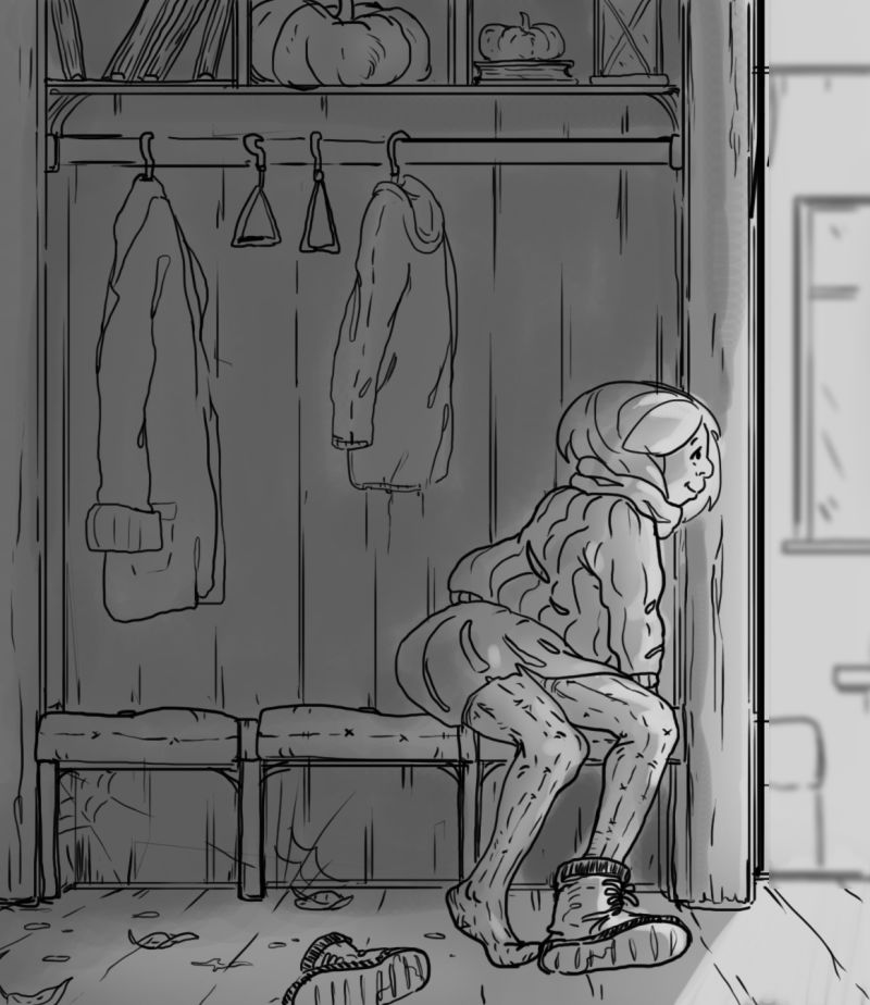
                            Yes! That extra scene to the side allows the eye to flow over the drawing way better! Love this dude!

                            https://elizabethrosehoffman.com/
                            https://www.instagram.com/elizabethrosehoffmanart/
                            https://linktr.ee/elizabethrosehoffman

                            1 Reply Last reply Reply Quote 1
                            • Jonas Zavacky
                              Jonas Zavacky last edited by

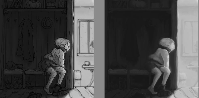
                              Showing this one more time in value phase. Just to make sure the focal point is clear to you guys and overall if it feels right.
                              0_1536777599262_crit.jpg

                              1 Reply Last reply Reply Quote 0
                              • Jonas Zavacky
                                Jonas Zavacky last edited by Jonas Zavacky

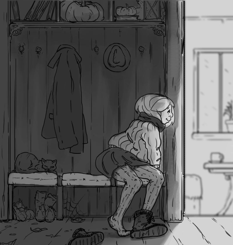
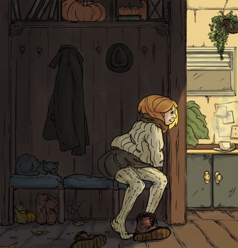
                                Ok, finally I think the values are in a place that I can move further on so I decided to finally work on color (also I changed the background because I was very unhappy with the last one)

                                This is the first shot and I definitely want to explore more color schemes. but do you guys think I am going the right way? Thanks again for every comment. You are the best!
                                0_1537218887323_color.jpg

                                1 Reply Last reply Reply Quote 0
                                • Jonas Zavacky
                                  Jonas Zavacky last edited by

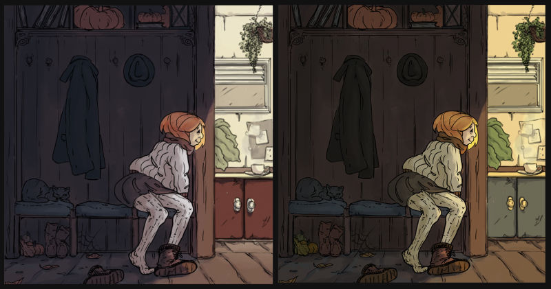
                                  I played with the colors more and tried a cooler variant too which I probably like more than the more warm one.

                                  But what do you guys think?
                                  0_1537298497669_color choice.jpg

                                  TessaW 1 Reply Last reply Reply Quote 3
                                  • TessaW
                                    TessaW @Jonas Zavacky last edited by

                                    @jonas-zavacky I like the cooler variant as well

                                    Website: www.tessawrathall.com

                                    Instagram: www.instagram.com/tessawrathall_art/

                                    1 Reply Last reply Reply Quote 2
                                    • Elizabeth Rose
                                      Elizabeth Rose last edited by

                                      Dude! Looking great! I love the changes you did in the side room scene. I like the second one with the green cabinets because of the warm yellow lighting. Definitely feels warm in that room.
                                      I like the first one with the red in the cabinets bouncing off the color of her scarf. Good stuff bro

                                      https://elizabethrosehoffman.com/
                                      https://www.instagram.com/elizabethrosehoffmanart/
                                      https://linktr.ee/elizabethrosehoffman

                                      1 Reply Last reply Reply Quote 0
                                      • chrisaakins
                                        chrisaakins last edited by

                                        Looks great. Man...I like both. I think I like the cool colors on her more, though.

                                        Chris Akins
                                        www.chrisakinsart.com
                                        www.instagram.com/chrisakinsart/

                                        1 Reply Last reply Reply Quote 0
                                        • Jonas Zavacky
                                          Jonas Zavacky last edited by

                                          Thank you for the feedback! @TessaW @Squirrelsize @chrisaakins

                                          I think I will go with the cooler one, but I will push the warmth of the side room more to get the feeling I am looking for.

                                          Thank you!! ^^ 😃

                                          1 Reply Last reply Reply Quote 3
                                          • First post
                                            Last post