TRASHED - Bologna Children Book Fair Project
-
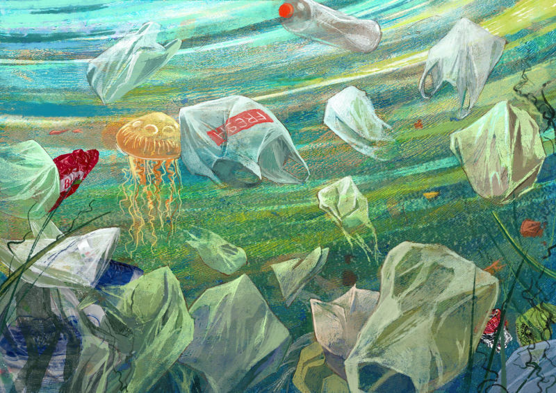
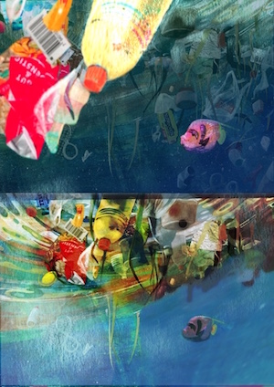
First one down!
Acrylic gel prints, found trash objects and one of my favorite Kyle's brushes: Wamazing Fat RoughWhat do you think? It certainly was a lot of fun and very liberating, but as usual, new experiment always leave me full of doubts...
@Lee-White I´d love to have your opinion - you´re the voice that pushes me to experiment
")
-
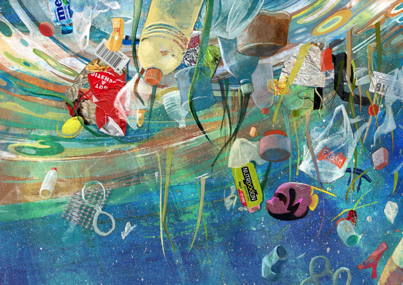
No 2!
-
@smceccarelli Wow! I'm impressed how cohesive the found objects and painting objects go together! Keep rockin it!
-
These are so good! I DESPISE litter so looking at these makes me sad, which is a proper emotion for this topic. So bravo!!


-
@smceccarelli Great work as usual. You're an awesome inspiration to me at a time when I am stuck in a seemingly inescapable rut. Thanks and good luck with your entry.
-
These look great! I love mixed media.
-
@smceccarelli I'm really liking these illustrations especially no2
-
@smceccarelli Hey Simona these are looking great - there is one issue for me that i am seeing in the finals - it looks to me that in your color comps the contrast is working well and my eye can travel around the images in a pleasing manner - in the final versions the values are very close to one another with no real "light on dark" or "dark on light" to separate each part of the composition so it is hard to find a path through the image..if that makes sense? I did a couple quick and terrible thumbnail sketches to try to separate some of the elements(i put them below the original)...these are not good but i decided to share them anyways
") I think that your image 2 may have the same issue - when i shrink them down very small i cannot discern the what the image is - once again i think the color comps dealt well with contrast and composition .... i hope this is not annoying feedback...feel free to ignore of course...really nice pieces!
I think that your image 2 may have the same issue - when i shrink them down very small i cannot discern the what the image is - once again i think the color comps dealt well with contrast and composition .... i hope this is not annoying feedback...feel free to ignore of course...really nice pieces!
-
@kevin-longueil Thank you a ton Kevin for pushing me to reconsider the contrast and depth! I will definitely take a go at separating foreground-midground and background elements. I hid the focus element by design - I wanted it to be a second read ... but maybe it's not a successful design choice, after all.
-
@smceccarelli Love the collage, though the Gut & Gunstig label pops out (could be because I lived in Germany for 7 years), but I suspect also because of the red being so pure. Perhaps consider obscuring both this red and the Nutrixxion label since they both are their pure color and have no obscurity from ocean visibility or sun fading.
Also, can you tell me more about acrylic gel printing?! I was a printmaker and have not heard of this technique. Is it a way to transfer an image? What did I miss?!
www.adrianabergstrom.com
IG/Twi/Pin/etc @adriprints -
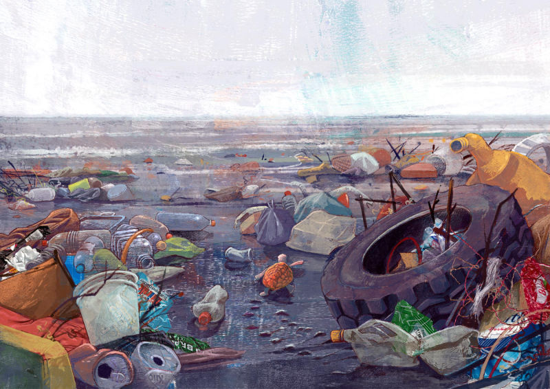
@smceccarelli - I'm really loving the emotion the 2nd image evokes. Haunting, sad, and desolate. (Color is on point) It's almost hard to look at (in a good way.) It did take me a minute to find the turtle, so if that is what you were going for, thumbs up! I think having similar pops of the same orange as the turtles
shell, draws your eye to many areas of the image. -
These images are so powerful to me. Their theme seems to be deepened by the way that the animals don't instantly stand out. I was so moved by them that I showed them to my husband. The way they are now seems very impactful and affects the mind in the way that the dizzying amounts of trash in the oceans do in reality. That's my reaction anyway. Thanks so much for sharing these...
-
@adriana-bergstrom Good points and yes - I think I should increase the “underwater” feeling of some of the elements and those two will be the first candidates.
This was my first experience in printing and I dared it because I only needed it for the backgrounds. You basically make a large batch of flavorless jelly-o (but you use more gelatine to water than you would normally) and make it settle in plate form (I used an oven pan). Then you can roll any water-based color on it and press a sheet of paper on top to transfer it. Because gelatine is soft, you don´t need tools to make the paper lift the color properly.
That is....the theory - there are a lot of tutorials and it seems to produce good results. My gelatine plate, however, kept breaking (I probably didn’t make it firm enough) and become unusable very fast. So I dag out a piece of foam core board from my stock and went on with that one. The color transferred well and I got the effect I wanted (randomly mixing stripes of colors with lots of texture). So maybe I should say “acrylic printing with gelatine and random art materials” rather than “acrylic gelatine printing” ;-)) -
No 3 - not quite finished yet - there are a couple of ellipses to correct and maybe some color balance....
-
@smceccarelli Really Nice!!
-
I just want to chime in here and say that your preliminary sketches are SO solid @smceccarelli. I really endeavor to put more thought and effort into mine.
-
@smceccarelli i love number 3. All the textures just adds to the feeling that the scene takes place at the beach. The colors are amazing as always.
-
@smceccarelli
For me, the concept on the first one and the perspective on the last one are really great! -
These are so good! I am glad to see these from drawing to finished painting. Thank you for posting. Excited to see the rest!
=)x -
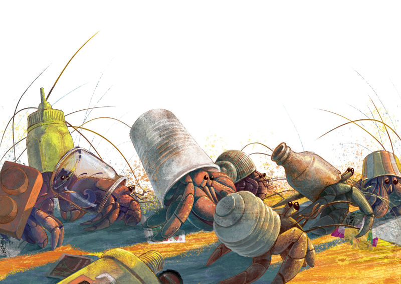
No 4!