WIP dummy book opening pages (crits welcome)
-
Getting back into a picture book I left on hold a while ago as part of a project piece for my portfolio and for my own learning experience (so far there has been a lot of errors, but I feel that I have learnt from nearly every one of them).
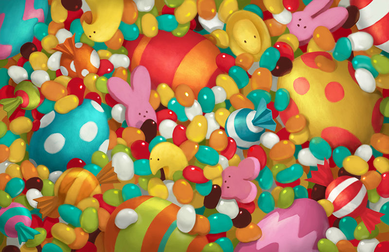
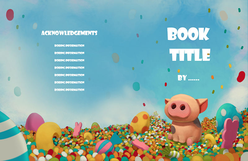
I don't know how important it is to have images on the first 2 pages and last 2 pages (the same for both), but I felt it would look fun to have them. Do you think the image is too busy to have it as the initial image? A lot of the books I looked at, that use those initial and final pages have a lot of repetition in their layout and are quite abstract in some cases, which in a way was what I was going for here, but I'm worried that there is too much impact and detail.
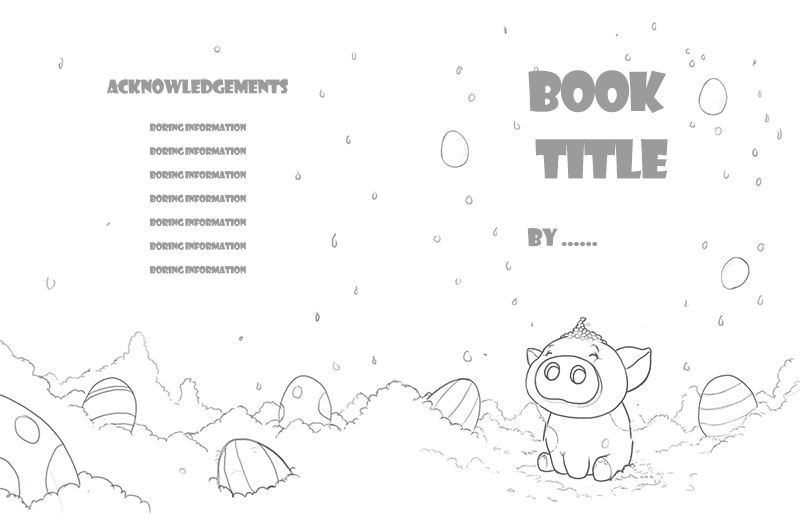
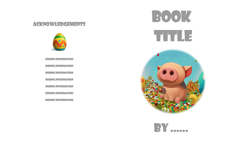
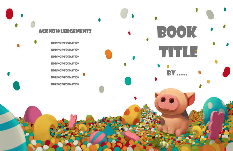
As for the title page, although it's far from complete (I promise I will add eyes) I wanted to continue theme of candy. Out of the 3 layouts I was thinking of, which one would you prefer to see? I quite like the full color spread, but as it's not the official start of the story I'm thinking it could be confusing and maybe the vignette would work better.
If you have any any thoughts on either image or critiques about the design in general it woudl be realyl useful to hear your opinions
")
-
Looks great. I am actually writing a very similar book. So freaking strange lol. Maybe it will be a year full of pig books.
-
The images look great! What you’re talking about are the endpapers, and they can take any form - sometimes they even add to the story.
If you’re doing a dummy with the idea of pitching it, though, you definitely wouldn’t do the endpapers. You would do sketches and a couple of finished interior pages. Not the cover. The idea is that the dummy should show the story and how the illustrations would look like, but leave the AD still enough freedom to give his/her own creativity to the book. The cover is generally a big deal and is better left for a discussion involving AD and marketing, etc... There are exceptions, I’m sure: these are just my agent´s recommendations.I love the style, the idea and the images. I’m not a fan of the font you chose for the title, and even less of using the same font for the author and the back cover. That´s another item that the AD will determine - though you can make suggestions if you feel comfortable with graphic design and font selection and/or you hand-letter.
If this is only for your portfolio, then forget everything I`ve said: it looks awesome. I would definitely change the typography, though - maybe enlist the help of a designer friend!
-
@Eric-Castleman If we get 1 more we can do the 3 little pigs.
@smceccarelli Ahh endpapers! I was trying to remember what they were called. I probably shouldn't have called it a dummy book though, perhaps a test book or a practice book would have been a better word to use. I don't plan on pitching it though, it's mainly a portfolio project, and at most, something to order a small amount of copies to use at some of the schools I visit or for family and friends.
I wasn't planning on using the pig image for the front cover. The plan was to have it as the 2 pages after the first endpaper, am I right to call it the "title page"? Also I should have said to disregard the font, it was a random 3 second choice to be a temporary place marker for where I would want the text to go (I hate that font as well). Sorry to be confusing.
-
For the title page I like the first one best, with the pig in a circle and the little egg over the copyright info. It’s like tease. I also like the full color spread with the blue sky, but it might give away too much. The white background one is very busy with the candy contrasting the white. The pig is adorable even with out his eyes.
-
Beautiful! I think the end paper design works great- especially if the book is about candy. My daughter loves when end papers are more elaborate. It makes her spend more time with the book. It's a nice place to ponder some of the illustrator's work, without feeling like you have to be propelled forward with the narrative of the story.
I think all of your title page options are strong. I tend to like 2 and 3 because of the movement the jelly beans in the air provides. I agree with @burvantill that 2 does seem a bit busy, but I think it could be worked out by softening the colors of the jelly beans in the air, especially the ones further back in perspective. I know it might be a WIP, but I'd also add some atmospheric perspective to the candy piles as they go back in space.
Do you have an agent? I know you want to make this just a personal project, but it looks so great, it seems like it would be worth shopping it around.
-
@gary-wilkinson My first thought upon seeing the end paper spread was this reminds me of those books where you have to look for objects in a busy, jam-packed illustration. I think kids would love the vibrant colors and candy. All that said, I personally would like to have some quiet spots, or a quiet spot, within this energetic-feeling spread. Perhaps the pig character could be poking its face or snout out from the pile of candy. Then at least there would be one thing that my eye could focus on?
-
Looks very nice. I think you have big things in your future your work looks great. I'm also working on a pig book myself. Except I have three space biker pigs in mine
")
-
I think your work is beautiful! I love seeing illustrated end papers and think what you have shown will work very well. I don't have any suggestions, just positive encouragement. Nicely done.
-
I love this concept and your pig is so cute, I agree with @smceccarelli that the font is detracting from the layouts. You're going to want people to focus on your illustrations so if you want to include text it would be better to pick something a little more neutral that won't become so much of a focus, You'll definitely want to go with something that has upper/lower case.
-
This looks really lovely!
I think the candy spread end paper looks great!
For the title pages normally I like the vignette kind of things, this full color spread too cool.
But if you want something more quiet after the burst of colors, easing into the book itself, then the vignette could work nicey with a bit more intentionally designed crop / cut out. I'm not a fan of this blurred out circle crop, I think it doesn't really support your image. Exploring the vignette a bit further could be nice if you have the time for it. If not, I'd pick the full color which is nice and cohesive and I think it works best from these options. -
They all look really great! I don’t know which to choose. I agree, i like the last illustration because of its full colored spread but i also fear it might be too much. I just don’t know which to choose.