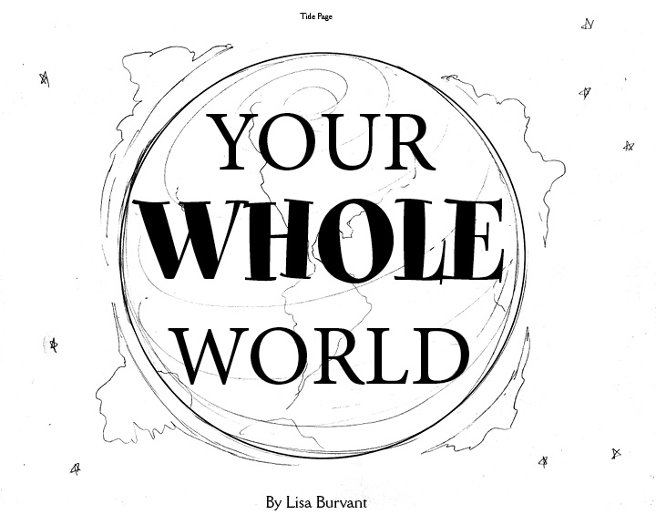
Book Dummy laid bare- Please help: revised title
-
@burvantill AHHH that makes so much sense! Post if you like-but I'll trust you
")
-
@Susan-Marks , Here it is with the text, cropped to the actual page size of 8x10. The left side is the gutter side. This is my first book dummy so I am not exactly sure how much room to give for the gutter. For the pages that have text near the gutter, I gave it an extra half inch from the gutter.
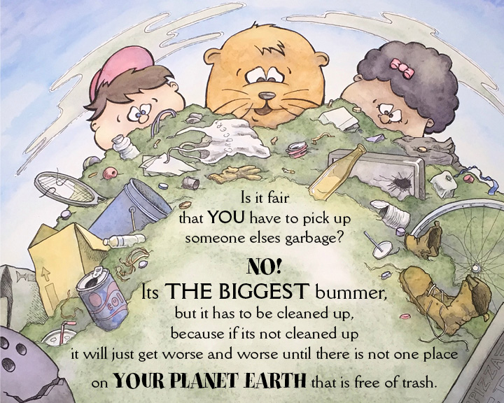
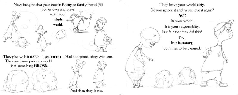
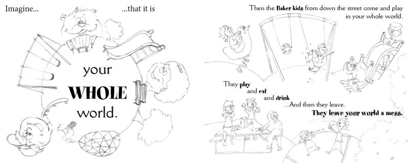
In this scenario, they are imagining this huge pile of litter, so I wasn't too concerned with keeping things proportional, since it fantastical. @Gary-Wilkinson , Do you think that it is too distracting having the characters be that big? The smiling bowling ball was intentional, like the garbage is liking the pollution pile . Probably not a good idea, lol. I'll photoshop that little grin at the corner off, since its creating a tangent there anyway.
Here is a quick screen shot of the spread, too.
My initial intention was to have the real litter on the left page (the big box) be part of the imaginary pile on the right side. Looking at the spread, I think I have to rethink that bowling ball. That was a last minute change that doesn't seem to be working out as well as I hoped.Thankyou for your feedback. I greatly appreciate it!
 . =)x
. =)xLisa Burvant
www.lisaburvant.com
Instagram & Twitter & SVS: @burvantill -
@burvantill I love the art! The text bothers me a bit though. I think it might be better to have one font style rather than 3 or 4. It is a little distracting. But that is just my preference. Also, Its should be It's because you are saying it is. (I am a secret grammar police, much to the chagrin of my wife and students) I also wish it was not centered. But again, this is a preference issue. I love the movement you created with the round heads mirrored by the round pile. It makes me think of the earth, which is what your story is about.
-
@chrisaakins Thankyou Chris. I was eyeballing that “Its” after I posted. I always get that wrong.
The fonts! I was going for a Trucktown kinda thing because I LOVE the fun graphic font style of those books but I heard on a podcast recently to let the publishers/ art director decide the fonts so I will change them all back to one consistent font before I send out the dummy.
If it makes you feel better the text is not centered on every page . It’s (
 ) kinda all over the place from one page to the next.
I would love to post the whole story dummy, but I have a question. Should a person copyright their stories before showing a dummy of it for critiques? What if some sneaky booger tries to pass it off as their own? I’m not implying anything, it’s just a concern/ thought. I mean it’s not a Pulitzer winner or anything, but it is mine. -
Pretty sure you own the copyright once you type it up.
-
@burvantill Now that I see the text, I think this is well balanced and looks appropriately in scale. You've gotten feedback on the mixed fonts so I won't comment more on that. In general I'm not a fan of centered text-but I can't really imagine what left-aligned text would look like in the context of this pretty symmetrical "round" look-is it easy enough to try that and see how it looks?
I too am not a fan of the bowling ball. -
I will try a different alignment for that text. And the bowling ball is officially scratched. Lol!

-
Hi there
Your book dummy seems to be coming together really well, it's a lovely idea and I like your characters and the pile of garbage, i actually quite like the bowling ball haha!
I agree with others about the typeface and alignment etc, I was also thinking maybe you have a bit too much text on your main page? It looks a little crammed to me, but maybe that's because you've used a few fonts and used capitals. If that is going to be your most important page then perhaps the wording needs to be addressed again? Unless you can use that as your front cover with just a simple title in the space?
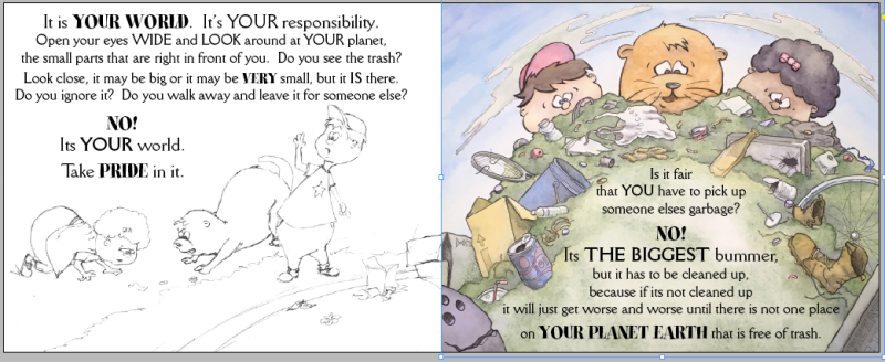
I would also up the saturation on your illustration too as the colours look a bit murky and you have lots of lovely bits in the scene which could pop out a lot more Also, your sketch on the left page, maybe lower it a bit so it's not too close to the text, usually you need to leave an inch space.
Also, I know what you mean about copyright but I think you'd be fine when approaching publishers etc
I hope this is helpful, look forward to seeing where you take it next! Good luck with it -
@hannahmccaffery I see what you mean about the text on the left page, thank you.
When I started this September dummy challenge I had just finished a story so it was the perfect opportunity to go to the next step. Unfortunately the critique group I was placed into was not a good fit. I should've posted my loose dummy here first, because the feedback I get from you awesome SVS'ers is so valuable.
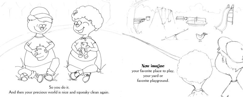
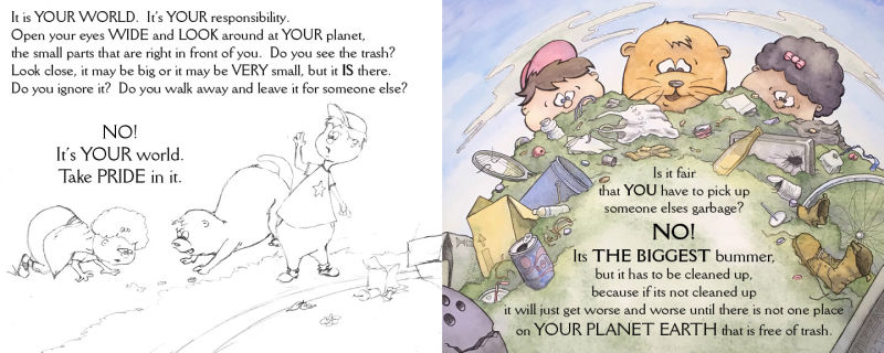
I had a story and divided it into 24 pages, trying to keep a good flow. I did sketches and thumbnails and loose drawings and placed them into inDesign. I am not sure if the title page and copyright/dedication page are supposed to be included in that 24 count. So I ended up with 25. I think I have too much text, so, do I whittle it down to keep the 24 count or do I spread it out and and enough pages to make 32 (which seems huge to me for a childrens book).
I want to do this right, so all feedback is greatly appreciated.
Here is my dummy.
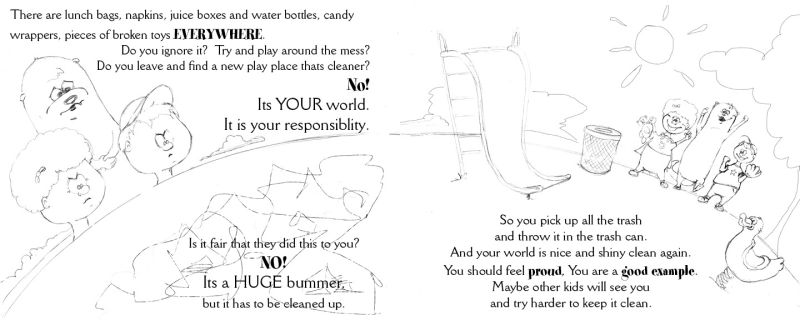
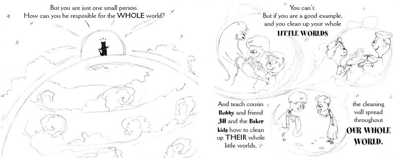
Most of the pages have a spread look to them, where some aspects of the left page flow onto the right page.
These three spreads will be just solid white or light pastel background or vignettes
Well, that's it. I'm laid bare. Be gentle with me... actually, don't. I need to know my mistakes. -
First of all, well done you! I can imagine this has taken so much work and a lot of thought and to get a whole picture book laid out like this, illustrations included, it is definitely something to be massively proud of!
Have you seen Michael Morpurgo's 'Grandpa Christmas'? It only came out recently but it is beautifully illustrated by Jim Field and is about looking after the planet, it might be something to have a read of for reference or it might help you to steer your wording in a slightly different direction. If you're aiming for this to be a 32 page picture book, then I think there is too much wording at the moment.
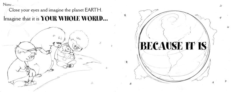
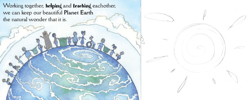
You have some lovely compositions and expressions going on within your illustrations, but maybe some aren't needed as your images and text need to be able to breathe (if that makes sense?). Your last page for example, with the children standing on top of the world, I think this would work beautifully as a double page spread, it would be a lovely image to end your book on and then the text would work a better.
I don't think all of your pages should have a plain or white background either, maybe look at incorporating a few more full bleed illustrations or even having more like your first spread, where it overlaps onto the other page? That will again, give your text a bit more room to breathe.Be careful not to make your vignettes too big either, you don't want to overcrowd themIt's worth looking at lots and lots of successful picture books that are out there, to get an idea of what works and what publishers/art directors may want to see. Your words and pictures have to compliment each other throughout the book
Brilliant work though, I do like the subject matter and I can imagine it's definitely something publishers would be interested in! All the best with it!