Feedback for thumbnail sketches for Howl's Moving Castle contest
-
Thanks for the feedback, all! I've been doing my best to make time for this and these are actually moving forward, and it feels SO GOOD to be getting back to illustrating again.
I got some comments from a few other art friends, and I've had some interestingly contradictory comments on the first image. Some like it as is, some dislike the whole thing. But I like it so I'm moving forward with it.
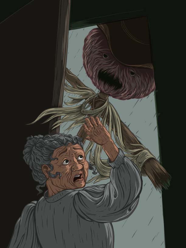
") @kaitlinmakes my actual intention was that its a calendar on a wall rather than a window, though that isn't super clear in the thumbnail.
@kaitlinmakes my actual intention was that its a calendar on a wall rather than a window, though that isn't super clear in the thumbnail. ") And though I see what you're saying @StudioLooong about her looking old there, one of the things I love about the book is how she acts old when she is young, and then becomes all bold and adventurous only AFTER she's turned old. So the hunch was totally intentional in that way, along with the more strong attitude of the old version of her.
And though I see what you're saying @StudioLooong about her looking old there, one of the things I love about the book is how she acts old when she is young, and then becomes all bold and adventurous only AFTER she's turned old. So the hunch was totally intentional in that way, along with the more strong attitude of the old version of her.Oh, and @StudioLooong I would LOVE to see your versions as well! I'm excited to see all the entries really. As I said, I don't expect to win, I'm doing it for the portfolio and the love of the book. So post yours on the forum if you're inclined, I'd love to see :-).
@TwiggyT Yes that is a button, at the suggestion of a critique I got from I friend I added another button up on the stairs so its easier to tell what the close up one is.
@robgale Thanks for the encouragement! It really is helpful to get comments and feedback of any kind. I am indeed going for it despite the craziness of the holiday season, and life with two little kids.
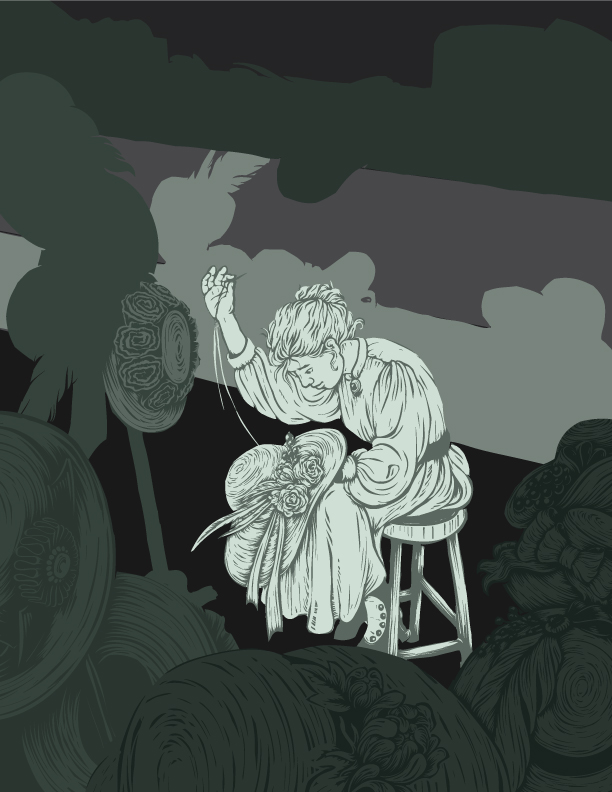
And in case anyone cares, here is where I'm at on the first image. I'm trying to get it to work with general values before I put any color in, and I want to keep the palette fairly limited anyway.
-
@sarah-luann this is really good. Would work well as a wood cut too. I'm so used to the Miyazaki version its great to see Howl's Moving Castle characters in another style. Aces.
-
@sigross Thank you! The reason it looks like a wood cut is that I actually use a reduction-type process to create the final linework, though the finished illustration will be totally digital/vector when complete. It's something I played around with once thinking it would just be for one project, but now years later I find myself unwilling to give it up because I just enjoy the process so much and love the unique quality it gives to the lines. So I'm glad you picked up the woodcut vibe from it, a lot of time is spent giving it that look.

-
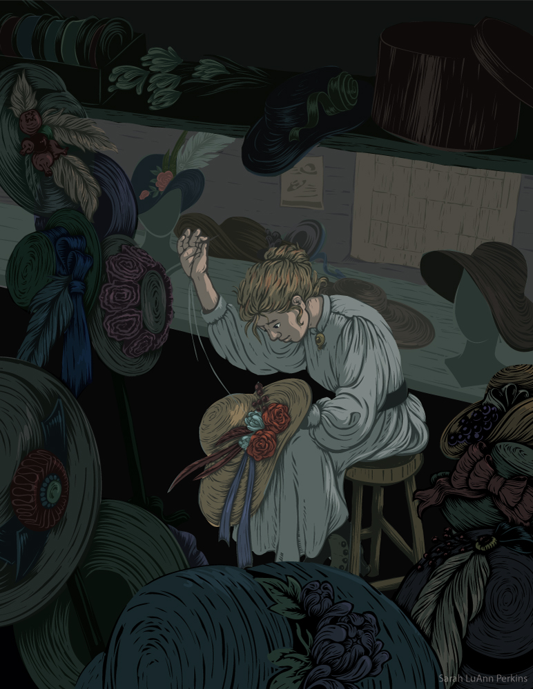
Aaaand here is what I have so far. Still very much ready and willing to edit this according to any critiques I receive, I particularly am wanting feedback on the colors--I want the hats to look colorful, but without drawing the eye away from Sophie. Also if there are any really distracting tangents or other little things to shift around. Or any thoughts at all, really.
-
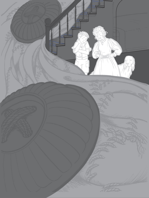
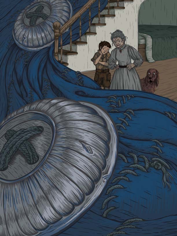
And how I've started on the third one. Because going in order is boring. Right?
I've inked the drawing, scanned it in, fixed some of the wonky perspective I had going on in the stairs, and laid down the overall value pattern I'm thinking of. Any comments are welcome, along with any on the Sophie Trimming Hats image above.
-
@sarah-luann This is really working for me! I have a hard time seeing anything I would want to change. One potential area that may want a little more love is the black area beneath the table where the hat she's sewing is. On one hand, I like that it's clean and makes this nice shape really allowing the hat to pop, but maybe just a little something more to break up the blackness a bit.
Honestly though, it feels really solid to me. Looking forward to seeing the others!
-
Thanks so much, @robgale ! You're right, that space is a bit dark. Though I drew the base of the hat stand there it is kind of getting lost, I may just lighten that a tad to occupy that space without totally ruining the overall dark shape.
-
@sarah-luann Cool! Forgot to add that the colors in that one really work for me. I am partial to a muted color palette and I like how you've balanced the warms and the cools.
-
@sarah-luann oh my gosh this is looking so nice!
-
@sarah-luann I LOVE that huge button!
-
I can't remember the film well right now, though I have seen it, so that may be good. I can remember more of the spirit of Miyazaki than the details of the plot. I only recall that Howl is proud and he moves around in a large contraption, and that as usual there are various spirits.
I especially like your illustration with the silver suit. It flows so well and makes such a nice composition!
And I really like your "woodcut" technique as well. The color is not my "mentality," but I think it works well. Just looking at the thumbnail for your first one, I might have said the figure needs to be bigger, but I saw the finished piece (I think in the November slideshow?) and I really liked it.
-
@Robgale Thanks--I am also partial to a muted color palette, obviously. And I made a deliberate effort to choose my warms and cools in a balanced way, thanks for noticing.
@Studiolooong Thanks! I'm pretty pleased with how it came out as well, though I'll be coming back to make a few tweaks.
@Burvantill I love the button too. I think its clear what it is in the larger detailed sketch, but I like how having a second button works in the composition, so both are staying.
@LauraA Sounds like its time to re-watch the movie!
JK. I'm hoping to have a distinctly different look and feel from the movie, so I hope that means I am succeeding.I really like the silver suit composition as well, I'm having a lot of fun as I'm diving into that one. It feels like a kind of yin/yang vibe if that makes sense, with the button on one side and the little section of the castle with Sophie and Michael almost exactly opposite from it. All I can say is: thumbnailing works, my friends! DO IT! Also, watch @Will-Terry 's re-make of the composition course, it is awesome.
I'm glad you like the woodcut technique--for quite awhile I would tell myself that I need to move on and try something else, but... I just enjoy the process so much. I think that is the point of experimenting--keep trying things until you find something you can commit to, for awhile at least. I'm not bored of the process one bit--in fact, when I get to the point where I get to start "cutting out" the image I get really excited, its where the fun starts in many ways. So, we're sticking with the woodcut process for now. Maybe one day I'll do a tutorial on my process, if that is something people would be interested in. Although I do it all in Adobe Illustrator (vectors for the win!) it could probably be adapted to Photoshop fairly easily.
-
@sarah-luann Yes, the yin/yang makes sense! And I am re-watching the composition course as well and getting new things out of it. And yes, I would love to see a tutorial of your technique! I really love all kind of printmaking, collage, and especially stone lithography (which I have never found a good way to approximate in Photoshop). It can be so hard to choose a technique!
Keep us posted on how the other pieces are going!
-
@sarah-luann It was great to see this project develop. Did you get your entry in to the contest?
-
I did! With the holidays my work was interrupted and then it was a mad rush to get them done before the due date, but I did get them in! I am glad I did it because, win or lose, I feel like they are some of my best pieces to date. I will post them all when the long list is announced (whether I’m on it or not
) -
@sarah-luann Good stuff. Yes having a deadline for something gets you to get stuck in and you produced quality work. I hope you get it.
-
So true! That’s one of the main reasons I entered really... an external due date to make fanart of one of my favorite books ever. How could I not go all in and make it happen?
-
So, the longlist has been announced! Take a look at it here: http://bicpeopleschoice.org/book-illustration-competition-2019/
And no, I'm not on it. I really like many of the entries that are, and some I don't really care for at all--it just goes to show how subjective this field is! (Also the fact that I am a huge fan of the book and a pet peeve of mine is when illustrations contradict the text, but the if art is beautiful I can sort of forgive that, almost.)
I know my pieces are far from perfect, but they were the best I could do and I'm proud to have them for my portfolio.
Thanks again for all your help and feedback! It really helped me to make my entry the best it could be. I think I may enter again next year if it's a book I'm interested in.
-
omg that cover is beautiful.
I'm actually pretty surprised they didn't snag you - but your attitude is so lovely about it. Beautiful work Sarah - it's been wonderful watching it come together. -
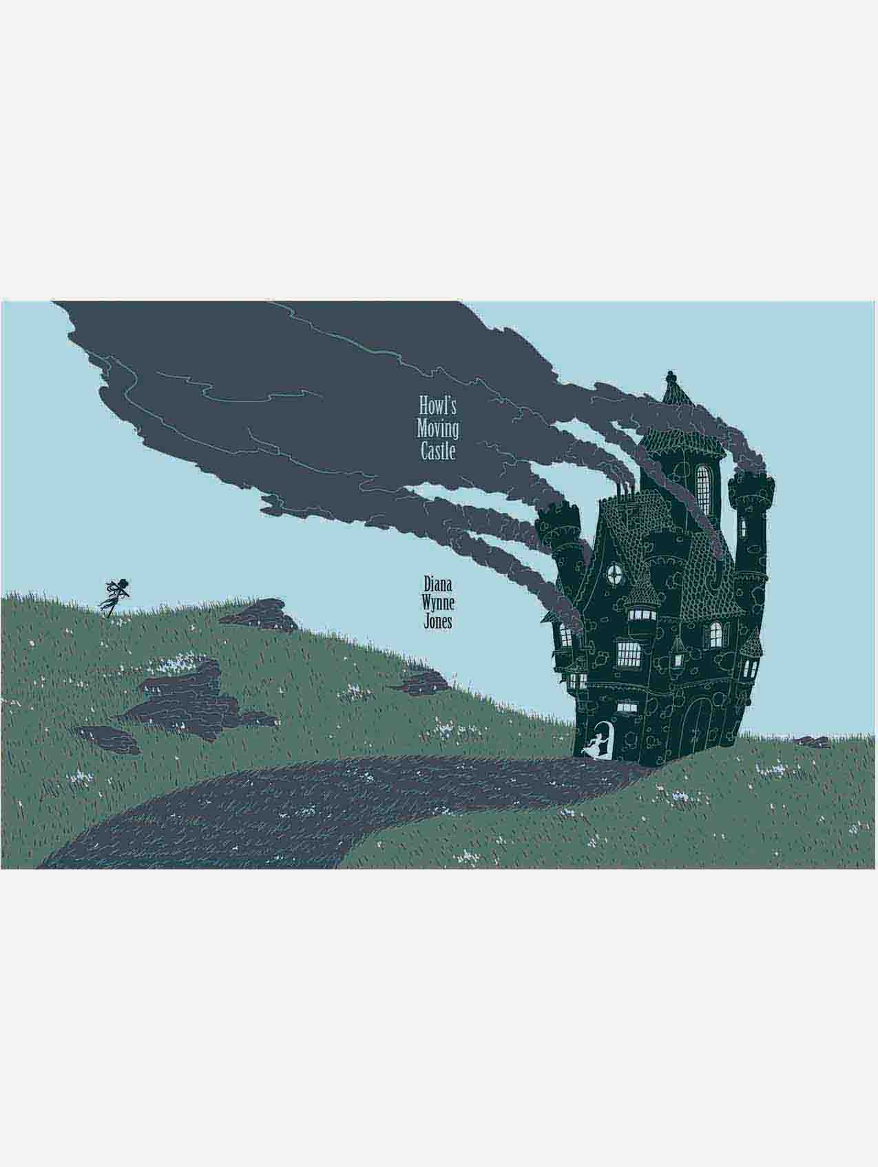
Thanks! It was fun to (finally) get the cover to work. Using only four colors was a real design challenge, and the cover went through a really ugly stage before I worked it out
 but that’s art for you, right? If I could have one more color I think I would add a few clouds to the background so it would have a bit more texture/interest without drawing away from the main focal points.
I was both surprised and not surprised that several of the others had a similar composition with the castle on the front cover and the scarecrow on the back. The title of the book being what it is, putting Howl’s Moving Castle on the front makes sense. And what other story element could work in the composition to add interest to the back? Obviously the scarecrow. One could argue that it’s unoriginal, but at the same time the fact that many talented artists went for that solution means, to me, that it is a great representation of the book.

 ️
️