North Pole Cover Critique Please
-
This is sooooo cute! I love it!
The only I might say is that the title is getting a bit lost in those aurora borealis lines... Both are so pretty and nicely done, it would be really too bad to lose either. Maybe you can rework the placement and shapes a bit so they don't overlap? There's a nice empty space in the middle where your title can fit if it's sized down. Or you could keep the title there but rework the aurora so the shape stays close to the horizon? -
Thanks Ness. That's good advice. I think my best bet is to keep the title big and and rework the aurora borealis so it fits better. Cool. Thanks!!
-
Other than what @NessIllustration said, I don't have any crits either, it's really cute. You could also thicken up the letters a bit in the title to make them pop? It's a great job, for sure!
-
I agree with the rest of the posts.
") Very cute!
Very cute!Marsha Ottum Owen
-
@Aaron-Pierce Thanks Aaron. I took your advice and made the letters thicker which makes a lot of difference. The text is certainly clearer to read now.
@NessIllustration Thanks Ness. What do you think about this aurora borealis? I went a bit more subtle.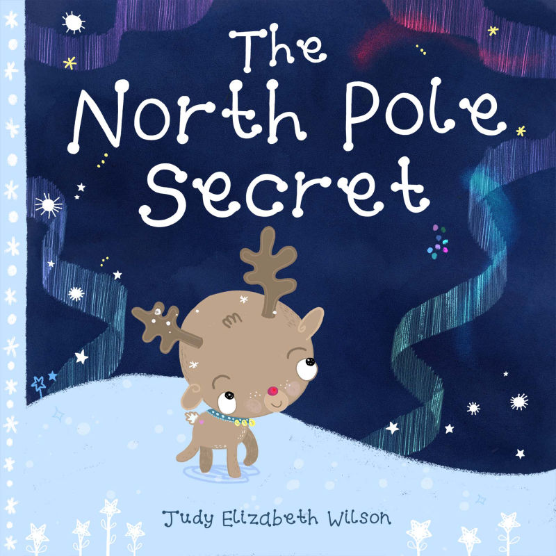
Website http://www.judyelizabethwilson.com/
Instagram https://www.instagram.com/judyelizabethart/
Sharing positivity through art.
-
@marsha-kay-ottum-owen Thanks Marsha!
-
@judy-elizabeth-wilson said in North Pole Cover Critique Please:
It is much more readable. Still cute
-
@Judy-Elizabeth-Wilson SO pretty!!!! Love it!
-
Awesome! Looks great, @Judy-Elizabeth-Wilson !!
-
@judy-elizabeth-wilson Looking very nice.
-
This is so cute, i love it! Definitely looks better now that you've thickened the lettering and reworked it! I would make the reindeer colours slightly more warmer/saturated just so that he stands out a bit better from the snow? I love his little nose!
-
The new cover is looking amazing