North Pole Cover Critique Please
-
Other than what @NessIllustration said, I don't have any crits either, it's really cute. You could also thicken up the letters a bit in the title to make them pop? It's a great job, for sure!
-
I agree with the rest of the posts.
") Very cute!
Very cute!Marsha Ottum Owen
-
@Aaron-Pierce Thanks Aaron. I took your advice and made the letters thicker which makes a lot of difference. The text is certainly clearer to read now.
@NessIllustration Thanks Ness. What do you think about this aurora borealis? I went a bit more subtle.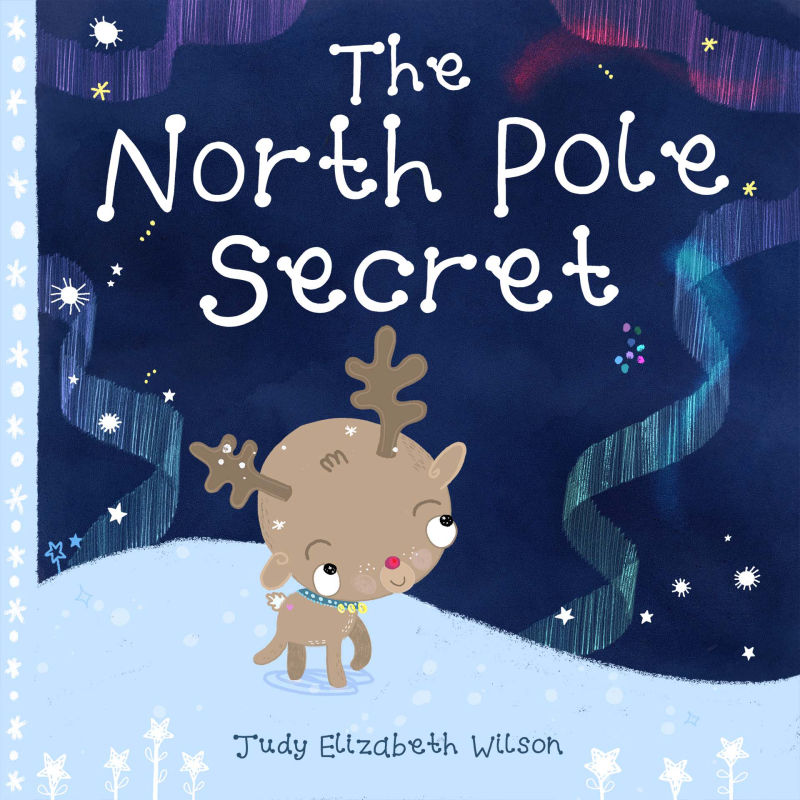
Website http://www.judyelizabethwilson.com/
Instagram https://www.instagram.com/judyelizabethart/
Sharing positivity through art.
-
@marsha-kay-ottum-owen Thanks Marsha!
-
@judy-elizabeth-wilson said in North Pole Cover Critique Please:
It is much more readable. Still cute
-
@Judy-Elizabeth-Wilson SO pretty!!!! Love it!
-
Awesome! Looks great, @Judy-Elizabeth-Wilson !!
-
@judy-elizabeth-wilson Looking very nice.
-
This is so cute, i love it! Definitely looks better now that you've thickened the lettering and reworked it! I would make the reindeer colours slightly more warmer/saturated just so that he stands out a bit better from the snow? I love his little nose!
-
The new cover is looking amazing