BIG- WIP
-
@nyrrylcadiz Love all your ideas. My vote is for the cat and Thumbelina.
-
For the wolf idea, I think it would work better from a change of angle, in where we see Red Riding Hood walking toward the viewer, and the wolf is a looming figure.
My vote goes to the Thumbelina one. There's always a sense of fear I have of pets somehow growing larger than life, especially cats. Plus, I love the cat's face. -
I get the most sense of 'big' from the massive cat (this is my nightmare). The big bad wolf comes in second.
The cat gives us a nice sense of scale (and the opportunity to make that cat truly eeeeeeeeeevil is something I wouldn't pass up
") )
) -
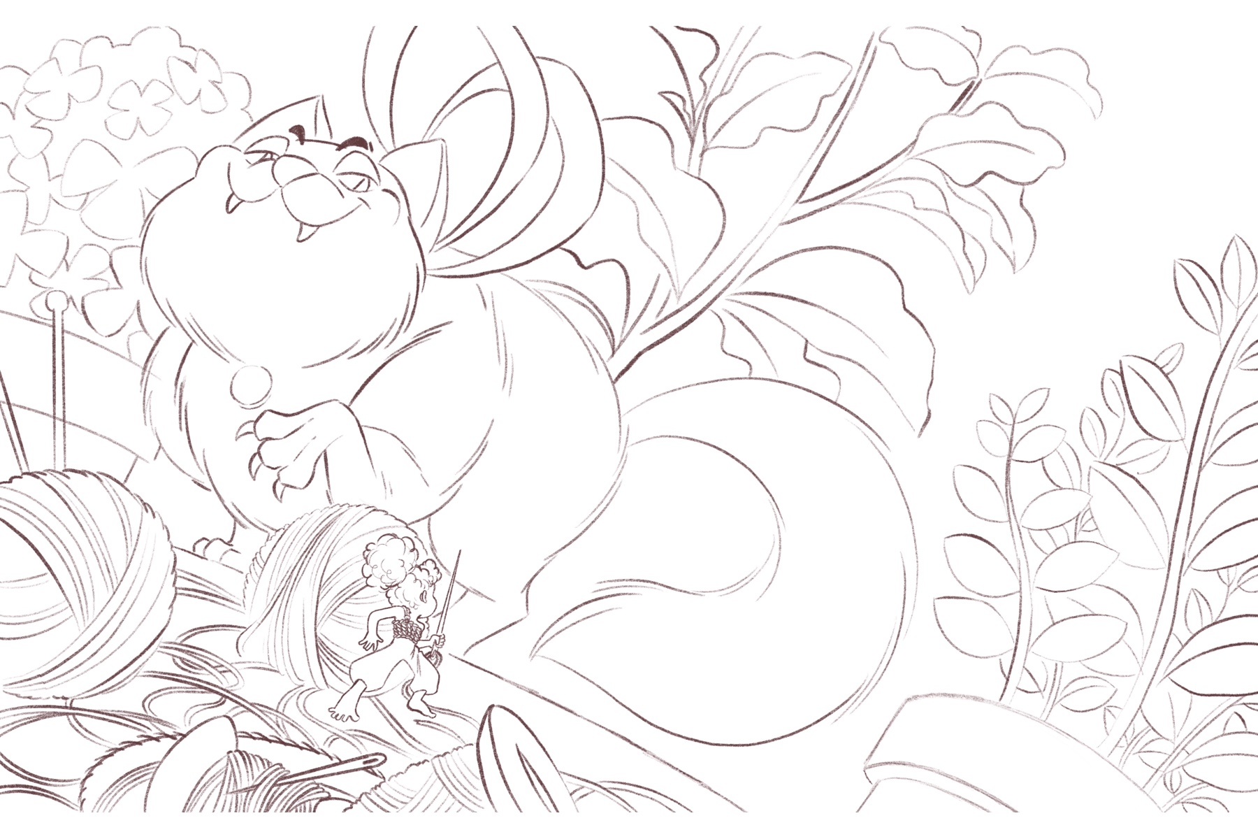
Hi, everyone! I’ve inked the cat and thumbelina illustration. Please let me know if you see any wonky or faulty elements or have any suggestions. I truly appreciate your critiques. Thank you so much!
-
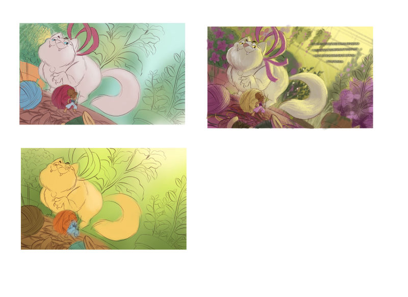
I just did some color comps. When i did the third one, I was really in love with the colors that I think I added too much detail on the comp. What do you think guys? Any suggestions? I’m still open to other color palettes. I think i have too much yellow pieces in my portfolio already. I want to try something new

Portfolio: nyrrylcadiz.com
Instagram: https://www.instagram.com/nyrryl_cadiz/
YouTube: https://www.youtube.com/channel/UCbJCF1Im8ZO7hpGWTKOJMuA -
Ohhh I like the second one!
vanessastoilova.com
instagram.com/vanessa.stoilova/Check out my Youtube channel for tips on how to start your career in illustration! www.youtube.com/c/ArtBusinesswithNess
-
@nessillustration the bottom one?
Portfolio: nyrrylcadiz.com
Instagram: https://www.instagram.com/nyrryl_cadiz/
YouTube: https://www.youtube.com/channel/UCbJCF1Im8ZO7hpGWTKOJMuA -
@nyrrylcadiz No the one on the right with the purple!
vanessastoilova.com
instagram.com/vanessa.stoilova/Check out my Youtube channel for tips on how to start your career in illustration! www.youtube.com/c/ArtBusinesswithNess
-
@nessillustration oh, i see! That’s my favorite too.
Portfolio: nyrrylcadiz.com
Instagram: https://www.instagram.com/nyrryl_cadiz/
YouTube: https://www.youtube.com/channel/UCbJCF1Im8ZO7hpGWTKOJMuA -
@nyrrylcadiz Concur! That's a winner
-
@nyrrylcadiz Love the purple one
-
Purple one for sure!
-
The purple one's colors seem both more "dangerous" and more "fantastical". Regarding too much yellow in your portfolio, maybe you can pull the yellows into a blue-ish color? Does it have to be during the day? Can it be at night?
Children's Illustration Portfolio: https://www.coreyartusillustration.com
Art Portfolio: https://www.coreyartusimagery.com
Mastodon: https://mindly.social/@Coreyartus
Pixelfed: https://pixelfed.social/Coreyartus -
The first one looks really good too if you want a yellow break. I think the last one is more polished so it just shines.
-
@coreyartus @ThisKateCreates @inkandspatter @Kat thank you so much for the input. I really appreciate it. I’ll give a night time setting a try and something more blue.
-
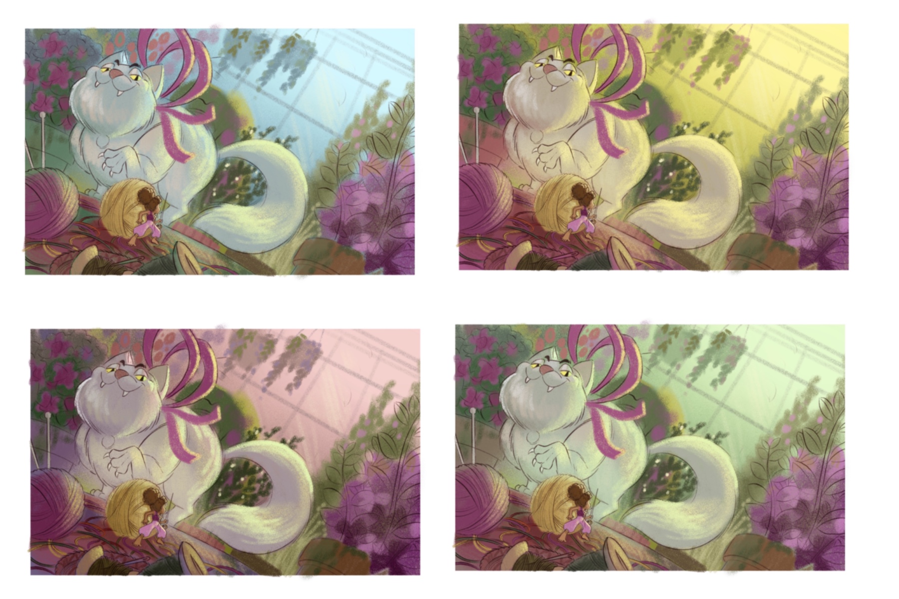
Hi everyone! I’ve been tinkering around with my color comps, adjusting their hues, saturation, brightness and what not and I think I’ve made my decision. Of the four color comps I have below, i really really like the green one at the bottom. For me it really just gives the atmosphere a chilling, scary, and unnerving feeling. It gives me a horror movie feel which is kinda what I wanted for this piece. What do you guys think?
-
@rinovarka haha
 I know the feeling! I’m not a cat person. I always have this slight fear of cats given what they’re capable of. They hunt rodents, birds, fish, etc. They’re natural born hunters! Just imagine if they’re 20 feet tall! Lol
-
@Johanna-Kim @Braden-Hallett thanks for your votes!
-
I like these! I like the bottom right one for slight creepiness, and the top left one for sheer harmony of color. I think for it to be horror movie, you might have to take down the saturation of the purple a bit on the bottom right. I'm not sure, though.
Another thing I'd keep an eye on is Thumbelina. Putting the focus on a small figure is such a challenge! Just make sure she doesn't start to look like another hydrangea at first glance.
I like the off-kilter angle, the colors, and the overall composition. The figure of Thumbelina in the line drawing is fun and has good perspective. And I like the rhythm and line work in the yarn. Nice!
-
@lauraa hi! Thanks for the suggestions. Yeah, i really need to desaturate that purple plant at the corner. As for the upper blue piece, i also really like the colors. It’s my second choice actually. However, given that I wanted a more scary atmosphere, i think the lower green piece conveys it better. I am going to save that blue comp’s color palette. I think it would be great for a bright, upbeat illustration. I’ll try my best to make thumbelina read clearly but i’m scared i might not do it properly. With all the elements going on, i’m having doubts if i can really make her stand out. I’ll give it a try. Thank you again!
Portfolio: nyrrylcadiz.com
Instagram: https://www.instagram.com/nyrryl_cadiz/
YouTube: https://www.youtube.com/channel/UCbJCF1Im8ZO7hpGWTKOJMuA