WIP for a portfolio piece
-
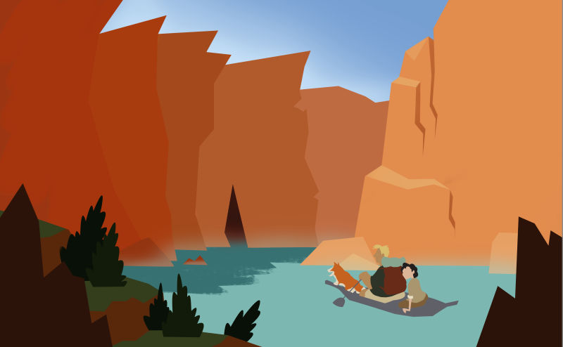
Hi all, I'm trying to work on more environment shots as so far I've been more focused on characters. I've produced this composition of some explorers in a canyon but I'm struggling to go beyond here. My main sticking point is texturing the rocks in a simplified, stylised way. Any tips or suggestions?
-
Perhaps simple horizontal striations with a texture brush? You have a lovely texture in the water. Maybe you could echo that in the cliffs? Matching the atmospheric effect getting lighter in the distance, maybe the texture of the cliffs gets less detailed, helping to suggest scale? Just a thought.
There are some lovely national park postcard images that have simple canyon illustrations as a possibility, maybe?
-
Hi! My suggestion is find yourself some rock textures that you like on google and use them in your work. Place the texture on top of your paint layers and set it to multiply. You could also tweak the opacity and hue of the rock texture to fit your vission. I hope this helps.
-
@coreyartus Thanks for the suggestions, those canyon postcards are absolutely perfect, I'll definitely take inspiration from them!
-
@nyrrylcadiz Hey that's a good idea, an easy fix too
") I will give it a try. Thanks for your help.
I will give it a try. Thanks for your help. -
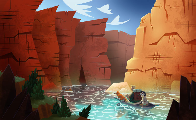
@nyrrylcadiz @Coreyartus Hey I finished it up, what do you think?
-
@jp_scribbles
I absolutely love this! -
@jp_scribbles I absolutely love this. Great work!! The details you did for the cliffs are spot. on. Kudos!!! There is a lot of really vibrant, rich, saturated color that changes values in just the right places, your characters fit in perfectly, and the amount of detail is just enough in the right places!! Really nice!
-
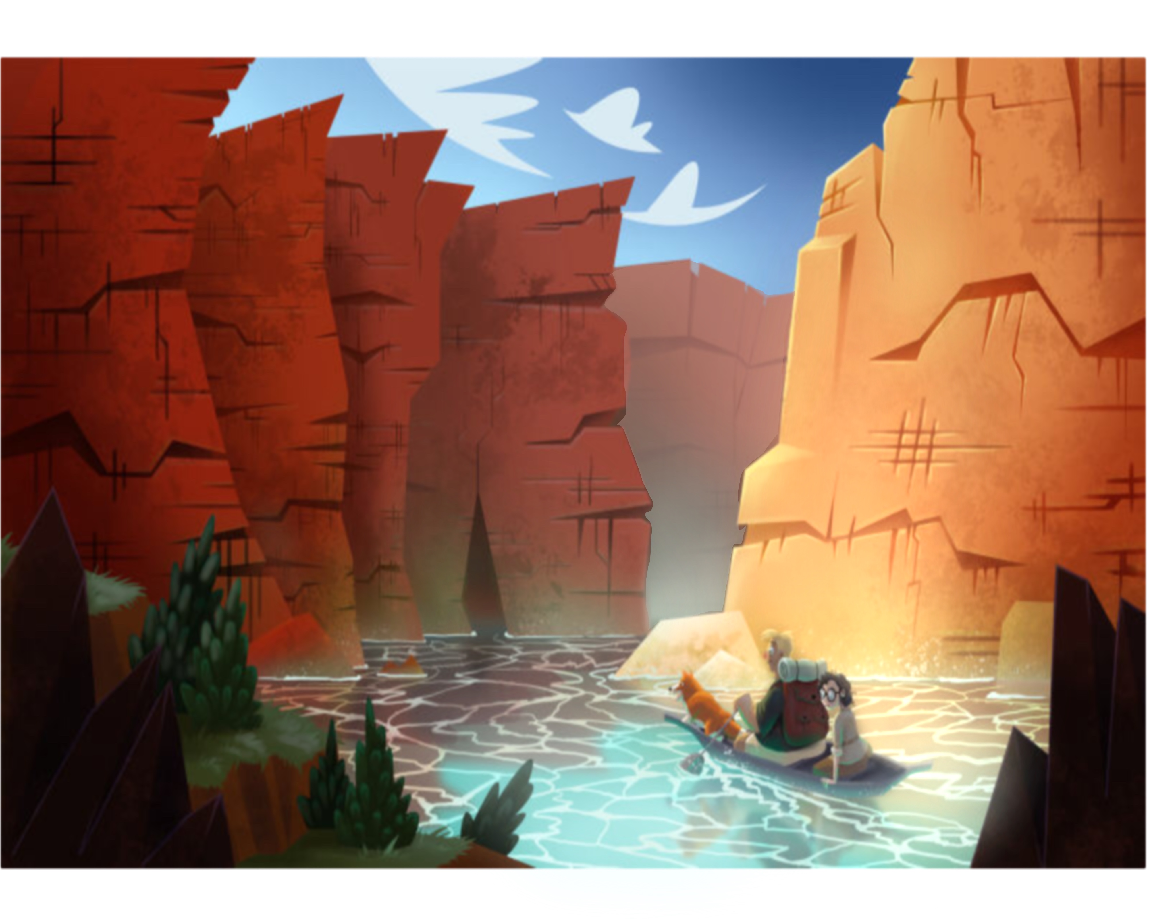
@jp_scribbles WOW! INCREDIBLE! This is very amazing! I love your colors. I love how you rendered the characters. I love the shape of your cliffs and the waves of your river. I think you can still push this piece though. I have a few suggestions. I believe lightening that ridge at the furthest back will improve the sense of space in your piece, making it bigger. I also think that your characters are getting lost in the background especially that girl at the back of the canoe. Her colors and tones are quite similar to the water. To improve this, you can lighten the water and that cliff behind them but leave your chracters as is so that they will stand out on a light background. Perhaps also tonning down your waves. I must admit, they are beautiful but they make the piece too busy given that you already your textured cliffs. You need a little more spce for your viewer’s eyes to rest. Your cliffs could also use a bit more blue reflecting from the water. Here’s my quick paint over of your work. Over all, i think your piece is amazing. It just needs a few tweaks. I hope you find this helpful.
-
Oh wow this is brilliant, i LOVE IT! That dog is fab hehe!
I agree with @nyrrylcadiz about toning down the waves in the water a bit, but you've got such a strong piece here
-
@jp_scribbles Wow, this looks incredible! I love the scale and colours.
-
Wow, I'm so inspired by how this turned out. Thanks so much for sharing your process. In case it's helpful, my eye keeps resting on the hatched area on the closest cliff (the one that forms a checkered pattern), I think because it's the only patch of markings on the rocks that seems unnatural to me.
I really like the cave, by the way... I think it adds a great touch. -
Looks great but your characters get a little lost with the cliff and water. I would try to lower the saturation a bit on the bright cliffs or render the hair something other than blonde perhaps?
-
That's real nice! I wasn't sure where you were going with it in the WIP, but wow very nice indeed! Love your colours (like sparking jewels), the way you made the water (in the first clear finished one) and your bushes. I do find that your rock formations (cracks are too straight and some remind me too close to this symbol # which bothers me a bit).
-
This post is deleted! -
@kaitlinmakes @Coreyartus @inkandspatter @hannahmccaffery Thanks a lot for your comments
-
@nyrrylcadiz Wow thank you for the paint over! I agree with all of your comments - if I have time I will go back and change a few things.
-
@KathrynAdebayo @Heather-Boyd I agree with both of you about the patch on the cliffs that looks like a # - I will try to go in and redesign it a bit.
-
@Aleksey Thanks for the feedback, if I have a chance to revisit it I will give that a go.
-
This post is deleted!