Mammoth WIP - Would Love Feedback
-
@burvantill and I are doing a collab the next two months - we're creating illustrations for each other based off of a prompt, which we'll then trade and color. Pretty exciting! We have a forum going right now for it, but I was hoping to reach the community at large for some feedback.
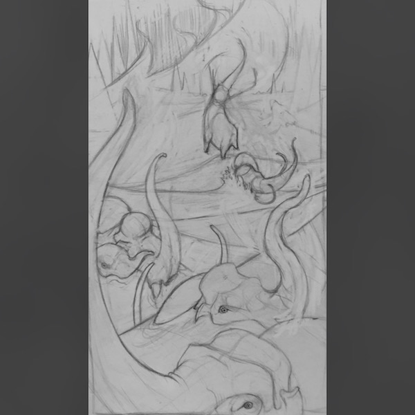
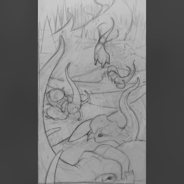
For Images 1 and 2, I'm stuck on which elephant, 3rd from the viewer, helps the overall story the best and fills the space appropriately.
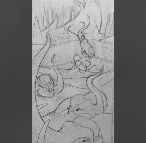
For Image 3 I adjusted the back two elephants to see if it would help the flow of the piece better.
But I've been adjusting and playing and I'm just too close to it now.I'd love to hear feedback on which image carries your eye through it most organically - what feels right.
Anything else that catches your eye I'd love to hear about too! I'm really working on bigger shapes at this stage, so if elements feel off I will try any and all suggestions!
There are probably tangents, ha, but I'll definitely address those in the next stage.Thank you so much for taking the time to look.

-
@kaitlinmakes I had a hard time focusing my eyes to see the full design until number 3. I’m not sure specifically what makes the flow better, it might be the trunk position on the last mammoth toward the top of the page, but it seemed easier on the eyes. Really interesting design, looking forward to seeing it painted!
-
I think I prefer number 2, for the elephant at the back and the two elephants huddled together. Are they all in water?
I love the shapes you've created with their trunks and their faces are wonderful! I'm struggling a little bit to tell what is happening in the illustration, but I'm sure once you've done your values/colour it will look wonderful
-
@inkandspatter
Thank you so much for your imput! I totally agreed with you, but I couldn't figure it out either - but I think that mammoth running into the surf was too far right and it drags the eye to the right and forces the viewer to strain their eye to pull back into the composition. -
@hannahmccaffery @inkandspatter
Thank you so much for your feedback! It really helped me to see the problems and move forward.
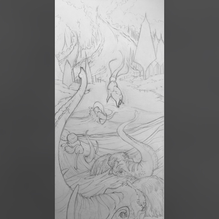
I worked more on the comp and then moved forward into the drawing - I'm going to ink it out to really help to give the lines hierarchy - BUT here is the current work in progress! Does it read better - can you tell whats happening in the illustration? Because whats the point if you can't tell what's happening?
Thank you thank you
-
This is much better, just by adding some detail to the water it has made it a lot clearer as to what is happening here
 and i love the detail you've added on to the first two mammoths!
The one thing that I've noticed is the background, is that the river flowing up to the top of the page? Or the wind? Again, I'm sure that will be a lot clearer once you add colour, or maybe it's just me who's not looking properly! -
@kaitlinmakes Oh wow, it definitely reads better. I see everything clearly now. This is such a great composition. It has such great flow!
I agree with @hannahmccaffery on the water, and wondered the same thing - does it just need paint to help the perspective? But thats one of those things you don’t want to find out too late. Did you try stopping short of the edge of the page, and showing a hint of the horizon? I would leave the trees as they are at the top, and try binging the river down an inch or so and losing it in the trees.
-
Since I know it’s not a river i didn’t notice it before but the fire storm does look like a river disappearing in the distance. Maybe if you give the shape more of a left right swoosh it will lose the look of a river.
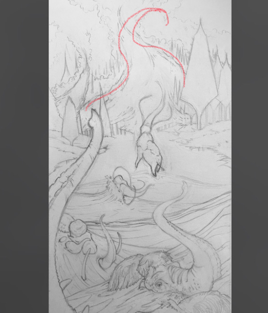
-
@burvantill @hannahmccaffery @inkandspatter
I totally see what you guys mean about it looking like a river, and I'm so thankful for your reads of it. I like your suggestion @burvantill - I'll play with the fire shape more and some other bits that are itching at me.
Mahalo! -
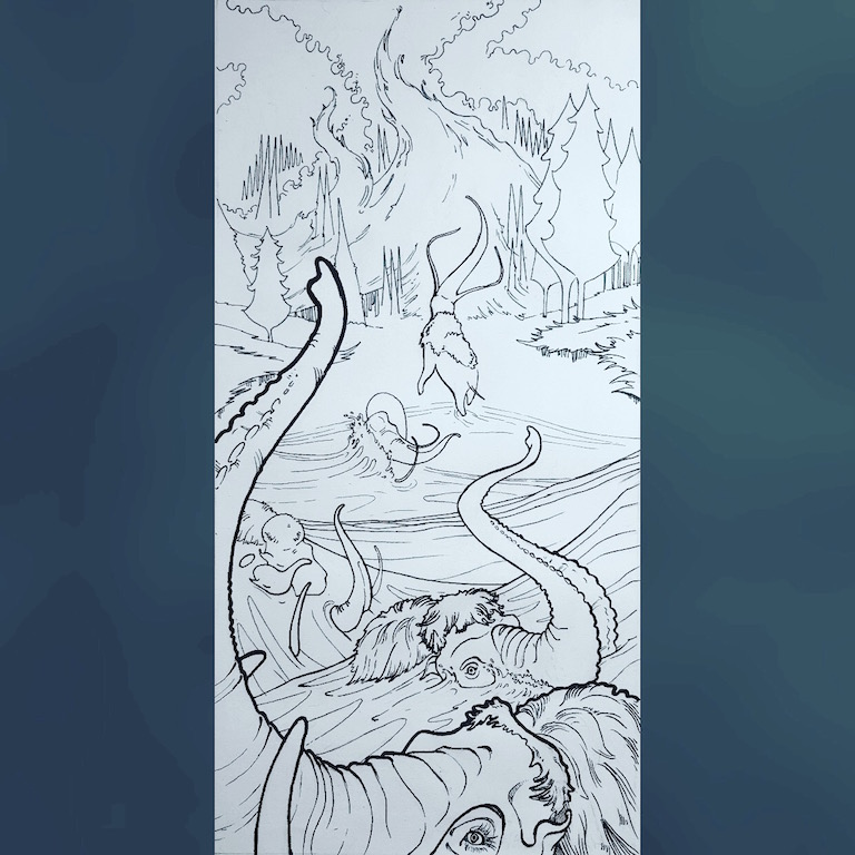
Well art friends! I inked it - thank you for helping me to see the things I could not.
I didn't adjust the main fire as far @burvantill suggested because I thought it pulled the main S curve too far out of balance, but I adjusted the little fire spout on the left to give it more of a wild flame kind of feel. I hope this choice was a good choice, and not a byproduct of being a stubborn artist refusing to grow. I guess we'll see in a year when I look back on this piece.
There is a bit of a tangent now with the bottom two mammoths, and one spot that nags at me a bit, which I can address in a final final.
But I wanted to share where I am.
Thank you thank you!
The Original Collab Thread is here if you're inclined.
-
I like the composition, the tight framing and overlapping of the mammoths really heightens the sense of panic they are having. There's a sweet detail where the baby mammoth is supported by the parent, really subtle but evocative. Nice work, looking forward to seeing this in color.