Master Studies Homework Buddy? (Composition and Env classes)
-
I want to finish 20 thumbnail master studies for Creative Env design as well as the workbooks for Creative Environment and Creative composition in the next 4 weeks.
Anyone want to join me and encourage each other?My first is the picture here: https://www.robalexander.com/index.php/product/city-of-the-dead-overgrown-tomb-canvas-2/
Rob Alexander City of the Dead-Overgrown tomb. This is a quick thumbnail version. I may redo as a full study later.
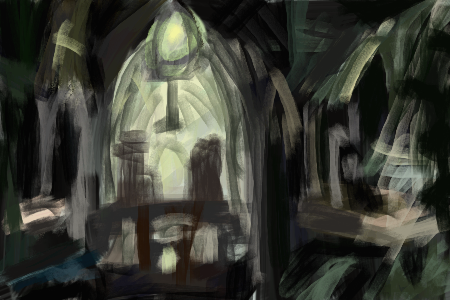
I learned: Even though it looks detailed everywhere, he kept all detail in the lights and the darks are full of lost edges. The original accomplishes looking formal and stable but with organic structures overtaking it by several means. The focal point is off center, but not all the way to the third with key breaks along the halfway and one fourth mark to generate some interest but not be too dynamic. The geometric/architectural elements are mostly symmetrical and pointing to the focal point with some disruption from the organic forms. The only saturated color is near the focal point and the atmospheric lighting adds interest but is in a less saturated hue. The stability of the architectural forms is complemented by less symmetrical organic forms. Also, even though the organic forms are green in local color, they are still way less green than the focal point light.Feel free to post your studies or comment! We could learn together.
")
1 down, 19 to go! -
After This:
https://www.robalexander.com/index.php/product/vault-of-whispers-canvas/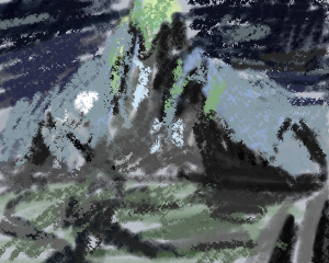
Things I see: Simple analogous color scheme. The green and white "hot spots" aren't really grouped. I thought they were at first but they exist as decorative notes that lead my eye in a circle. The grass hass greens but those are pushed really blue and with the rocks your eye pushes back out into the tower at the center. The focus is front and center but the brightest highlight is the moon which stands alone to the left third zone and helps keep the composition from being too dull. I think the way shadow and cutaway is used on the tower in the center helps create balance between lights and darks and a bit of movement. Also the cutaway gives an area you can stop to examine.
I clearly have a lot to learn here.
-
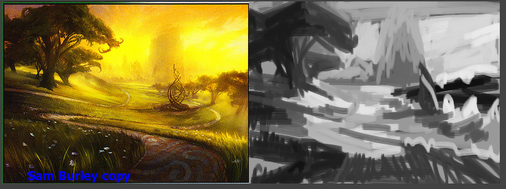
After Sam Burley.
Another analogous color scheme. Skilled artists can do a lot with limited palettes. He used lost edges substantially in the BG. It really brings out the scale. The value difference between the trees and sky was even greater than I initially realized. I have to watch myself in overmodeling the darks and having them start reading as lights. I intellectually knew the importance of separating them but this exercise is emphasizing that for me. Also, having abstract shapes pointing towards the focus is a really effective tool. So long as they fit. -
7/20 Value studies down for my Environment HW
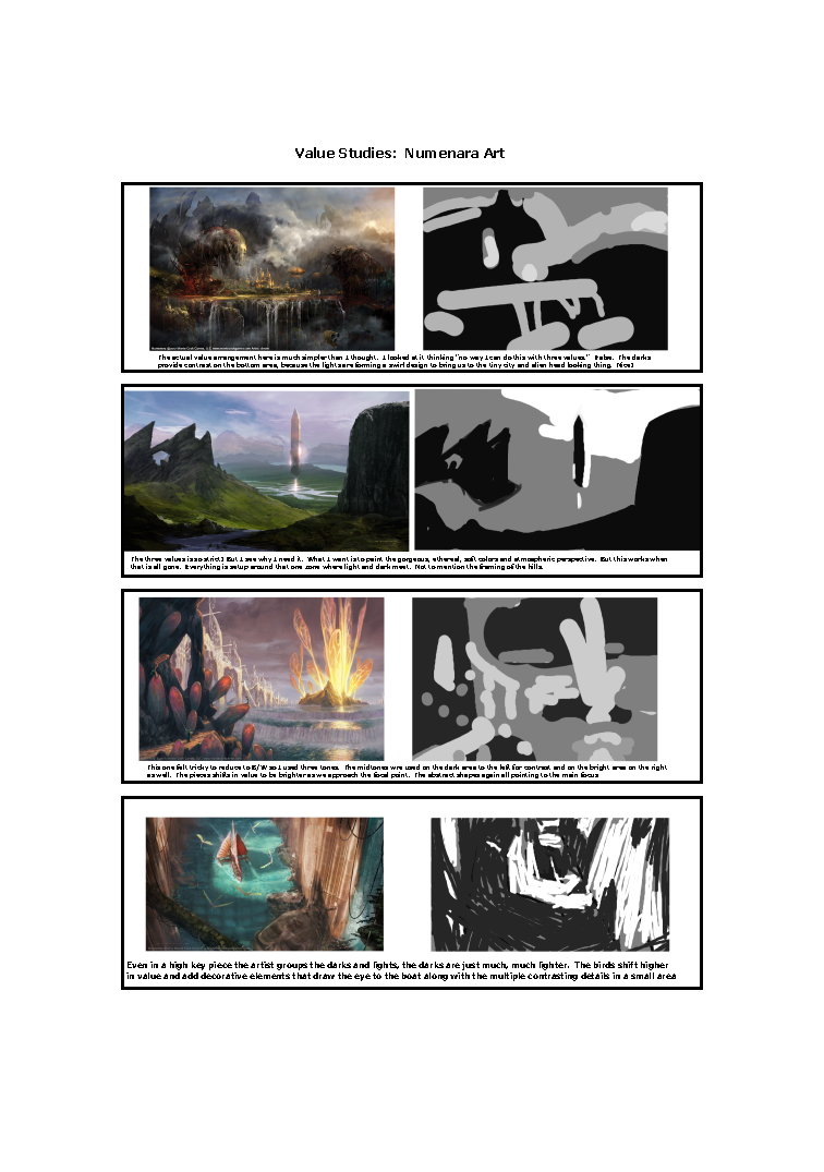
After watching another video realized it was supposed to be a max of 3 values and maybe even 2.
Notes:
1st
The actual value arrangement here is much simpler than I thought. I looked at it thinking "no way I can do this with three values." False. The darks
provide contrast on the bottom area, because the lights are forming a swirl design to bring us to the tiny city and alien head looking thing. Nice!
2nd
The three values is so strict! But I see why I need it. What I want is to paint the gorgeous, ethereal, soft colors and atmospheric perspective. But this works when
that is all gone. Everything is setup around that one zone where light and dark meet. Not to mention the framing of the hills.
3rd
This one felt tricky to reduce to B/W so I used three tones. The midtones wre used on the dark area to the left for contrast and on the bright area on the right
as well. The pieces shifts in value to be brighter as we approach the focal point. The abstract shapes again all pointing to the main focus
4th
Even in a high key piece the artist groups the darks and lights, the darks are just much, much lighter. The birds shift higher
in value and add decorative elements that draw the eye to the boat along with the multiple contrasting details in a small area -
11/20 down for Environments.
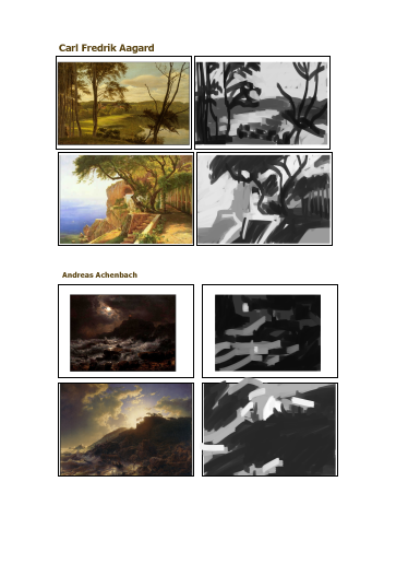
From gaming to old dutch and german landscape artists from art renewal center.I love how the last two seem to be the same place but conveying very different ideas and moods.
Sticking to 3 values does seem to really push me into looking at what the abstract composition is. -
@ThisKateCreates I may consider it but I need to focus currently on finishing BIG so I let you know Friday (if you can wait that long,
) What class is this, on SVS or no?Instagram: www.instagram.com/heatherboyd.illustration/
Website: https://heatherboydillustration.ca
Shop: https://www.inprnt.com/search/products?q=HeatherBoydIllustration
Ko-Fi: https://ko-fi.com/heatherboydillustrationBe blessed,
-
@Heather-Boyd It's one of the SVS classes. This is Creative Environment Design and I may also post Creative Composition studies here. If you join Friday that would be great . I'm aiming to get through all the assignments for both courses and watch/rewatch the videos before the last week in February.
-
@ThisKateCreates I am 3/4 way through Creative Composition 1 -so I have to finish that up, as well as Introduction to Photoshop. I can start posting some of my Creative Composition class work here and then when I finish up that class and the Photoshop I will move to the environment design class -looking forward to as my BIG January prompt I like that part the best.
-
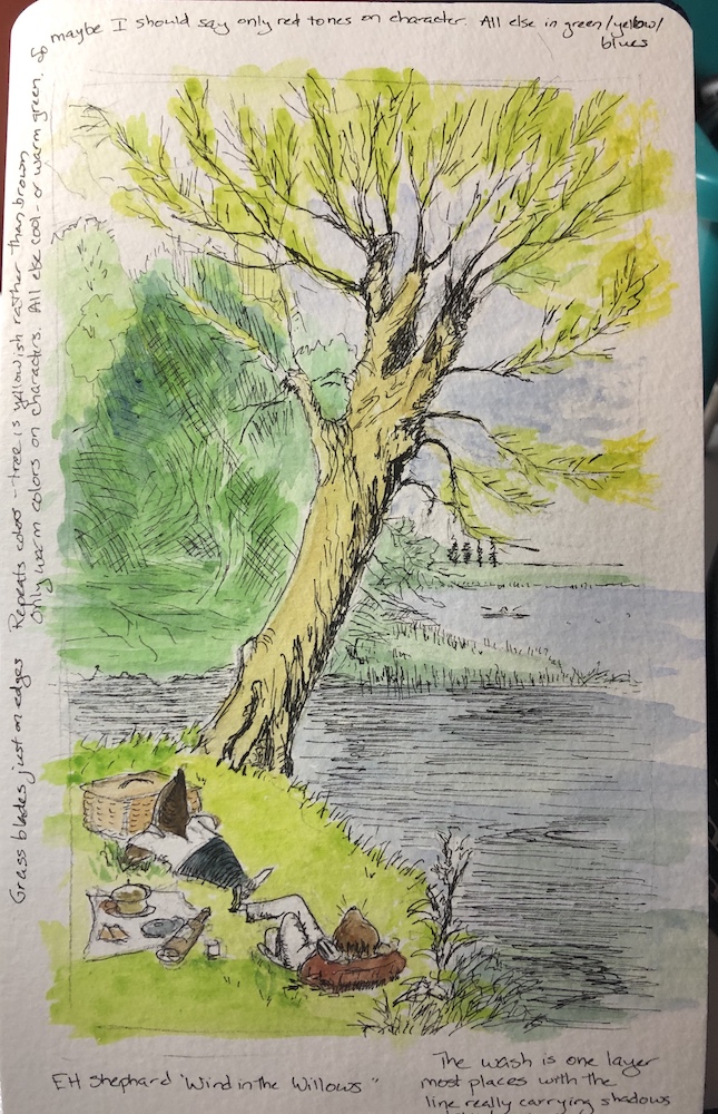
I've been watching your master study thread and kept thinking that I should take you up on your offer to be a homework buddy but life kept getting in the way. I still can't commit to doing this on a regular basis but I did finally spend some time this weekend on two small master studies. Here is the one I did of an E.H. Shepard line and wash from "Wind in the Willows," looking at his color choices and the balance of line with the watercolor. I learned that he uses all yellows/greens/and blues for the background, including even a yellowish tree trunk, and reserves the reds and browns for the main characters. He also lets the line do most of the work for the texture, shading, and values.
It's a really great learning process. Thanks for sharing yours because it made me decide to do this.
Laurie DeMott
instagram.com/demotlj -
@demotlj That's beautiful! I have my next few picked out so thanks for the reminder to do them. Maybe I should do a few paper ones. I actually feel more comfortable that way anyway. XD
-
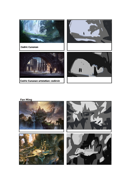
I did two Cedric Cunanan and two Fan Ming.
This was a good combo because the devices they use are so different.The first two by Cunanan both frame dark figures against a light background. It's fairly simple as a way to draw the eye, but the fifished images still have a lot of depth from the use of detail and pattern within the lights and darks.
The last two by Fan Ming have a more complex, rhythmic distribution of darks and lights. The first one uses a lot of shapes swirling into the main focus, which is high contrast and the second draws the eye down the bridge to the tower. The framing dark shape of the first Cunanan also shows up here on the right, with the lights doing kind of the same on the left. In copying I should probably have better grouped the central lights to get the way the eye is pulled through them better.
-
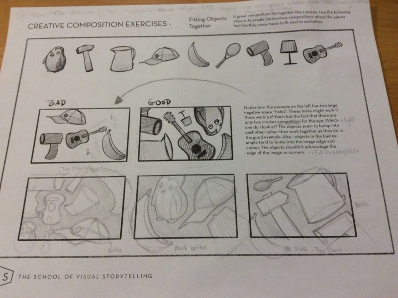
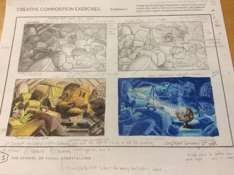
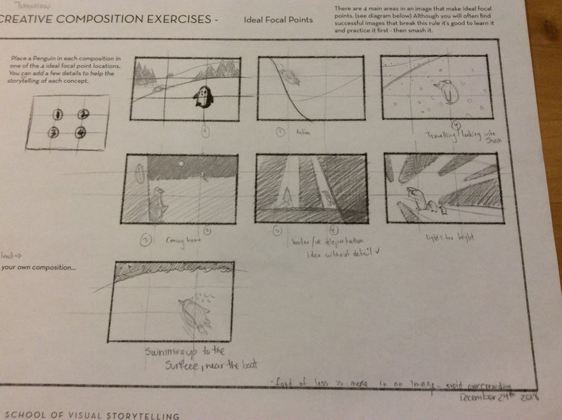
A bit late but here are 3 varying sheets from Creative Composition 1. I am on page 22 of the worksheets and only through half of the videos lols.
Pages included below are #16, #11, and #9. Thanks!
Instagram: www.instagram.com/heatherboyd.illustration/
Website: https://heatherboydillustration.ca
Shop: https://www.inprnt.com/search/products?q=HeatherBoydIllustration
Ko-Fi: https://ko-fi.com/heatherboydillustrationBe blessed,
-
@Heather-Boyd Nice!
-
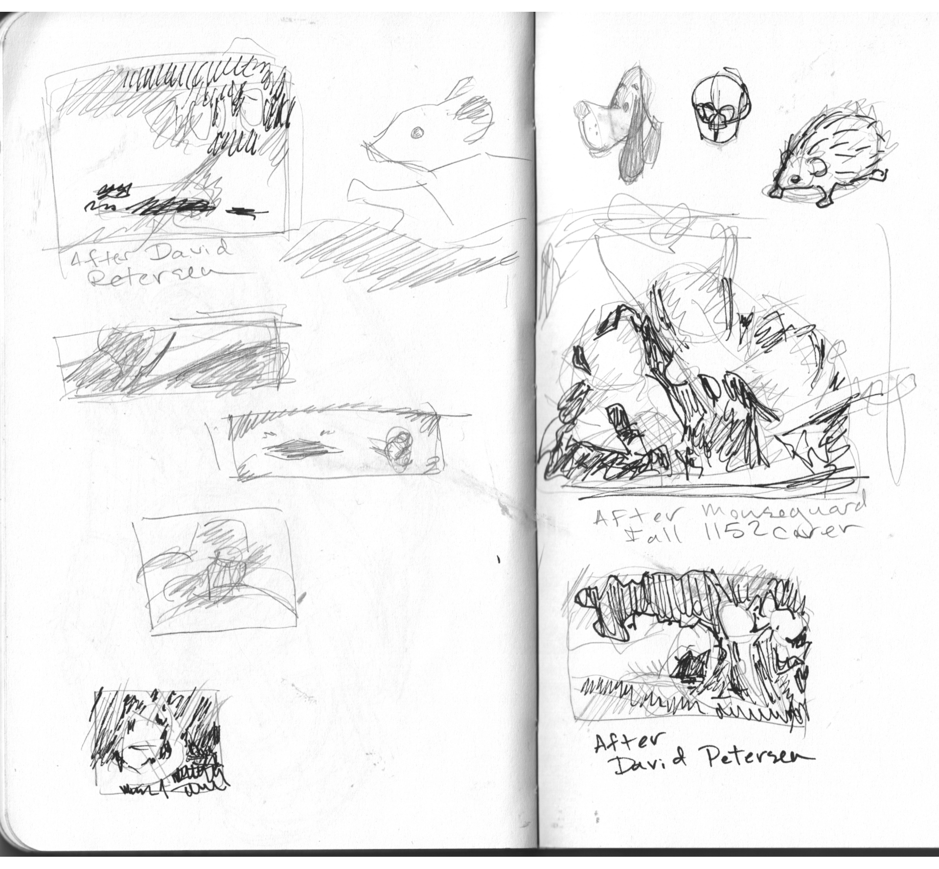
Did some studies out of my new copy of mouseguard. I did these late evening by candlelight. But even in low light the compositions screamed.
-
@ThisKateCreates The lighter pencil shading ones are easier to read then the added pen ones. I can read After David Petersen one however. The one above it I am struggling with reading it.
Instagram: www.instagram.com/heatherboyd.illustration/
Website: https://heatherboydillustration.ca
Shop: https://www.inprnt.com/search/products?q=HeatherBoydIllustration
Ko-Fi: https://ko-fi.com/heatherboydillustrationBe blessed,
-
@Heather-Boyd It just says "After Mouseguard Fall 1152 cover"
I know it's not very readable, but I still learned from it and am counting it towards my total. XD -
@ThisKateCreates
I love this idea of partnering up on working through a class with a buddy and sharing the homework. The Creative Environments is way over my head--but I started Creative Composition. Next time I'm considering starting a class, I think I'll post to find a partner. Thanks for inspiring me. -
@Heather-Boyd Wow girl! You really did your homework. Looks great
 (I am heading back to do mine all over now..... shame on me)
 -
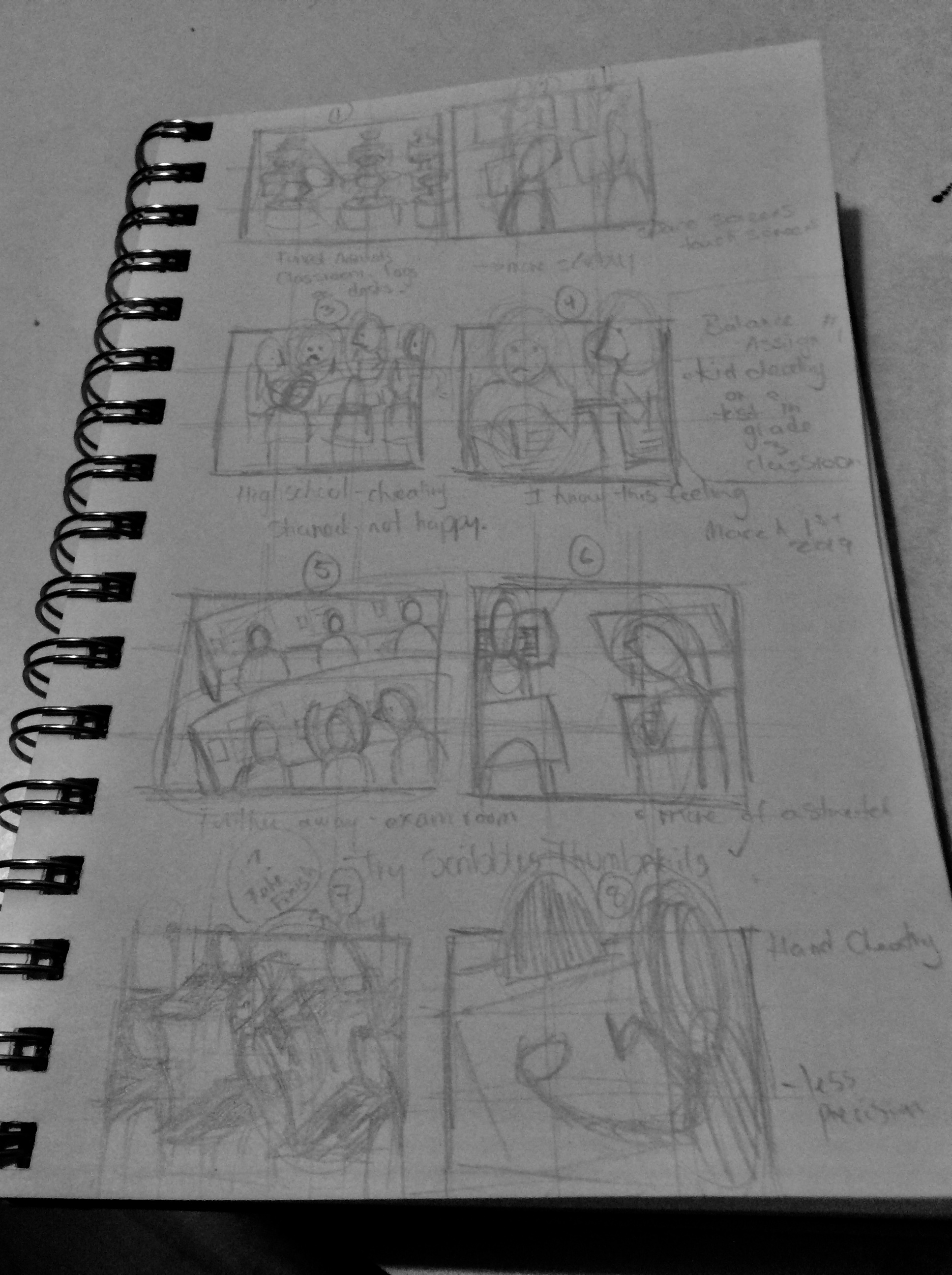
Under Balance Video in Creative Composition quickies. Assignment #1 Kid Cheating on a test in a grade 3 classroom.
I use a 4H pencil so the clarity of my thumbnails are a bit difficult to read. I know about thumbnails but I haven’t used them till of late. Scribbling the bottom two were easier than trying to figure out shape for desks, ugh. Lols
Instagram: www.instagram.com/heatherboyd.illustration/
Website: https://heatherboydillustration.ca
Shop: https://www.inprnt.com/search/products?q=HeatherBoydIllustration
Ko-Fi: https://ko-fi.com/heatherboydillustrationBe blessed,
-
@Heather-Boyd Nice work!