Requesting a second set of eyes on my collaboration
-
Hello! I am hoping to get a second set of eyes (or more) on this. It’s my part of kaitlinmakes’ mammoths, the collaboration we are doing. I started a new post so that Kaitlin could choose to not to see it if she wanted to be surprised. Anyway, I feel like it’s almost done, but as @Lee-White has mentioned, newbies don’t push themselves to their potential (I’m paraphrasing). So, help me push myself. Please.
 . What can I do to make this great?
Lisa Burvant
www.lisaburvant.com
Instagram & Twitter & SVS: @burvantill -
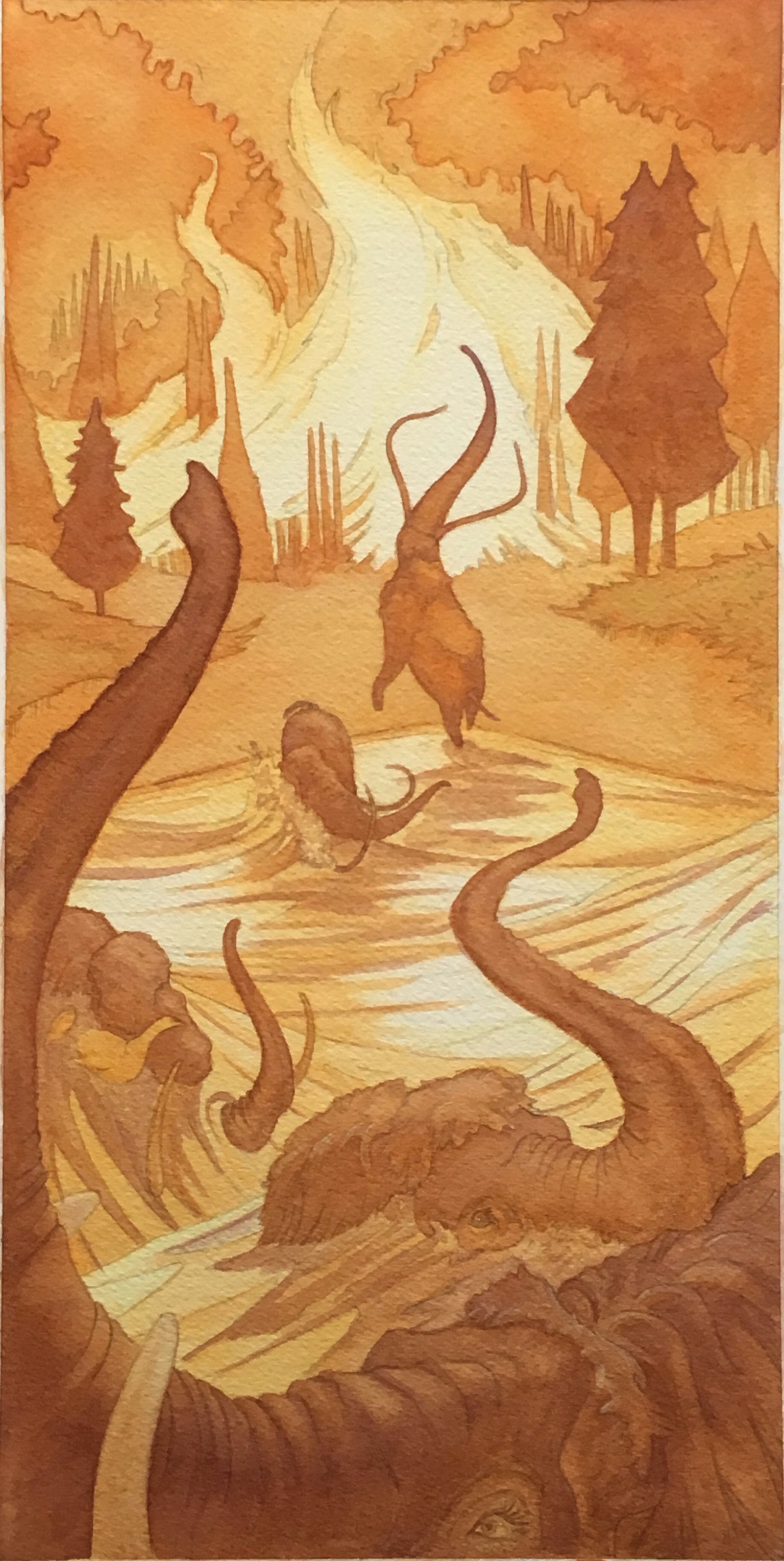
@burvantill is that a forest fire? I think it is... If so then I would try and exaggerate your lighting more in the scene, make the fire dictate your lighting set up. That way the whole thing would be more dramatic.. Its looking good though just my thought

-
@Jason-Bowen Thankyou for taking a look at this. So I think your saying I need to go darker with my darks. So the lights pop.
Okay.
I’m deep breathing right now to gear my self up. Wish me luck. -
I think higher contrast overall would have more impact - darker darks and lighter lights. I noticed there is no actual white in the composition. Usually with light, especially fire, you need to use white (or something close to it) to achieve the glow.
-
I agree with @inkandspatter. Maybe using white to outline the elephants and trees for example? And maybe some shines on the water.
Overall it is looking great! You can do it!
-
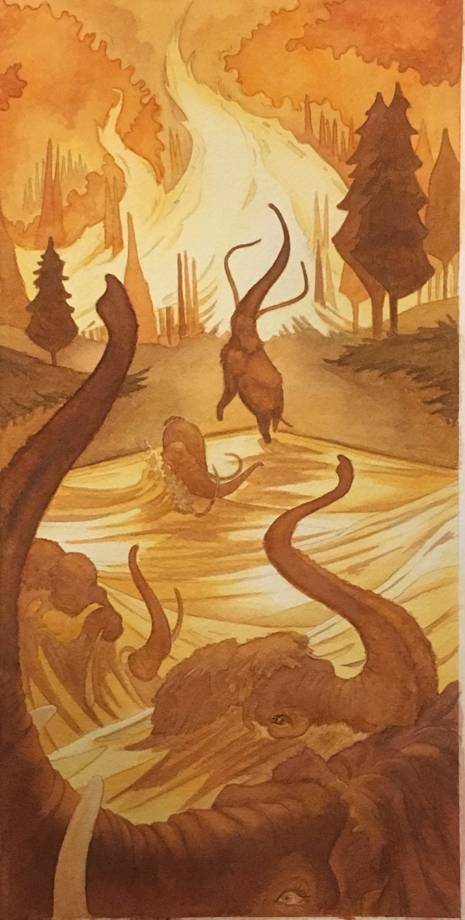
Thankyou all for your advice. I pushed my darks to add contrast. I normally use the white of the paper for my whites and this time I did a very thin wash of yellow before I started so all the white whites are non existent as mentioned
 . I added a teensy bit of whitish highlight back in per your advice but not too much because it started to look like it didn’t belong. I need more practice with the white paint. My watercolor professor was a purest so we RARELY used white paint. Here is my update. How’d it looking? Do I need to go darker? Or is it working now?
Thankyou again for your help.
-
Orange/yellow light would cast blue/purple shadows. Adding just one more color in the shadows would kick it up several notches, IMO. The fire looks fantastic! And the mammoths in the foreground are the right balance of detailed v. subtle.
-
@Debra-Garcia hmmm. Interesting idea. I was going for an analogous color scheme but I like that thought
 .
.
I’ve been staring at it this morning and there are only a couple of spots that are bugging me;
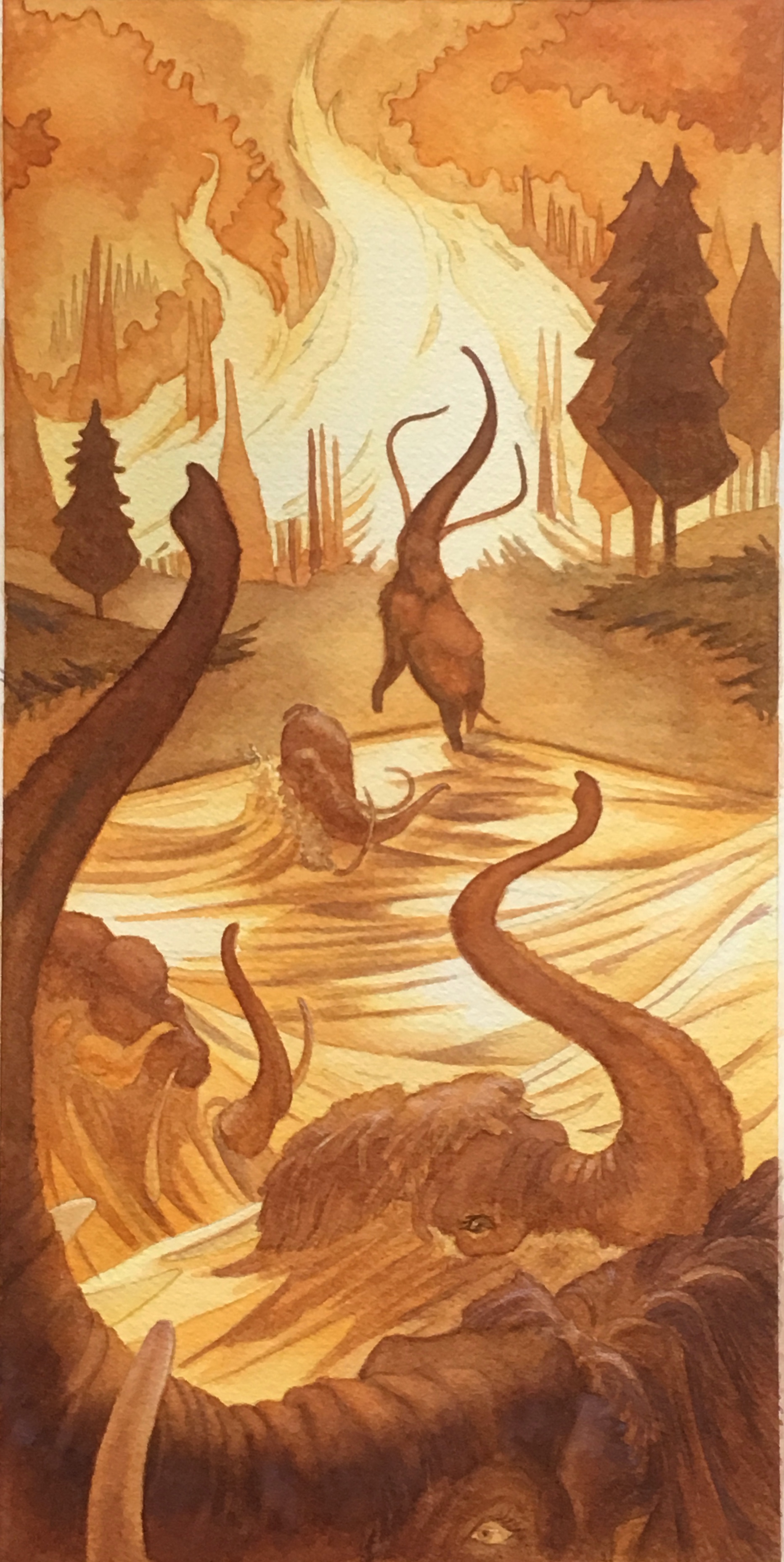
I want to push the foreground mammoth darker and his tusk needs dealing with. Looks like a big slash through his trunk; they all need their highlights to show more. They are there but obviously not nearly enough for anyone but me to see them; I’m happy with the top portion of the picture, I’m loving the silhouette of the mammoth near the fire. It’s the bottom half that’s still not quite there. I’m gonna post again later.
Please stand by. -
Good improvement on the second post there, but I have to be honest... that fire is so bright? You could probably go darker still for a stronger impact lol. Over all, though, it looks really great. I love the monochormatic scheme on the piece. Very effective.
-
Hey that looks really good!
Love the color scheme and composition ")
-
Also, Question: Are you using a mix of watercolor pencils and regular water colors on this? Trying to figure out how you got that tight outline on the trees and stuff
If that's all brush work, I bow before the master lol -
This is a really nice piece! Your drawing skill shows and you have good control over the medium. So good work there!
But, I feel like you are working on it in the wrong order. You have painted the final and now are looking to change it, but your value, composition, and concept are already locked in. Which I feel is WAY too late to be making global adjustments.
I'd use this as a rough comp. Start sketching out some more value studies and compositions and see which one hits what you are trying to say.
The snag with this piece (for me) is figuring out what the actual focal point is and what is happening in that area. Right now my eye goes to that central elephant, but there isn't much payoff there. So staging the animals differently might be something to try out. The fire sort of looks like fire, but it also looks like a river going back in space, so that is a little problematic too.
So I'd suggest going back to the sketch stage and work this out before hand. Maybe present 4 or 5 different value studies and start there. The end result will be much better for it. : )
Good luck!
-Lee -
@Aaron-Pierce LOL. Thanx but I'm no master. Its all brush. I have sizes 000, 1 & 2 that I used for the tiny lines. After the comments about using white for highlights I used a plain colored pencil for some of that but I think it looks weird in combo with the watercolor. BTW, I will post that image in a minute.
-
@Lee-White LOL! Thank you, I appreciate you taking a look at this very much (SVS Holy Trinity
) I think that kaitlinmakes would benefit from your comments. We are doing a collaboration, we drew pictures of a story prompt and then swapped to finish each others work in color. The original post of our prep work is called "Collaboration!!!" So the drawing/layout is Kaitlin's and I'm finishing it in watercolor. I've been posting the last stages of my finished piece here so that she could choose to look or not.
I always get to a certain point and have trouble pushing myself. Afraid I'm going to F it all up. I try not to "love" what I'm doing so that I can get past that but since this is part Kaitlin's, it is pushing my comfort zone. Having the forum critique this, is helping me get through that wall. I hope.
Here is my latest pass.
-
It is looking great!