Society of Visual Storytelling

    SVSLearn Forums

    • Register
    • Login
    • Search
    • Recent
    • Tags
    • Popular
    • Users
    • Groups
    • Search

    WIP March book cover composition. Critiques welcome.

    Artwork
    21
    79
    4645
    Loading More Posts
    • Oldest to Newest
    • Newest to Oldest
    • Most Votes
    Reply
    • Reply as topic
    Log in to reply
    This topic has been deleted. Only users with topic management privileges can see it.
    • ArtofAleksey
      ArtofAleksey last edited by

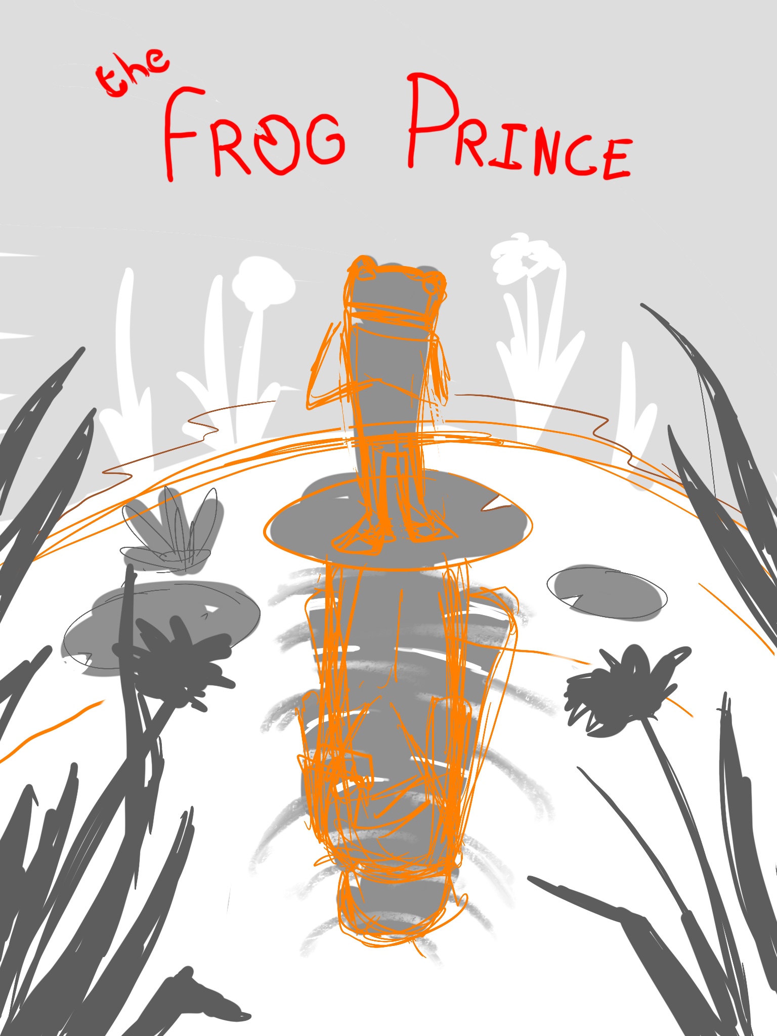
      My march book cover idea for the Grimm brothers “the frog prince”

      I made a few composition pieces and I really liked this one the most.

      It’s a frog standing on a lilypad pond and in the reflection you see the figure of a prince.
      I might do a different font but the lilypad for the O in frog, too much?

      Critiques welcome.

      990486AC-515B-452D-A593-C4972293D7F3.jpeg

      Y 1 Reply Last reply Reply Quote 2
      • Y
        yeungtina @ArtofAleksey last edited by

        @Aleksey This is adorable. I think the lily pad O is clever.

        1 Reply Last reply Reply Quote 1
        • djly
          djly last edited by

          @Aleksey - "The Frog Prince" is such a great choice for this month's prompt! I think the lilypad "O" idea is clever, not too much.

          1 Reply Last reply Reply Quote 1
          • saciia_
            saciia_ last edited by

            That’s a really nice idea and I like the overall composition! The only thing that caught my eye were the two dark flowers in the front. They are in the same height and maybe you could try to move one of them more down. The O as a lilypad I would just leave open and just try both versions on the finished illustration ...I think it´s hard to say yet. I look forward to see how it will turn out ☺

            Instagram: saciia_

            1 Reply Last reply Reply Quote 1
            • saciia_
              saciia_ last edited by

              Maybe you could also just add a third flower on the right side 🌸

              Instagram: saciia_

              1 Reply Last reply Reply Quote 1
              • BenBernardSmith
                BenBernardSmith last edited by

                I really like it! As others have said, maybe make it a little less symmetrical by adding an extra flower to one side, or a bug on a reed or something.

                1 Reply Last reply Reply Quote 1
                • Kristin Wauson
                  Kristin Wauson last edited by

                  Very cool concept! I can’t wait to see how it turns out!

                  1 Reply Last reply Reply Quote 1
                  • Bennie
                    Bennie last edited by

                    Love your creative thinking in the text and having the prince reflection... maybe the composition is to symetric. At least i should create some differents left and right with the plants and create some more depth. Curious how you will go further from here...

                    https://www.instagram.com/bennievialle/

                    1 Reply Last reply Reply Quote 1
                    • Jonas Zavacky
                      Jonas Zavacky last edited by

                      @Aleksey I love the idea!!!

                      I was just thinking about the font. Since you imagined the "o" as a lilypad.
                      Maybe the whole font is floating on a water level? Just an idea tho... it can be foolish. 🙂

                      1 Reply Last reply Reply Quote 1
                      • ArtofAleksey
                        ArtofAleksey last edited by

                        Yeah symmetry is a concern however since it’s a book cover, I wonder if one can use symmetry to their advantage. Im going to go to the library or barnes and noble and look at book covers for inspiration

                        Susan Marks 1 Reply Last reply Reply Quote 0
                        • burvantill
                          burvantill Moderator last edited by

                          I like this idea. Looking forward to see the progress.

                          Lisa Burvant
                          www.lisaburvant.com
                          Instagram & Twitter & SVS: @burvantill

                          1 Reply Last reply Reply Quote 1
                          • ArtofAleksey
                            ArtofAleksey last edited by

                            This post is deleted!
                            1 Reply Last reply Reply Quote 0
                            • ArtofAleksey
                              ArtofAleksey last edited by

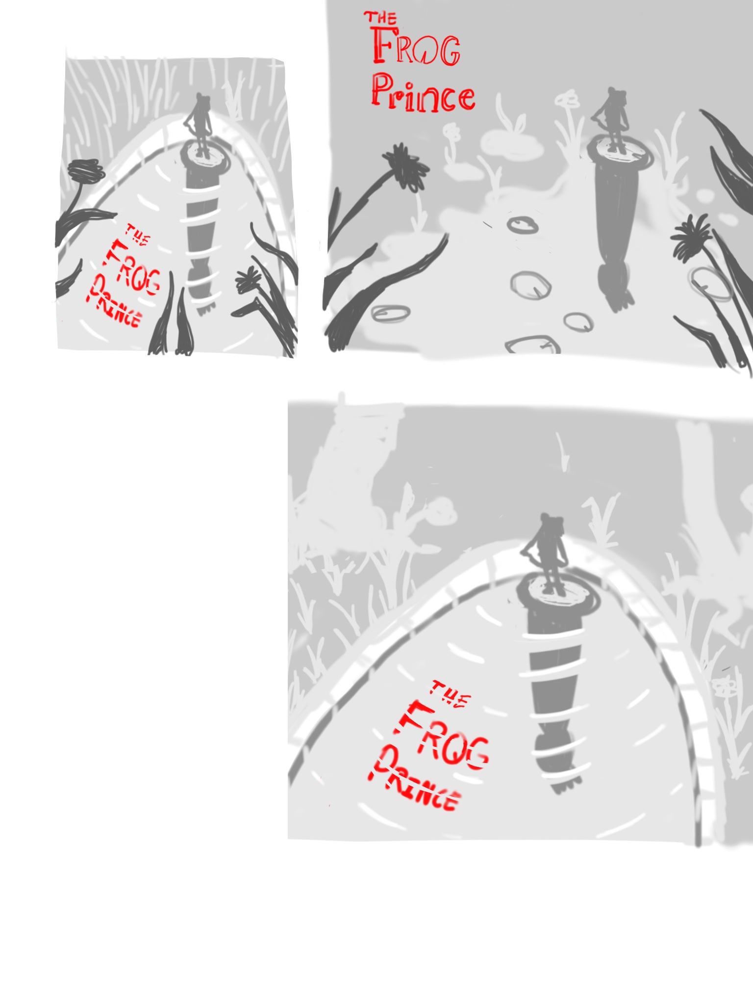
                              Ok here Are a few other compositions I like the ripples in the water more. What does everyone else think?
                              FF966ECC-7DB9-4D9A-87FC-E7BDAC2F6D19.jpeg

                              Sas CobaB 2 Replies Last reply Reply Quote 1
                              • djly
                                djly last edited by

                                @Aleksey - I think I like the third composition best in the newest thumbnail set. I agree, the ripples are nice!

                                ArtofAleksey 1 Reply Last reply Reply Quote 1
                                • J
                                  JennyJones last edited by

                                  Big yes to the ripples! I love the current take on the composition.

                                  1 Reply Last reply Reply Quote 1
                                  • ArtofAleksey
                                    ArtofAleksey @djly last edited by

                                    @djly @JennyJones thanks
                                    I think I can add a little more components if I push it up a little more.

                                    1 Reply Last reply Reply Quote 0
                                    • Sas
                                      Sas @ArtofAleksey last edited by

                                      @Aleksey Oh this is nice and so brilliant!!! I loved your foreground though. It gives your piece depth and a 3D lookish effect. The lines in the text is brilliant but makes it a bit difficult to read. Maybe you can make the whole text part of the water? It kind of looks like the text is submerging from underneath the surface. I don't know if that's the effect you were looking for though. I love your reflection of the prince in the water!

                                      Can't wait to see your progress!

                                      https://www.instagram.com/sasmakkinje/

                                      1 Reply Last reply Reply Quote 1
                                      • CobaB
                                        CobaB @ArtofAleksey last edited by

                                        @Aleksey Oh wow! Yes, the first one you've got there with the top down view and the ripples is lovely!!

                                        ♥ Illustration : https://www.instagram.com/coba_illustration/

                                        ArtofAleksey 1 Reply Last reply Reply Quote 1
                                        • ArtofAleksey
                                          ArtofAleksey @CobaB last edited by

                                          @CobaB @Sas ok so what I’ve gathered so far is:
                                          Foreground elements are good but dont overcrowd the piece
                                          Keep the ripples but make the text clearer.

                                          I might do a thing where it says “Frog” on the surface of the water, and the O is a lilypad while the word “prince” is being reflected in the water much like the prince himself.

                                          Sas CobaB 2 Replies Last reply Reply Quote 1
                                          • Sas
                                            Sas @ArtofAleksey last edited by

                                            @Aleksey Great ideas!!! 😃

                                            https://www.instagram.com/sasmakkinje/

                                            1 Reply Last reply Reply Quote 1
                                            • First post
                                              Last post