Alice In Wonderland Book Cover WIP
-
So I just finished reading Alice in Wonderland and the book cover is for March so it’s a nice fit. Ideas I like to illustrate that I loved from the book are the following: light hearted, fun, laughter, conversation and confusion. So I roughly did some thumbnails.
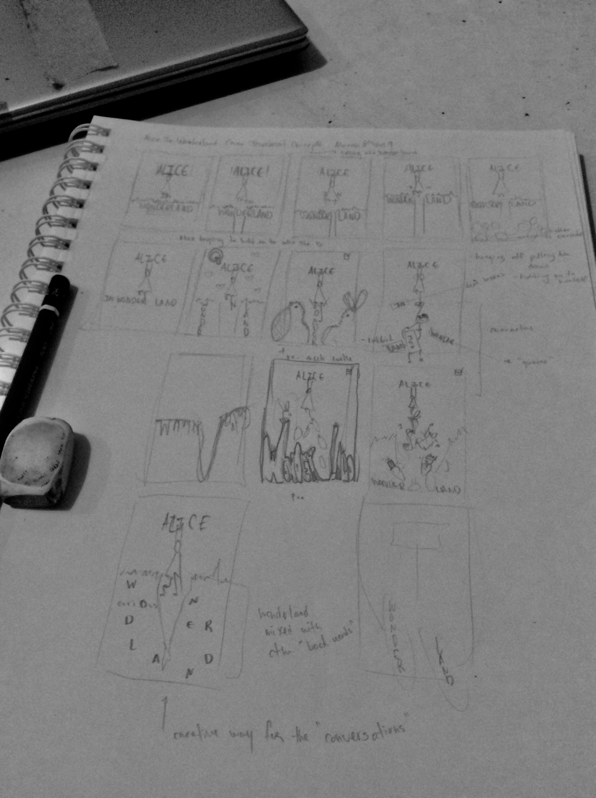
Getting into the WIP earlier this time through.
")
-
I have played around more and have a solid start with this thumbnail. Excited to work through this one and resolve all the details. Right now my sharing is primarily to keep me accountable. But from this thumbnail I ask for a one or two word description or emotion you feel? That be splendid.
Oh and I measured my cover and it was 8.5 by 5.5 inches. But it looks longer lols.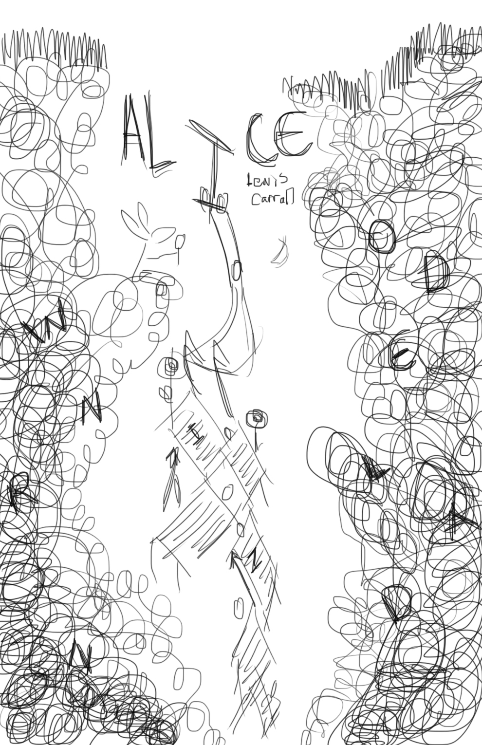
-
I like it. When I see it I think, "Falling."
If I can give a bit of input -- I think the way you have Wonderland is a bit confusing as is. I wonder if it would be better all together at the bottom, as you have it in one of the thumbnails.
Overall the image definitely captures the spirit of the book, and I love how the rabbit is sitting there holding a glass (or a rose? or his watch?) out to Alice as she goes past.
I look forward to seeing where you take it from here!
http://twiggyt.com
Instagram: www.instagram.com/twiggyt_art/
Twitter: @twiggyt_art -
@TwiggyT I actually worry more about the "in" but yes I understand the confusion at least in the thumbnail - I am honestly not opposed to the idea of confusion because her dream was an elaborate conglomeration of her life etc. And it would be clearer in the final.
But thank you for being bold to add your input!
-
Here is my 1-2 word response
Whimsical
Here are my additional thoughts.
I like how you incorporated the text into the title, it is very whimsical and fits the book perfectly.
However, it needs more refining, the wonderland lettering being on each side of the hole isn't working. You cannot rely on the fact that most people know the title. You should instead assume that someone picking up this book has no idea what the title is or what the book is about and the cover should give them all that information. right now it tells me that this is a whimsical crazy adventure that starts down a rabbit hole, good job! But without some direction, I can't read the title.
This is a great idea, I think you just took it a little too far. Dial it back a little and you will have an amazing piece.
Keep up the great work!
Cheers,
Anderson Carmanhttps://www.andersoncarman.com/
https://www.instagram.com/andersoncarman/ -
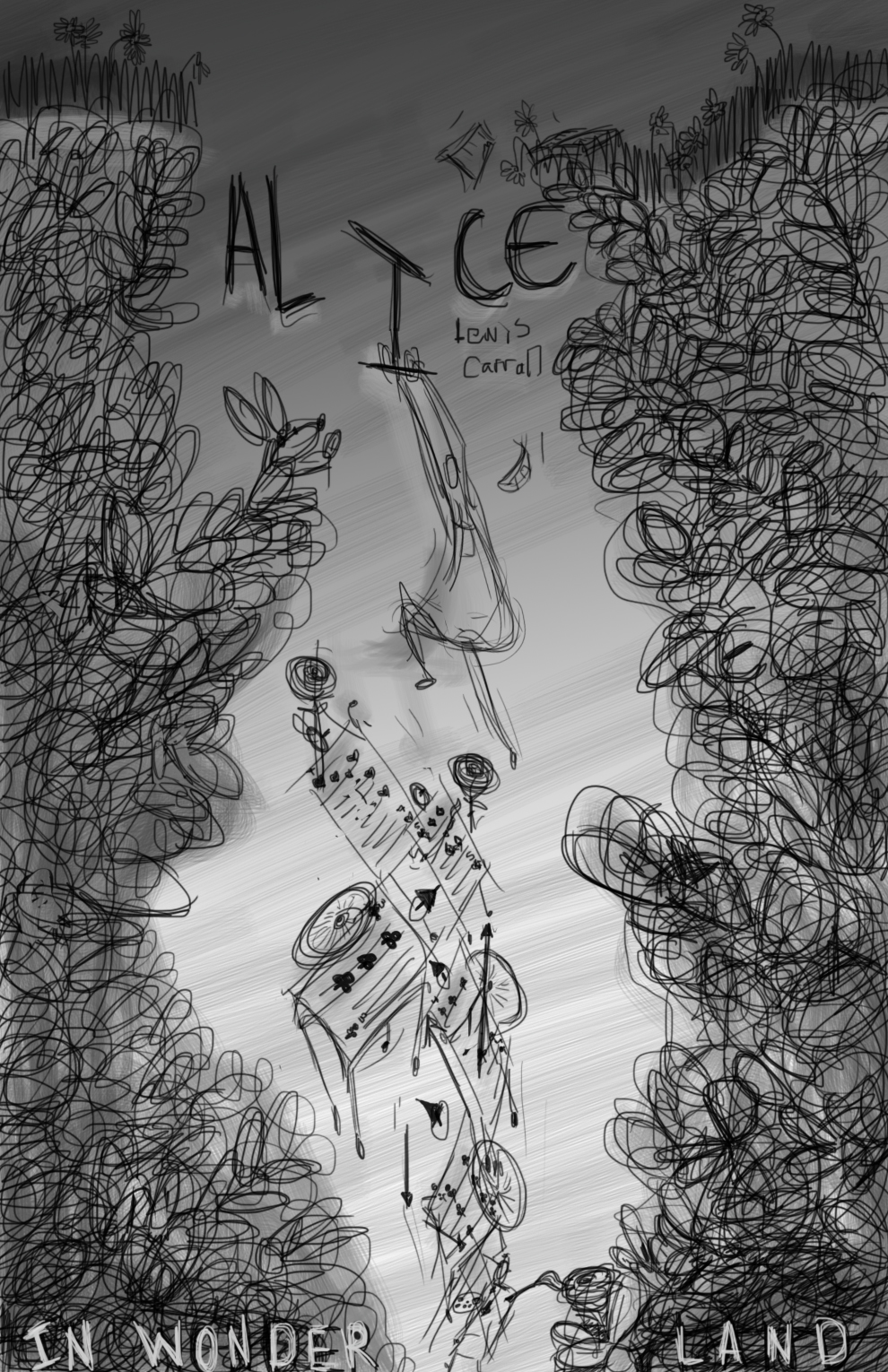
@andersoncarman Thanks. I haven't worked heavily on the "font" of the text of the title - my below edited version has the "In Wonderland" at the bottom in a light grey
I added the grey scale to help me visualise my idea/mood so that I can imagine my colour choices for later. I also added on tweaks to get me going - it is still very rough.I wanted to add the fact that Alice goes under a hedge to get to the rabbit hole (not just dirt) and several other story features -I will be needing to be selective what tin bits I like to include.
You are absolutely right about new readers, thanks -this is my first time adding text to an image.
Instagram: www.instagram.com/heatherboyd.illustration/
Website: https://heatherboydillustration.ca
Shop: https://www.inprnt.com/search/products?q=HeatherBoydIllustration
Ko-Fi: https://ko-fi.com/heatherboydillustrationBe blessed,
-
Fun!
I love how shes holding the I for dear life and the rabbit as shes going down the hole. I love how you captured the essence of the story by adding roses and the little card soldiers. Maybe you can add the cheshire cat on the right side? Then you'll have two huge characters on each side maybe making it more balanced?
Can't wait to see where you're taking this!
-
@Sas yes thank you for noticing my scribble details. I have few other details that I hope will be an addition of surprise fun lols.
-
Hey @Heather-Boyd , I'm a newbie and don't know much about title placement, but one suggestion might be to write "in wonderland" closer to "Alice" but maybe much more smaller? Everyone will know about the book just by reading "Alice". I don't know it feels a bit odd to have part of the title at the bottom and "cut" by the composition. Otherwise, I really like the composition and I can't wait to it with more details!
-
I agree with @marine, i think the in wonderland should be closer to Alice. I would also, randomize the falling cards a little. they seem very organized as they fall. I love the top half of the image. Very chaotic, in a good way. =)x
-
@Heather-Boyd I really like your concept, great design! As a graphic designer though I have to say no, no, no, don’t separate the title! The title of the book is very important and the illustration should be there to support it or enhance it. In terms of priority, it’s title first, illustration second. Otherwise, this has a really great layout!
-
Love how this is developing!! The chaotic concept is perfect for this book. Separating the title at the bottom, though, definitely makes it look like an afterthought and not a necessary element, of which it is important! Anyway, I love how the flow of the illustration naturally draws your eye through it top to bottom- Perfect!!
www.facebook.com/LMuggliArt
www.instagram.com/lmuggliart/
www.lmuggliart.etsy.com -
So the title is together now. But this week has done a number on me with home life (my father is struggling with his mental health)-so lacking in motivation I just decided to play around with colour to help visualise and since I don't have a style I experimented with scribbles etc. lols But I love my colours -if not a bit dark -dreamy dark let's say.
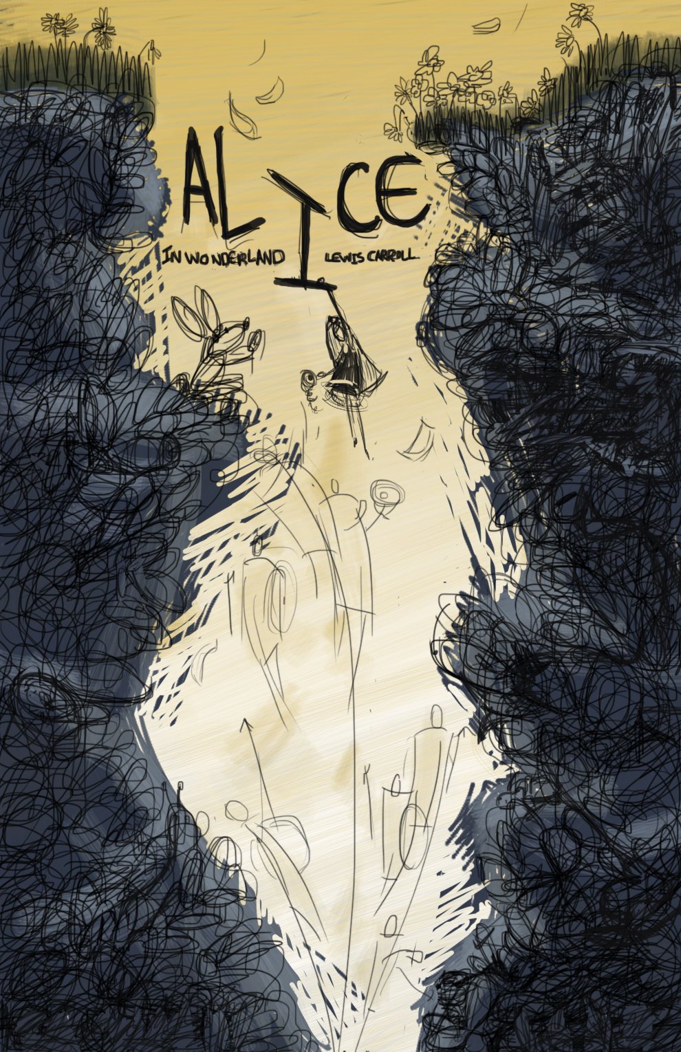
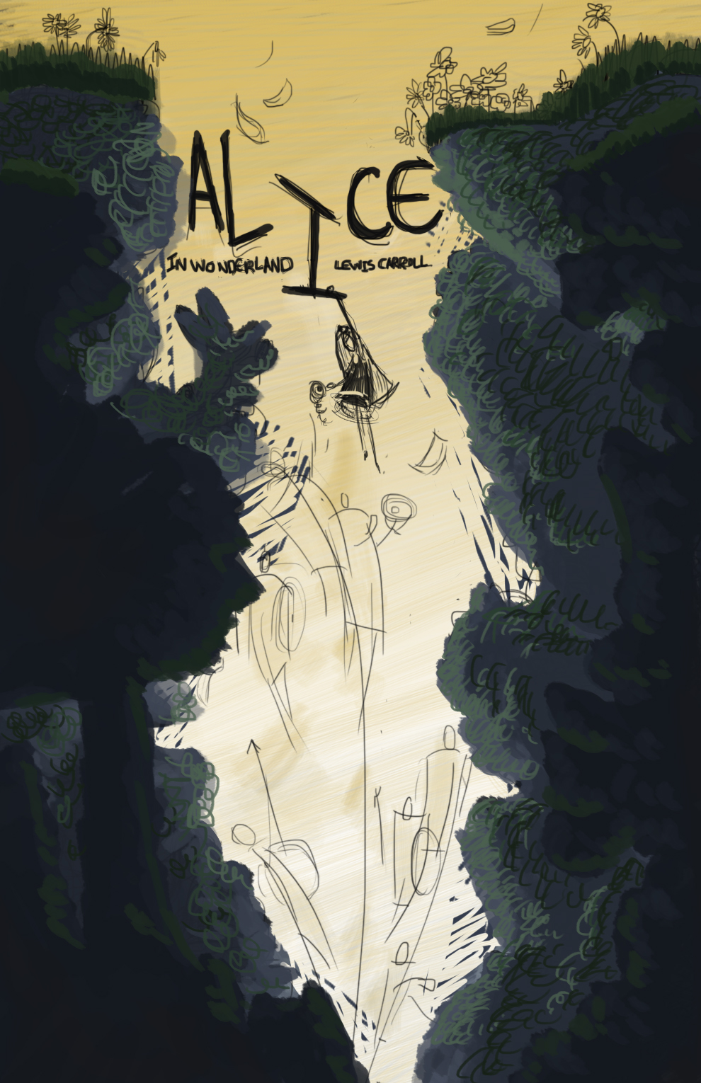
They look better if you click on the image -full screen.
Question though do you know any artists or illustrators that "refine the scribble" mark making / texture etc.?Thanks
-
It’s a cool image. Alice looks a little calm given the circumstances but I assume she’ll get more expressive as you render it more. I like the feel of it very much.
Laurie DeMott
instagram.com/demotlj -
I was working with Alice's size and placement and the story around her and those playing cards -but yes you have a good point
. -
UPDATE
My Alice in Wonderland is far more of a challenge than I was expecting. I have decided to put it on hold for a few days and if I think I can return to it and hand it in for March I will, if not I plan to complete the Creative Composition class this month and move into my Environment Design class and review some introductory classes. Sometimes giving up just means reorganizing priorities and maybe I will rework it later - I have definitely still learned plenty. My idea included characters, creatures and environment - just too overwhelming right now. Thank you for all your support.
Instagram: www.instagram.com/heatherboyd.illustration/
Website: https://heatherboydillustration.ca
Shop: https://www.inprnt.com/search/products?q=HeatherBoydIllustration
Ko-Fi: https://ko-fi.com/heatherboydillustrationBe blessed,
-
@Heather-Boyd I totally understand where you are coming from, I have been there more than once. I really do love your design, but it is definitely a complex and difficult one to paint.