Eragon REDO! Book Cover WIP
-
I like the Breaking of the Rose or the one to the left of it because they tell a little about the story without telling too much, plus they are full of action. Plus, if you did the rest of the series you could have similar covers with the other dragons and riders (the really old one -- I can't remember his name -- and Thorn).
-
Nice work
")
I think my vote is for the breaking of the rose with the dragon and rider coming from the upper left corner. It's got the strongest silhouette. You'll have to be careful to spot potential tangents as you're the working the design, though, with things exiting the corner.
-
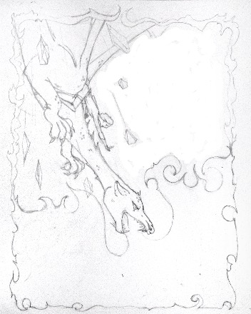
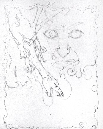
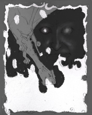
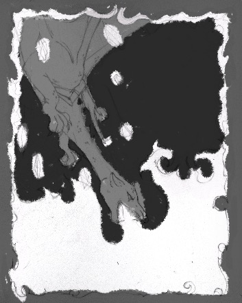
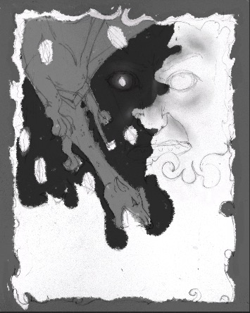
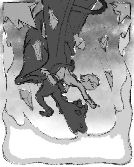
I decided to go with one of the Breaking of the Rose images. Here are a couple version ideas. The guy in the back is the shade. He would be spooky subtle. There is a large unbalanced space if I don't use the face in the upper right. I played around with it. I'm undecided. I may go with the front facing version of this where Eragon and Saphira are coming right at the viewer. Any comments or advice on that particular problem are welcome.
-
I'm starting over!!! After listening to todays podcast I figured out what I was not liking about this project. It's a YA book and not a picture book, which is my focus for my portfolio. SO, I'm still going to do Eragon (because my son is spoiled
 ), BUT I'm going to do a cover as if the book was written for little kids. This should be fun!!
 -
After listening to the latest podcast I realized that I was not following my goal, in regards to this months contest and my childrens illustrator portfolio. I was trying to illustrate a young adult book cover, when I want to make art for children's books. I still want to do Eragon but now I am pretending that it was written for children and am illustrating accordingly. I'm much happier with it.
I've gone from this

To this
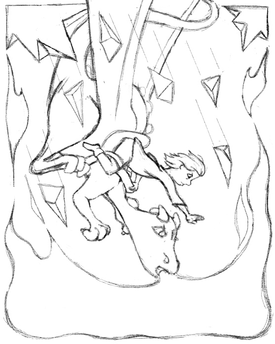
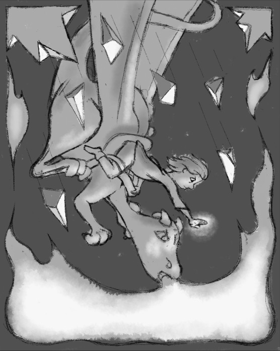
I'm sketching it in procreate so if you see anything bad that jumps out at you, please let me know, I can change it easily.
I'll post values thumbs tomorrow.Lisa Burvant
www.lisaburvant.com
Instagram & Twitter & SVS: @burvantill -
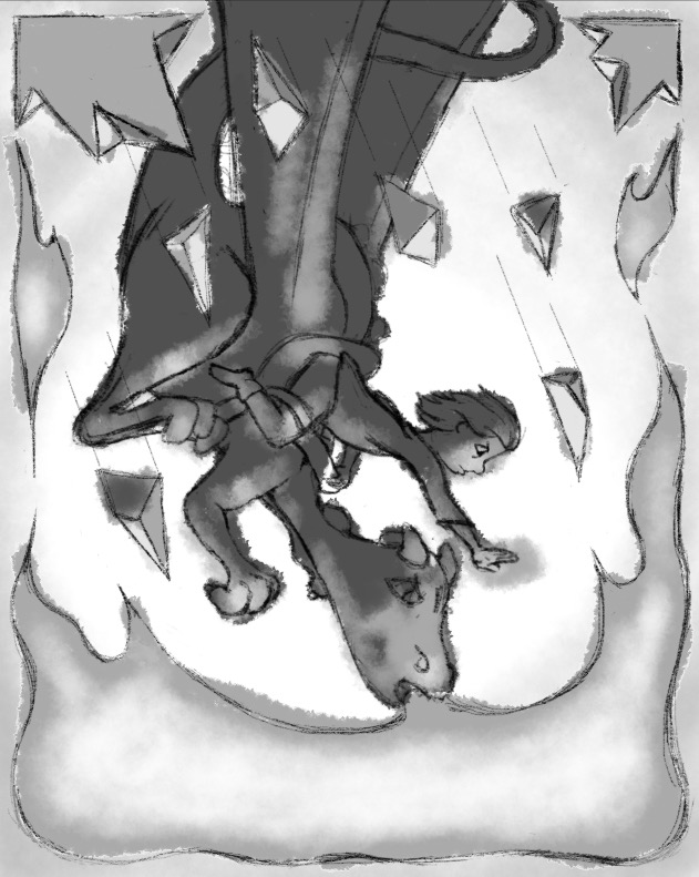
@burvantill I love what you ended up with! You can have some fun with the fire and the shattered crystals and rocks. Looking forward to seeing this progress!
-
@Heather-Bouteneff Thankyou. It seemed mentally easier to draw the new version, I think my brain was subliminally telling me that I was going in the wrong direction
 . I AM having more fun with it now.
-
Wow well done for sticking to your goal and adapting your work to fit that (something I'm struggling with at the moment too!) I really really like your new piece, it's definitely more children's book friendly - even though I liked your YA version too
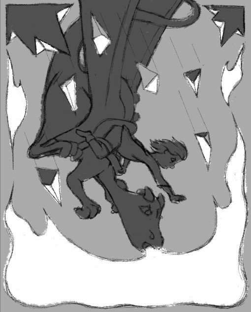
I love the triangular shapes you have here, the only thing I would say is maybe try it with the characters coming into scene from a diagonal position? So they'd be pointing towards the bottom right corner instead instead of straight down from the top. Maybe you could also try losing the triangular shapes you have for the border and only having the fire from the dragon as a border?
Look forward to seeing your finished piece
-
For some reason my account decided to delete itself so i've had to make a new one, but this was my reply:
Wow well done for sticking to your goal and adapting your work to fit that (something I'm struggling with at the moment too!) I really really like your new piece, it's definitely more children's book friendly - even though I liked your YA version too
I love the triangular shapes you have here, the only thing I would say is maybe try it with the characters coming into scene from a diagonal position? So they'd be pointing towards the bottom right corner instead instead of straight down from the top. Maybe you could also try losing the triangular shapes you have for the border and only having the fire from the dragon as a border?
Look forward to seeing your finished piece -
@burvantill Ohhh yeah!!! This is sooooooo cool! You were so right at changing your mind. Love it!
-
Thank you @hannahmccaffery and @Sas.
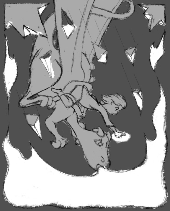
Here are my value thunmbnails. I rendered my favorite a little more than the others so that I could get a better idea of what it could look like. I need more practice with value sketching.
-
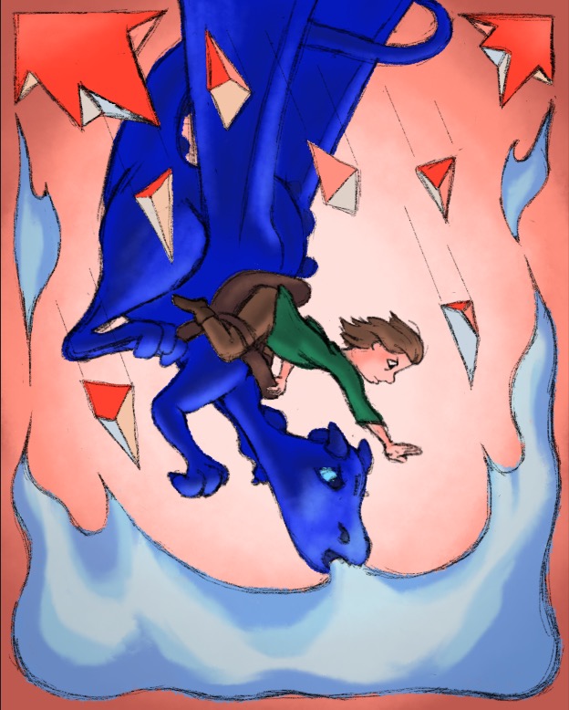
I played around with the values a bit more and decided to go with a light background.
Here is my color scheme. I'm doing all of the prep work in digital before I ink and watercolor. So the colors will change slightly but this is pretty much it. I need fresh eyes. Please be honest and direct. Thank you.
Lisa Burvant
www.lisaburvant.com
Instagram & Twitter & SVS: @burvantill -
@burvantill I think it was a good idea to go with the light background. It makes the characters pop. As far as colors, and forgive I am not familiar with the story so I may be way off here, but maybe try a different color for the dragon. The blue seems to be over saturated. Maybe a purple or green would look good. Or what if you went with a light blue background and a red dragon? I always liked the contrast of a warm/cool piece.
-
@Chip-Valecek lol. Saphira is blue
. Thankyou for mentioning the brightness of her. That is a digital rookie mistake. She will not be that electric in my watercolor. 
-
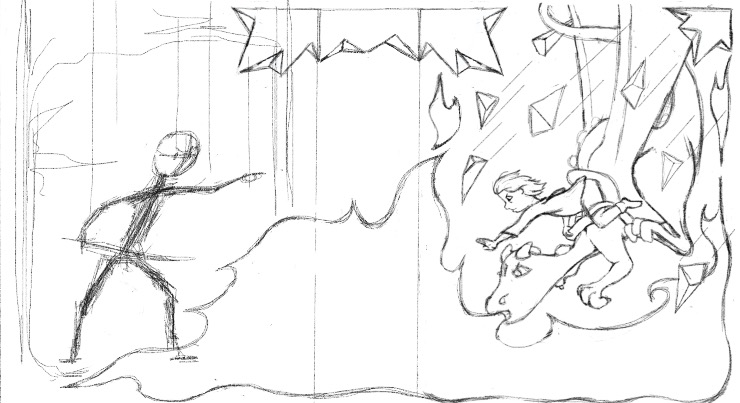
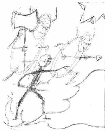
I'm working on the back/full cover now. I took your advice @hannahmccaffery and angled them more diagonally so the fire could spread to the back cover as well. Now the front can work by itself or together with the back if viewed as an open book. My plan is to have the shade, Durza, directing the Kull Warriors to attack towards Eragon with the fire beginning to engulf his feet. To the left/behind the Kull will be trees that I will somehow blend with the broken rose crystal at the top. Here are my sketches so far. I had to break them up into two files because my wimpy iPad couldn't handle the procreate file size.
Does the arrangement/ composition work? Is it too complicated?
My taxes are done, YAY, so I will be able to spend a good chunk of time the rest of the week on this project.
-
Yay! It looks great, can't wait to see it all finished
-
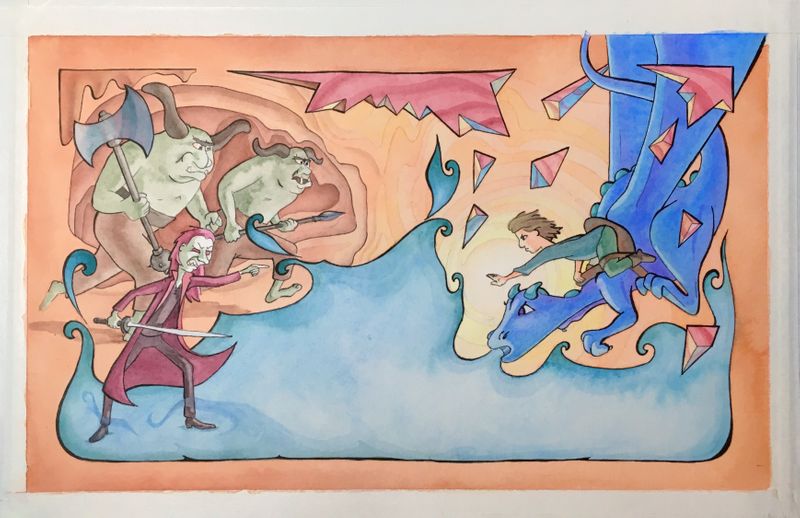
Well, I’m finished and it’s not perfect. After my last post I finished drawing the full cover. After I transferred it to the watercolor paper and started adding color I got very depressed. I hated it. I liked the drawing but felt like I was just coloring within the lines. There was nothing special about it. I moped for a couple days and even had trouble drawing in my sketchbook. I was so far up my own butt I couldn’t see the light. I’m doing a sketchbook challenge this week so the fact that I was having to force my sketches really bummed me out even more. Then I drew something. I don’t know if anyone else would feel it but I thought it was great. Only because it made me feel good to draw it. After that the sketching went easier and I came back to my cover and added some details to help me like it if not love it. It’s time for a change and I feel like I just crawled out of a cocoon.
Lisa Burvant
www.lisaburvant.com
Instagram & Twitter & SVS: @burvantill -
Well I think it's turned out great, and you did the right thing by stepping away from it for a bit. It's a horrible feeling when you start something and you really like the drawing, then when you come to add colour it doesn't turn out the way you want it to - it's so disheartening! So well done for going back to it and working on it some more, you should be proud of a really great illustration
What does it look like with the title on it? -
@burvantill I like the backcover, great characters you did. The colors, I would only chose less saturated color for the dragon. I woul like to see Your book cover with the title on it. You did great. As for me, I am mostly not so happy with coloring my sketches, which I like a lot...I think we should color more and more be more confident in it.
-
@burvantill @MichaelaH I think it's a really common problem, I also prefer my sketches as I'm trying to "re-learn" how to colour in a simpler style, so you're not alone
like you say, it just takes more confidence and practice!