WIP Book Cover: The Picture of Dorian Gray
-
Here is my WIP for The Picture of Dorian Gray by Oscar Wilde. I love this book and its commentary on art and beauty.
Okay so here are 4 different thumbnails of what I am thinking of doing. I would like critiques on which one jibes with you most and WHY. I have not tackled type yet but It will probably be Victorian and curvy.
I only really know that the shape obscuring Dorian's face will be red and in my last thumbnail I played with a red green color pallete and I kinda like it but I may push the green to be more sickly.
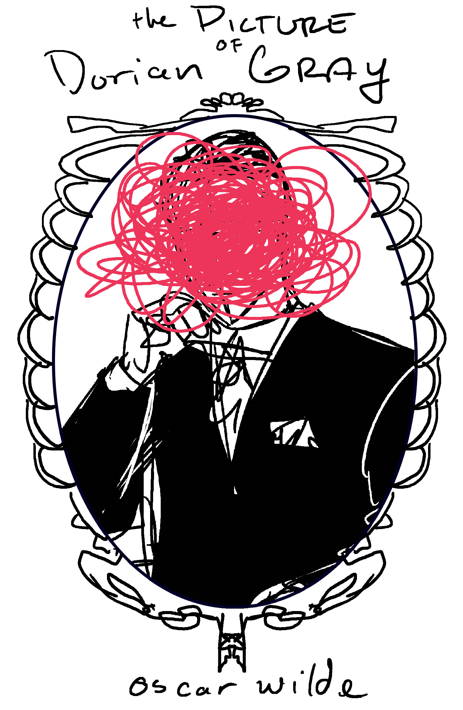
This first one is THE portrait of Dorian Gray in his 1890's appropriate garb and a giant red scribble over his face. The frame is skeletal in forms. I am trying for a very beautiful design at first but creepy at a closer look.
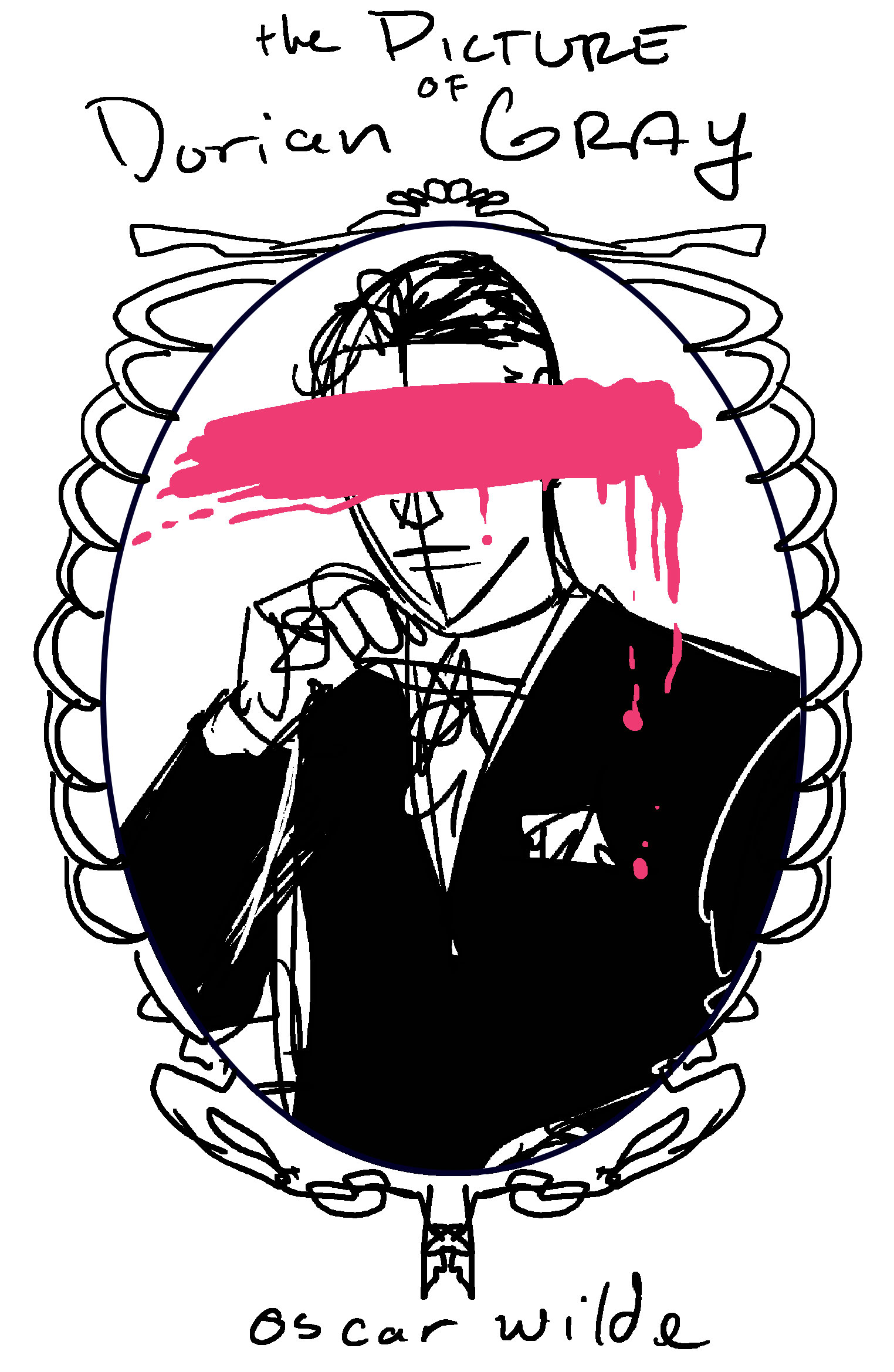
The same as the first except there will be a Red paint line across his face. I like this because you can see his lips and i want a slight very slight smirk.
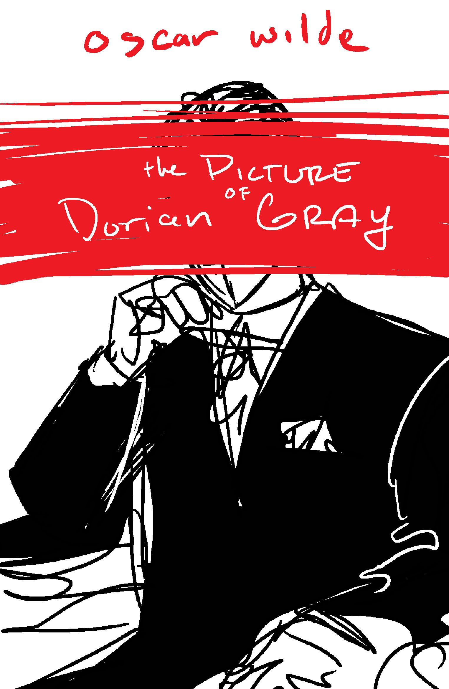
This one doesnt have the frame, and the title sits on Dorian's face.
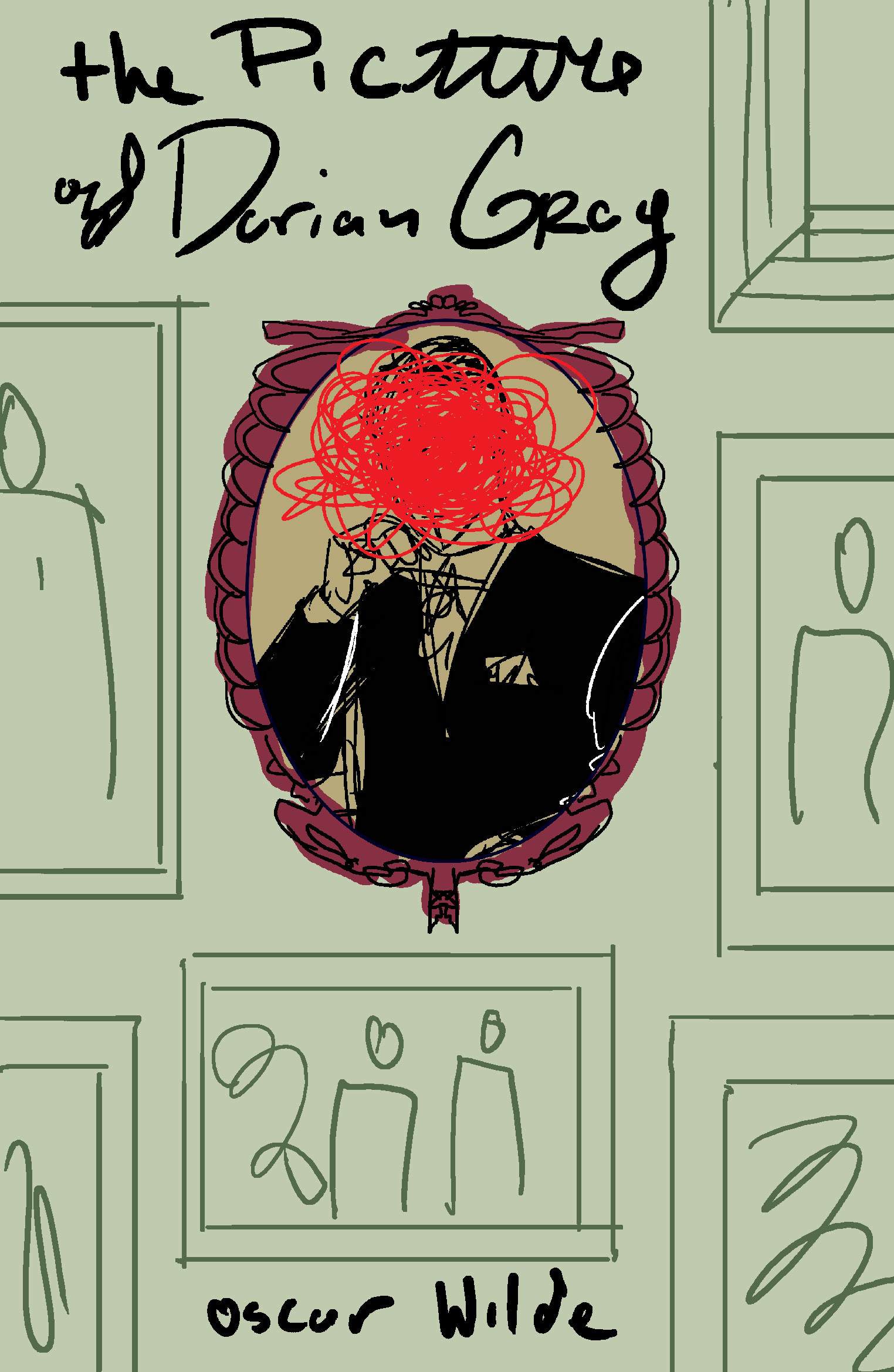
The benefit of this one is that his scribbled out face will contrast with the other figures in the other pictures who's faces will not be scribbled out. but the big con is that this would never be a moment in the book as Dorian hides the portrait away from everyone and doesn't properly display it on a wall.
I look forward to hearing which one you like and why!
Cheers,
Anderson Carmanhttps://www.andersoncarman.com/
https://www.instagram.com/andersoncarman/ -
Hey
")
I really like either the second one with the swipe of paint across his face (the pink is bold and different, really like it) and also the last one, but i'd prefer to see that with the paint swipe too instead of his face scribbled out. The swipe gives me more of an idea of the theme of the book, which is quite dark and scary whereas the scribble for me doesn't really do that. The last one will look awesome with all the other portraits around him and the pink swipe across his face will really stand out!
Look forward to seeing how this progresses -
@andersoncarman I agree with @hannahmccaffery the swipe of color across the face is the best one. I would also like to see that one in the bottom one as well.
-
Love the second one best! But I also really the 3rd one with the text across the face, I think that's really cool! I wonder how it would look if you mixed the 2, maybe make the paint swipe a bit bigger to put the text on there?
-
I think a combo between 2 and 4. Definitely prefer the solid stripe across the eyes, shows a sense of drama and hate by whoever did the cross out. And the eyes I think are something so personal, to look someone in the eyes can be a deep connection. To cut that out entirely I think simbolizes it’s personal.
I like the contrast with that of other portraits that are normal, untouched. You could add a lot of fun details with the teams and other portraits and then make the lighting and colors more bold on that center painting to really draw the eyes to that.
-
These are great. The 4th one is my favorite, but as you said, its not accurate to the story to have it hanging on the wall. I think you could make it work if you set the framed photo on the floor in an attic-type space with some other portraits laying or stacked close by. Maybe a few cobwebs and mothballs? That way you'd still have the contrast with the other pictures whose faces are not messed with. I really like the 2nd and 3d versions too, though. They are all very eye catching.
-
@andersoncarman
Again never read the book however visually speaking I like the background of number 4 with all the other portraits in the background but the paint swip of number 2 instead of the scribble, unless you made the scribble more like engrave scarring of his face. -
I like 2 and 3 the best. 3 would be my favorite.
-
Nice work! My fave is the last one. It has really good vibe. I love the idea that the picture is actually on the wall - I think that it can be explored in a ways that it doesnt interfiere with the story
-
This looks really great, I like the one with the pink swatch over the face.
I believe the portrait in the book is a full standing portrait which could open up some more compositional options if you choose.
Cool stuff.

-
love the full gallery one, but the second or third paint swatch like others have said. Almost like spray paint which modernizes the story for me in a really good cool way. You can have some fun with the other paintings 'reacting'. So creepy, love it!
-
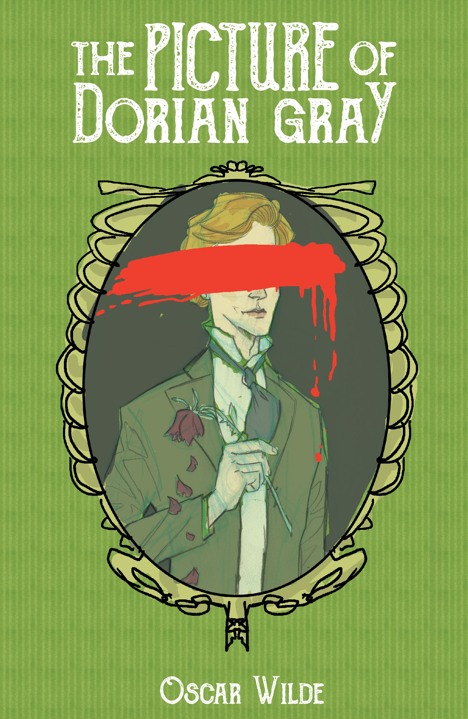
Thank you all for the wonderful feedback! I have continued to work on this and here is my current stage. I have a digital color mock-up.
I wanted to go with a really sickly green and red color scheme and the text is white because white is really important to the story. What do you think? I am concerned that it feels messy. The final will be watercolor and will give it a more painterly look on the portrait.
-
I like the color combination, so go for it. It looks good all together
-
I like the colors, looks good