March Prompt "Book Cover"
-
Brooke Knight @brookeknightillu
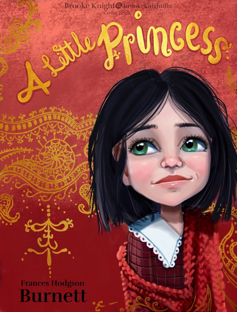
A Little Princess by Frances Hodgson Burnett
This challenge was so much fun. My hope for the cover was to capture Sara’s personality and Burnett’s fun way of describing her, ‘’ with a queer old-fashioned thoughtfulness in her big eyes.‘’
The background was inspired by Sara’s original upbringing and the kind man that befriends Sara after she is left with only three dresses and a doll. I chose to wrap the design around her to represent his kindness.
-
@Chip-Valecek I can almost smell the stench coming off that pigs head. Quality oozing!
-
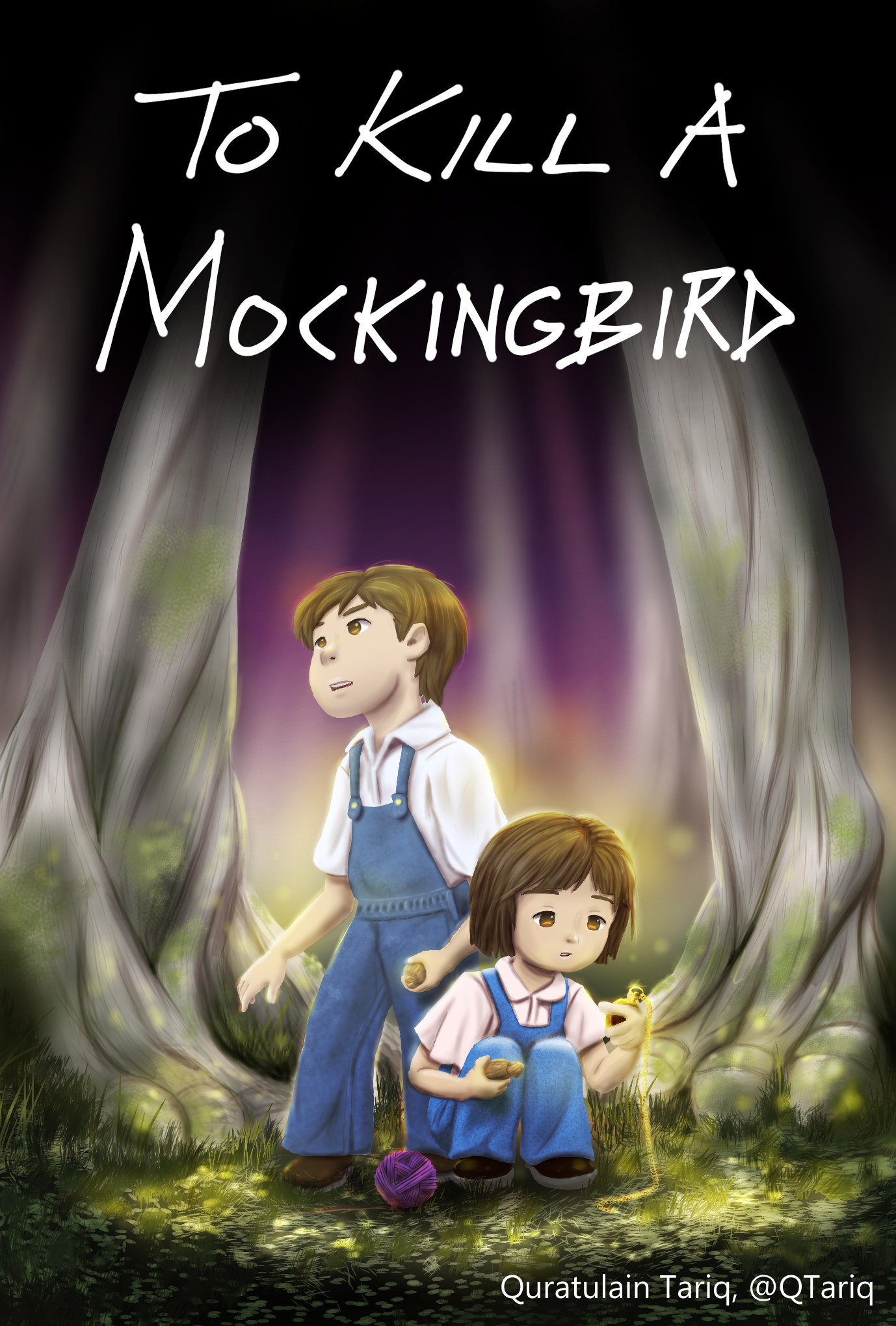
Hi everyone, I'm new here too yay! I thought I wasn't going to make it for this contest because of the flu, but managed to join in as well phew. Only got to watch few videos on Will Terry's colour-related class, so please feel free to leave critiques on how I can improve next time (I greatly appreciate each and every feedback!). I'll submit this as a final for the contest

-
She has an air of sadness in her eyes too. Your choice of colour is very nice. Thanks for sharing.
-
@Heather-Boyd oh thank you very much! And your right there is a bit of sadness in her eyes .
-
@josegalue25 I love the concept!
I've never read the book, but this cover makes me want to read it. -
@irwan I love the simplicity of this one. Nice positive and negative shapes. Reminds me of Jon Klassen's style.
-
@WindyWyoGal I love the feel of this one.
-
wow im loving so many of these
-
@Patri_P_P One of my favorites as well! I love the silhouette idea.
-
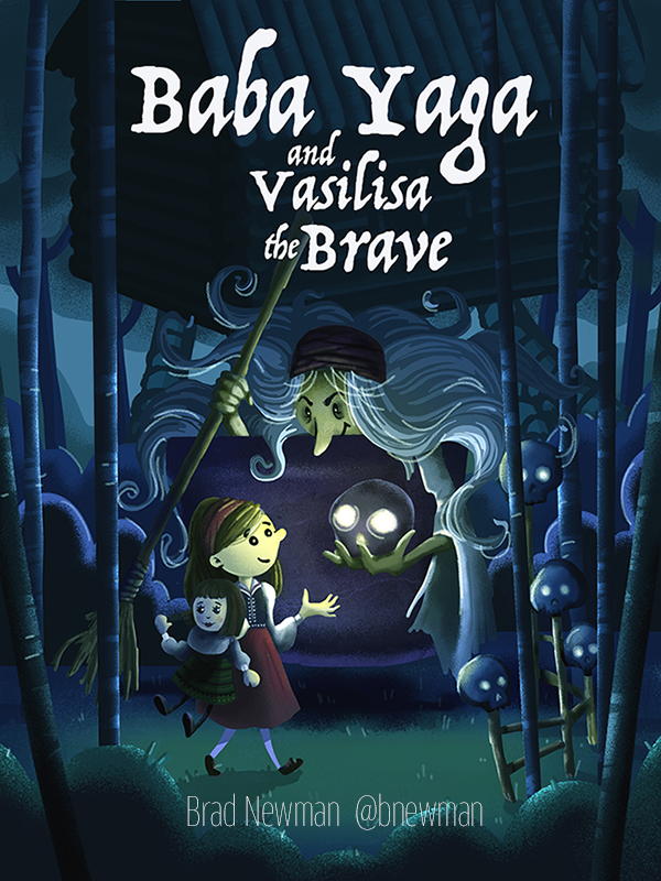
Here's my entry. Good luck to all!
-Brad
-
@brooketknight I love the colors in this one. This would stand out on the shelf.
-
@Clayhorsesdesign I did Alice too! I love it! I love your style.
-
@andersoncarman This is awesome! I love the concept. Is this done traditional and digital? It has some fun textures that makes me think some of it is traditional. Well done.
-
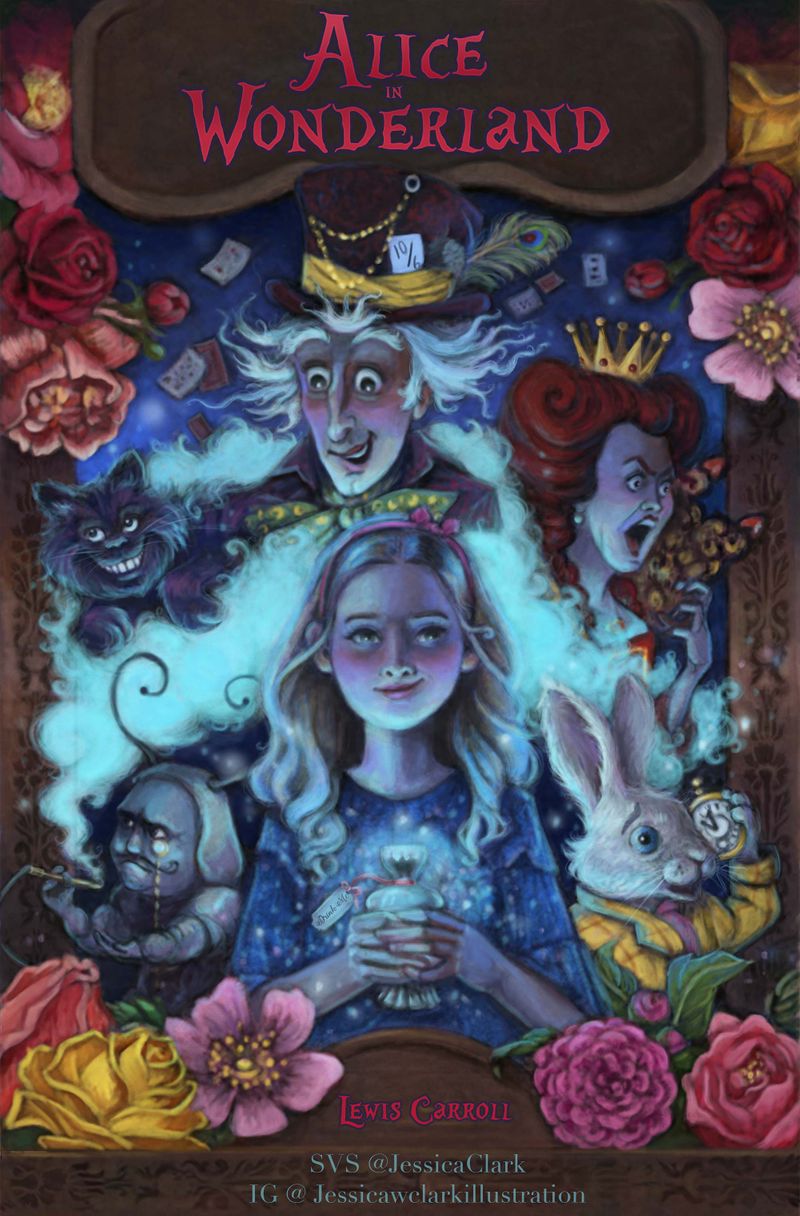
Here's my first submission (so hopefully I'm doing this right). Here's my take for Alice in Wonderland.
https://www.instagram.com/jessicawclarkillustration/
-
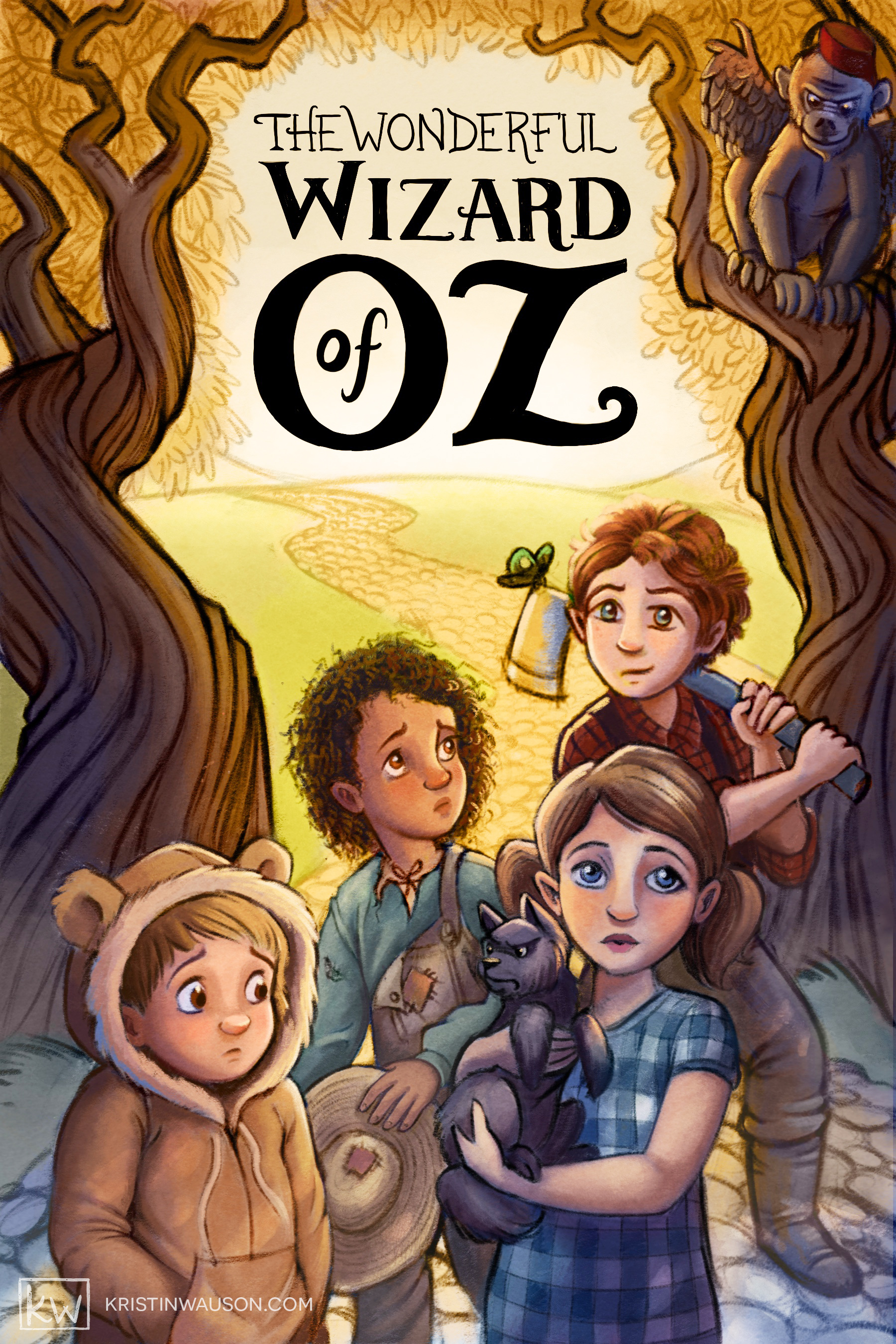
@Kristin-Wauson Oops! I was rushing to finish this before going on vacation and now that I'm home I noted that there are some stray marks that must have appeared after I rearranged some layers. Here is the updated version. Not sure if I should go back and delete the old one.
-
@bnewman I absolutely love this. You nailed the colours as well!
-
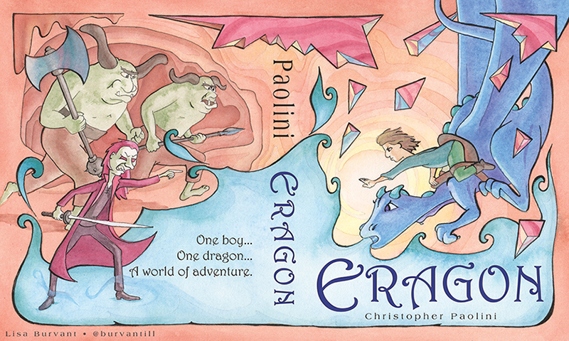
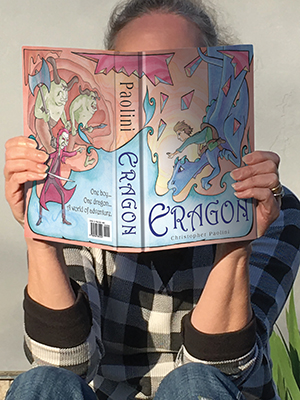
Eragon is a YA book but I want to illustrate for children so I pretended that it was a children’s book and illustrated it accordingly. =)x
-
@jennymwine NICE!!!
-
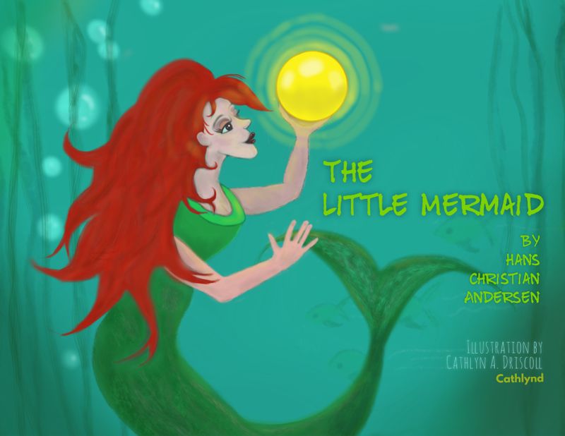
This is my first time entering one of these. The Little Mermaid. Thanks for checking it out and suggestions are always welcome. Cheers!
