Moment WIP Advice Sought
-
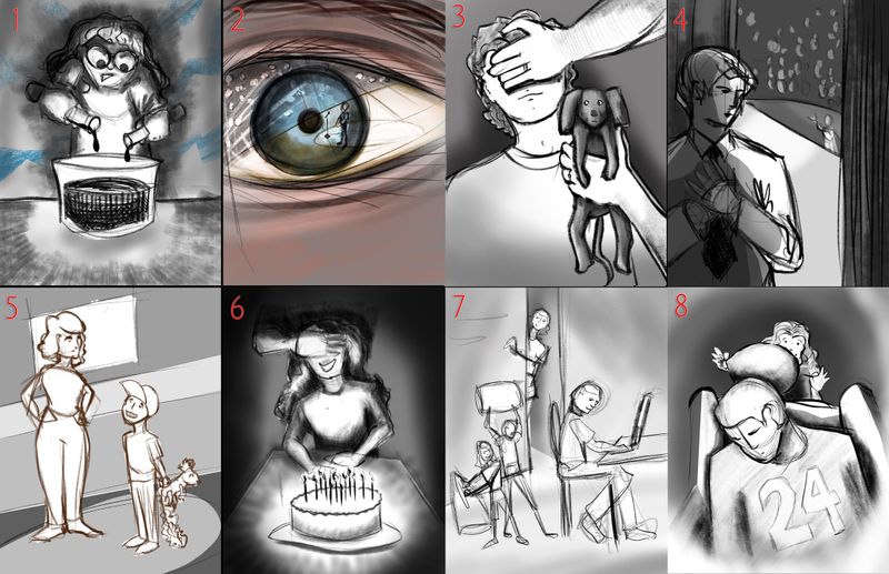
I have thought of a lot of images for "The Moment Before" and I can't narrow it down... I would greatly appreciate some advice... All of these would be great fun for me to draw and each offers a unique experience for me to practice. I'm trying to concentrate on the story in the image, though. Are any of these less clear? More interesting? I think some of these may lean more toward YA readers and I don't know if that makes a difference...
Children's Illustration Portfolio: https://www.coreyartusillustration.com
Art Portfolio: https://www.coreyartusimagery.com
Mastodon: https://mindly.social/@Coreyartus
Pixelfed: https://pixelfed.social/Coreyartus -
@Coreyartus I like the two on the far right. The young man before he goes on stage and the person about to be woken up very rudely
 . They have good drama, tension and composition. I agree that these could be considered YA but there is nothing wrong with that. Teens like illustrations too. Especially those that hate to read.

-
My vote goes to number 1 and 4, for me they show the most tension and really tell a little story, plus they look like they'd be the most fun to do in colour
There's nothing wrong with YA either! Look forward to seeing where you take this next -
Hi
I think nr. 4 is the most interesting, you can really work with emotions on that one. Nr. 8 is also very good! Can almost hear the balloon popping. -
@Coreyartus I agree with the others with number 4, however 2 would be cool with the reflection in the eye.
-
Hey there! For me it is number 4 definitely... Speaks very clearly about what is this picture about
-
If you are wanting to target a different age range you could always adjust the age of your characters (not saying you need to) but if you wanted to make #4 more geared towards smaller children, you could change the character to be a little boy before his first violin recital, or go in the other direction and make it clear that this older character is backstage in a more adult venue, like a bar - maybe he's about to try out his standup comedy act for the first time.
-
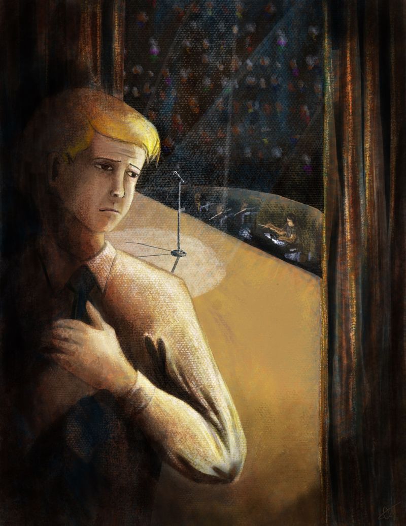
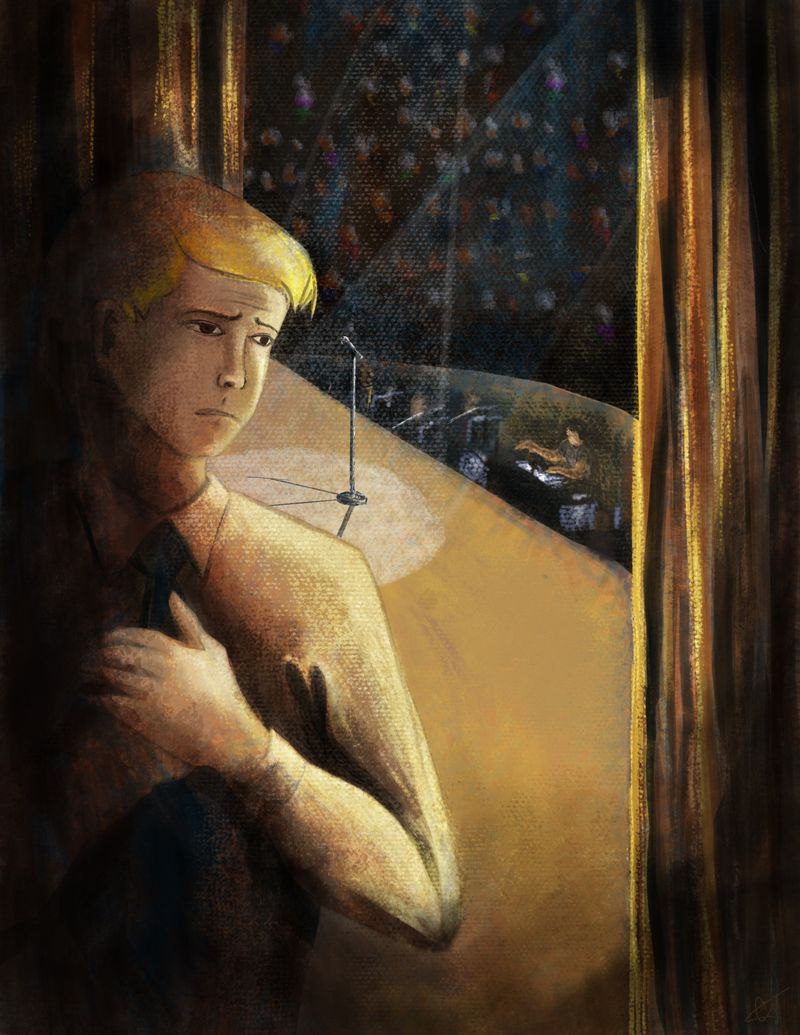
Thank-you all--this was very insightful! I'm looking forward to doing #4, since that's the one that most of ya'll thought would be a good choice. Thanks so much--you really really helped me!!
-
I really like #2!
-
Okay, I chose #4, and have rendered the image over and over again unsuccessfully, trying each time to develop a moderate fluency with the canvas brushes I'm playing with. Perhaps I should have just used a rendering method I'm more familiar with, but this is all about learning, right?
I felt like my challenge was not making it too chiaroscuro, as that started to make it look kinda creepy and abstract. That being said, if one is uncomfortable doing things in front of tons of people one does begin to feel a little out of sorts... hehe...
I suspect I need more detail (in the shirt especially--it looks unrealistically flat in comparison to the depth of shadows in the curtains) and probably needs to be fuller on the arm, but I'm wondering if anything else sticks out as overtly wonky...
Children's Illustration Portfolio: https://www.coreyartusillustration.com
Art Portfolio: https://www.coreyartusimagery.com
Mastodon: https://mindly.social/@Coreyartus
Pixelfed: https://pixelfed.social/Coreyartus -
@Coreyartus If you're worried about the amount of detail in the shirt being outshonen by the depth of shadows on the curtains, I might make the curtain relatively flat and black (those heavy theatre curtains really don't reflect anylight anyway
) -
@Braden-Hallett You were right! I lowered the intensity of the curtains and bumped up the intensity of the shirt, added a smidge more definition in the fact, and finally adjusted the angle of the stage to make it feel less like he was waiting to go on from a balcony and instead felt more like he was in the wings. Thanks so much for the advice!! I truly appreciate it!!