Society of Visual Storytelling

    SVSLearn Forums

    • Register
    • Login
    • Search
    • Recent
    • Tags
    • Popular
    • Users
    • Groups
    • Search

    Group run through creative environment design week 1 art and feedback

    Artwork
    14
    138
    11548
    Loading More Posts
    • Oldest to Newest
    • Newest to Oldest
    • Most Votes
    Reply
    • Reply as topic
    Log in to reply
    This topic has been deleted. Only users with topic management privileges can see it.
    • MichaelaH
      MichaelaH last edited by

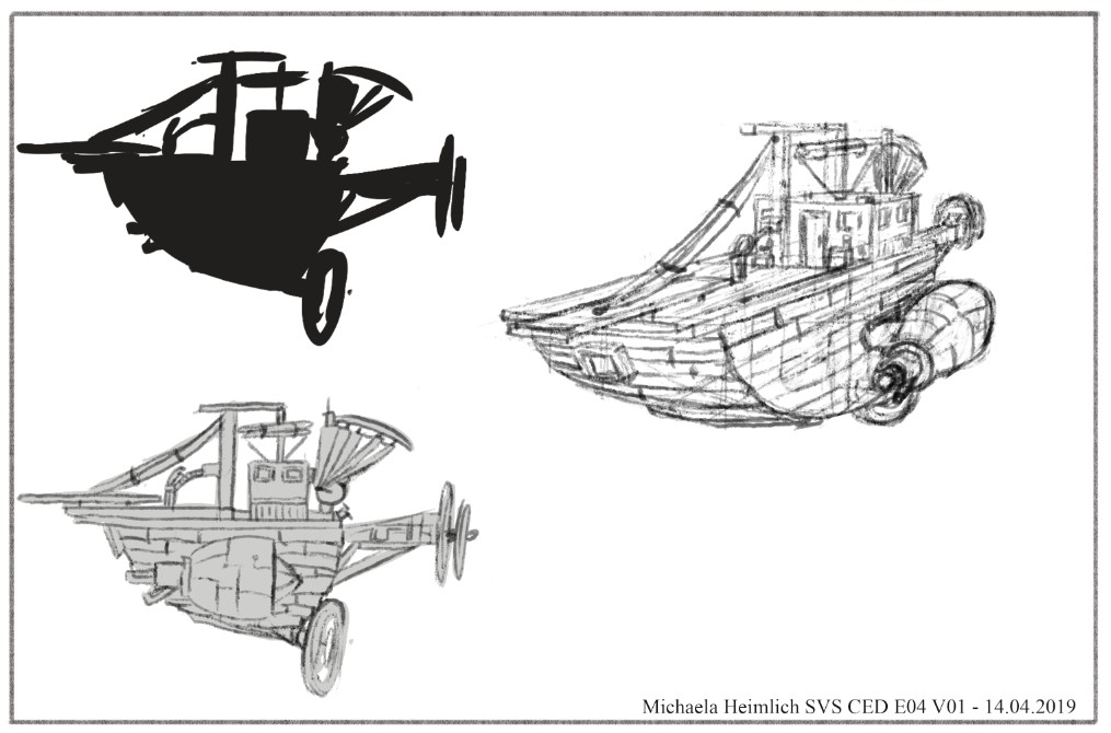
      So I think I am finished, not perfect. It was very difficult, because I never do such perspective. It is only one raw sketch, would like to do one clean sketch with better perspective (after it is finished I see many parts lacking..but as Jake said, it is good to go some more times over the design after time passes), but after 2 hours doing this exercise, I need some break. But I am proud of me, that I did some environment and one I never usually do...

      SVS CED4 OD V01 Michaela Heimlich.jpg

      https://www.instagram.com/michaelaheimlich/
      https://www.heimlich-illustration.de/

      demotlj murielle 2 Replies Last reply Reply Quote 4
      • demotlj
        demotlj SVS OG @MichaelaH last edited by

        @MichaelaH Very intricate! The different perspective is very nice and well done. That's something I have real problems doing -- turning my creation (or anything) around in space and imagining how it would like from another angle. Yours is great.

        Laurie DeMott
        instagram.com/demotlj

        MichaelaH 1 Reply Last reply Reply Quote 1
        • MichaelaH
          MichaelaH @demotlj last edited by

          @demotlj Thank You. I know what You mean, I also never turn my objects, because I don't know how and am afraid of it. Now I know it takes also a lot of time and work. I think my ship looks longer than it is in frontal sketch, but it is ok for the first try.

          https://www.instagram.com/michaelaheimlich/
          https://www.heimlich-illustration.de/

          demotlj 1 Reply Last reply Reply Quote 0
          • demotlj
            demotlj SVS OG @MichaelaH last edited by

            @MichaelaH I've started making clay models of my characters so that I can turn them around but it would be a lot faster and easier if I could just get my brain to do it without aids 🙂

            Laurie DeMott
            instagram.com/demotlj

            MichaelaH 1 Reply Last reply Reply Quote 1
            • MichaelaH
              MichaelaH @demotlj last edited by

              @demotlj That is a great idea, to take objects like models or like you do with the clay.

              https://www.instagram.com/michaelaheimlich/
              https://www.heimlich-illustration.de/

              1 Reply Last reply Reply Quote 0
              • murielle
                murielle @Erin.Cortese last edited by

                @ErinCortese These look so good. Nice job!

                http://artbymurielle.com
                https://www.instagram.com/artbymurielle/

                Erin.Cortese 1 Reply Last reply Reply Quote 1
                • murielle
                  murielle @MichaelaH last edited by

                  @MichaelaH This looks so good 😍

                  http://artbymurielle.com
                  https://www.instagram.com/artbymurielle/

                  MichaelaH 1 Reply Last reply Reply Quote 0
                  • MichaelaH
                    MichaelaH @murielle last edited by

                    @murielle Thank You Murielle 🤗

                    https://www.instagram.com/michaelaheimlich/
                    https://www.heimlich-illustration.de/

                    1 Reply Last reply Reply Quote 0
                    • Erin.Cortese
                      Erin.Cortese Moderator @murielle last edited by

                      @murielle Thanks!

                      1 Reply Last reply Reply Quote 0
                      • murielle
                        murielle last edited by

                        The last stretch for this week.
                        I wasn't planning on doing the trees but by lack of other inspiration, I thought I'd give it another try. This is the second time that I do this exercise, taking at heart everything I've learned here by reading the comments.

                        I was looking to design pine trees and creepy trees.
                        Pine trees seem to be really boring, does anyone have an idea on how to make them more interesting?

                        Schermafbeelding 2019-04-14 om 15.24.55.png

                        Schermafbeelding 2019-04-14 om 15.34.10.png

                        http://artbymurielle.com
                        https://www.instagram.com/artbymurielle/

                        Heather Boyd 1 Reply Last reply Reply Quote 4
                        • Heather Boyd
                          Heather Boyd @murielle last edited by Heather Boyd

                          @murielle

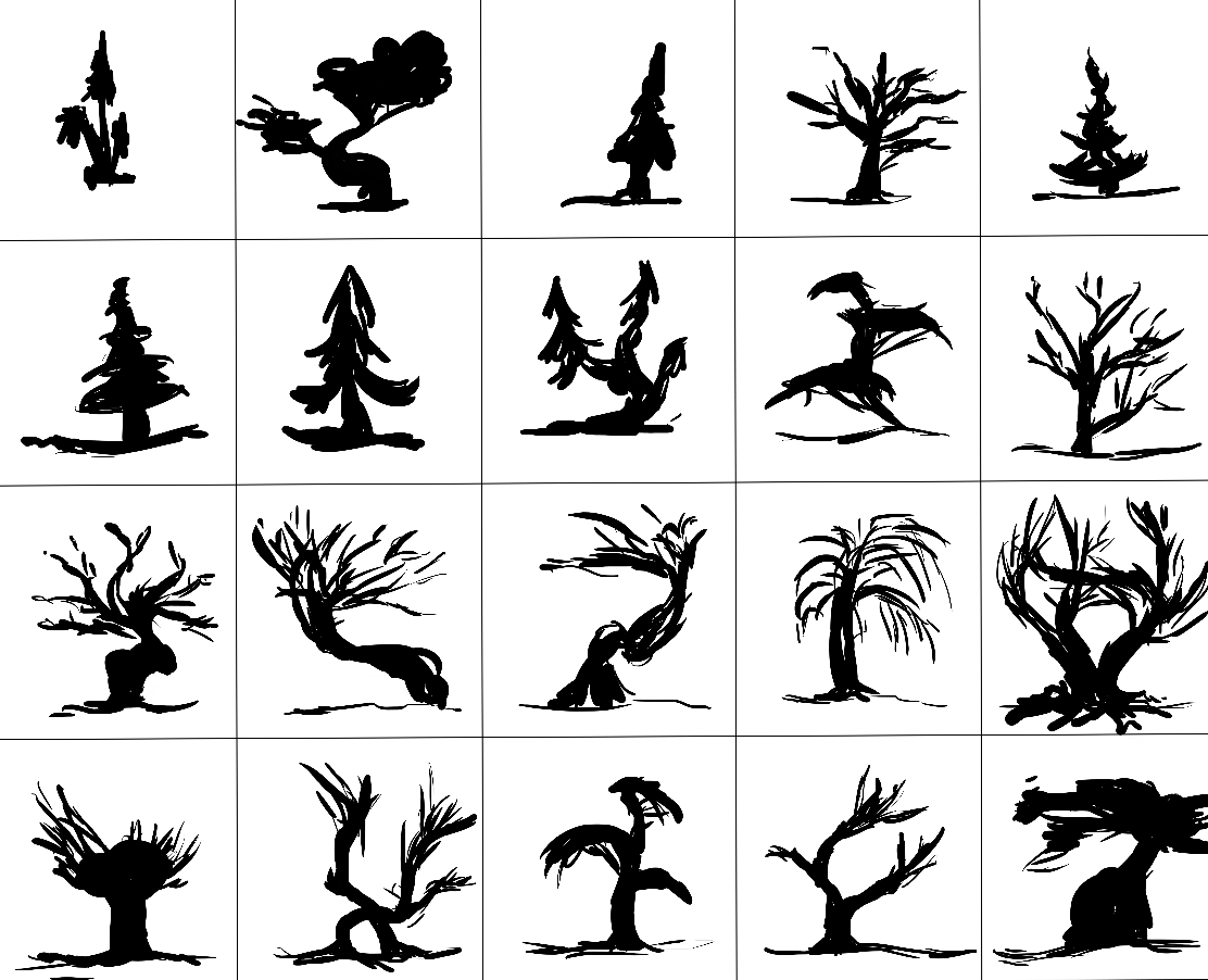
                          I love trees including pines. I put some of mine on the side of a cliff (setting) and I stylized a few. For one I saw the shape in another persons work - persons hair, so I really find ideas everywhere I look.

                          Instagram: www.instagram.com/heatherboyd.illustration/
                          Website: https://heatherboydillustration.ca
                          Shop: https://www.inprnt.com/search/products?q=HeatherBoydIllustration
                          Ko-Fi: https://ko-fi.com/heatherboydillustration

                          Be blessed,

                          1 Reply Last reply Reply Quote 1
                          • braden H
                            braden H last edited by

                            Started a thread for week 2 😃

                            https://forum.svslearn.com/topic/7368/group-run-through-creative-environment-design-week-2-art-and-feedback

                            1 Reply Last reply Reply Quote 0
                            • braden H
                              braden H last edited by

                              If anyone here wants more critiquey feedback on their work, post it and tag me with an @ and I'll give you a short critique (I like to keep it to one thing I like and one thing I'd change)

                              If you want a critique but DON'T wanna post it here for whatever reason feel free to PM me on these forums or DM me on discord 🙂

                              JerrySketchyArt Coley 2 Replies Last reply Reply Quote 0
                              • Coley
                                Coley last edited by

                                2019-04-14 16.05.47.jpg 2019-04-14 16.06.28.jpg 2019-04-14 16.07.05.jpg
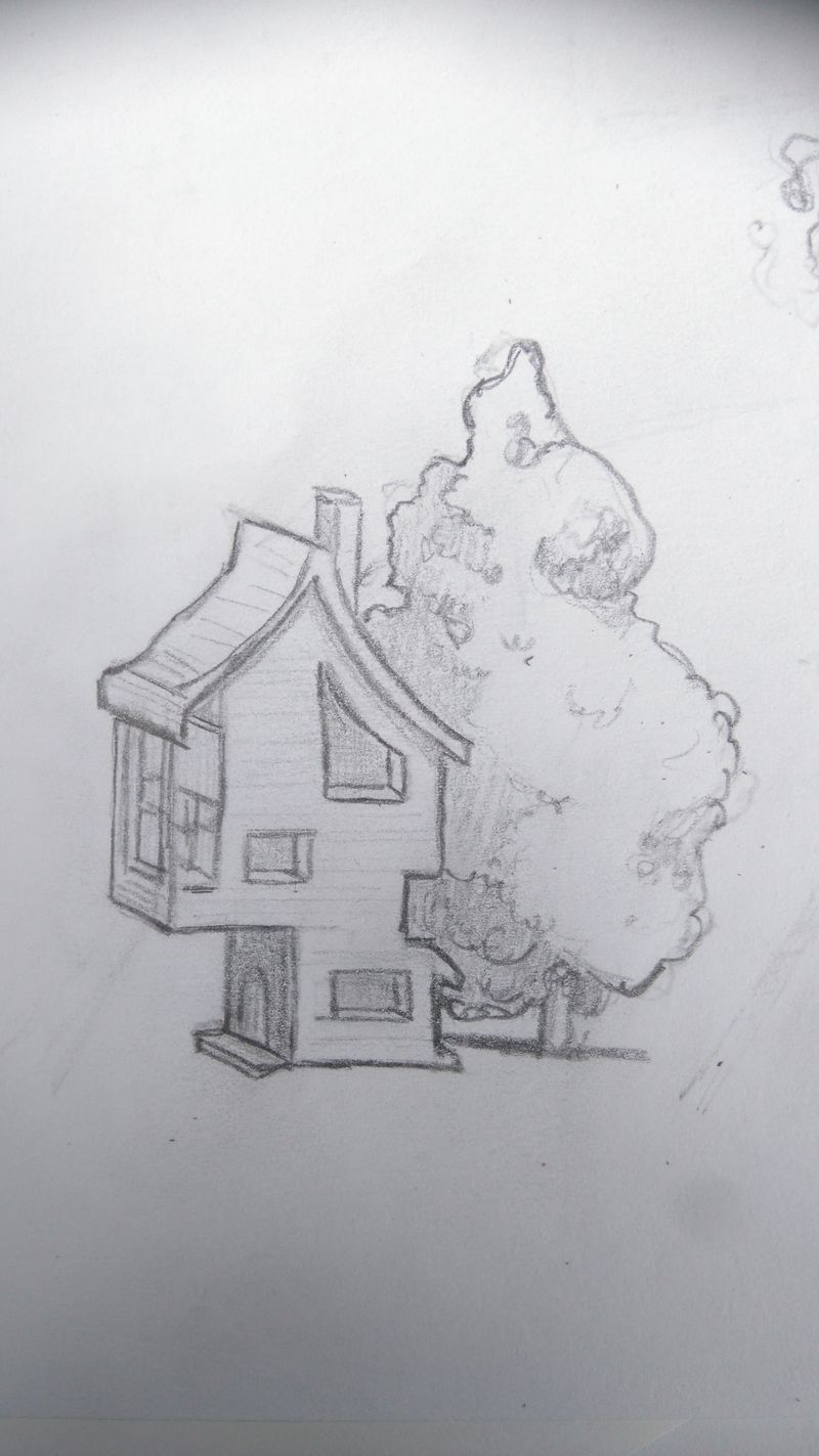
                                Ok I did a sketch from my two favorite thumbnails, put them together into one. My sketch is pretty small and in pencil. I will hopefully get a chance to do in photoshop as well as I need the practice but have been busy with family and away from computer.
                                I found this hard! Not used to drawing anything in the environment. I felt like I didn't know what to add to make it interesting. But it was fun to try to think of the perspective as I " turned " the house. this is a fun way to start thinking about how to get into the environmental design process though. Baby steps! Onto week two!

                                https://www.instagram.com/nicoleledrewmay/

                                braden H 1 Reply Last reply Reply Quote 0
                                • JerrySketchyArt
                                  JerrySketchyArt @braden H last edited by

                                  @Braden-Hallett Let me have it. As a game developer, I'm not sensitive. You can't possibly say meaner things about my work than users on Google Play. 😄 (And anyone else feel free to join. I'm looking to improve.)

                                  alt text

                                  MichaelaH Heather Boyd braden H 3 Replies Last reply Reply Quote 0
                                  • Coley
                                    Coley @braden H last edited by

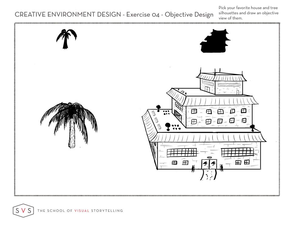
                                    @Braden-Hallett I just saw this post after I posted mine. Would love a critique! Wanting to improve so I'm totally open and not the least bit sensitive about it! 😉

                                    https://www.instagram.com/nicoleledrewmay/

                                    1 Reply Last reply Reply Quote 0
                                    • MichaelaH
                                      MichaelaH @JerrySketchyArt last edited by MichaelaH

                                      @JerrySketchyArt My feedback: I like the palm the best, really detailed with great stroke. I like the palm better than the house.
                                      I think the house is missing little details, the facade in the first and second floor has strokes like for smaller house, to strong in my opinion. I don't like the black trees on the first roof, I think bright sketchy and some better design would be better. The windows are bit to much rough with the big lines. More details would make it better. The best part of the house is the second roof. It is fine detailed on the facade -this facade I would make on the whole house.
                                      Hope it helped.

                                      https://www.instagram.com/michaelaheimlich/
                                      https://www.heimlich-illustration.de/

                                      1 Reply Last reply Reply Quote 0
                                      • Heather Boyd
                                        Heather Boyd @JerrySketchyArt last edited by

                                        @JerrySketchyArt

                                        I agree I like the palm tree -texture reminds me of a pineapple 🙂

                                        House wise I am distracted by the two types of lines you have. The outer lines are accurately straight but then your inside detail lines are free hand (I concluded), I like it to be consistent. Drawing straight lines digitally is hard for me too but I rather draw freehand all for final works. *Now I could be terribly off and you have hand drawn them but point remains (windows are wiggly and walls are straight).

                                        Time is wiggly wobbly -Doctor Who memory lols

                                        Instagram: www.instagram.com/heatherboyd.illustration/
                                        Website: https://heatherboydillustration.ca
                                        Shop: https://www.inprnt.com/search/products?q=HeatherBoydIllustration
                                        Ko-Fi: https://ko-fi.com/heatherboydillustration

                                        Be blessed,

                                        1 Reply Last reply Reply Quote 0
                                        • braden H
                                          braden H @JerrySketchyArt last edited by

                                          @JerrySketchyArt

                                          Okeedokee!

                                          Something I like: Those doors and windows certainly do give us a sense of scale. Lots of neat little details.

                                          Something I'd change: The silhouette feels unbalanced (feels to me like it really wants to fall over to the right). I would either shift that top floor further centre, or extend the base floor to the right.

                                          Another thing I'd change: I also think this would benefit from being done in something closer to isometric perspective (because you want this to be really objective, yes?) This'll also make it easier to avoid tangents like the one formed with the left awning edge and the bottom of the building. I'm gonna do a drawover at some point today to show you what I mean 🙂

                                          1 Reply Last reply Reply Quote 0
                                          • braden H
                                            braden H @Coley last edited by

                                            @Coley

                                            Critique 😃

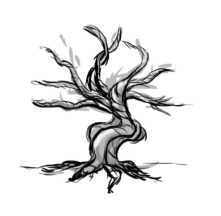
                                            Something I like: That tree is awesome. You've got that form shading with the edge of the leaves down pat!

                                            Something I'd change: Your silhouette had elements which made it feel balanced which are missing in your objective view! The silhouette has thin supports at an angle from the left and right which certainly made it feel more stable. I would add in supports to hold that second floor balcony up. It seems in your objective view that it's extending a bit too far for comfort 🙂

                                            Coley 1 Reply Last reply Reply Quote 0
                                            • First post
                                              Last post