Finishing Drills for a Chronic Dabbler.
-
@ShannonBiondi Great reminder from that podcast: produce more than I consume. While in the learning stage (that's where I definitely am)-I'm so tempted to go grab another tutorial. Like you, I make my time-put-in-goals. And I gather up my "best 3" each month-They're usually finished (to my standards)--occasionally I slip in a comic panel which are so hard for me, and they are not ever yet "done" to my standards.
@animatosoor --this is a great thread and I support the accountability.
-
@MichaelaH Thank you! I realise it is said that the sandman sweetly sprinkles magic dust over the top of people's eyelids, but I had to have this one pull the man's skin taut to pour the dust in. Haha, we make our own fun, I guess. XD
-
@marine Such a supportive thing to say. Thank you.

-
@Susan-Marks Rounding up your best 3 pieces of work every month sounds like a great thing to do. All the best with your comics. I'm not sure if you have been posting those, but if you do, I'm sure the forum folks would be more than happy to help you along!
Thank you; I feel largely driven, with a few days (like today) where nothing seems to be moving forward. I just keep telling myself these "down moments" are part and parcel of my attempting to improve.
-
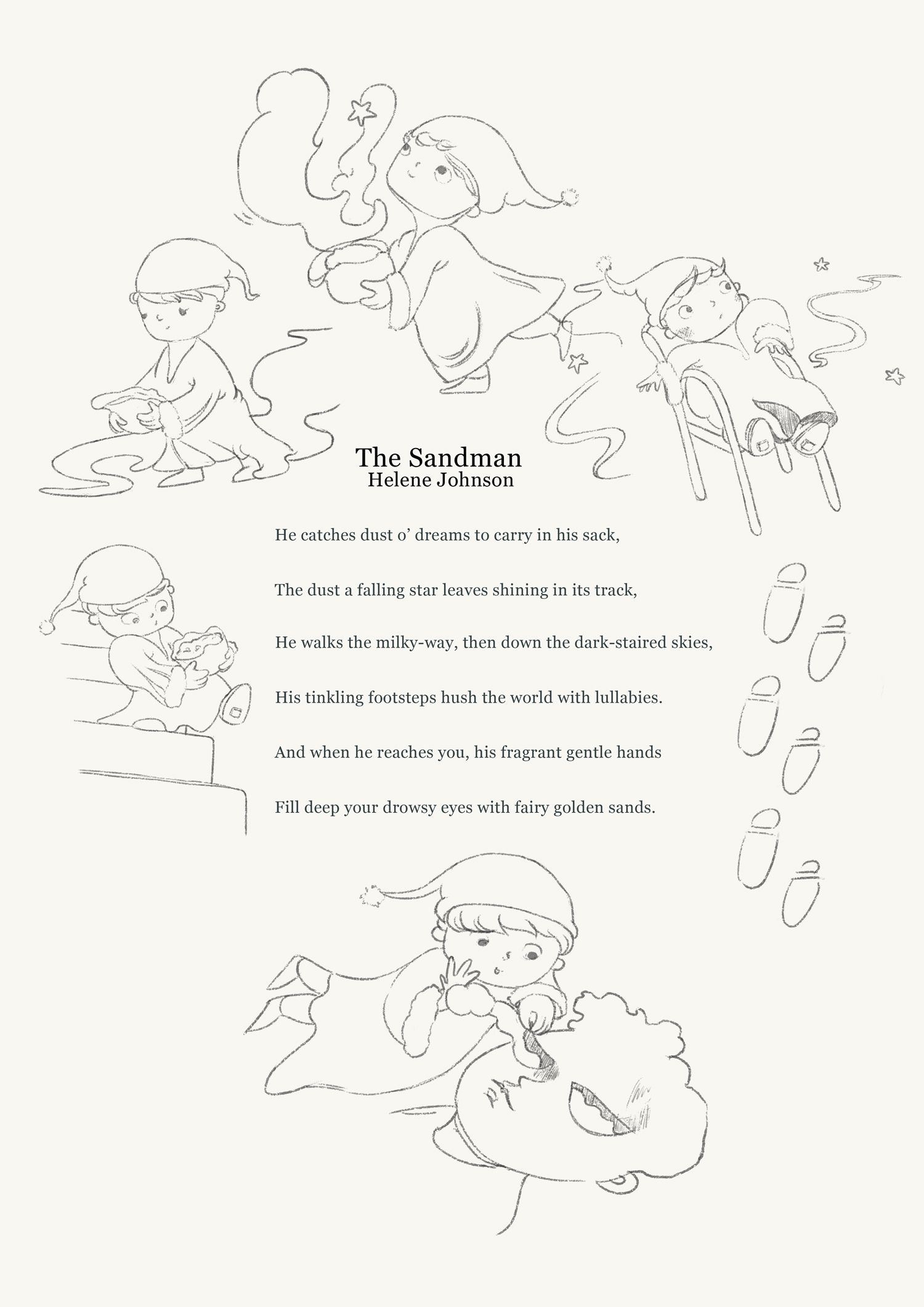
Picking up after feeling a bit down yesterday, with progress on my Sandman illustrated poem page.
I have not made such a page before, but have always wanted to. I'm wondering if anything looks problematic on this layout?
-
Progress shot. The footprints on the right side of the picture felt lazy to me, so I've removed them. I still worry that the page might be too crowded, hehe.
https://www.instagram.com/sooryajart/
The Beatles: "Roll up, roll up for the Mystery Tour!"
-
@animatosoor It is better without the footprints, maybe putting the bottom picture little bit left and than the sandman right little bit down. It looks very nice.
-
@animatosoor Looks like you're making amazing progress. These look fantastic
")
-
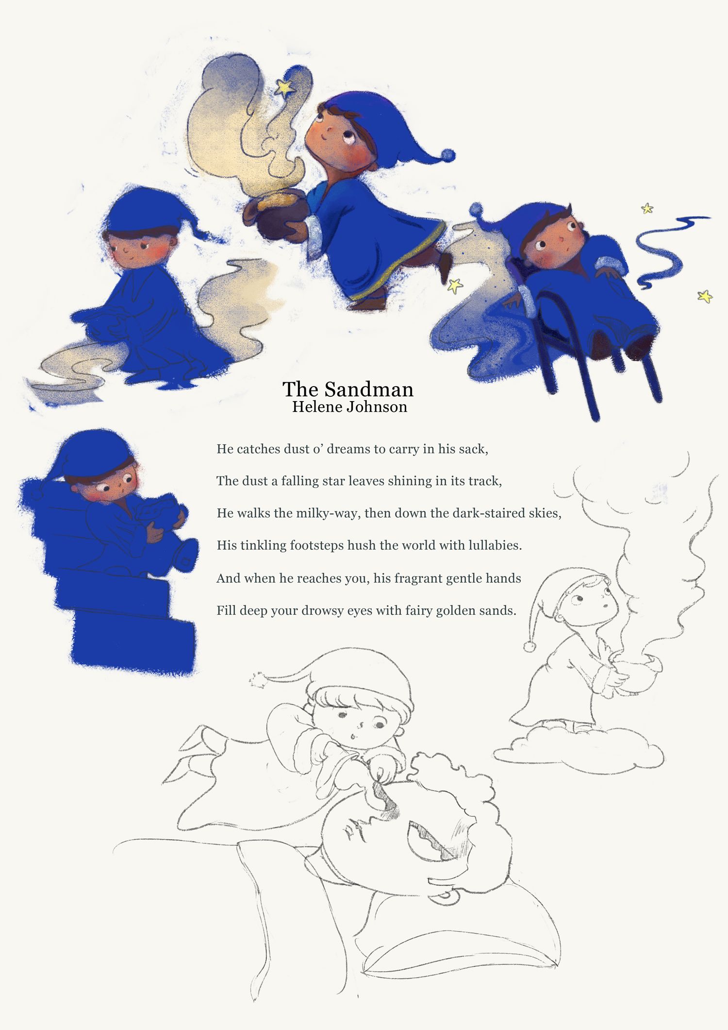
Almost done! Please feel free to point out if anything looks very out of place.
@MichaelaH Your note on moving the sandman (sandmen, lol) around helped so much. Thanks for that.
@NelsonYiap Thanks, Nelson. That's very kind of you.

https://www.instagram.com/sooryajart/
The Beatles: "Roll up, roll up for the Mystery Tour!"
-
@animatosoor I like this style of this book, it is really wonderful. Maybe I would move the right bottom sandman little bit down. so taht it isn't so near to the chair.
-
@MichaelaH Thanks once again! It's so helpful to hear notes on the arrangement, since after a certain point I feel like I can't really see what needs to be moved where anymore. I've moved it down to let it breathe a bit, and it does look better.:
-
@animatosoor I really love your use of colour and lighting. It’s great to see your process as well.
Keep going, you’re doing great

-
@sarahlawrence It means a lot to hear that, especially since colour/light has been scary for me to tackle. Thank you, Sarah.
https://www.instagram.com/sooryajart/
The Beatles: "Roll up, roll up for the Mystery Tour!"
-
@animatosoor I love this! Do you work traditionally or digitally? The blue reads a little intense to me. If you work digitally, what might it look like knocked back just a bit? When I think of night and sleepy, I think a little more muted.
-
@Susan-Marks Thank you so much for your comment on the colour. It's weird, but it's like I threw those keywords (relaxing, dreamy, sleepy) completely out the window with the blue. XD
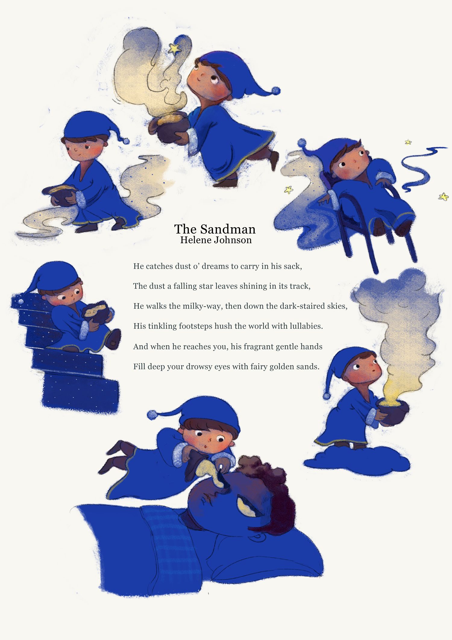
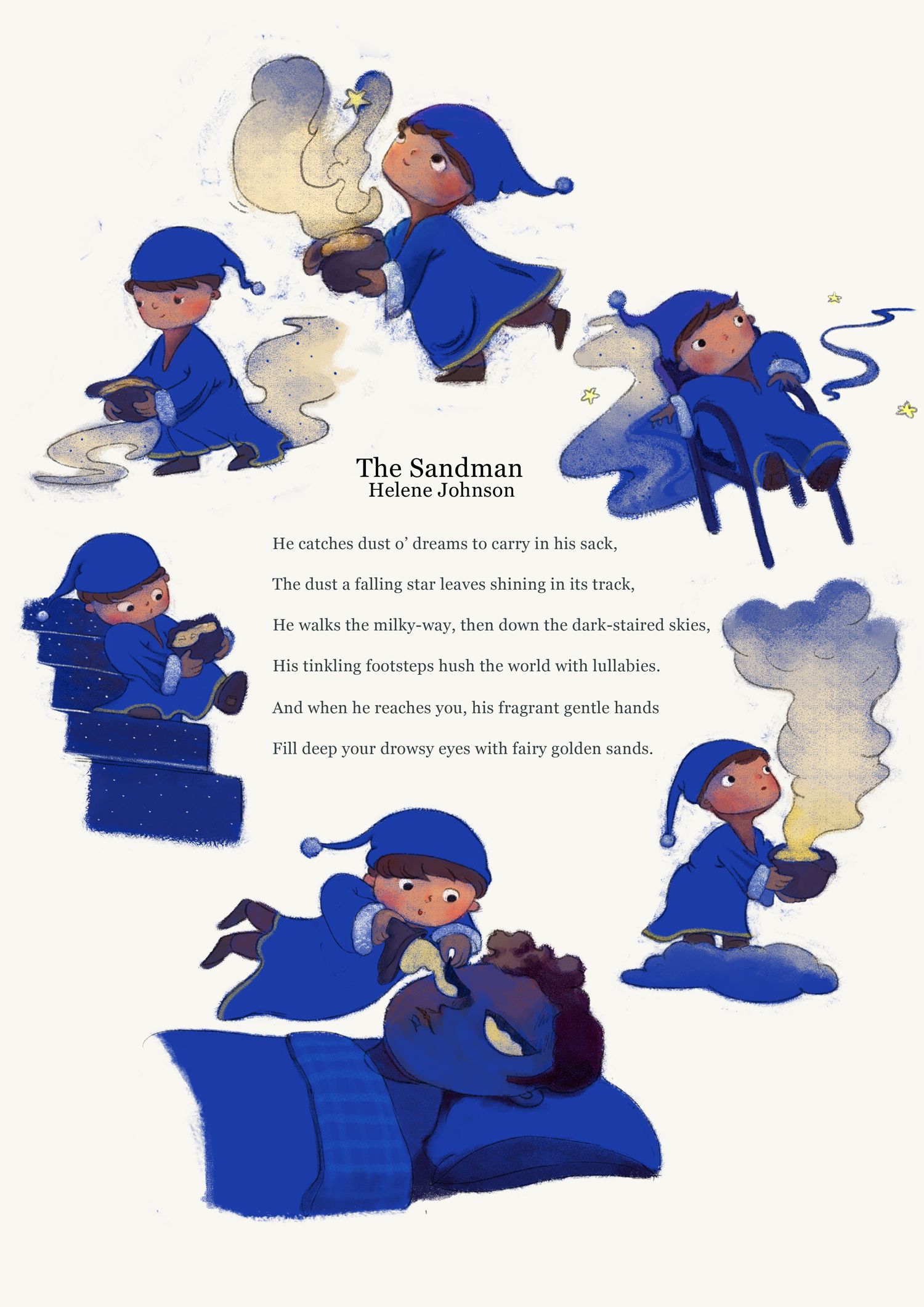
My painting is all done digitally. Your comment got me thinking, and I took your advice and knocked the blue back a bit to see what it looks like. I actually think I like the new versions better, particularly #3. What do you think?
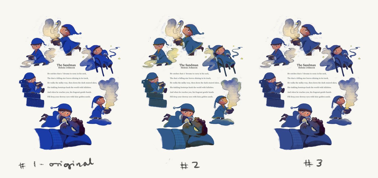
https://www.instagram.com/sooryajart/
The Beatles: "Roll up, roll up for the Mystery Tour!"
-
Super cute. I love the shade of blue on version 3. Gives a night time feeling.
All my links: https://APHOTICMOTH.carrd.co/
-
@CLCanadyArts Hehe thank you, Cassandra! I'm also getting more of a night-time feeling from that one than I was from the original!

https://www.instagram.com/sooryajart/
The Beatles: "Roll up, roll up for the Mystery Tour!"
-
@animatosoor I think it's easier on the eyes as well, could be just me, but the original was harsh enough blue that I didn't want to look, insta headache, in print would probably be a lot different without the blinding backlight on my computer.
It would be lovely to see a little collection of pieces like this in a book.
-
I like the original strong bright color, but 3 goes also for me. I think the most ppl the original color is to strong, I found it very refreshing in the point, nobody else is doing it and I was drawn to it.
-
I like 1 and 3. 3 is a bit softer but 1 original blue brighter for me portrays a more active sandman -because it is about him and his daily duties.
Instagram: www.instagram.com/heatherboyd.illustration/
Website: https://heatherboydillustration.ca
Shop: https://www.inprnt.com/search/products?q=HeatherBoydIllustration
Ko-Fi: https://ko-fi.com/heatherboydillustrationBe blessed,