Finishing Drills for a Chronic Dabbler.
-
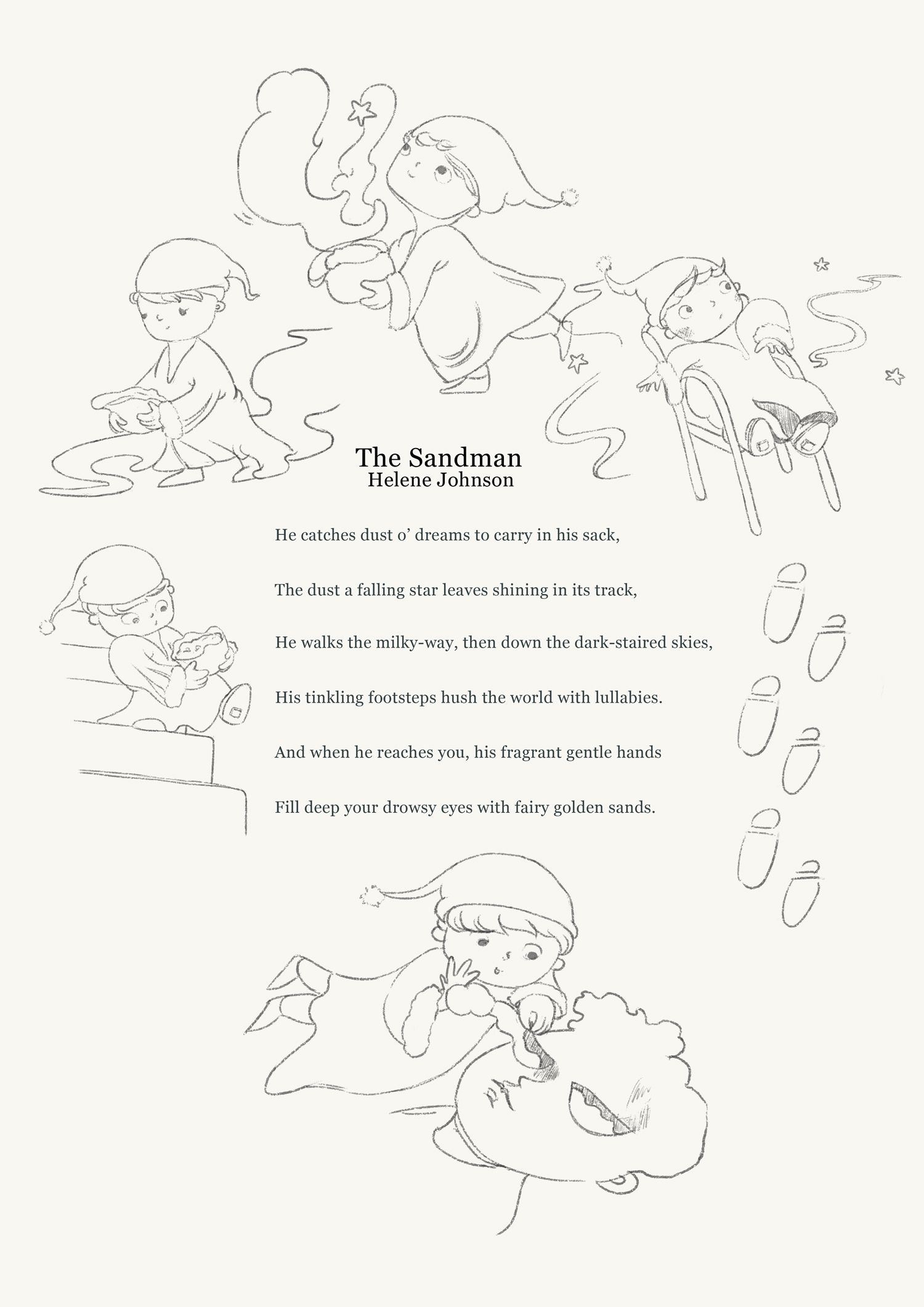
Picking up after feeling a bit down yesterday, with progress on my Sandman illustrated poem page.
I have not made such a page before, but have always wanted to. I'm wondering if anything looks problematic on this layout?
-
Progress shot. The footprints on the right side of the picture felt lazy to me, so I've removed them. I still worry that the page might be too crowded, hehe.
https://www.instagram.com/sooryajart/
The Beatles: "Roll up, roll up for the Mystery Tour!"
-
@animatosoor It is better without the footprints, maybe putting the bottom picture little bit left and than the sandman right little bit down. It looks very nice.
-
@animatosoor Looks like you're making amazing progress. These look fantastic
")
-
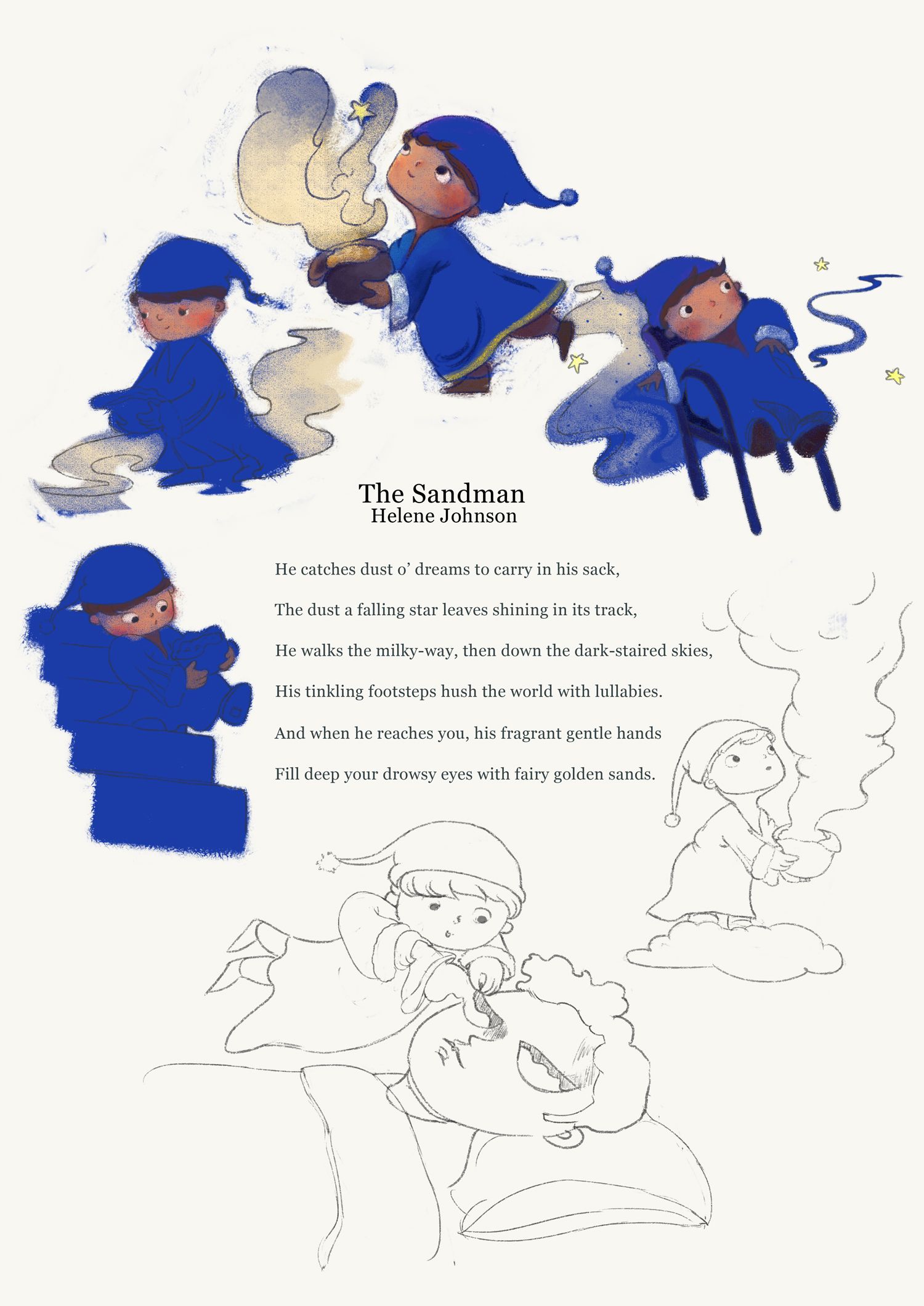
Almost done! Please feel free to point out if anything looks very out of place.
@MichaelaH Your note on moving the sandman (sandmen, lol) around helped so much. Thanks for that.
@NelsonYiap Thanks, Nelson. That's very kind of you.

https://www.instagram.com/sooryajart/
The Beatles: "Roll up, roll up for the Mystery Tour!"
-
@animatosoor I like this style of this book, it is really wonderful. Maybe I would move the right bottom sandman little bit down. so taht it isn't so near to the chair.
-
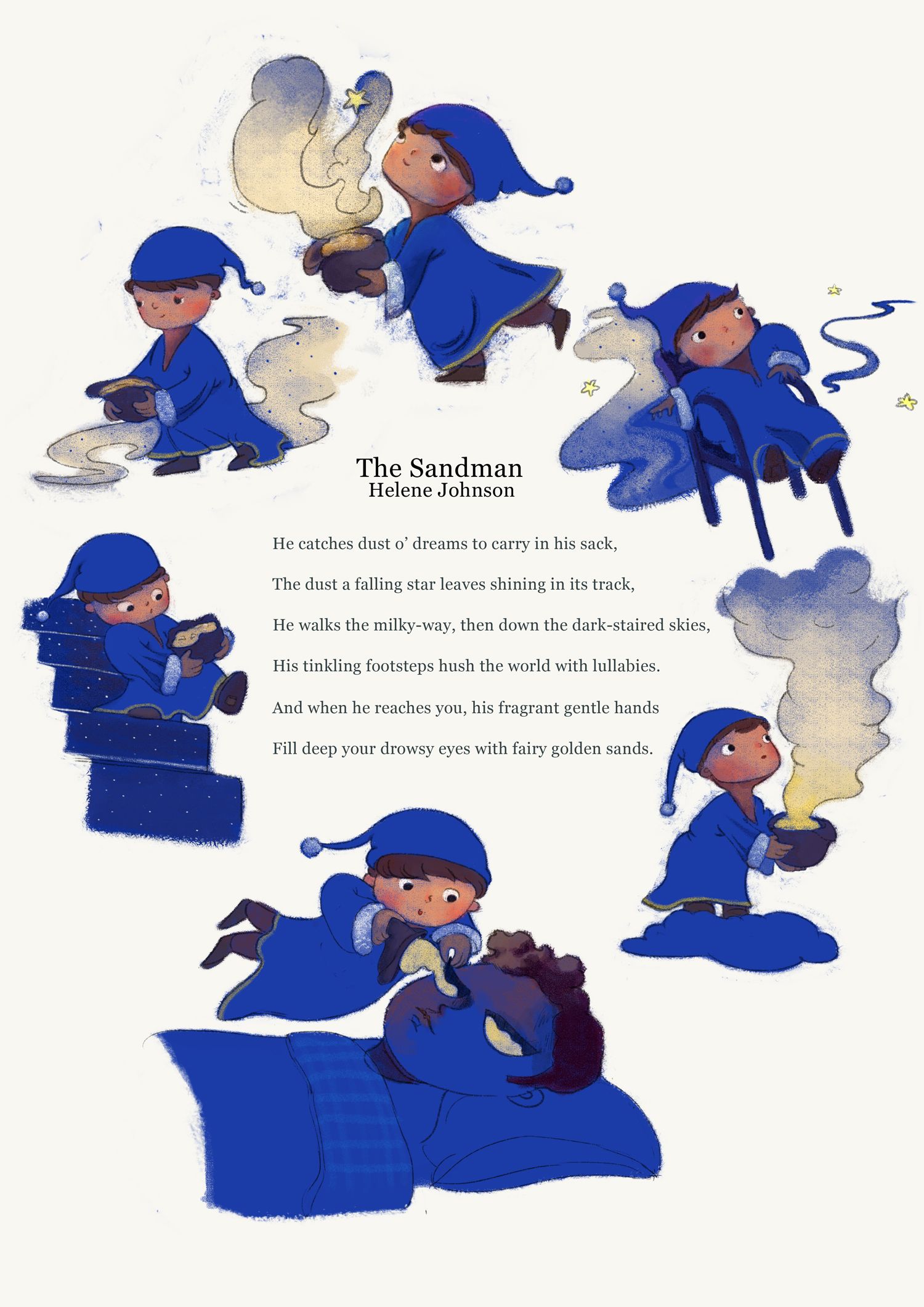
@MichaelaH Thanks once again! It's so helpful to hear notes on the arrangement, since after a certain point I feel like I can't really see what needs to be moved where anymore. I've moved it down to let it breathe a bit, and it does look better.:
-
@animatosoor I really love your use of colour and lighting. It’s great to see your process as well.
Keep going, you’re doing great

-
@sarahlawrence It means a lot to hear that, especially since colour/light has been scary for me to tackle. Thank you, Sarah.
https://www.instagram.com/sooryajart/
The Beatles: "Roll up, roll up for the Mystery Tour!"
-
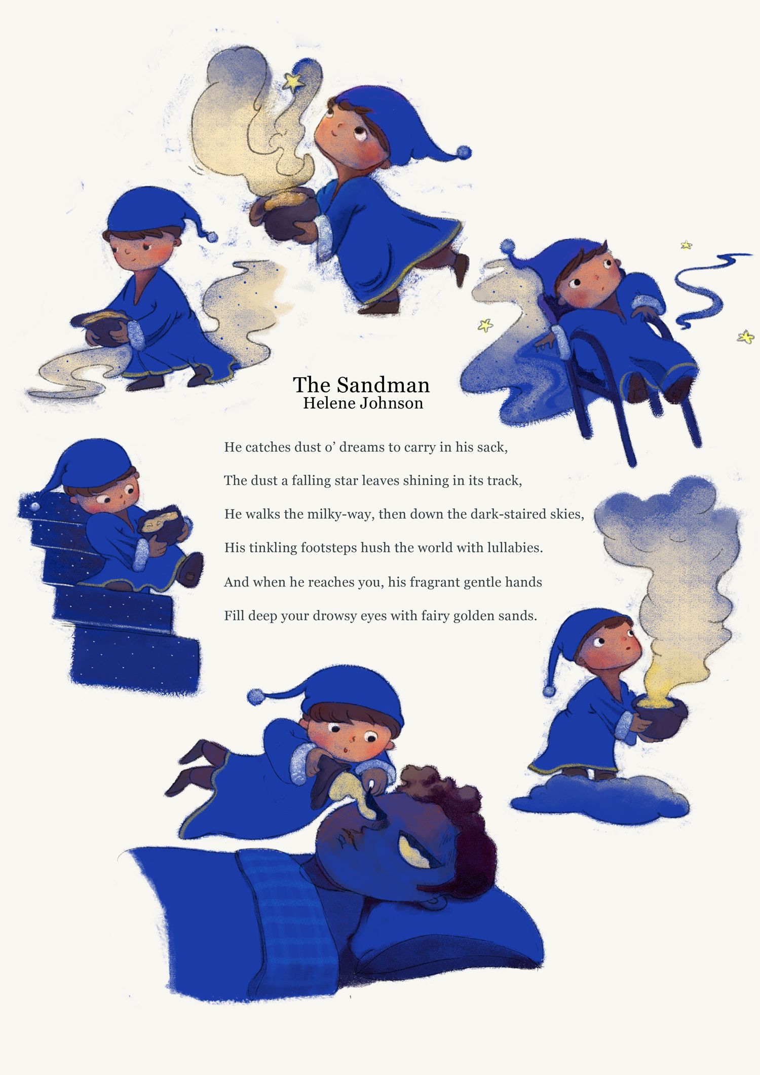
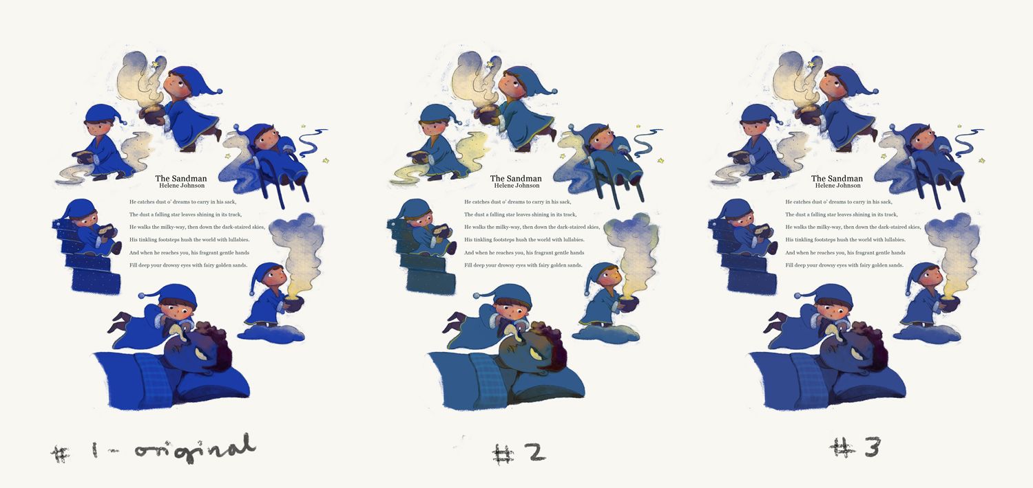
@animatosoor I love this! Do you work traditionally or digitally? The blue reads a little intense to me. If you work digitally, what might it look like knocked back just a bit? When I think of night and sleepy, I think a little more muted.
-
@Susan-Marks Thank you so much for your comment on the colour. It's weird, but it's like I threw those keywords (relaxing, dreamy, sleepy) completely out the window with the blue. XD
My painting is all done digitally. Your comment got me thinking, and I took your advice and knocked the blue back a bit to see what it looks like. I actually think I like the new versions better, particularly #3. What do you think?
https://www.instagram.com/sooryajart/
The Beatles: "Roll up, roll up for the Mystery Tour!"
-
Super cute. I love the shade of blue on version 3. Gives a night time feeling.
All my links: https://APHOTICMOTH.carrd.co/
-
@CLCanadyArts Hehe thank you, Cassandra! I'm also getting more of a night-time feeling from that one than I was from the original!

https://www.instagram.com/sooryajart/
The Beatles: "Roll up, roll up for the Mystery Tour!"
-
@animatosoor I think it's easier on the eyes as well, could be just me, but the original was harsh enough blue that I didn't want to look, insta headache, in print would probably be a lot different without the blinding backlight on my computer.
It would be lovely to see a little collection of pieces like this in a book.
-
I like the original strong bright color, but 3 goes also for me. I think the most ppl the original color is to strong, I found it very refreshing in the point, nobody else is doing it and I was drawn to it.
-
I like 1 and 3. 3 is a bit softer but 1 original blue brighter for me portrays a more active sandman -because it is about him and his daily duties.
Instagram: www.instagram.com/heatherboyd.illustration/
Website: https://heatherboydillustration.ca
Shop: https://www.inprnt.com/search/products?q=HeatherBoydIllustration
Ko-Fi: https://ko-fi.com/heatherboydillustrationBe blessed,
-
@animatosoor I think the color changes you're exploring think it's helped make your piece more dreamy. I like them both, with a #3 winning by a bit.
-
@Heather-Boyd interesting point--about keeping the active sandman brighter or more saturated than the sleeping man.
-
@CLCanadyArts Yikes, I didn't realise it might have been headache-inducing!
 Thank you for your input; I will be keeping it in mind as I choose colours in the future. Definitely learning with every new piece on this thread.
And yes, I am in the process of sketching new ideas for more poems I'd like illustrated, and eventually I'd want to compile them! It's nice to hear I won't be the only one interested in that outcome. :face_savouring_delicious_food:
-
@MichaelaH I appreciate that - thanks! I'll be going for #3.
@Heather-Boyd Thank you - that is an interesting take, and something for me to consider for my next piece.