Godzilla WIP. Feedback always welcome!
-
@Braden-Hallett
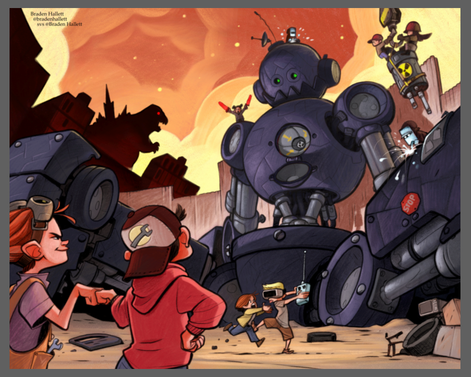
I like the purple sky. It’s both warm and cool and is a nice breather from the burning of the city but maybe have the kids in the foreground have the orange glow of the 5th work.
I so sorry if I’ve asked this before but how do you apply the colour on top of your black and white while keeping the pencil/brush strokes in your black and white, overlay is the only way I know, but your colours are much nicer?
Instagram: www.instagram.com/heatherboyd.illustration/
Website: https://heatherboydillustration.ca
Shop: https://www.inprnt.com/search/products?q=HeatherBoydIllustration
Ko-Fi: https://ko-fi.com/heatherboydillustrationBe blessed,
-
@Heather-Boyd I use a colourize layer. In Painter it effects only the hue and saturation leaving the values completely alone. So it's a lot like using an overlay layer while keeping the value at 128 except that I can just pick whatever colours I want instead of having to worry about the value of the colour I'm using
")
I'm pretty sure the comparable layer type in photoshop is a 'colour' layer. Though I could be wrong.
The trick I find is to start with fairly unsaturated colours (under 64 or so) and then pick things you want to shine through with higher saturation.
-
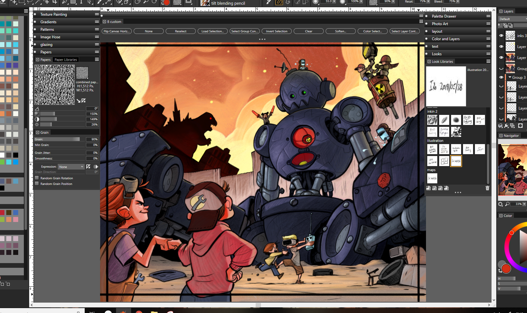
Picked some local colours keeping my basic colour study in mind. From here on out it's all on one colour layer with linework separate so time for painting with wild abandon
 Some things'll get brighter, some things'll get darker, and it'll slowly work its way to final.
-
@Braden-Hallett Love this!
-
Looking great, I'm always excited to see an update on this
-
Painting continues! I think the oranger sky says 'fire' more than the reddy/purple sky
That friggin' robot's got so many little bits... Ugh. Keep in mind, I haven't even started rendering any of the kids yet.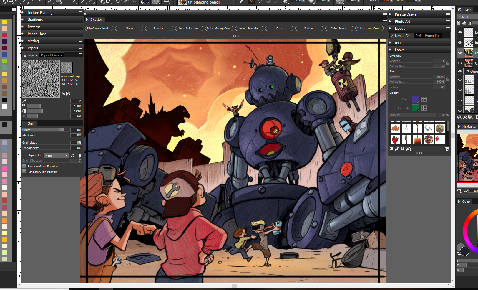
-
Next up I finished painting the last two kids, then flatten eeeeeeeeverything and do some fixes and glowies.
And then I think I'm close to done
-
@Braden-Hallett
The robots purple so there’s at least that.
Instagram: www.instagram.com/heatherboyd.illustration/
Website: https://heatherboydillustration.ca
Shop: https://www.inprnt.com/search/products?q=HeatherBoydIllustration
Ko-Fi: https://ko-fi.com/heatherboydillustrationBe blessed,
-
Amazing work man. You are a render-beast! Are you finished with the sky? It looks a bit cut out to me and different from the rest of the piece. A bit distracting even. Some kind of vortex of doom up there... Just an observation.
-
I love looking through your process of creating this piece! It's definitely a strong one! I really enjoy those two kids fighting over the remote.
-
@Braden-Hallett love how it is coming out... but something is not quite right with the colors. Unfortunately, I am not good enough to know what!?!?! It is driving me crazy.
I wonder if you changed the robot's plug to a neon (nuclear?) green instead of the red. I think the warm colors are over powering it.
I am sorry I can't pinpoint it. Something just feels off though.
Oh, on a side note, the texture on the robot's metal looks great the way you did it! Came through beautifully and is not distracting at all.
-The Prairie Fox
https://www.instagram.com/theprairiefox
https://www.theprairiefox.com -
I think I'm loving it @Braden-Hallett . Just one thing, can the circular red object be lowered in saturation or removed? I think it takes the attention away from the focal point.
Awesome process as well! Do you have a range of colors to pick from when going from grays to color? I find this process challenging for me : |
Great going..would love to see it finished!
-
@Heather-Boyd I may be slightly colour blind. He looks blue to me :smiling_face_with_open_mouth_cold_sweat: Either that or my monitor's not properly calibrated.
-
@bnewman Thanks
I am indeed done with the sky. I really want it to look like the city's being actively trashed. Lot's of fire 'n glowy smoke. -
@theprairiefox Something's always not quite right my my colours
I'm hoping with time and practice they'll be less likely to feel off. Either that or I need to steal more colour schemes :smiling_face_with_open_mouth_closed_eyes:I think you and @Darian are right, though, the red's way too much. I think the same grey as the rest of the robot innards'll work better.
-
@Darian Thanks! Right now the only thing I try to do all the time when it comes to colour is make sure I explore as many options as possible before committing (hence the several random colour studies). I try to keep things low-mid saturated so I have places to go and it's more likely to harmonize.
Other than that, everyone's got so much advice when it comes to colour it's hard to keep it all in the air. I either try to keep it as analogous as I can or I find someone else's work that has the colour scheme I like and 'borrow heavily'. I'm still tryin' to figure colour out
-
I missed the description on the contest page that says 'design a Kaiju to contend with godzilla'
 Not a Kaiju. Don't care. Still gonna submit For every giant monster there's almost always a giant robot anyways.
I'm gonna sit on it 'til tomorrow and after maybe a couple more minor changes I'll send it off.
Thanks to everyone for the feedback! This is always an awesome learning experience.
-
@Braden-Hallett Monster is a loose term, I think it counts, my boy as a toddler could be termed a monster on some days Lol Fantastic piece!!!!
-
@Braden-Hallett I like that much more... nice improvements.
-
@Braden-Hallett oops, I didn't read that part either... hopefully they are okay with more loose interpretations cuz this is an awesome piece.
Taylor Woolley
(Formerly Taylor Ackerman / StudioLooong)
Website: www.woolleystories.com
Instagram: https://www.instagram.com/woolleystories/