postcard design! Anythin' I'm missing?
-
@Braden-Hallett It looks awesome!
") Just don't forget to add in your phone number before sending it off... I once printed a whole 1000 batch of business cards with my (000)000-0000 as my phone number lol
Just don't forget to add in your phone number before sending it off... I once printed a whole 1000 batch of business cards with my (000)000-0000 as my phone number lolvanessastoilova.com
instagram.com/vanessa.stoilova/Check out my Youtube channel for tips on how to start your career in illustration! www.youtube.com/c/ArtBusinesswithNess
-
Looks amazing!
-
Your name needs to be nice and readable on the front!!
-
I don't know much about postcards, but can offer some advice just design-wise. First, I would get rid of your email on the front, keeping it as just a full bleed image of your work. So it would be just the back that has all your contact info. And then on the back I would get rid of the "Find more at" text. If you just have your email listed they'll know it'll be to your portfolio. Also think about your hierarchy: I would make your name the largest font size and the "illustrator" text a bit smaller so it's not competing with your name. To me these changes make for a cleaner design and gets rid of info that isn't necessary. Best of luck! I'm sure there's an art director that'd love to work with you!
-
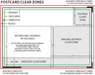
I second removing the text on the front, personally I don’t think it’s too much of a stretch for the AD to turn over the card to find your info, plus, USPS is most likely going to print a barcode right over that part of your card anyway. I know it says they print it on the back but so far of all the cards that have come back to me, they have it printed on the Front as well.
Taylor Woolley
(Formerly Taylor Ackerman / StudioLooong)
Website: www.woolleystories.com
Instagram: https://www.instagram.com/woolleystories/ -
@StudioLooong hmm more reason for me to try out my envelope design idea.
-
I am going to respectfully disagree with removing your name from the front. I have read many times in many places that you should always have your name on the front. You want your name to be associated with your images in a split second viewing before the postcard ends up in the trash. WELL, yours won't because this card is AWESOME. I would like you to inform us when you get a paying gig so we can all marvel at how fast it happened.

-
@Braden-Hallett I would definitely put your website or name on the front, why, because many editors have some "wall" where they put postcards they like, have it from a friend, who knows soem editor and than tehy don't want to look at the back, everytime they want to know the name. I would make it more simple on the back, no things like "contact me"... only instagram, email, phone and the website
-
@burvantill @MichaelaH
I always assumed the image should be left alone and be unobstructed by words, and if it packs a punch then it would be eagerly flipped over. But I'm also just starting to learn more about the business so I can see how having your name with your work would be easier for the people viewing it to make the image/name connection. I'll be sure to keep this in mind for when I get to the postcard creating stage!So if this is the case, and it helps ADs recognize your work easier, I would make sure your name is big and clear on the front so that it's easily read and purposefully placed.
-
I think this looks wonderful! Everyone is making very good points about the artwork on front, and I find I'm not really sure where I fall with regard to having your name on it...I'll leave that to your discretion.
As for your back, though, I would recommend cleaning up the design elements a bit. Center aligning your name and illustration can be a bit tricky when it's not actually center-aligned within the piece itself. I would recommend something like this to straighten up the hierarchy of your information (forgive my mouse-drawn bear):
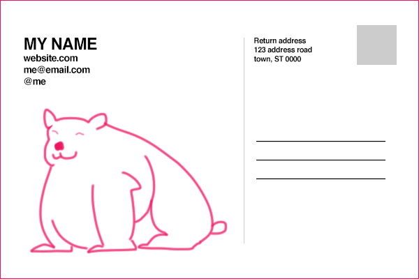
I know the back of the card is probably not going to be prominently displayed, but something like this will help to give your name and information the best real estate arrangement.
-
@NessIllustration That's a typo I could see myself making

-
Thanks for the feedback, everyone
Lot's to think about. I think I'm about ready to send them off to the printers after a few more small changes. -
Hi ! You have wonderful style, I love your illustrations! The only thing that I would change is the way the first illustration is cropped. It seems like the most important part of it is at the bottom and we can’t see it, on the other hand there is not much going on in the the upper part of the drawing. At the first glance I had a feeling that the image just fell down.
-
@Braden-Hallett @Braden-Hallett looks great! I do like your name on front and the alignment changes on back suggested by @thousandwrecks make it an easy read.