Going Digital ... Feedback, please!
-
Hello to all!
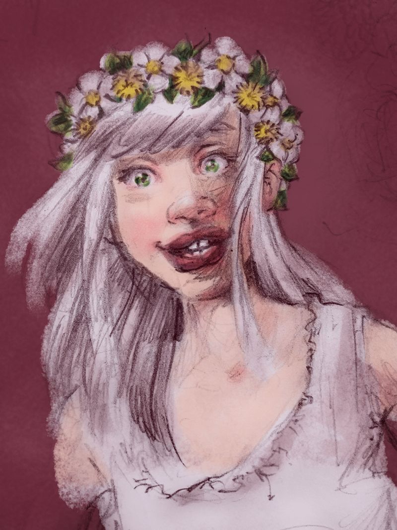
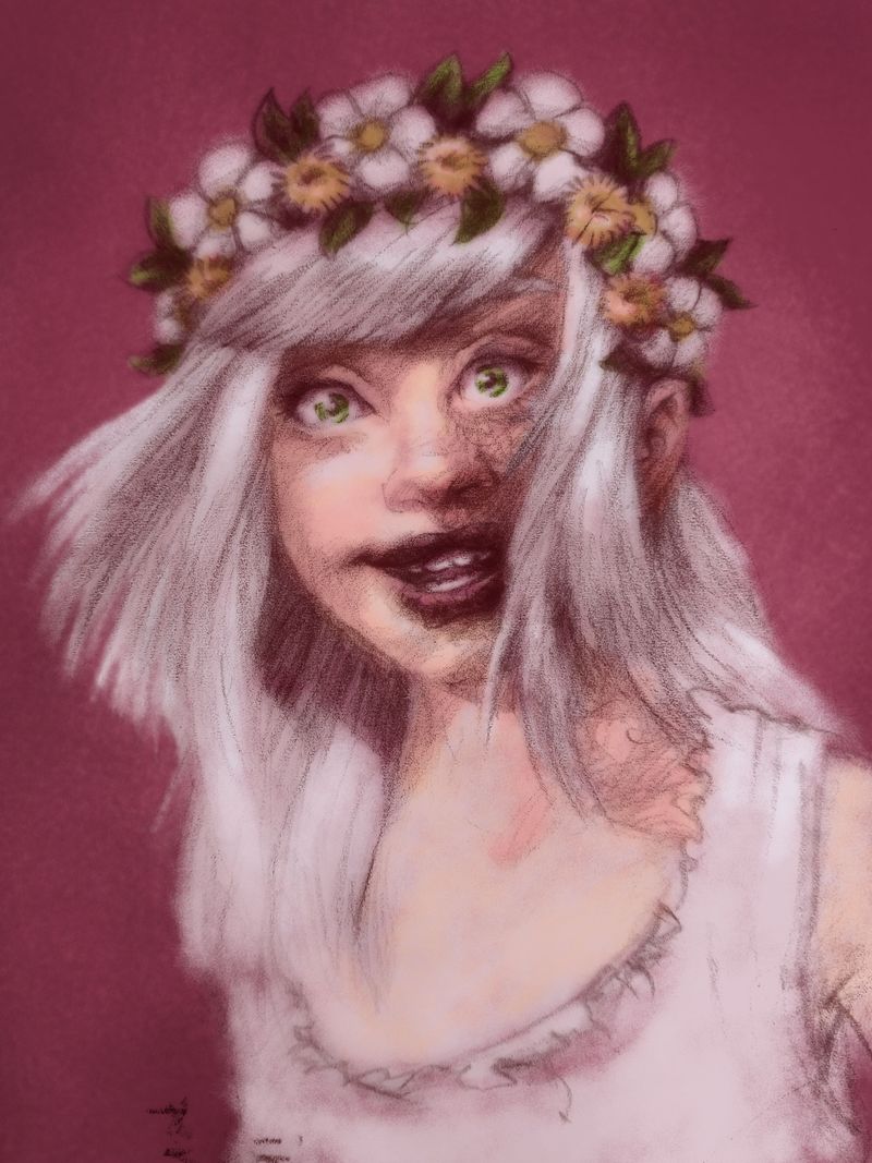
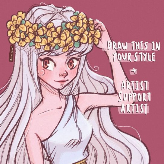
I am trying to get my digital workspace set up now. Have done some experimentation on a sketch and a drawing based on the same sketch (this was actually for a "Draw this in your style" Challenge without worrying too much about the original #chooosemi10k). The results are fairly different. I would like to know what you think. I don't see this style working together with my "old style" (I don't yet have a distinct style, but I hope you know what I mean).

-
Seems, like @Lee-White already answered to some of my doubts in his video about Slowvember. Thank you!

 I need to know where to go before I start walking.
 -
@Meta hi! What exactly do you want help with this illustration?
-
@Meta I like pencil work on top of solid colour but I think you may want to watch how dark some areas have become and work on what areas you want loose pencil and more restrained. Which one is yours or both?
-
I like your efforts here a lot. I like that original too. I am a big fan of letting the process show in the final art and this does that in a lovely way. For your painting, I think it's starting to veer into that "soft focus" look that digital tools can bring out so I would try to harden up your brushes and get crisp strong edges where you need it. Soft edges are fine for areas that bleed together or backgrounds, etc. but just watch out for getting too much of an "air brush" look.
Keep it up! I love seeing new work!
-
Thank you all for your feedback so far! I think my main process here is to figure out where to go. Or, in this case, to end up with an image that doesn't fit with what I want. Without really knowing why. And without knowing what I want. I guess I can only give this answer to myslef, instead of hoping to find it here

Both pictures I've posted are mine; not sure if I can actually post the original character from instagram - if not, please delete it! So this was the original DTIYS-challenge:

(credits to chooosemi)It doesn't really matter what the impulse was. I saw it, I liked the the flowers and wanted to draw this character.
@Heather-Boyd, Both are mine. It's intersting you mention the dark areas. I already broke it down a bit by giving the lineart some color instead of keeping it black. What is ist that you don't like about the dark areas? Is ist that the skin looks dirty this way?
@Lee-White said in Going Digital ... Feedback, please!:
so I would try to harden up your brushes and get crisp strong edges where you need it.
I can definitely try that with the same drawing. I also found the look of the second one very soft and wasn't sure if I like it or not
 I havn't drawn that way yet, so it's exploring the tools.
I've seen some of you guys putting together their dream portfolio. I've looked it up in the SVS classes and think it might help to figure out in which direction I want to go.
-
@Meta Thanks for clarifying that. I like your top one much better than the bottom. I like yours better than the original art!
-
@Meta the bottom one yes muddy where the mouth hits the darker scribbles. I really have to remember my screen is on a yellow tint. Maybe try a different colour pencil, a warmer colour, even a darker skin colour by slight notice or lightened the transparency of the pencil. I’m sure you will figure it out and like Lee said look forward to more.
-
@Lee-White said in Going Digital ... Feedback, please!:
I like your top one much better than the bottom.
Me too! And I usually like my sketches much more then the "final" illustration (if you call the bottom one final). Was the same with inktober, many times. I would like to transfer this easiness of lines, but I don't know how.
-
@Heather-Boyd I can still change the color of lines as they are on a seperate layer within a mask. Will post that another day. You don't have that impression with the one above?
-
@Meta a little but less so
-
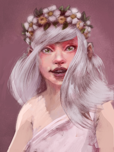
@Meta I think this is looking good! Not sure if you are looking for critique of the image or not? I did a quick cut and paste/draw over thing of your bottom image to show the three minor things I am thinking. It looks like maybe her left eye (our right) has been squeezed in a bit too close to the nose - possibly to fit the space left over by the hair. I duplicated the left side of the image and flipped it to give a symmetrical location for the eye - the other thing I was thinking was mentioned by @Heather-Boyd - I think in the case of skin tones it is pretty safe to go warmer as you go darker - I may have gone too warm in the cut and paste image but I think there is something worth exploring maybe (also sneaking the reds in as close to the green eyes as possible really made them pop (complimentary colors)) last think was the hair almost touching the edge of the canvas really grabs my eye so I warped it back on itself (I love procreate!) to get rid of the tangent - feel free to ignore this post of course
 just checked out your Instagram - some really nice stuff!
-
@Kevin-Longueil I caught the red complementary with the green right away lols. And I agree warmer can work. I wouldn’t ignore your comments.
-
@Kevin-Longueil Took a bit time to answer, sorry! Thank you Kevin, this is helpful! Critique is always welcome
 I am going to redraw her completely and post her here. Yes, everything was slightly squeezed, which I noticed when I mirrored her. I gave more space to the ear in the bottom drawing already. It was based on a really fast sketch.
Warmer skin tone in dark areas - this is interesting to me, because I used to choose a colder tone for shaded areas as this was what I learned to see. (reflection of blue sky light). I will experiment with that. Making the eyes pop =
@Kevin-Longueil said in Going Digital ... Feedback, please!:
just checked out your Instagram - some really nice stuff!
Thank you!