Discovering our style - Who's in?
-
@kat Cut the extra pieces out! It's so much fun once you get started!
@LauraA I was really surprised with how my dream portfolio turned out. I thought I liked color more. I haven't seen your dream portfolio but I can imagine all kinds of interesting combinations using these artists. It's really interesting.
-
So, do we post these here or create our own thread? I gather people are doing both.
Anyway, I think I just proved that I am stylistically confused
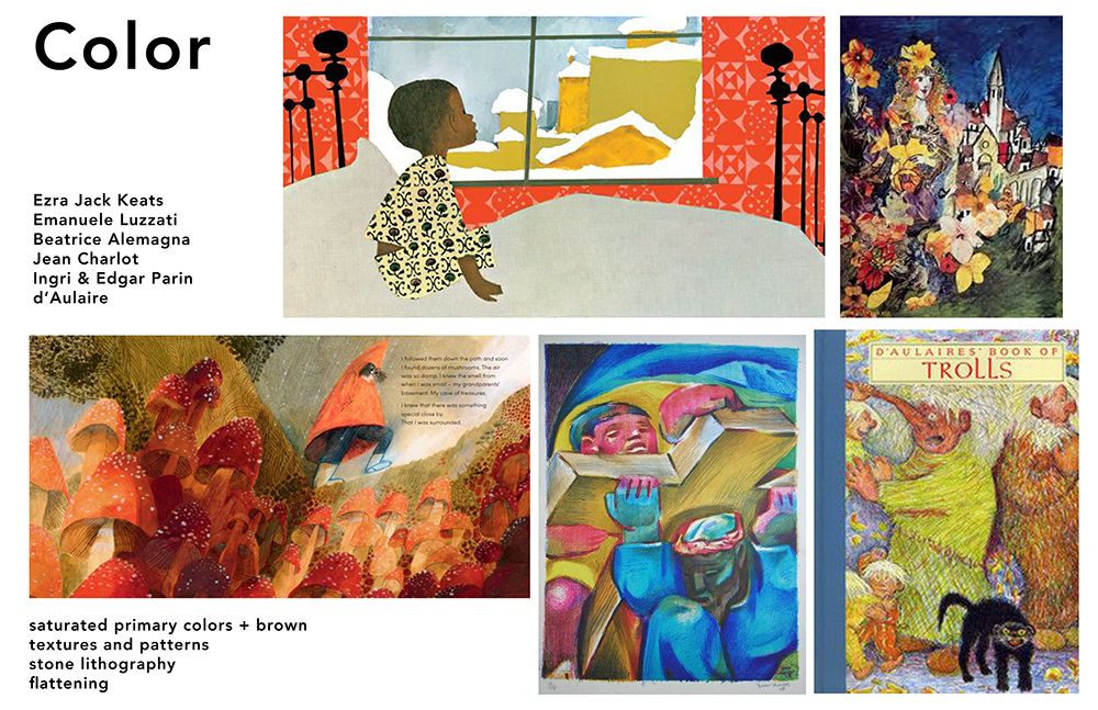
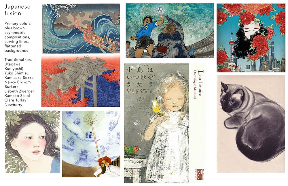
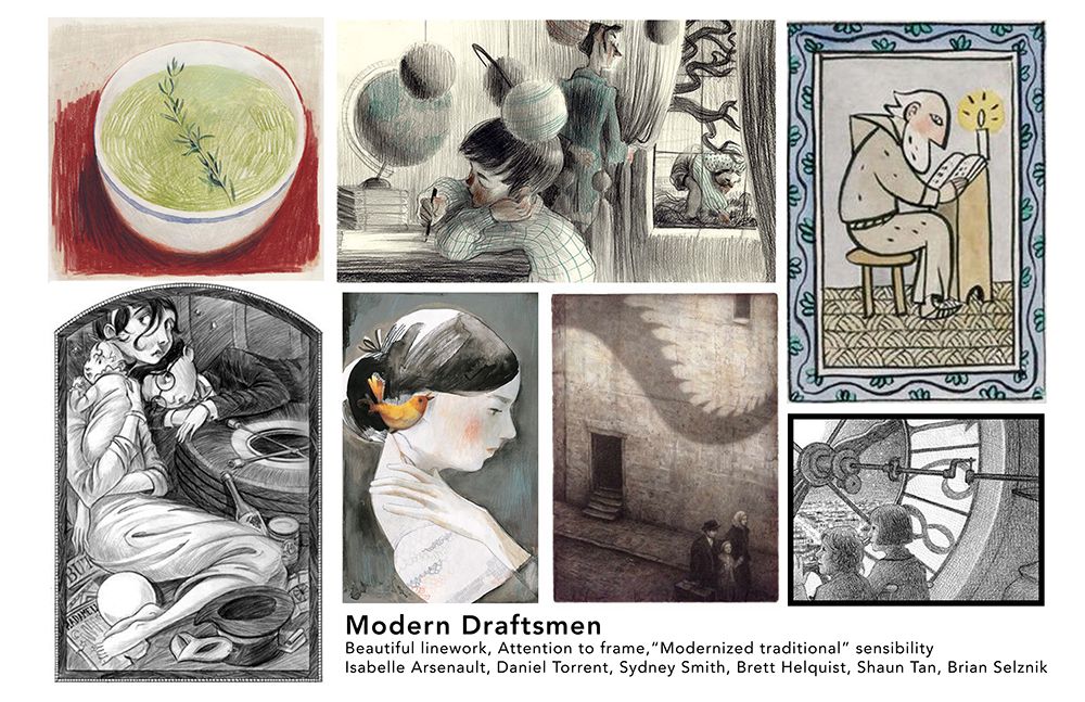
 . After culling and culling, I still have four boards! They total over 20, but I'm still going to put them up here to see if anyone can find what they all have in common. Here's the best explanation I can come up with:
-
The first set is the kind of illustrations I liked as a child, and they still have something I deeply long for in a book.
-
The second set probably have something to do with my studio painting degree. I love all the artists involved, but I probably wouldn't copy any of them directly. And I do love bright color, but then why are two of my other boards so unsaturated?
-
The third set (the "Japanese" one) is very near to my heart. It may even be my favorite. I can't figure out why, as I am not Japanese and have never even been to Japan. But I have also loved this kind of art since childhood.
-
The last set is my favorite modern illustrators. I have a great respect for all of them. How much will my style modernize to meet up with theirs? I don't know yet!
And finally, here is my Instagram account so you can see my work: https://www.instagram.com/lauraintorino/ My favorite posts are the Puritan girl, the man looking into the pond, Cosette, and perhaps the little boy with the blanket hair. But there needs to be more production!
Haha! If anyone wants to help me make sense of this, I'd be extremely grateful!

-
-
@Zachary-Drenski Just posted. I have a color/no color problem as well!
-
@Miriam said in Discovering our style - Who's in?:
I'm wondering if you might be "trying to hard" & are too focused on finding works to copy. Perhaps you could benefit from allowing yourself to relax more, and try gathering collections on boards for art that you don't necessarily want to copy, or do that style, but just like.
This is pretty much what I ended dup doing
") While the dream portfolio I ended up with isn't perfect it gave me a place to start (I'm gonna over the next month add and subtract images).
While the dream portfolio I ended up with isn't perfect it gave me a place to start (I'm gonna over the next month add and subtract images).But I was definitely overthinking it, lol
-
@Miriam Thankyou. I have done this before with my phone. I uploaded my own pics of a sewing technique I used for Boy Scout merit badges. I haven’t used it for anything else though. I forget about that feature.
 Thanx for the reminder.
 -
@LauraA @Zachary-Drenski seems to be a common theme these days...
-
@Braden-Hallett I'm working on mine again but yeah over a month -bringing in and taking out until I am more settled.
-
@LauraA Looking at your work and your dream portfolio a few words to describe them would be 'nostalgic, tenderness, and hand-made.' For some reason when I looked at your dream portfolio, Aaron Becker popped into mind as a possible combination of all of these (not saying you should emulate his work). Your work is really lovely, by the way, and am interested to see how you would handle more complex compositions.
-
Thank you for commenting - yes I need to find that exact pink paint!
I think illustrating people is a weak point of mine so I'm very drawn to images that do this well and in an interesting way. Definitely a priority for me to work on.
@Miriam said in Discovering our style - Who's in?:
I don't know much about color, but I am noticing a lot of bright colors, with somewhat subdued saturation. I especially notice the same Pink! in several of these images.
I'm also seeing that most of the images have people or buildings or other human objects. Only a few of them have only animals/nature.
Nicola Schofield
Twitter: twitter.com/NSchofieldArt
Instagram: instagram.com/NicolaSchofieldArt/ -
@LauraA lots of variety in your dream images as you say. The word that keeps coming to mind for them as a whole group is soft. I'm not sure exactly what I mean by that but somehow the images generally feel soft / calm / gentle. This is through the subject matter and composition (often figures looking away from the viewer - contemplative) but also through subtle texture, line work and blurring of objects / figures into each other though the same techniques and use of similar colours.
I see a lot of this in your Instagram images but not all - you have a mixture of soft and bold styles.
-
@LauraA In the end I think I got rid of the few images I liked but that looked out of place in the group. I will have to redo this exercise treating each image individually rather than in context with the whole portfolio. For now I am happy though and yes the pink / blue was a bit of a surprise because I generally don't like that combo. I need to do a master copy or two to really analyse it!
Nicola Schofield
Twitter: twitter.com/NSchofieldArt
Instagram: instagram.com/NicolaSchofieldArt/ -
Yes, I gathered all the images at the same time - it's just split in two for ease of posting here. I think I'm now going to do a few master copies to get a better feel for the colours. There are a couple of images that I really don't want to copy. I'm thinking I should remove these from the portfolio for that reason and replace them...
@bugeyefly said in Discovering our style - Who's in?:
@neschof Did you assemble the two boards at the same time? The second group feels much more of a piece to me than the first one. There are three in there at least that make use of the same complementary colour approach (blue-orange) for their mood. The range and depth of colour is greater in the first group and I can't see a pattern in the colours there.
-
Yes I see what you mean about Matisse!
Playful is definitely a word I would aspire to someone say about my portfolio so that's a good direction I'm headed
@chrisaakins said in Discovering our style - Who's in?:
@neschof I love your dream portfolio. I see a whole lot of lines used as texture and pattern and a lot of expressive movement. Your dream portfolio reminds me a lot of Matisse's work and has a playful feel to it.
-
@Zachary-Drenski Your dream portfolio is lovely and definitely a coherent set to send you off in a specific direction. When picking my images I also tried to only include one image per artist. I didn't stick to images from picture books but I only included images that I could imagine being included in a picture book. Some of my images are not exactly the perfect image that I love but are more just a sample of an artist where I like everything they do.
I decided to not overthink it and getting something generally good together was better than striving for perfection and not actually making progress.
-
@neschof I understand! I felt mine were incoherent as well and that's why I made four boards--each group had something in common but it was hard to find sense in the whole. I trust that in the end there is a good reason for all of our choices and I hope your master copies provide you the insight you are looking for.
-
@Zachary-Drenski Yes, I do like Aaron Becker's work! I love his sense of lighting, color, landscape and invention. I don't like his figures as much, which is probably why he didn't make the final cut. But I saw a portrait he posted on Instagram, and--wow!
I'm touched that you got the word "tenderness" out of my selections, and I hope that it's something I can eventually convey in my work. I do believe tenderness is something I try to convey both in my work and in real life. It's awfully underrated these days!
@neschof I think that's interesting that you noticed that all the figures are looking away from the viewer. It wasn't a conscious choice, but I looked, and there it is! I like "contemplative" as a description as well. I also like mischievous characters, but more the type of mischief that simply results from imagination and exuberance. I am aware of the texture choices, but can you give me an example of blurring so that I can see what you mean? Thanks!
-
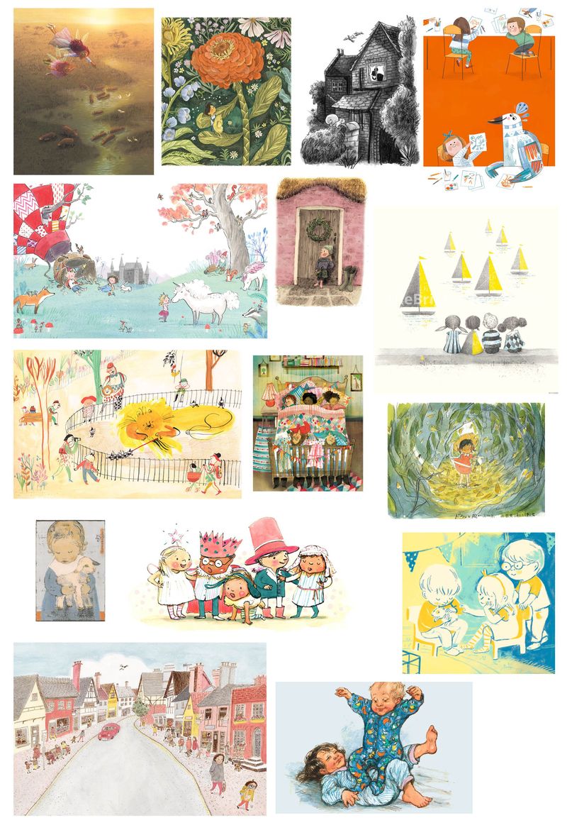
This is a great excercise! My dream portfolio is a work in progress but these are some pieces from artists I really admire at the minute. I'd love to hear anyones thoughts.
Artists: Briony May Smith, Emily Hughes, Alice McKinley, Laurie Stansfield, Becky Cameron, Fiona Woodcock, Cindy Wume, Katie Hickey, Miyazaki, Lee Komako Sakai, Eve Coy, Robyn Owen Wilson, Shirley Hughes
Instagram and Twitter: @eriberart
Website: www.erinmcclean.com -
I think blurring was maybe a poor choice of word by me. I meant that objects/backgrounds next to each other often have similar colours and textures - it seems purposeful to make you look closer at the images and gives them a slight dream like quality - like the objects are made of smoke and you can't quite hold onto them. Of course it could also just be that these images are quite small, I'm reading too much into them and the full size versions would not have this effect

@LauraA said in Discovering our style - Who's in?:
@neschof I think that's interesting that you noticed that all the figures are looking away from the viewer. It wasn't a conscious choice, but I looked, and there it is! I like "contemplative" as a description as well. I also like mischievous characters, but more the type of mischief that simply results from imagination and exuberance. I am aware of the texture choices, but can you give me an example of blurring so that I can see what you mean? Thanks!
Nicola Schofield
Twitter: twitter.com/NSchofieldArt
Instagram: instagram.com/NicolaSchofieldArt/ -
@eriberart The words that instantly came to mind as I saw the images were fun, whimsical, light, airy, carefree. Generally light colours applied sparingly. And they all feature young children drawn in a similar way - similar proportions / silhouette.
Nicola Schofield
Twitter: twitter.com/NSchofieldArt
Instagram: instagram.com/NicolaSchofieldArt/ -
@neschof No, you didn't make a mistake. I got what you meant more or less, but just wondered what specific examples you were thinking of. I think the de-emphasis of background objects is purposeful, or at least it's a technique portraitists learn in order to draw attention to the subject. Sargent was quite a master of it!