Society of Visual Storytelling

    SVSLearn Forums

    • Register
    • Login
    • Search
    • Recent
    • Tags
    • Popular
    • Users
    • Groups
    • Search

    Help needed for House Color

    Artwork
    10
    16
    767
    Loading More Posts
    • Oldest to Newest
    • Newest to Oldest
    • Most Votes
    Reply
    • Reply as topic
    Log in to reply
    This topic has been deleted. Only users with topic management privileges can see it.
    • Nyrryl  Cadiz
      Nyrryl Cadiz SVS OG last edited by

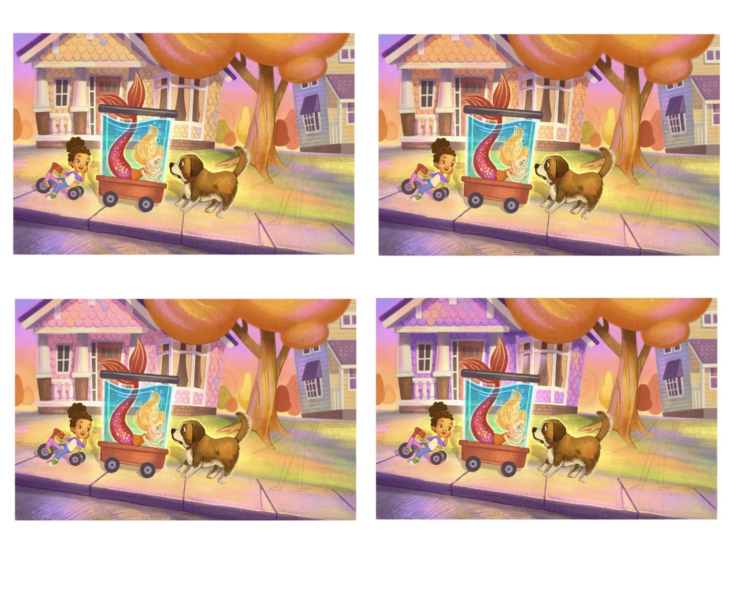
      Hi, everyone! I need your opinion. I’ve been working on an illustration. I can’t decide on the color for the house behind the kids. Originally it was that purple one below but someone suggested I should try another color. I’ve come up with four choices below. I need your help deciding on which one. What are you thoughts guys? Thank you so much.

      7AAE59E4-89B0-419D-852C-3178FE6C7101.jpeg

      Portfolio: nyrrylcadiz.com
      Instagram: https://www.instagram.com/nyrryl_cadiz/
      YouTube: https://www.youtube.com/channel/UCbJCF1Im8ZO7hpGWTKOJMuA

      peteolczyk Laurel Aylesworth 2 Replies Last reply Reply Quote 0
      • eriberart
        eriberart last edited by

        I prefer the first image (yellow house.) The pink and purple versions draw your eye to the house when it isn't really the focal point of the image

        Instagram and Twitter: @eriberart
        Website: www.erinmcclean.com

        1 Reply Last reply Reply Quote 1
        • burvantill
          burvantill Moderator last edited by

          If you use color theory then a light red orange would probably be the best choice so I’m leaning towards orange house but since your mermaid is already in the reddish orange hue that would compete with her and you have yellows and oranges in the children, so I think your purple is a good choice too, it’s just too bright, too saturated. If you desaturate the purple it might still work.

          Lisa Burvant
          www.lisaburvant.com
          Instagram & Twitter & SVS: @burvantill

          1 Reply Last reply Reply Quote 1
          • peteolczyk
            peteolczyk @Nyrryl Cadiz last edited by peteolczyk

            @Nyrryl-Cadiz personally I prefer the second choice as the saturation level looks more in keeping with the other colours. Nice work Nyrrly.
            (Top right)

            www.peteolczykillustrations.com

            www.instagram.com/pete_illustrations

            1 Reply Last reply Reply Quote 1
            • CosmoglotJay
              CosmoglotJay last edited by

              Mark me down as in favor of the orange house.

              Jay Douglas Rumisek

              www.instagram.com/CosmoglotJay
              www.CosmoglotCreative.com

              1 Reply Last reply Reply Quote 1
              • Suji Park
                Suji Park last edited by

                My vote is for the second orange house! lovely.

                www.sujisuji.com
                instagram.com/sujiparks
                SCBWI member

                1 Reply Last reply Reply Quote 1
                • Laurel Aylesworth
                  Laurel Aylesworth @Nyrryl Cadiz last edited by

                  @Nyrryl-Cadiz I dig the bottom left because cool colors recede and it lets us focus on the foreground characters. Ah, choices 🙂

                  www.laurelaylesworth.com
                  instagram.com/laurelaylesworth

                  1 Reply Last reply Reply Quote 2
                  • braden H
                    braden H last edited by

                    Cute stuff 😃

                    My vote's for the top left. I'd go in whatever direction helps to contrast against that mermaid's tail. So I might knock the house back even a bit further (or just have a slight halo around the tail).

                    Honestly enough, though, I kinda like the original purple (or the pinkish one beside it). This seems like it wants to be a colourful piece!

                    1 Reply Last reply Reply Quote 1
                    • deborah Haagenson
                      deborah Haagenson last edited by

                      I actually prefer the pink. I agree that the purple might take the focus from the kids, but I think the pink enhances it, by making the background behind the kids stronger. It kind of keeps your eye in the picture.

                      1 Reply Last reply Reply Quote 1
                      • Nyrryl  Cadiz
                        Nyrryl Cadiz SVS OG last edited by

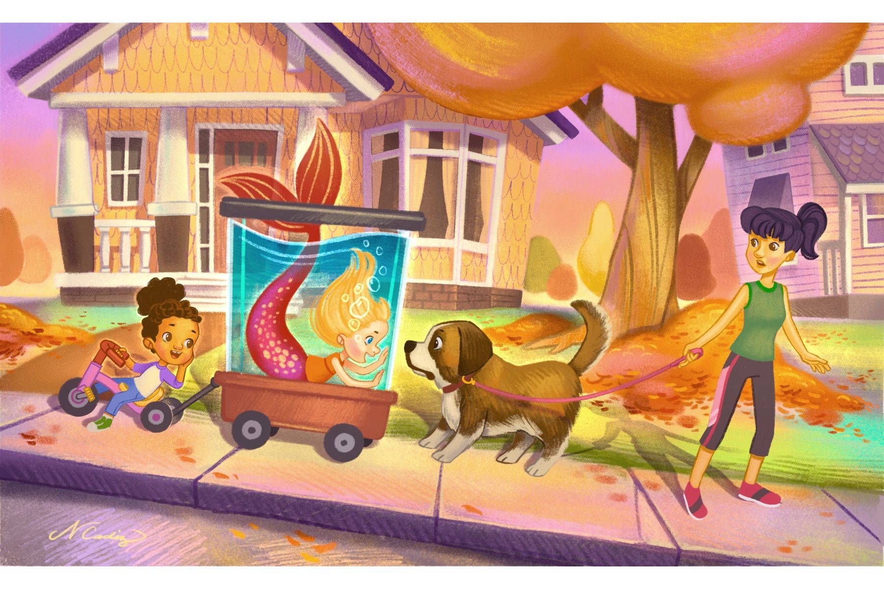
                        Hi, everyone! So I decidedto go with the orange/yellow color. Thank you so much for the help.

                        51C87FD1-75F2-49B7-B1EF-C3D4FF0F7D68.jpeg

                        Portfolio: nyrrylcadiz.com
                        Instagram: https://www.instagram.com/nyrryl_cadiz/
                        YouTube: https://www.youtube.com/channel/UCbJCF1Im8ZO7hpGWTKOJMuA

                        braden H 1 Reply Last reply Reply Quote 3
                        • Nyrryl  Cadiz
                          Nyrryl Cadiz SVS OG last edited by

                          @eriberart @burvantill @CosmoglotJay @Braden-Hallett @deborah-Haagenson @Laurel-Aylesworth @peteolczyk @Suji-Park Thank you so much for your help guys!

                          Portfolio: nyrrylcadiz.com
                          Instagram: https://www.instagram.com/nyrryl_cadiz/
                          YouTube: https://www.youtube.com/channel/UCbJCF1Im8ZO7hpGWTKOJMuA

                          1 Reply Last reply Reply Quote 2
                          • deborah Haagenson
                            deborah Haagenson last edited by

                            It looks great! I love your rendering style too. I am just starting to work with digital, so my style needs a lot of work. Being able to see work like yours is an inspiration!

                            Nyrryl  Cadiz 1 Reply Last reply Reply Quote 1
                            • Nyrryl  Cadiz
                              Nyrryl Cadiz SVS OG @deborah Haagenson last edited by

                              @deborah-Haagenson thanks!

                              Portfolio: nyrrylcadiz.com
                              Instagram: https://www.instagram.com/nyrryl_cadiz/
                              YouTube: https://www.youtube.com/channel/UCbJCF1Im8ZO7hpGWTKOJMuA

                              1 Reply Last reply Reply Quote 0
                              • braden H
                                braden H @Nyrryl Cadiz last edited by

                                @Nyrryl-Cadiz Nice! I really like how it turned out 🙂

                                Nyrryl  Cadiz 1 Reply Last reply Reply Quote 0
                                • Aaron_T
                                  Aaron_T last edited by

                                  @Nyrryl-Cadiz That color looks great!

                                  https://www.instagram.com/aaron_t/

                                  1 Reply Last reply Reply Quote 0
                                  • Nyrryl  Cadiz
                                    Nyrryl Cadiz SVS OG @braden H last edited by

                                    @Braden-Hallett @Aaron_T Thanks, guys!

                                    Portfolio: nyrrylcadiz.com
                                    Instagram: https://www.instagram.com/nyrryl_cadiz/
                                    YouTube: https://www.youtube.com/channel/UCbJCF1Im8ZO7hpGWTKOJMuA

                                    1 Reply Last reply Reply Quote 0
                                    • First post
                                      Last post