Composition practice - critiques appreciated
-
I signed up to schoolism to try out their classes, specifically nathan fowkes classes but there are some others that i might try. Like Terry Whitlach. The first one im doing is “Self Taught Pictoral Composition”
One of the assignments is create 5 of your own comps based on “unity and variety” which I’m still struggling to understand a bit but I’m gonna do it anyway!
But if anyone that has a better grasp of composition can help me with any input it would be greatly appreciated.
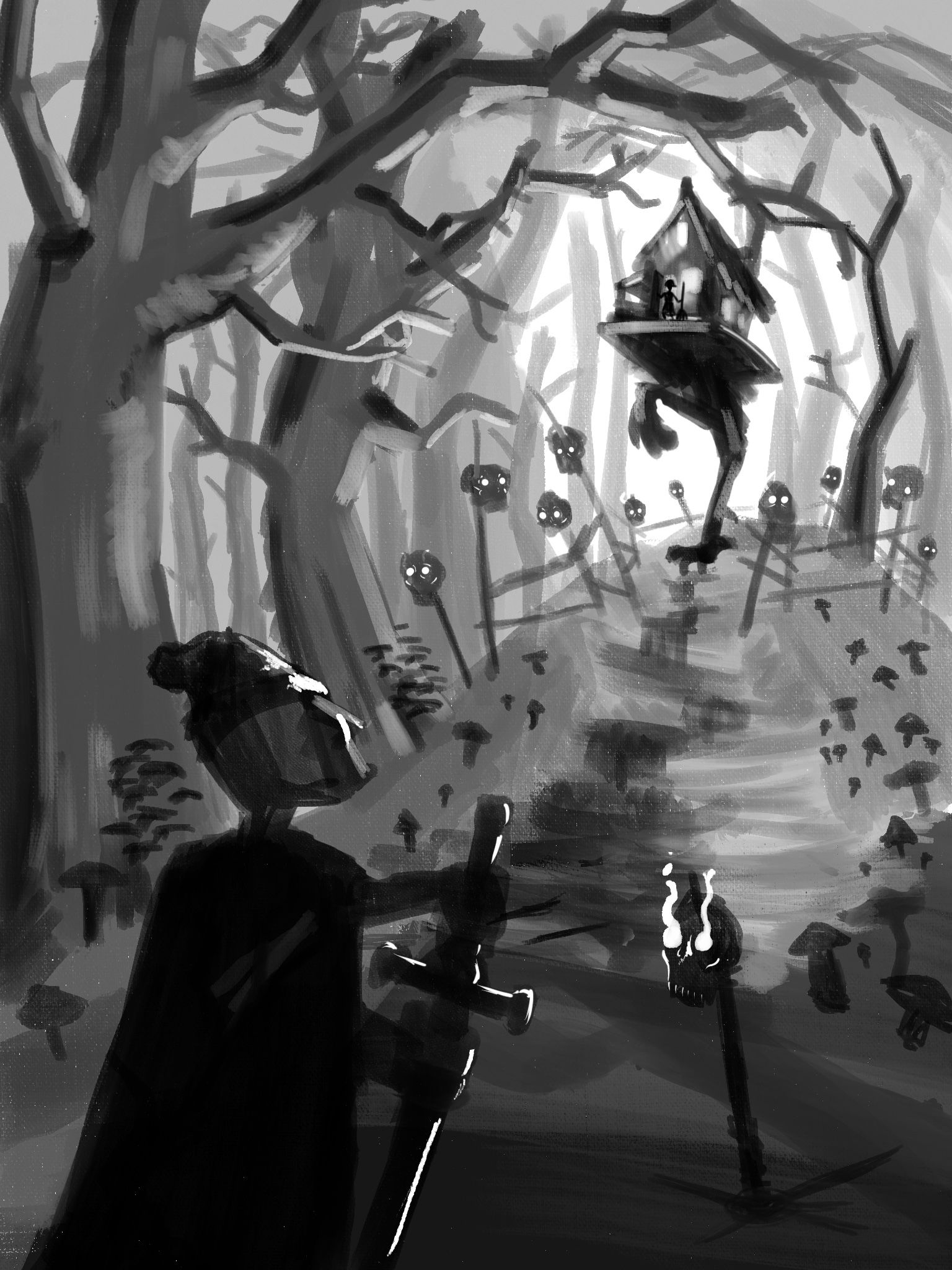
Here’s my first one
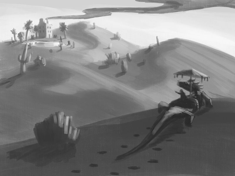
instagram and twitter: @artofaleksey
alekseyillustration.com -
Oh man, I literally ended the critiqued session for this course in december, so you actually are able to see my feedback videos

As a course veteran, lemme help ya out here
This is looking dope, really. I like the idea and that big lizard and I am happy to see that you're approaching it the correct way and making it sketchy and not all refined. I've seen way to many folks doing things that looked almost finished when they were supossed to deliver some thumbnails.
I have spare half an hour so here's a quick and very rough paintover.
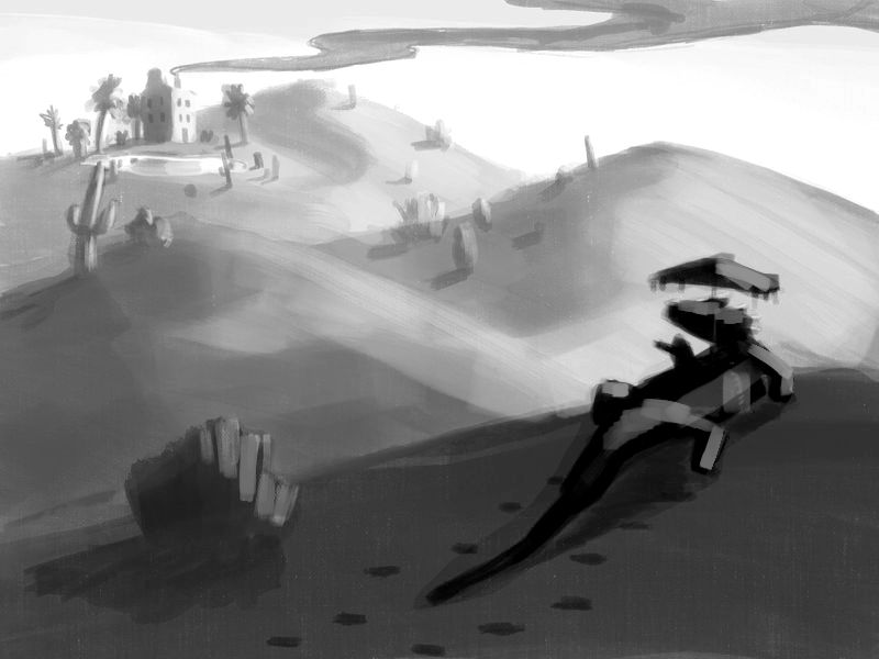
I don't know your exact aim with this one so I don't want to push my solution through as THE RIGHT ONE... however, when I looked at your comp I got this unpleasant grey blob feeling that Nathan sometimes points out in the videos. It all kinda blends into one grey value that doesn't quite reach black or white and is lacking the punch.
This scene has some epicness to it, so pushing the contrasts increases the drama nicely.
I also introduced some atmosphere in there, to further separate the background from the forground.Last but not least, I really thing that this bush on the left, while it works nice as tool of balance, doesnt need those extra highlights you've added. I mean, there are some lighter brush strokes on it that I find unnecessary, so I pushed that back a little.
That being said, while I don't consider myself to be a noobie, I am also NOT a teacher or any big industry professional, so take everything I did and said with a grain of salt. There is a chance that some corrections I had made go against your intial idea for the piece.
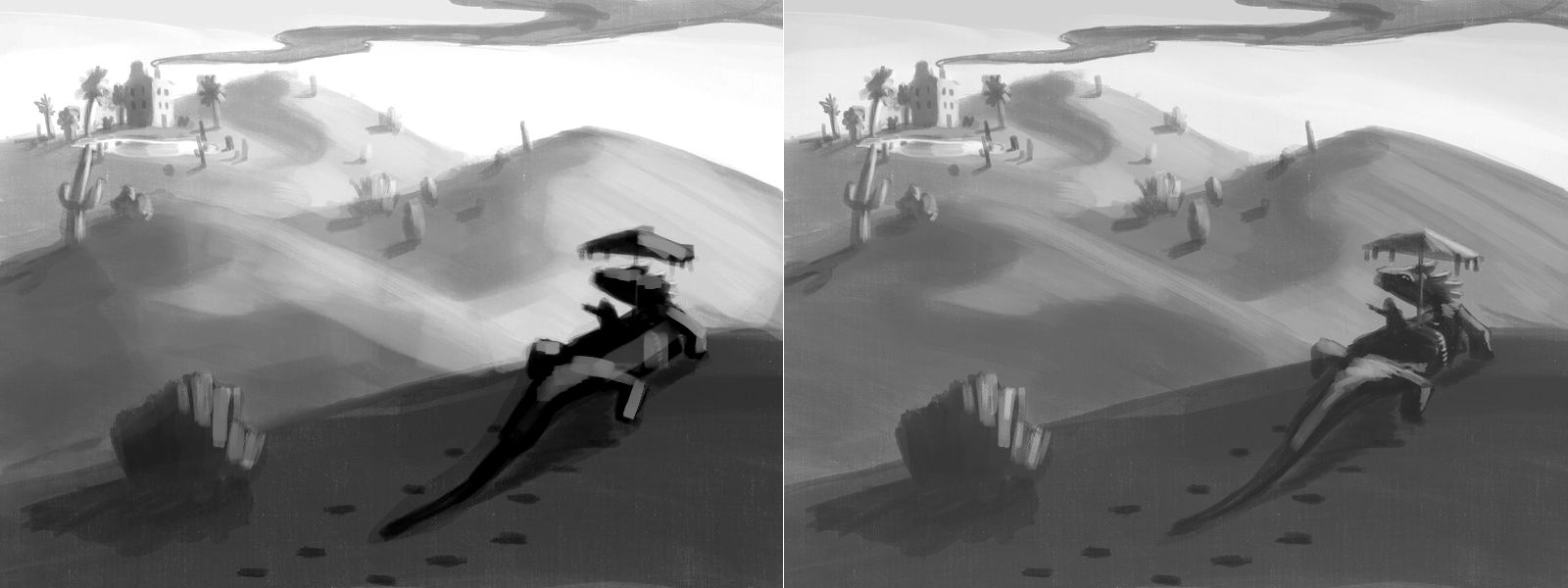
Grab this comparison, buddy!
It ain't much but maybe I was able to help somehow. Can't wait to see you progress through the course. It's been hell of a ride for me and I am eager to see how you handle it
-
I don't have a strong understanding of composition so take what I say with a pinch of salt. I feel like the smoke coming from the house is a little distracting as it pulls my eye out of the frame. Other than that I think it's a strong comp. I hope that helps and I look forward to seeing this piece develop!
-
@IanS thanks yeah i can totally see that!
@IgorWoznicki this is veryy helpful. Now that i did this one i feel loosened up to do other ones. Thank you.
-
Here’s a second composition
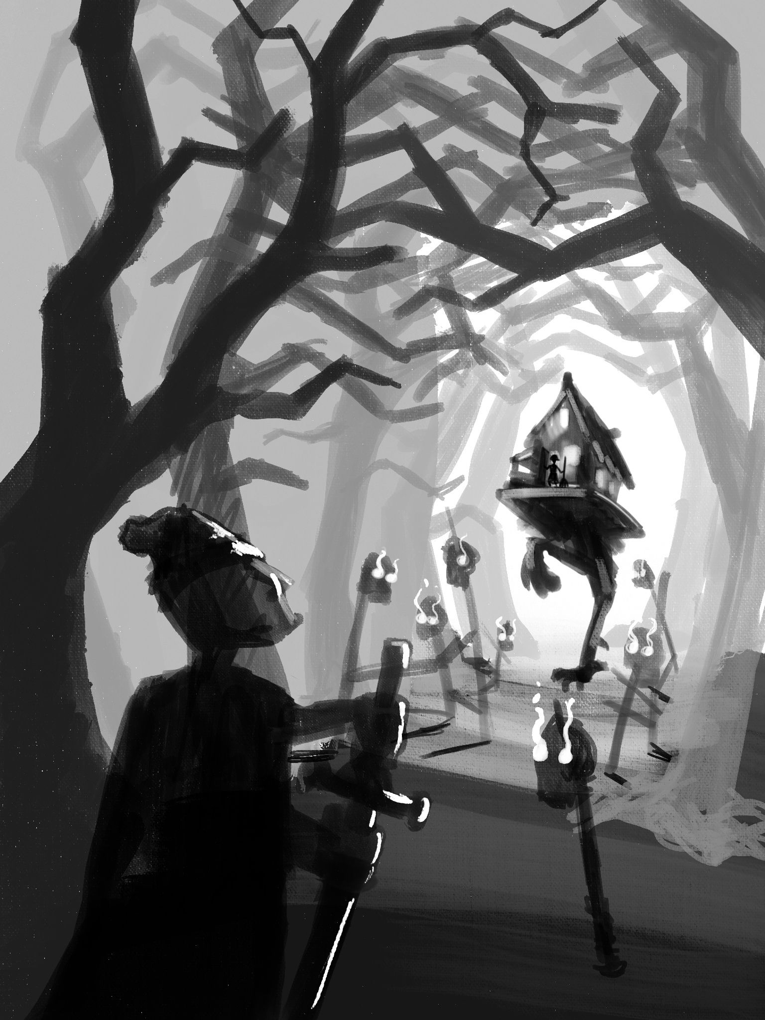
instagram and twitter: @artofaleksey
alekseyillustration.com -
@Aleksey the drama in this piece is really cool. One thing I teach my students is to think how every mark or object tells the story. Your branches are getting a lot of my attention. The lines cause my eye to stay up in them rather than circling back to the warrior and house thing. Have you done Will Terry's composition 2.0 class? If not I highly recommend it.
-
@chrisaakins yes I have the issue im having with the branches is im not very good at trees. I was trying to make them look like spooky branches that create an archway around the baba yaga house. Maybe I should reduce their contrast and curve them a bit more
edit: i reread what you said and I think i know how to fix this, thank you!
-
I'm kind of weak on composition ( working on it tho) so no constructive comments but I like the depth you've got going on. I can see changes in your work. Also the Christmas one you posted recently with the hills in the background was very nice too!
-
@Coley aw thanks. Yeah ive been getting better at depth it’s only a matter of time before i tackle composition
-
Ok i worked on number 2 a but more. I think im really happy with it.
instagram and twitter: @artofaleksey
alekseyillustration.com -
Alright heres my third one
-
@Aleksey I'm interested in doing the terryl whitlatch course at some point. Looks great
-
@Coley yeah me too!
-
@Aleksey This is really great. The use of light in the composition is amazing!
-
@Kalimostlypaints is it? Ty because im having a really hard time with it
instagram and twitter: @artofaleksey
alekseyillustration.com -
@Aleksey Yes, it has great contrast and leading lines.
-
@Kalimostlypaints thank you i really appreciate that, glad im making progress cause composition is very hard for me