Book Cover WIP: Mrs. Frisby and the Rats of NIMH
-
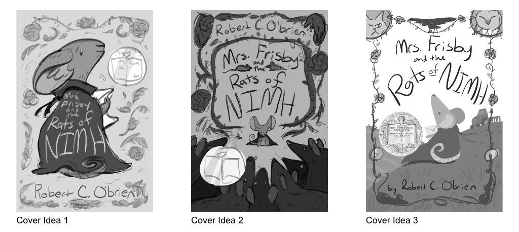
I'm working on a cover redesign for Mrs. Frisby and the Rats of NIMH for my portfolio. Which one of these options feels the strongest? All three designs will have some sort of rose-thorn-vine-leaves design. Since this is a Newbery medal winner, I incorporated the seal into the design as well.
I'm partial to #1 because of its simple design.
Edit: The book is about a mouse, Mrs. Frisby, who has a sick child who cannot be moved, but it is spring and the farmer's plow is going to destroy her house. She seeks the help of the rats in the rosebush, who are an escaped group of lab rats and much smarter than usual. She makes friends with a crow, gathers courage to talk to an owl, and faces the farmer's cat, Dragon.
Keywords: courage, heartwarming, adventurous.
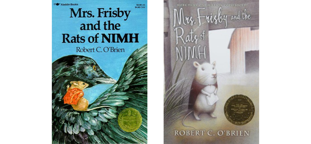
Old covers:
-
I am not familiar with the story. What kind of vibe do you want the cover to have?
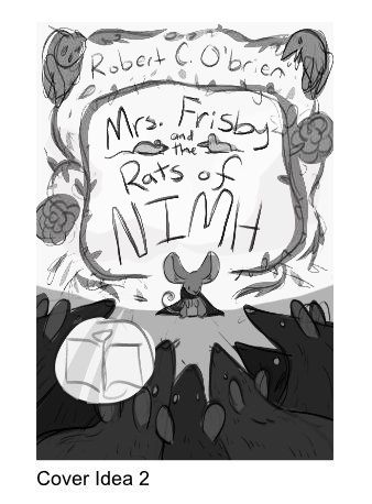
#1 and #3 give a sense of wonder, warm feeling. #2 feels a bit threatening just by looking that the layout (all the triangular shapes pointing the main character). -
@carriecopadraws I think 3 works best. The way she is looking up at the crow really works. The combination of the border with this simple scene is so clever for representing the book! But I'm not sure about the two circles going into the corners like that. Also the newberry medal might be best in a lower corner covering a part of the border that's not as important, because right now, it's blocking my view of the horizon. So with the three circles placed that way, it becomes too much of the focal point, and the border can be more asymmetrical. Also, the crow is dead center, and creates a horizontal line, so maybe he can be placed differently to look more dynamic.
-
@xin-li I edited my post to include a summary of the story. The story has both danger and wonder, so I wanted an option for each!
Carrie Copa
https://carriecopadraws.com/ -
@carriecopadraws after reading the book description. I think I would try to develop #2 (dangerous courage), maybe also #3 (courage and wonder).
-
I think the first one is a little vague compared to the other two. My preference is number 2 but I agree that you maybe need to develop it a little so the rats don't look as threatening. Number 3 is also lovely and conveys a sense of adventure but I think 2 best illustrates the story.
-
I loved this book and movie as a child! Something is drawing me to 3 but it depends, as others have said, on the atmosphere you're trying to convey. There's something nice and calm about 3. I would flip the direction the mouse is facing though. By facing towards the right you are almost subconsciously encouraging someone to turn the page and open the book.
I also like 2. It's very dynamic, I think it could make a great spot illustration from the book (obviously taking out the title etc). The pointed rats faces facing towards the small mouse is great.
-
One if my favorite childhood books! I really like the idea of number 2. I think it captures the essence of the story. But I agree - definitely work on making the rats look non threatening.
-
2 looks the best to me, the composition is pleasing and it captures the story and the characters' relationships best out of the three. Only thing I would suggest is maybe removing the two small rats/mice by the title words "and the", Initially I wasn't really sure why they were there or if they were a part of the larger illustration. The rosebush border with the crow and owl is really cool!
-
Thanks for the feedback everyone! I thought #3 was the most "boring" idea because it's a mouse in a field pretty much, I was surprised to see many people gravitate to it. But the design is reminiscent of old classic tales. I think #2 might be the more interesting concept, and will play around a bit more with the composition and shapes.
-
@carriecopadraws Hi!I think version 3 works with me a lot .though it seems like a bboring idea like you said, the use of negative space really makes it interesting! With that being said, B is a pretty nice idea ,but i think you have to incorporate some kind of negative space to it..
Just my opinion on this!!thanks for sharing!
PS : Something like this,with the sky creating the negative space or something like that.
Hope I helped you even a little!
Instagram : https://www.instagram.com/g.chris.artwork/
Deviantart : https://www.deviantart.com/g-chris -
@Georgios-Christopoulos Maybe a better word is that #3 felt cliche to me, not boring. But if so many people like that one it must have a strong composition! Perhaps I will develop that cover instead. I appreciate everyone sharing their views.
Thanks for the updated #2 concept! You're right that it probably needed more contrast. The rats in the story live in a rosebush so I was going for dark tones, but it was probably too dark. In fact your updated look reminds me of concept #3 and how the values work well on that one - a sense of adventure, but not too dark and scary.
-
I’ll put in another vote for 3. I think the contrast is nice and you have a clear focal point. I didn’t notice the crow in it though (looking on a phone). If you want that as a point of emphasis you might want to make it a little more clear or just unclutter the top some. I thought the mouse was looking up at the title until one of the other comments mentioned the crow.
-
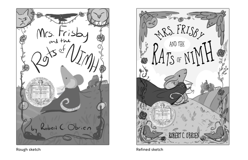
I refined cover idea #3 with your feedback! I think it's looking promising, I'm glad you guys helped me pick the cover to go forward with. I changed the top part of the design to artistic representations of the crow and owl from the story. (Mrs. Frisby is still looking at her friend the crow.) The rose/vine design borders the cover with space at the bottom for the author's name, and two rats in the lower corners. I kept the scene background fairly simple so the border will stand out.
Thoughts on this? I know the mouse's red cape is too long to be realistic but it reminds me a of a super hero cape this way. And draws the eye to her.
-
I really like that refined sketch.
-
This is phenomenal! I love everything about this. It's so whimsical.
As for the cape, I would be interested in seeing a color comp. Because the red is such a strong color, I suspect the image might look totally different in color vs. black and white.
Bailey Vidler
Portfolio: baileyvidler.com -
@baileymvidler Thank you, color studies are next! I wanted to nail down the composition and rough values first. If it works in greyscale it's more likely to work in color.
-
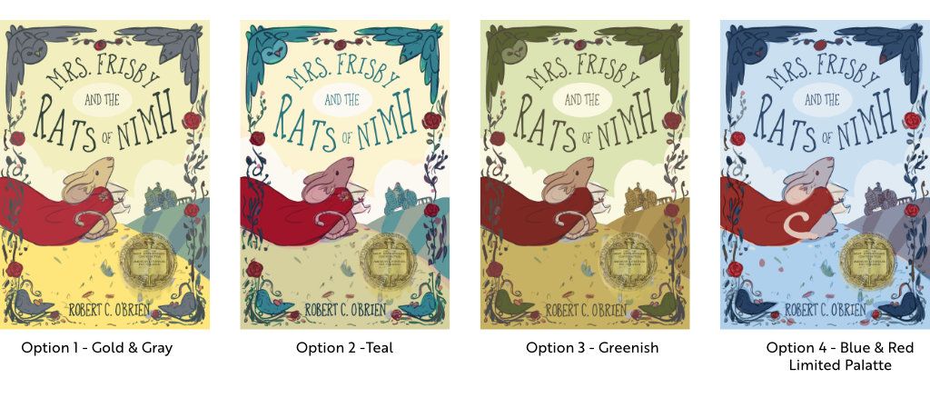
Color studies are ready! This is a story from 1971, so it's a classic tale with a modern cover update. The story takes place in spring and keywords are: Heartwarming (or hopeful), courageous, adventure. Which do you think works best?
(The option 4 mouse has a different tail treatment that I will probably apply to the final cover because it flows better.)
Carrie Copa
https://carriecopadraws.com/ -
@carriecopadraws This is really beautiful! Color palettes are super subjective so I think you may get a wide range of opinions here, as you've made each one attractive. My personal faves are 1,2,3 lol. Does that help? 4 is beautiful, but maybe would be better saved for a different project. When I think of the 70s, farms, and The Secret of Nimh, I personally think of a warmer color palette.
I do think you could make slight tweak (very very subtle adjustments). That could be down to monitor differences however.
Option 1- I think you could make the gray in the border just a whisper darker.
Option 2- I think you could make Mrs Frisby's fur a bit less pink.
Option 3- The sky a little lighter.
Website: www.tessawrathall.com
Instagram: www.instagram.com/tessawrathall_art/
-
@TessaW Thank you! I like all your suggestions for each option, and will keep them in mind for the final illustration!