Society of Visual Storytelling

    SVSLearn Forums

    • Register
    • Login
    • Search
    • Recent
    • Tags
    • Popular
    • Users
    • Groups
    • Search

    Our SVS Virtual Studio APRIL 2020🐰

    Artwork
    40
    151
    11152
    Loading More Posts
    • Oldest to Newest
    • Newest to Oldest
    • Most Votes
    Reply
    • Reply as topic
    Log in to reply
    This topic has been deleted. Only users with topic management privileges can see it.
    • chrisaakins
      chrisaakins last edited by

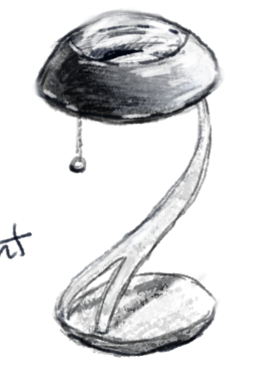
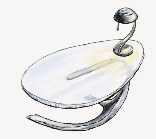
      Working through the prop design class. Here is my first lamp design:
      ce6ae6c8-c248-4ca8-b861-64188bda8be3-image.png
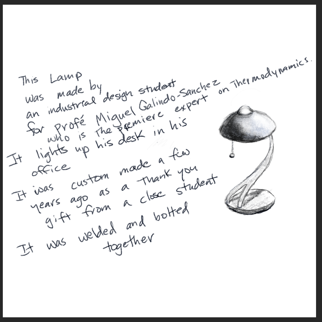
      BTW I would buy this lamp in a heartbeat.

      Chris Akins
      www.chrisakinsart.com
      www.instagram.com/chrisakinsart/

      1 Reply Last reply Reply Quote 6
      • J
        jdubz last edited by

        I've been making a lot of new brushes. In the past I had adapted quite a few brushes from other artists, so I figured one big step I could take is create a whole set of my own.

        Here's one of the first ones playing with some of those new textures. I'm not super comfortable with it yet, but I like how some of them are starting to feel.

        I'm basically just doing a piece, then adjusting the brushes, then doing the next piece, etc. The hope is that in a few more images I'll be able to dial them in.

        pumpkingirl.jpg

        Josh White
        https://www.instagram.com/joshwhiteillustration/

        Jeremy Ross 1 Reply Last reply Reply Quote 8
        • chrisaakins
          chrisaakins last edited by

          My wife said the first lamp looked a little bit...anatomical...so I changed it up a little. I like it even better. In my imagination, it would light up below with one tug, above with two tugs and both with three. Brushed nickel base with a hematite and glass shade.
          f51bc222-7da7-4aff-80e4-72abd4655ce0-image.png

          Chris Akins
          www.chrisakinsart.com
          www.instagram.com/chrisakinsart/

          1 Reply Last reply Reply Quote 6
          • Coley
            Coley last edited by

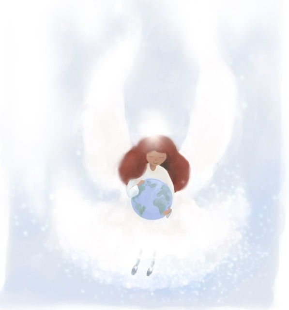
            Played again with my angel this evening. Tomorrow I might wake up and be horrified at this but I’m plunking it here and resting my eyes overnight. 😜

            084D6F29-BD77-4016-98D6-901981372E26.jpeg

            https://www.instagram.com/nicoleledrewmay/

            1 Reply Last reply Reply Quote 1
            • Aaron_T
              Aaron_T last edited by

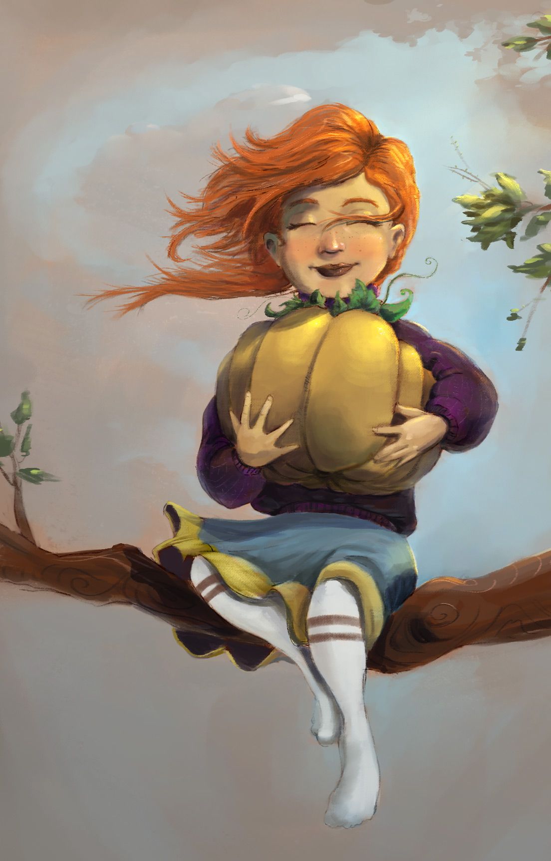
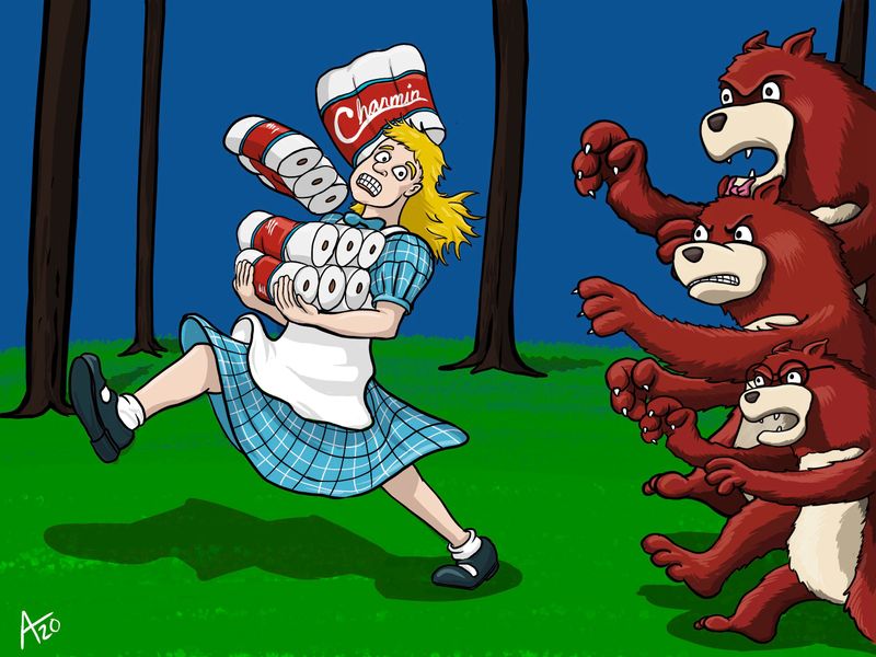
              Reimagined Goldilocks for 2020. Just a fun personal project after a chat with some coworkers gave me the idea.

              Goldilocks.jpg

              https://www.instagram.com/aaron_t/

              1 Reply Last reply Reply Quote 4
              • Jeremy Ross
                Jeremy Ross @jdubz last edited by

                Amazing @jdubz!

                https://www.instagram.com/jeremyrayross
                https://www.jeremyrayross.com/
                https://twitter.com/jeremyrayross
                https://jeremyrayross.substack.com/

                J 1 Reply Last reply Reply Quote 0
                • Jeremy Ross
                  Jeremy Ross @burvantill last edited by

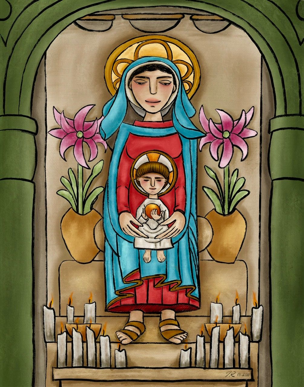
                  Did a tribute piece on behalf of Tomie DePaola recently passing.
                  882718AA-653E-405B-8AD3-F64906B63290.jpeg

                  https://www.instagram.com/jeremyrayross
                  https://www.jeremyrayross.com/
                  https://twitter.com/jeremyrayross
                  https://jeremyrayross.substack.com/

                  1 Reply Last reply Reply Quote 4
                  • chrisaakins
                    chrisaakins last edited by

                    @Jeremy-Ross Your tribute is beautiful!

                    Chris Akins
                    www.chrisakinsart.com
                    www.instagram.com/chrisakinsart/

                    Jeremy Ross 1 Reply Last reply Reply Quote 0
                    • chrisaakins
                      chrisaakins last edited by chrisaakins

                      More progress from the prop design class. Also, this is a lot of work. Far more than I would have thought. And curved lines are hard. I did discover the use of the ellipse creator. My inking is woeful but I could not keep a steady hand.
                      Oh well. I still like the design.
                      table and desklamp.JPG

                      Still have a cup, a reading device, and a chair to go.
                      All for a future where a professor of thermodynamics and energy transfer is actually a superhero who converts heat into kinetic energy. Basically he pulls the heat from the environment and uses it to move things with his mind. The energy had to come from somewhere, right? Also, that gives him the ability to both freeze things and stop fires and explosions. My backstory is that he got his powers and then studied hard to understand them becoming a world-renowned physicist in the process.

                      Chris Akins
                      www.chrisakinsart.com
                      www.instagram.com/chrisakinsart/

                      1 Reply Last reply Reply Quote 5
                      • Casual-T
                        Casual-T last edited by

                        Just swinging by to say that I’m entirely flabbersmacked (or is that gobsmitten?) by the amount of skill and imagination to be found at SVS in general and this thread in particular. Love seeing all you guys and gals incredible work! (When I grow up I wanna be just like yous!)

                        Happy Saturday, everyone!

                        -T

                        I hope the publisher likes stick figures!!
                        www.casual-t.com
                        www.instagram.com/casualcreates.art

                        1 Reply Last reply Reply Quote 1
                        • J
                          jdubz @Jeremy Ross last edited by

                          @Jeremy-Ross Thanks! I'll be honest the colors I'm not totally happy with and I don't know why. Maybe I went too far into the warm tones or something? I feel like when I paint in Photoshop it turns out more garish than when I work in Procreate and I'm trying to figure out why.

                          Josh White
                          https://www.instagram.com/joshwhiteillustration/

                          1 Reply Last reply Reply Quote 0
                          • J
                            jdubz last edited by

                            Last night I pulled in my sketch/linework to that same image above and repainted it in Procreate real quick - it's a lot more rough, but immediately I feel as though I like how the colors came out in Procreate versus the PS version.

                            Looking at these two I think I'm over-saturating the tones in PS, and by the time I'm in it I can't tell the difference. The backgrounds are pretty similar color-wise but the character is WAY more saturated when I see them side-by-side.

                            pumpkin-girl-procreate.png

                            Josh White
                            https://www.instagram.com/joshwhiteillustration/

                            Jeremy Ross SunnySommerset Miriam 3 Replies Last reply Reply Quote 7
                            • Jeremy Ross
                              Jeremy Ross @chrisaakins last edited by

                              Thank you very much @chrisaakins! 9 hours of pure meditation! I listened to an endless church choir soundtrack too, which was nice and relaxing.

                              https://www.instagram.com/jeremyrayross
                              https://www.jeremyrayross.com/
                              https://twitter.com/jeremyrayross
                              https://jeremyrayross.substack.com/

                              1 Reply Last reply Reply Quote 0
                              • Jeremy Ross
                                Jeremy Ross @jdubz last edited by

                                Hi @jdubz, although I like them both, I can certainly see what you’re saying. The Procreate piece feels more balanced, whereas the PS version brings my eyes and attention to her hair. I suppose it depends on what your mission is. Either way, beautiful piece!

                                https://www.instagram.com/jeremyrayross
                                https://www.jeremyrayross.com/
                                https://twitter.com/jeremyrayross
                                https://jeremyrayross.substack.com/

                                1 Reply Last reply Reply Quote 0
                                • EliaMurrayArt
                                  EliaMurrayArt last edited by

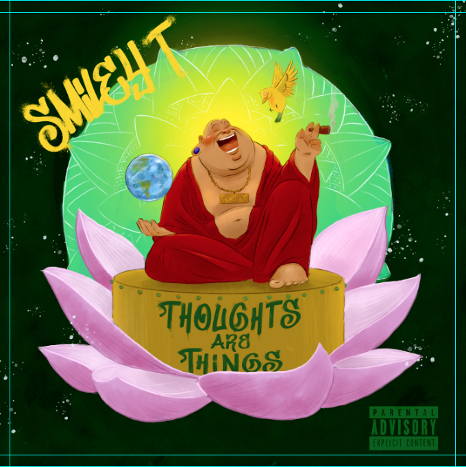
                                  Working on an album cover for a client who raps about peace, politics, the environment and also plays the fiddle. πŸ˜ƒ 42b031dd-60ab-4185-93ef-d59c049fc3d8-image.png

                                  Instagram: https://www.instagram.com/eliamurrayart/
                                  Portfolio: www.eliamurray.com

                                  1 Reply Last reply Reply Quote 4
                                  • Aaron_T
                                    Aaron_T last edited by

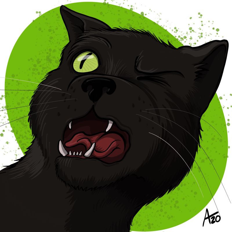
                                    Spending the day watching canceledcon and doodling. Another personal project inspired by one of the cats sneezing in my face.

                                    7F0EF5E5-5923-43FD-8C03-618E95578A4D.jpeg

                                    https://www.instagram.com/aaron_t/

                                    1 Reply Last reply Reply Quote 10
                                    • Coley
                                      Coley last edited by

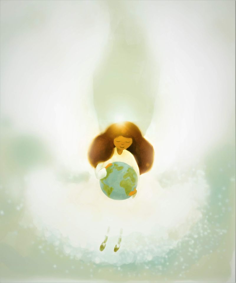
                                      Posted in another thread but worked on my first angel and then did another one. Gonna do more I think. AT least I'm doing more illustrations with a theme of hope to help get me through current times.

                                      received_151823996194989.jpeg

                                      received_1687646224719086.jpeg

                                      https://www.instagram.com/nicoleledrewmay/

                                      1 Reply Last reply Reply Quote 6
                                      • SunnySommerset
                                        SunnySommerset @SunnySommerset last edited by SunnySommerset

                                        @SunnySommerset

                                        Fountain1-sig.jpg

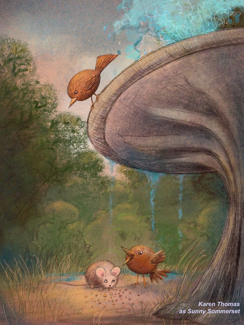
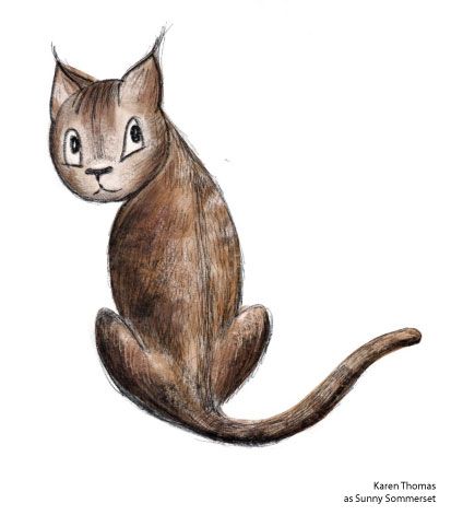
                                        I deleted the background foliage and started over. I really concentrated on a lot of illustrations I've seen. I did a highlight color layer and a shading layer. Looked at it for a while and thought it needed more white - so I did a "white pop" layer behind the mouse, both birds and some of the central area. It looks okay on the screen but when I print it - it looks muddy - and that is mainly the foliage. The characters blend into the background. I did this on Procreate and I really made sure not to have high saturated color. I have another drawing I did of a cat and I like how it prints. It's got the right amount of contrast. Any tips on getting a better handle of on this?

                                        tom-cat-chester.jpg

                                        1 Reply Last reply Reply Quote 6
                                        • SunnySommerset
                                          SunnySommerset @jdubz last edited by

                                          @jdubz I'm going through this as well.
                                          I like your Procreate version. It's loose and more painterly. The colors look good - I don't think they are over saturated. Have you printed it? Curious as to what you think.

                                          How are you picking your colors on Procreate? After watching Will Terry's live coloring sessions ( only 2 of 3 though) I started my new project differently. I really made sure not to have saturated colors -- I'm using the Value Control on the color generation. What are you using?
                                          I should probably watch a tutorial on creating colors in Procreate. (!) lol.

                                          I am using my iPad Pro and Procreate by default because - I cannot do long periods of time on a desktop - with photoshop. πŸ™‚ I'm committed to figuring out the iPad-Procreate combo.

                                          J 1 Reply Last reply Reply Quote 0
                                          • EliaMurrayArt
                                            EliaMurrayArt last edited by

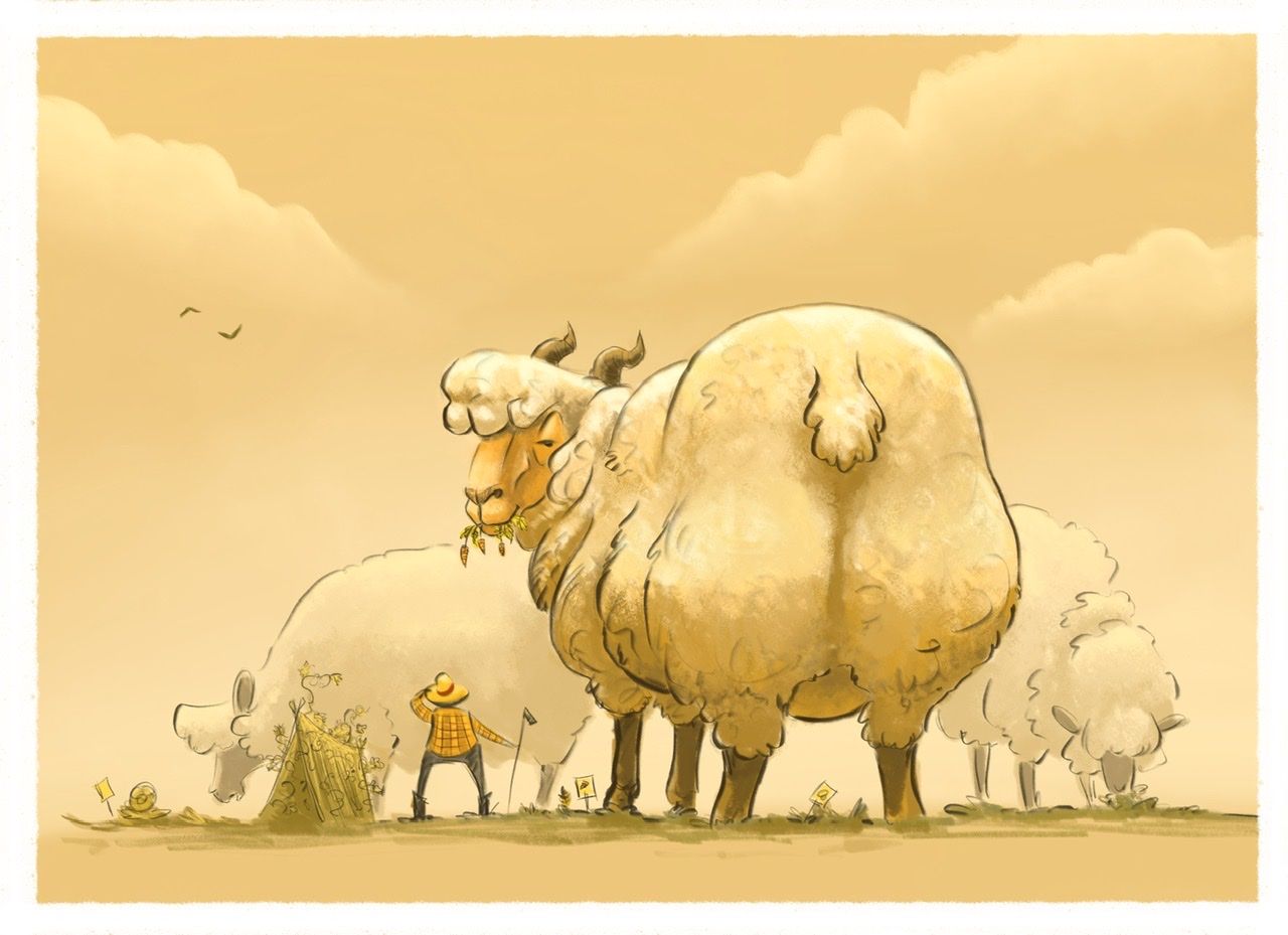
                                            Monochrome Month Prompt for today was Giant in the Garden. Reminded me of some of @Braden-Hallett work. So I went with some Megafauna and thought about some of the lessons/tips from his live stream! Another big thank you, Braden!

                                            If you didn’t get a chance to see it live I recommend watching it when he posts it πŸ˜ƒ

                                            46E152FC-F7F2-4100-8F2B-B17F64DD4BD7.jpeg

                                            Instagram: https://www.instagram.com/eliamurrayart/
                                            Portfolio: www.eliamurray.com

                                            braden H 1 Reply Last reply Reply Quote 16
                                            • First post
                                              Last post