Our SVS Virtual Studio APRIL 2020🐰
-
@Neha-Rawat this is so cute . Looking forward to seeing the rest of your drawings this month!
-
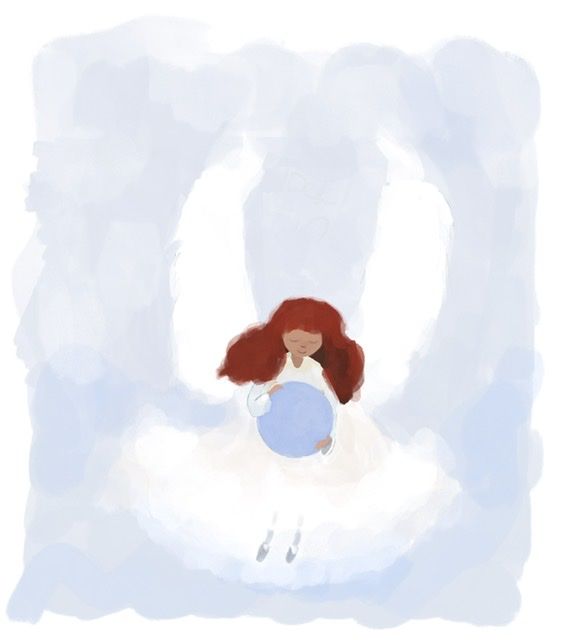
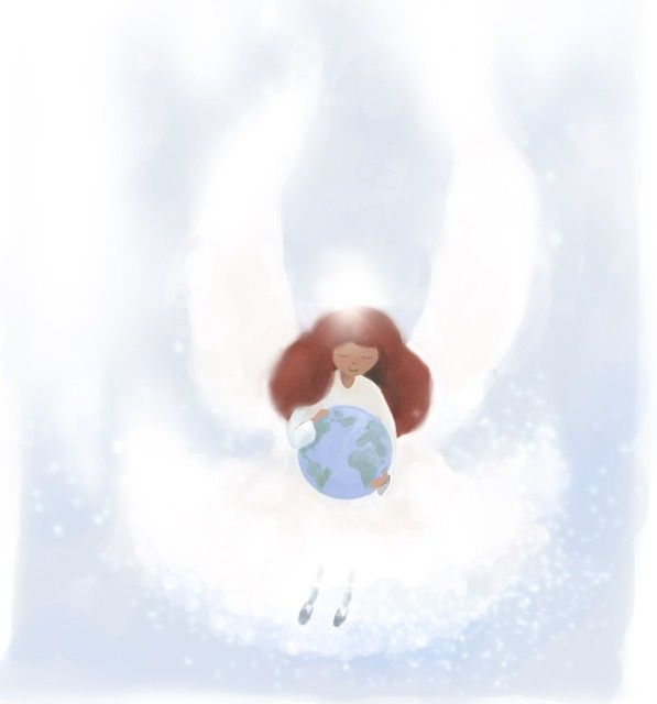
Playing around with an angel. Still rough and in progress. No big plans for this , just having fun. Eventually she’ll be cradling the earth. I am going to try to keep this simple and childlike.
-
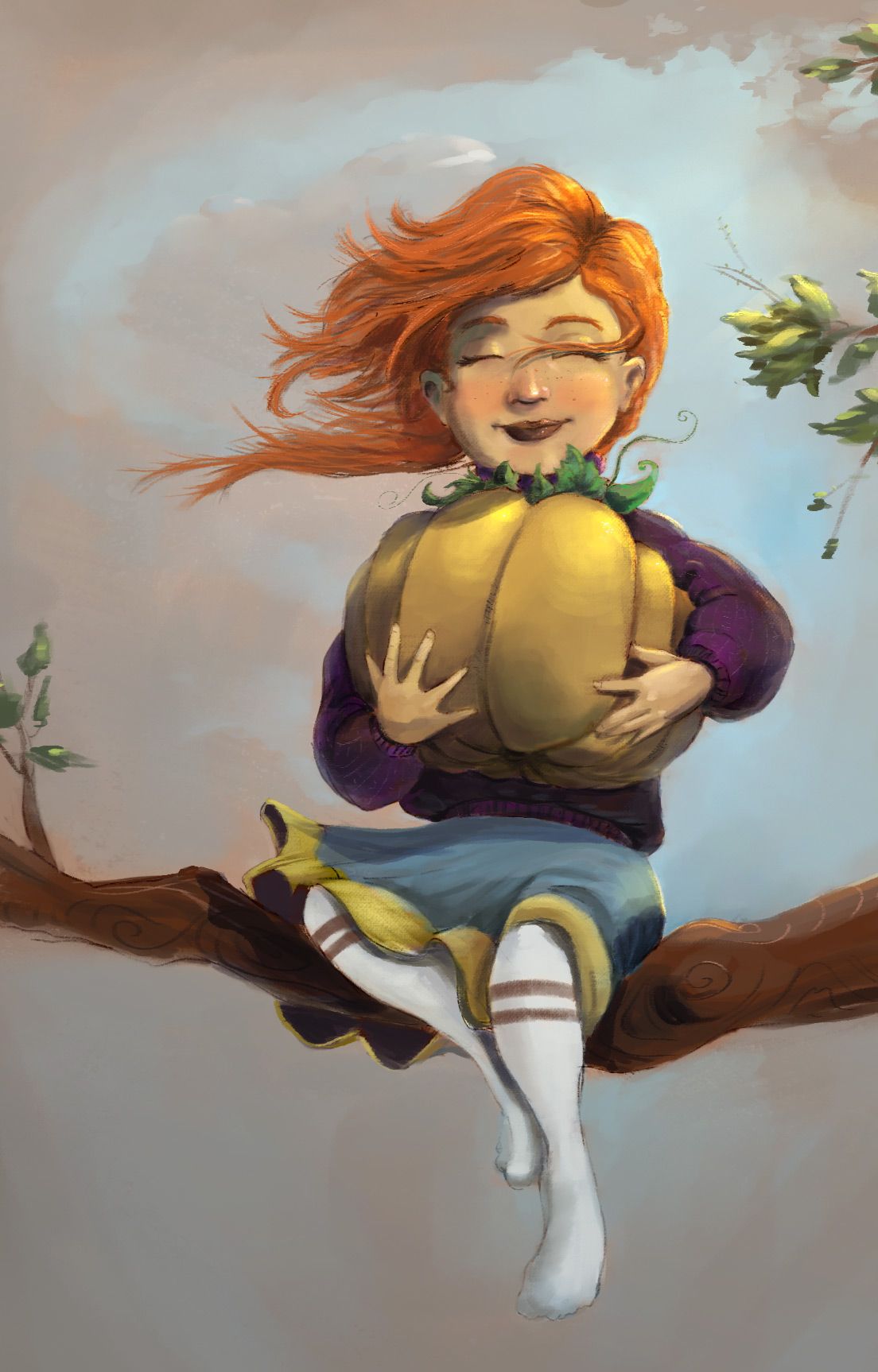
Lately I've been working on a children's book idea that I had planned out as my final major project for college. As it won't be considered toward my final grade anymore, I've chosen to make it a personal project to practice the process of illustrating and writing a children's book!!


Alisa I. Kamari ♡
IG: instagram.com/ilonaillos
Twitter: @ilonaillos -
Hi everyone
") I'm taking part in the instagram challenge #aprillustration and have done two so far. I did my 50 thumbnails for both and am pleased with the results so far. I did both pieces on my ipad which I don't normally use. Hope you are all well and staying sane! xx PS: The first prompt was Plant and the second The Princess and the Pea
I'm taking part in the instagram challenge #aprillustration and have done two so far. I did my 50 thumbnails for both and am pleased with the results so far. I did both pieces on my ipad which I don't normally use. Hope you are all well and staying sane! xx PS: The first prompt was Plant and the second The Princess and the Pea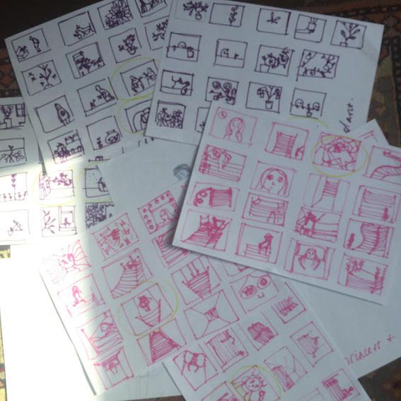
-
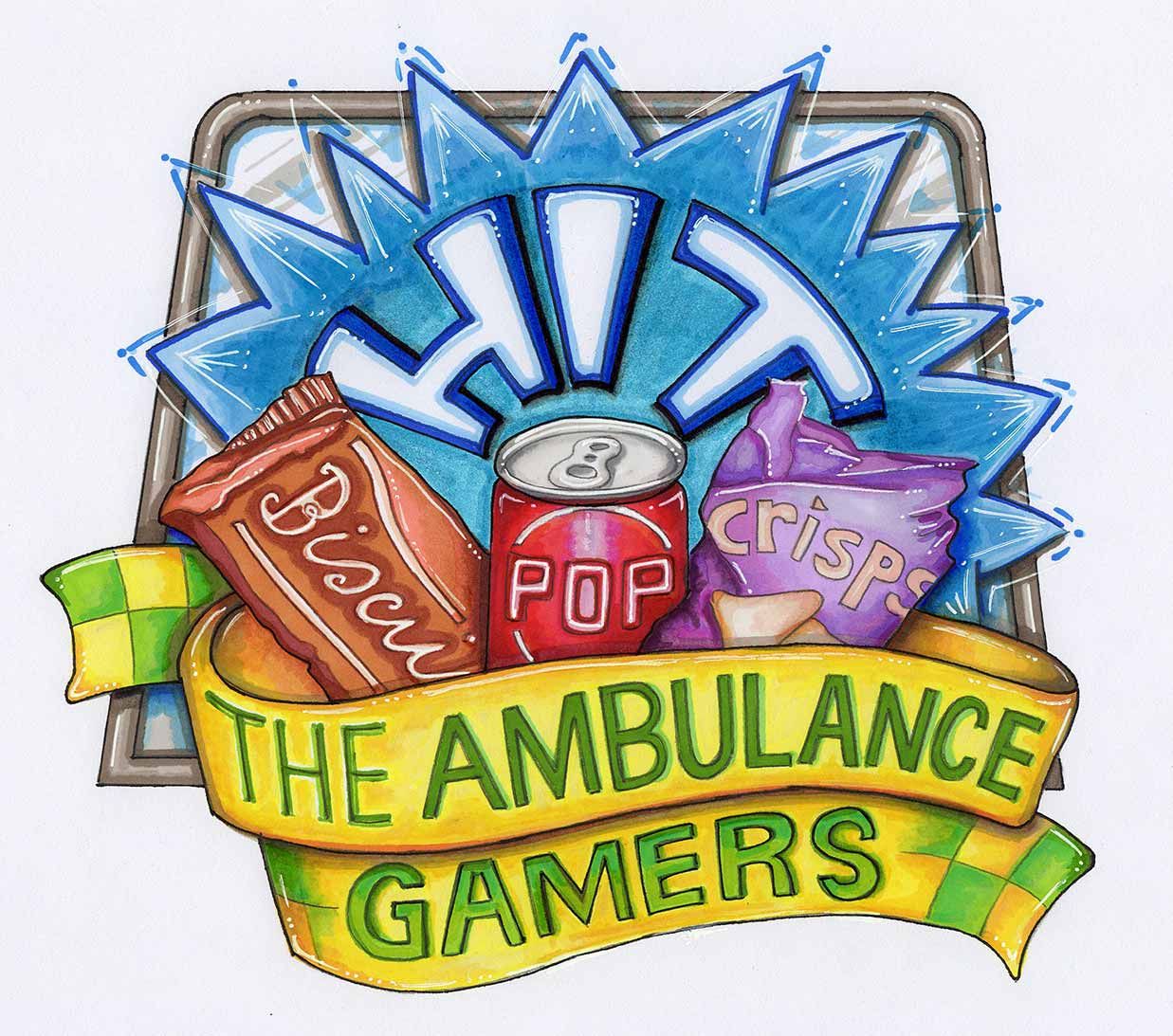
Hi All. I've just completed a logo design for a free competition on FB. Hit The Ambulance Gamers originated as a way to thank our NHS ambulance staff for all the work they do by leaving them treats on their vehicles. I went 'old-school' on this one, using my old tools of the trade and Promarkers to hand-render the logo.
-
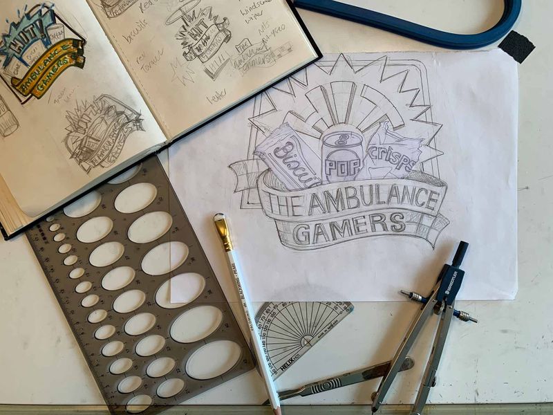
Oh goodness me. Am I out of my pen again? Many apologies.
-
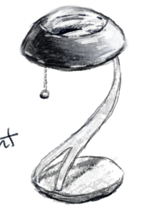
Working through the prop design class. Here is my first lamp design:
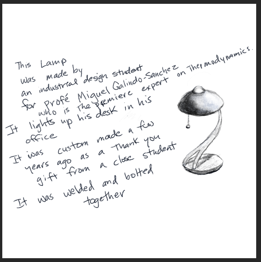
BTW I would buy this lamp in a heartbeat. -
I've been making a lot of new brushes. In the past I had adapted quite a few brushes from other artists, so I figured one big step I could take is create a whole set of my own.
Here's one of the first ones playing with some of those new textures. I'm not super comfortable with it yet, but I like how some of them are starting to feel.
I'm basically just doing a piece, then adjusting the brushes, then doing the next piece, etc. The hope is that in a few more images I'll be able to dial them in.
-
My wife said the first lamp looked a little bit...anatomical...so I changed it up a little. I like it even better. In my imagination, it would light up below with one tug, above with two tugs and both with three. Brushed nickel base with a hematite and glass shade.
-
Played again with my angel this evening. Tomorrow I might wake up and be horrified at this but I’m plunking it here and resting my eyes overnight.

-
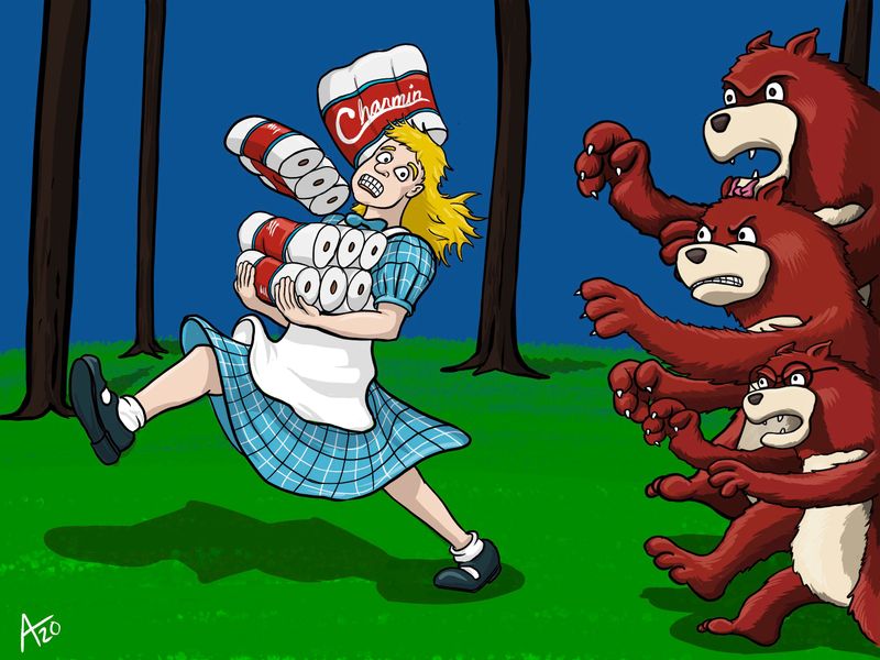
Reimagined Goldilocks for 2020. Just a fun personal project after a chat with some coworkers gave me the idea.
-
Amazing @jdubz!
-
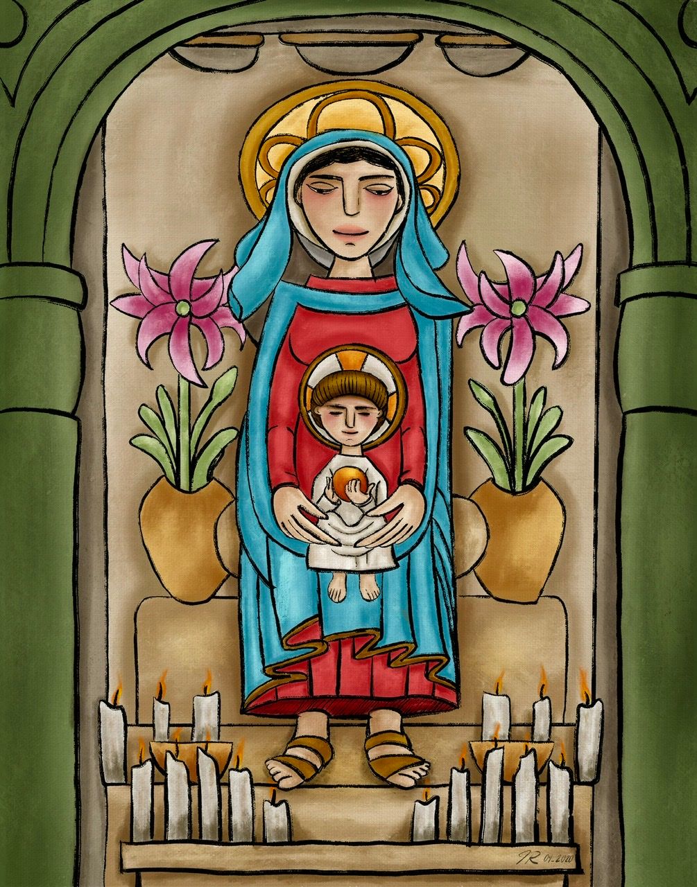
Did a tribute piece on behalf of Tomie DePaola recently passing.
-
@Jeremy-Ross Your tribute is beautiful!
-
More progress from the prop design class. Also, this is a lot of work. Far more than I would have thought. And curved lines are hard. I did discover the use of the ellipse creator. My inking is woeful but I could not keep a steady hand.
Oh well. I still like the design.
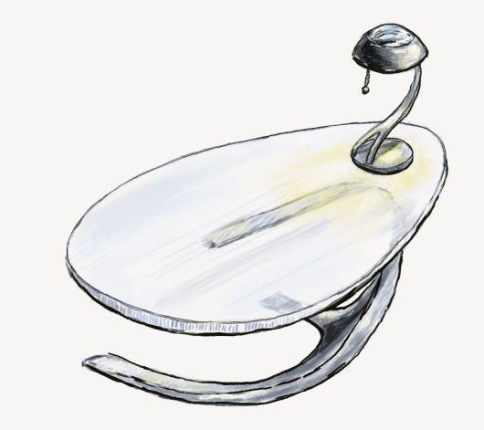
Still have a cup, a reading device, and a chair to go.
All for a future where a professor of thermodynamics and energy transfer is actually a superhero who converts heat into kinetic energy. Basically he pulls the heat from the environment and uses it to move things with his mind. The energy had to come from somewhere, right? Also, that gives him the ability to both freeze things and stop fires and explosions. My backstory is that he got his powers and then studied hard to understand them becoming a world-renowned physicist in the process. -
Just swinging by to say that I’m entirely flabbersmacked (or is that gobsmitten?) by the amount of skill and imagination to be found at SVS in general and this thread in particular. Love seeing all you guys and gals incredible work! (When I grow up I wanna be just like yous!)
Happy Saturday, everyone!
-T
-
@Jeremy-Ross Thanks! I'll be honest the colors I'm not totally happy with and I don't know why. Maybe I went too far into the warm tones or something? I feel like when I paint in Photoshop it turns out more garish than when I work in Procreate and I'm trying to figure out why.
-
Last night I pulled in my sketch/linework to that same image above and repainted it in Procreate real quick - it's a lot more rough, but immediately I feel as though I like how the colors came out in Procreate versus the PS version.
Looking at these two I think I'm over-saturating the tones in PS, and by the time I'm in it I can't tell the difference. The backgrounds are pretty similar color-wise but the character is WAY more saturated when I see them side-by-side.
-
Thank you very much @chrisaakins! 9 hours of pure meditation! I listened to an endless church choir soundtrack too, which was nice and relaxing.
-
Hi @jdubz, although I like them both, I can certainly see what you’re saying. The Procreate piece feels more balanced, whereas the PS version brings my eyes and attention to her hair. I suppose it depends on what your mission is. Either way, beautiful piece!