Suggestions? FINAL
-
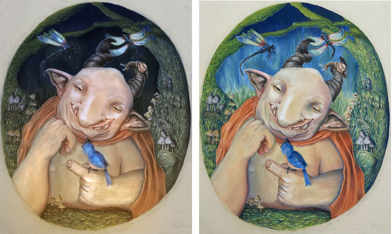
His expression definitely gives him a sense of life and personality. My suggestion is to increase the variation in value between him and the background to really make him pop from the background. It'll probably feel scary to push the hard work you did on the background to the...background, but I think it'll make the overall image more dramatic and powerful.
shinjifujioka.com
https://www.facebook.com/shinjifujiokaart
IG: @shinjifujiokastudio -
@shinjifujioka Awesome - thank you! I can see what you mean, but I'm not sure how to do it...I don't have much detail in the background, so should I make it a lot lighter?
-
@bharris Thank you, I'll add a little color to him!
-
@smoke Yeah, can you tell I struggled with the hands? LOL...A couple other people suggested that also, so I've done some work on them today - I'll post the update in a few minutes.
-
UPDATE: Hey everyone, so here's the update incorporating all of the suggestions except changing the snail's color - I just remembered that one! So I'm almost finished (I just have to finish all of the mushrooms on the left side tree and then darken the tree on the right side). Aside from that, is there anything else you can see that might improve this guy? Also, does the right hand look better?
Facebook Page: http://www.facebook.com/amberwingart
Instagram: @savinafranciscoart
YouTube: http://www.youtube.com/amberwingart
Website: http://www.amberwingart.com
SVS Sketchbook: http://forum.svslearn.com/topic/915/savina-s-sketchbook-updated-2-13-16 -
Good job fixing the hand! Really sweet piece!!
-
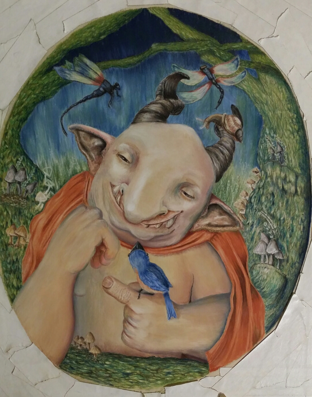
@amberwingart hi amber, What a great piece! Love the look and feel. There are a view things that i notice. The Gnome isn't looking at the bird, thats a bit odd, shouldn't not be that he's looking at him? As @Smoke mentioned, the hands may need some improvement. You can try and look for good reference and than practice a lot, cause hands are very difficult. But I am sure You'll manage! go for the best! Have a nice weekend!
Leontine
"A picture is worth a thousand words."https://leontineillustrator.com
https://www.instagram.com/leontine.illustrator/
http://www.facebook.com/leontineillustration -
@Thrace-Shirley-Mears Thanks so much!!
-
@Leontine Thank you for the suggestions! The hands still need some work? I just fixed those - I'm not sure what else to do on them...It's so funny, I'm usually pretty okay with hands (they aren't usually a stumbling block for me) in graphite, but I had such a struggle with these ones & I don't know why! Could you please tell me what I should fix on these? And the eyes - I meant to fix those too! lol Thank you for the reminder
") Do you ever look at your work and feel like it looks like a beginner did it? That's how I feel with this piece...I like the colors but I feel like the composition is off or something
Do you ever look at your work and feel like it looks like a beginner did it? That's how I feel with this piece...I like the colors but I feel like the composition is off or something 
-
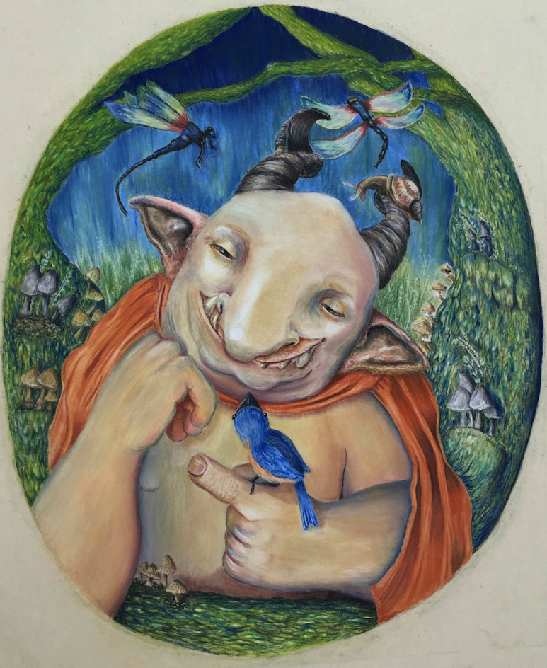
Hey all, here's the final version of Monster. I'm so unhappy with it (the only parts I like are his head and the color scheme). I feel like I really missed the mark with the environment and background (and the mushrooms on the left side of the page are driving me nuts). I know the hands can use some more work too, but that doesn't bother me quite so much, as it's something I feel I can practice. But I think the entire environment looks really beginner-ish, so I'm really frustrated right now...Environments are my weakest point and I don't seem to be able to get past the issue...
Anyway, I'm not going to work on him any more - I'm calling him done. I just wanted to share the final with you and get your thoughts...
Facebook Page: http://www.facebook.com/amberwingart
Instagram: @savinafranciscoart
YouTube: http://www.youtube.com/amberwingart
Website: http://www.amberwingart.com
SVS Sketchbook: http://forum.svslearn.com/topic/915/savina-s-sketchbook-updated-2-13-16 -
@amberwingart Oh my gosh, please don't feel like it looks beginner-ish because it does not at all! Take it from someone who has had no training at all and I felt exactly the same as you just a few months ago. In the past 5 months of taking classes and doing 3rd thursdays but mostly from getting help from my peers I feel that I am finally getting closer to being a good illustrator. I promise if you keep it up you will feel so much better soon. I just began using Photoshop, I used to paint with acrylics, a year ago and it makes such a huge difference even if you continue with your traditional work to be able to finish and correct in Photoshop. If you can I would give it a try and you won't be so frustrated about not being able to correct something. Keep working and sharing your process you will learn so much if you keep asking for help!
-
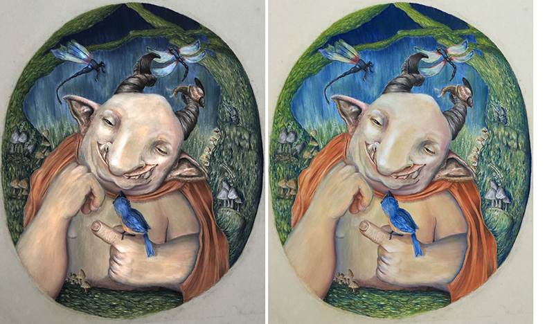
@amberwingart I hope you don't mind, I did a recolor using 1 of Will Terry's methods from his 10 Step Digital Painting course.
- Top layer - new layer filled with black, set to color dodge. Low opacity brush, 10% and 10% flow over the mushrooms in a muted yellow and light grey, over the skin tone in a muted pink, over the dragon flies and bluebird in a light blue, over the cape and underbelly of the bluebird in a light orange.
- Middle layer - duplicate of bottom layer (at -50 saturation) set to 50% multiply - to bring the contrast back.
- Bottom layer - the original set to -50 saturation.
-
@Thrace-Shirley-Mears Thank you, Thrace...I guess there's just a huge gap between what I had in my head and what my current skills let me produce this time around...Very frustrating...I just signed up here, so I'm hoping that the classes will help me - I'm starting my first one tonight...The peer critiques have already been really helpful & everyone here is awesome...
-
@Bobby-Aquitania Thank you Bobby - I don't mind at all! I appreciate you taking the time to do this! So since this is in pastel, darkening up that background looks like it would help a lot...My husband said I should also blur everything in the background - do you think that would help also? Thank you again for the great example!!
Facebook Page: http://www.facebook.com/amberwingart
Instagram: @savinafranciscoart
YouTube: http://www.youtube.com/amberwingart
Website: http://www.amberwingart.com
SVS Sketchbook: http://forum.svslearn.com/topic/915/savina-s-sketchbook-updated-2-13-16 -
@amberwingart Okay this time I did...
- A Gradient pass on Screen of a bright orange from bottom to half way. This is to simulate the light coming from the bottom and fading out above him.
- A Gradient pass on Multiply in a dark blue from top to half way.
- I erased the edges from the outer oval where it had become blue to match the warm bottom of the oval background
- I did some bright circular gradients in a light blue on the bluebird.
- And finally I selected the inner back ground and turned the contrast down to match the top darkness to give the illusion of going back.
I think the last part was the most effective. You could do this with a dark glaze in your painting. I would test it on some canvas paper first though. I could make the foliage under his arm more green, but you get the gist...