Feedback request for a portfolio piece.
-
Hi guys!
I made this illustration for my portfolio but I'm still not sure if this is perfect. Any guidance would be highly appreciated.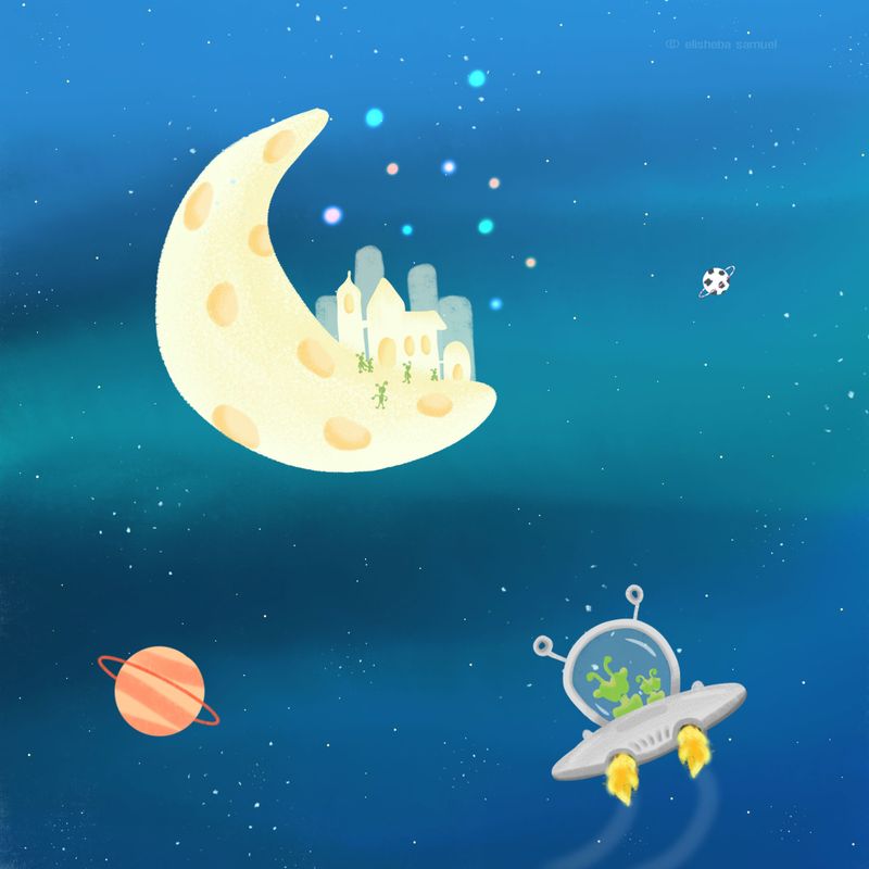
(1st option)I'm confused about the composition of this piece. I feel like it needs something but I'm not quite sure what. I tried a lot of options but nothing seems to satisfy me. I made minor adjustments like making the moon big and shifting it to the centre as shown below.
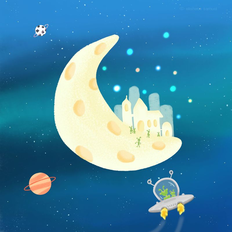
(2nd option)Do you think it is fine the way it is or it does the piece need more work or am I just being over critical about my work.

Which piece do you think is more stronger? Option 1 or option 2? And What should I change? I would love to know what you think.Thank you.
-
Hi Elisheba! Love your colors and shapes! When I zoom out and look at the piece, everything seems to work really well together.
I think one thing would be to create some depth to your piece. Right now everything seems to be on one plane. Maybe if you had some things overlap? Like stardust covering a part of the moon? Or make the spaceship larger so that it covers a small portion of the moon? You can also try blurring some of the edges of things that are further away while keeping things are close really sharp.
The orange planet stands out a lot, too, since it's the only warm object in a mostly cool picture. Maybe make it more desaturated or make the aliens orange instead?
I'm still figuring out how to make good compositions, too, so take everything I say with a grain of salt! You're doing great!

-
@aprilshin Thank you so much for taking time to share your wisdom. This was really helpful.
Actually I made the black & white planet small to create depth but it didn't work. Blurring it sounds good. I'll see if I can overlap certain parts of the illustration and will try to make the orange more desaturated. We'll see what works out. I'll post the edited version here.
Also, can you tell me which version should I take forward, is it option 1 or 2?
Thank you so much, I appreciate your help.
 ️
️ -
@Elisheba You are most welcome! I kind of like the scale of #2, where the moon is really big and the aliens are smaller. Are you able to extend the canvas more, though? I feel like the square format makes everything feel a little squished. Can't wait to see your edited version!

-
@aprilshin Ya, I can change the square format. In what size would you usually illustrate a portfolio piece? Are there any standard sizes?
-
@Elisheba I'm not sure where you live, but in the U.S., standard frame sizes are 8"x10", 11"x14", 16"x20", etc. I think internationally, they use sizes like A3, A4, but I'm not as familiar with those sizes.
I guess it mostly depends on what your illustration is intended for. Is it a print? Will it be in a children's book? I think children's books come in a variety of sizes including square formats, so it's really up to you as to what format you think would best fit your needs.
I hope this helps!
-
@aprilshin Oh okay! That helps. Thanks April!

-
@Elisheba You are most welcome!
-
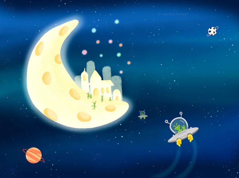
I finally finished this piece. Thanks to @aprilshin 's feedback, I tweaked certain things and voilà, it's done. I would love to know what you think? Any feedback is always appreciated.
-
Aww love it!! Can't wait to see more of your pieces!
-
@aprilshin Thanks April!
 ️
️