Society of Visual Storytelling

    SVSLearn Forums

    • Register
    • Login
    • Search
    • Recent
    • Tags
    • Popular
    • Users
    • Groups
    • Search

    Isolation book cover WIP - feedback thread-

    Artwork
    9
    17
    834
    Loading More Posts
    • Oldest to Newest
    • Newest to Oldest
    • Most Votes
    Reply
    • Reply as topic
    Log in to reply
    This topic has been deleted. Only users with topic management privileges can see it.
    • theprairiefox
      theprairiefox @carlianne last edited by theprairiefox

      @carlianne I think having a princess would add a lot of storytelling and funny. And like Jake and Lee said funny always wins!

      You know a princess climbing his beard to save him would be hilarious!

      -The Prairie Fox
      https://www.instagram.com/theprairiefox
      https://www.theprairiefox.com

      1 Reply Last reply Reply Quote 1
      • Jeremy Ross
        Jeremy Ross @carlianne last edited by

        Hi @carlianne, what a great concept!

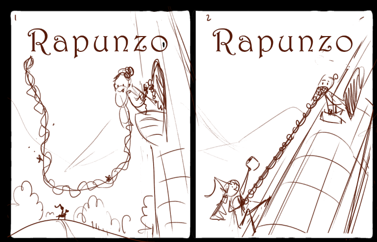
        What if you made the window higher on the tower to add elevation? Right now it looks like he could jump out rather than use his beard to be saved.

        Perhaps the perspective can be looking down with narrowed tower and emphasis on Rapunzo?

        Just my thoughts, but great book cover concept!

        https://www.instagram.com/jeremyrayross
        https://www.jeremyrayross.com/
        https://twitter.com/jeremyrayross
        https://jeremyrayross.substack.com/

        1 Reply Last reply Reply Quote 1
        • carlianne
          carlianne @Frost Drive last edited by

          @Frost-Drive Thanks!! I didn't quite make it to 50 thumbs like Lee suggests, but I'm at about 35! And seeing as I might still do more, I may still hit it lolol

          @theprairiefox Awesome!! I'm def. going to add the princess. Would having the princess climb his beard take away from the isolation feeling?

          @Jeremy-Ross Thank you so much!! And you're totally right, I will definitely push the perspective. I think I tried a thumb like that, I'll go compare!

          Check out my art and tutorials :)

          Instagram: www.instagram.com/carliannecreates/

          Youtube:
          https://youtube.com/c/CarlianneCreates

          Shop: www.carliannecreates.com

          theprairiefox 1 Reply Last reply Reply Quote 0
          • theprairiefox
            theprairiefox @carlianne last edited by

            @carlianne adding the princess might take away from the isolation.

            But you could have the princess doing something to reinforce the isolation. For example, in my pictures I am adding a mailman and making them reflect the joy of getting mail when you have been isolated. (I will be posting the value studies shortly for you to see in my WIP thread.)

            I wonder if you could have the princess bringing him toilet paper or groceries or something? TP would be pretty funny... other things that might work would be books or puzzles or something to do while isolated.

            -The Prairie Fox
            https://www.instagram.com/theprairiefox
            https://www.theprairiefox.com

            1 Reply Last reply Reply Quote 1
            • TessaW
              TessaW last edited by

              Haha, I love people's suggestions. Adding the princess maybe detracts from the isolation theme slightly- but I do like how it adds to the humor and adds to the idea that isolation doesn't have to last forever and that there's hope on the horizon,

              The princess bringing supplies is also hilarious and would make this feel like a covid-19 commentary with the timing- it would make the interpretation more specific.

              The princess climbing the beard is also fun, but would add some unpredictability as far as the contest theme and judging goes, since it detracts from "isolation. It could work well in a portfolio though.

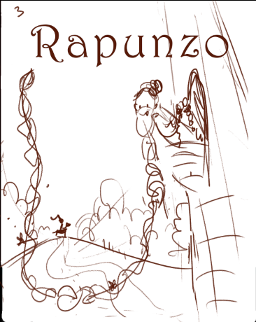
              I think pushing the perspective is a good idea in any case. One possible idea that may or may not work would be putting the background princess on a hill. It could indicate it's not a strait path on ground level to the tower and may give more interpretation to the tower possibly being higher up, if they are in an environment with hills and valleys. Does that make sense?

              Website: www.tessawrathall.com

              Instagram: www.instagram.com/tessawrathall_art/

              1 Reply Last reply Reply Quote 2
              • Neha Rawat
                Neha Rawat last edited by

                Oh great input on having the princess on a hill @TessaW ! I think that'll really add to the implicit height of the tower In that case you may not need to change the perspective too much either.
                The Princess getting toilet roll is really funny! It would work well for this prompt but not so much for a portfolio piece I think because it's too specific and timely. If you're feeling reaalllly ambitious, you can create different versions for the contest and portfolio coz the concept is great for both! 😃

                https://www.nrbstudio.in/
                https://www.instagram.com/nrbstudio.in

                1 Reply Last reply Reply Quote 2
                • carlianne
                  carlianne last edited by carlianne

                  d54fe778-e499-44b2-ba97-56dd4ace9dff-image.png e1b8d938-5b2f-4f66-abaf-e30148fe2e3c-image.png

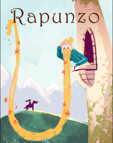
                  Okay do you like option 1, 2 or 3 better! And is that perspective working better?

                  @theprairiefox @Jeremy-Ross

                  Check out my art and tutorials :)

                  Instagram: www.instagram.com/carliannecreates/

                  Youtube:
                  https://youtube.com/c/CarlianneCreates

                  Shop: www.carliannecreates.com

                  Jeremy Ross 1 Reply Last reply Reply Quote 1
                  • Jeremy Ross
                    Jeremy Ross @carlianne last edited by

                    Definitely better @carlianne! I like #2 for May prompt and #3 for a cover portfolio piece! Nicely done!

                    https://www.instagram.com/jeremyrayross
                    https://www.jeremyrayross.com/
                    https://twitter.com/jeremyrayross
                    https://jeremyrayross.substack.com/

                    1 Reply Last reply Reply Quote 1
                    • J
                      jdubz last edited by

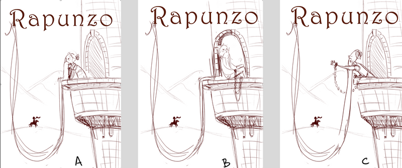
                      #2 is an immediate read for me on what's going on and it was instantly engaging.

                      Josh White
                      https://www.instagram.com/joshwhiteillustration/

                      1 Reply Last reply Reply Quote 0
                      • carlianne
                        carlianne last edited by carlianne

                        I went with #3 as I'm doing the contests more for my portfolio than anything else. Here is my color study image.png

                        Any additional feedback welcome!

                        Check out my art and tutorials :)

                        Instagram: www.instagram.com/carliannecreates/

                        Youtube:
                        https://youtube.com/c/CarlianneCreates

                        Shop: www.carliannecreates.com

                        LauraA 1 Reply Last reply Reply Quote 2
                        • LauraA
                          LauraA SVS OG @carlianne last edited by

                          @carlianne I think you've nailed it! It has your color palette, and it's all very clear at the same time. Go for it!

                          Instagram: https://www.instagram.com/lauraintorino/
                          http://lauraaldersonart.com/

                          1 Reply Last reply Reply Quote 1
                          • Coley
                            Coley last edited by

                            Gorgeous colors! Love it!

                            https://www.instagram.com/nicoleledrewmay/

                            1 Reply Last reply Reply Quote 1
                            • carlianne
                              carlianne last edited by carlianne

                              poses.png
                              I'm starting to clean up details and make some final decisions on the drawing, any thought on which pose is better and reads more like isolation?

                              Check out my art and tutorials :)

                              Instagram: www.instagram.com/carliannecreates/

                              Youtube:
                              https://youtube.com/c/CarlianneCreates

                              Shop: www.carliannecreates.com

                              1 Reply Last reply Reply Quote 0
                              • TessaW
                                TessaW last edited by

                                I like A. He opens us up to the whole scene, but he hasn't quite noticed the princess-in-shining armor yet and it amps up the anticipation.

                                Website: www.tessawrathall.com

                                Instagram: www.instagram.com/tessawrathall_art/

                                carlianne 1 Reply Last reply Reply Quote 1
                                • carlianne
                                  carlianne @TessaW last edited by

                                  @TessaW Thanks Tessa!

                                  Check out my art and tutorials :)

                                  Instagram: www.instagram.com/carliannecreates/

                                  Youtube:
                                  https://youtube.com/c/CarlianneCreates

                                  Shop: www.carliannecreates.com

                                  1 Reply Last reply Reply Quote 0
                                  • First post
                                    Last post