Society of Visual Storytelling

    SVSLearn Forums

    • Register
    • Login
    • Search
    • Recent
    • Tags
    • Popular
    • Users
    • Groups
    • Search

    June Prompt WIP - critiques welcome please

    Artwork
    14
    24
    1007
    Loading More Posts
    • Oldest to Newest
    • Newest to Oldest
    • Most Votes
    Reply
    • Reply as topic
    Log in to reply
    This topic has been deleted. Only users with topic management privileges can see it.
    • Johanna Kim
      Johanna Kim SVS OG last edited by Johanna Kim

      Hey all, here are my thumbs--which one do you like best? I'm totally up for continuing on with the thumbnail stage if none of these are resonating with anyone. Thanks for your time.

      Two more questions:
      Do you prefer your alligators more scary or more cute/gentle?
      Do you prefer your animals with or without clothes?

      Bongo thumbnails-s.jpg

      http://www.johannakim.com
      http://instagram.com/johannahkim/

      Jeremy Ross Kevin Longueil Nyrryl  Cadiz Julia 4 Replies Last reply Reply Quote 5
      • Jeremy Ross
        Jeremy Ross @Johanna Kim last edited by

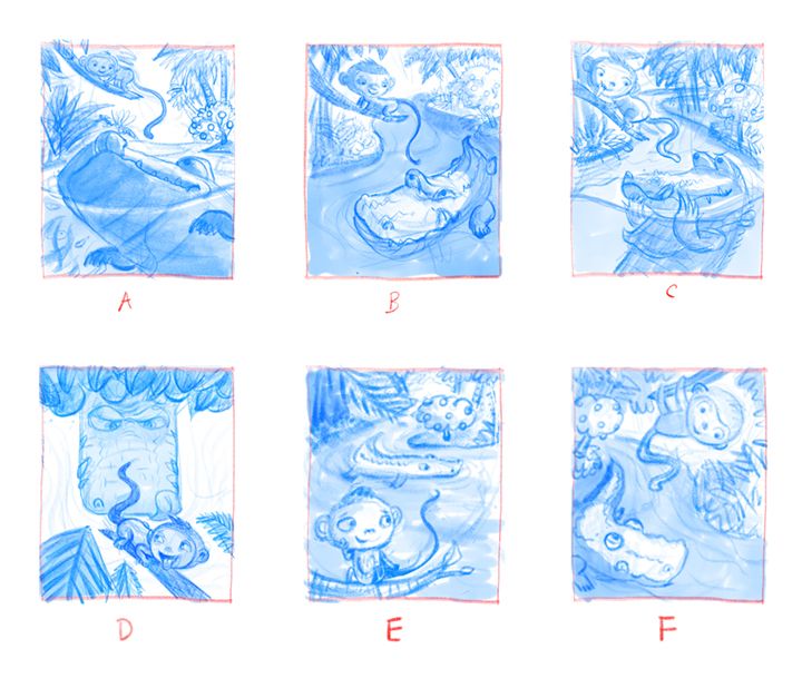
        Hi @Johanna-Kim, I like A the best. It’s an interesting camera angle.

        https://www.instagram.com/jeremyrayross
        https://www.jeremyrayross.com/
        https://twitter.com/jeremyrayross
        https://jeremyrayross.substack.com/

        1 Reply Last reply Reply Quote 1
        • charitymunoz
          charitymunoz last edited by

          @Johanna-Kim I like B. It reads the easiest and seems to allow for the most expression between the 2 characters. Keep in mind though, I'm very much still a beginner at all this, and I love all of them!

          www.instagram.com/munozcharity
          www.facebook.com/charitymunozart

          1 Reply Last reply Reply Quote 1
          • miranda-hoover
            miranda-hoover last edited by

            Super cute! A is definitely my favorite. But B and C are good too.

            https://www.instagram.com/mirananemone

            1 Reply Last reply Reply Quote 1
            • Jacy13
              Jacy13 last edited by

              @Johanna-Kim My favorite thumbnail is B. I really like the dynamism of the alligator and the overall perspective going on! πŸ˜ƒ

              As per your two other questions; I like both the cuter and the scarier alligators. I don't really prefer one or the other. It depends more on the type of effects you're looking to achieve in the illustration. As for question two; I typically prefer animal characters without clothes πŸ™‚

              Deviantart: https://www.deviantart.com/jacy13
              Instagram: https://www.instagram.com/jacy13draws/?hl=en
              Portfolio: https://jacy13.artstation.com/

              1 Reply Last reply Reply Quote 1
              • Kevin Longueil
                Kevin Longueil SVS OG @Johanna Kim last edited by

                @Johanna-Kim They are all really good!! D cracks me up though and it is a unique composition. You can't go wrong with any of these!

                Portfolio: kevinlongueil.com
                https://www.instagram.com/kevinlongueil/

                Johanna Kim 1 Reply Last reply Reply Quote 1
                • deborah Haagenson
                  deborah Haagenson last edited by

                  I like the composition and the eyes of the alligator looking up in F.

                  1 Reply Last reply Reply Quote 1
                  • D
                    Diane Kond last edited by

                    Hi! I like F for the monkey, fells more dynamic. And alligator drawings from B.
                    Very interesting thumbnails!

                    1 Reply Last reply Reply Quote 1
                    • K.Flagg
                      K.Flagg last edited by

                      I agree, i think B for Clyde and F for Bongo. A combo of those 2 would be awesome but I love them all. Nice work πŸ‘

                      K.Flagg

                      1 Reply Last reply Reply Quote 1
                      • Nyrryl  Cadiz
                        Nyrryl Cadiz SVS OG @Johanna Kim last edited by

                        @Johanna-Kim amazing thumbnails! Really great composition but D looks really sexual to me πŸ˜‚πŸ˜‚πŸ˜‚πŸ˜‚ in all seriousness tho. I think A and B are your strongest ones

                        Portfolio: nyrrylcadiz.com
                        Instagram: https://www.instagram.com/nyrryl_cadiz/
                        YouTube: https://www.youtube.com/channel/UCbJCF1Im8ZO7hpGWTKOJMuA

                        Johanna Kim 1 Reply Last reply Reply Quote 1
                        • Neha Rawat
                          Neha Rawat last edited by

                          These are so cute! Super work on the thumbnails!

                          I also like B for Clyde and F for Bongo.
                          I also like the depth in E since it sort of shows the journey and obstacles that Bongo has to overcome to reach his goal.

                          For your questions, I love everything cute! And the clothes are nice if it adds to their personality.

                          Really looking forward to see this develop! πŸ™‚

                          https://www.nrbstudio.in/
                          https://www.instagram.com/nrbstudio.in

                          1 Reply Last reply Reply Quote 1
                          • Johanna Kim
                            Johanna Kim SVS OG last edited by

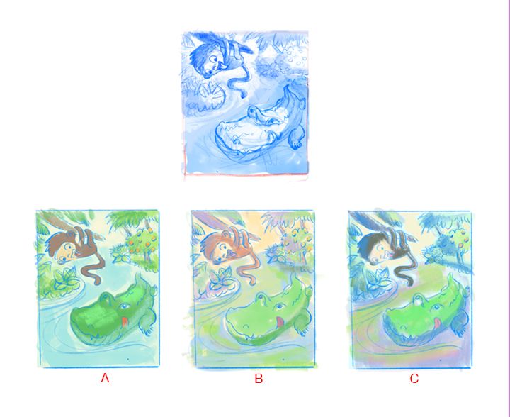
                            Hello friends (@Neha-Rawat @Nyrryl-Cadiz @K-Flagg @Diane-Kond @deborah-Haagenson @Kevin-Longueil @Jacy13 @gavpartridge @miranda-hoover @charitymunoz @Jeremy-Ross), thanks so much for taking the time to chime in about your preferences and suggestions. I tried my best to listen to all your notes. In some instances, I got conflicting notes, so I had to use my best judgement and landed on the following thumbnail sketch. Now I'm considering color palette. I'm leaning towards color sketch B because it feels like summer to me, and it's the least reminiscent of Curious George, as much as I love that character.

                            I'm working on finalizing the drawing now but if you see anything glaringly wrong or bothersome, please let me know. Thanks again!

                            Color studies-2 s.jpg

                            http://www.johannakim.com
                            http://instagram.com/johannahkim/

                            deborah Haagenson Jacy13 2 Replies Last reply Reply Quote 3
                            • Johanna Kim
                              Johanna Kim SVS OG @Nyrryl Cadiz last edited by

                              @Nyrryl-Cadiz Thanks for the note about D appearing sexual. I always worry about inserting that kind of connotation into a children's illustration.

                              http://www.johannakim.com
                              http://instagram.com/johannahkim/

                              1 Reply Last reply Reply Quote 0
                              • Johanna Kim
                                Johanna Kim SVS OG last edited by

                                @gavpartridge Thanks for your comments. As for my thumbnails, these were version 2 of my thumbnails, so you could understand them. You should have seen the first scribbly ones--unreadable, for sure! I think it's better to keep thumbnails really loose, though. I find that as soon as I start tightening up the drawing, I lose that feeling of spontaneity and spark. I'm actually trying to work on this illustration faster than usual, since I have a habit of working an illustration to death.

                                http://www.johannakim.com
                                http://instagram.com/johannahkim/

                                1 Reply Last reply Reply Quote 0
                                • Johanna Kim
                                  Johanna Kim SVS OG @Kevin Longueil last edited by

                                  @Kevin-Longueil Thanks for your vote for D:) I really like that bold perspective and will have to find a better use for it in a future illustration.

                                  http://www.johannakim.com
                                  http://instagram.com/johannahkim/

                                  1 Reply Last reply Reply Quote 1
                                  • deborah Haagenson
                                    deborah Haagenson @Johanna Kim last edited by

                                    @Johanna-Kim I agree with your choice. I like B! To me it's got more life than the other two.

                                    1 Reply Last reply Reply Quote 1
                                    • Jacy13
                                      Jacy13 @Johanna Kim last edited by

                                      @Johanna-Kim I also like B for the color palette as well! Looks very lively and vibrant πŸ˜ƒ

                                      Deviantart: https://www.deviantart.com/jacy13
                                      Instagram: https://www.instagram.com/jacy13draws/?hl=en
                                      Portfolio: https://jacy13.artstation.com/

                                      1 Reply Last reply Reply Quote 1
                                      • Julia
                                        Julia @Johanna Kim last edited by Julia

                                        @Johanna-Kim hello! I am coming a little late. My favourite would have been D with an opened mouth but I like your final sketch, it looks great too!
                                        I can't wait to see the final drawing in colours. Good luck!

                                        https://www.instagram.com/julia.nsw/

                                        1 Reply Last reply Reply Quote 1
                                        • Johanna Kim
                                          Johanna Kim SVS OG last edited by

                                          Hi Friends,

                                          Here's the painted version.

                                          Some questions:
                                          Is there anything here that's bugging you (even if you don't know why)?
                                          Is Bongo cute enough?
                                          Is Clyde too scary for kids?

                                          Bongo_painting7s.jpg

                                          http://www.johannakim.com
                                          http://instagram.com/johannahkim/

                                          carlianne 1 Reply Last reply Reply Quote 2
                                          • Neha Rawat
                                            Neha Rawat last edited by

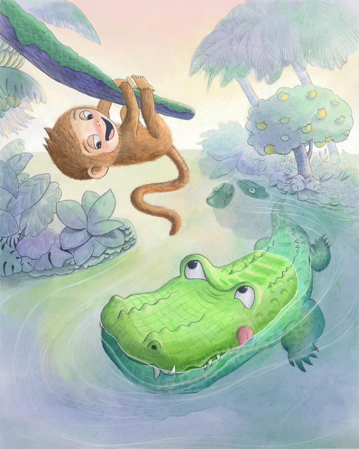
                                            @Johanna-Kim This is so cute! I love the soothing color palette and Clyde is perfect! I love Bongo's teasing expression. The way you've shown the underwater part and the distant foliage is super! I'm struggling to find anything to critique!

                                            https://www.nrbstudio.in/
                                            https://www.instagram.com/nrbstudio.in

                                            1 Reply Last reply Reply Quote 1
                                            • First post
                                              Last post