Society of Visual Storytelling

    SVSLearn Forums

    • Register
    • Login
    • Search
    • Recent
    • Tags
    • Popular
    • Users
    • Groups
    • Search

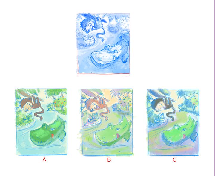
    June Prompt WIP - critiques welcome please

    Artwork
    14
    24
    1007
    Loading More Posts
    • Oldest to Newest
    • Newest to Oldest
    • Most Votes
    Reply
    • Reply as topic
    Log in to reply
    This topic has been deleted. Only users with topic management privileges can see it.
    • miranda-hoover
      miranda-hoover last edited by

      Super cute! A is definitely my favorite. But B and C are good too.

      https://www.instagram.com/mirananemone

      1 Reply Last reply Reply Quote 1
      • Jacy13
        Jacy13 last edited by

        @Johanna-Kim My favorite thumbnail is B. I really like the dynamism of the alligator and the overall perspective going on! 😃

        As per your two other questions; I like both the cuter and the scarier alligators. I don't really prefer one or the other. It depends more on the type of effects you're looking to achieve in the illustration. As for question two; I typically prefer animal characters without clothes 🙂

        Deviantart: https://www.deviantart.com/jacy13
        Instagram: https://www.instagram.com/jacy13draws/?hl=en
        Portfolio: https://jacy13.artstation.com/

        1 Reply Last reply Reply Quote 1
        • Kevin Longueil
          Kevin Longueil SVS OG @Johanna Kim last edited by

          @Johanna-Kim They are all really good!! D cracks me up though and it is a unique composition. You can't go wrong with any of these!

          Portfolio: kevinlongueil.com
          https://www.instagram.com/kevinlongueil/

          Johanna Kim 1 Reply Last reply Reply Quote 1
          • deborah Haagenson
            deborah Haagenson last edited by

            I like the composition and the eyes of the alligator looking up in F.

            1 Reply Last reply Reply Quote 1
            • D
              Diane Kond last edited by

              Hi! I like F for the monkey, fells more dynamic. And alligator drawings from B.
              Very interesting thumbnails!

              1 Reply Last reply Reply Quote 1
              • K.Flagg
                K.Flagg last edited by

                I agree, i think B for Clyde and F for Bongo. A combo of those 2 would be awesome but I love them all. Nice work 👏

                K.Flagg

                1 Reply Last reply Reply Quote 1
                • Nyrryl  Cadiz
                  Nyrryl Cadiz SVS OG @Johanna Kim last edited by

                  @Johanna-Kim amazing thumbnails! Really great composition but D looks really sexual to me 😂😂😂😂 in all seriousness tho. I think A and B are your strongest ones

                  Portfolio: nyrrylcadiz.com
                  Instagram: https://www.instagram.com/nyrryl_cadiz/
                  YouTube: https://www.youtube.com/channel/UCbJCF1Im8ZO7hpGWTKOJMuA

                  Johanna Kim 1 Reply Last reply Reply Quote 1
                  • Neha Rawat
                    Neha Rawat last edited by

                    These are so cute! Super work on the thumbnails!

                    I also like B for Clyde and F for Bongo.
                    I also like the depth in E since it sort of shows the journey and obstacles that Bongo has to overcome to reach his goal.

                    For your questions, I love everything cute! And the clothes are nice if it adds to their personality.

                    Really looking forward to see this develop! 🙂

                    https://www.nrbstudio.in/
                    https://www.instagram.com/nrbstudio.in

                    1 Reply Last reply Reply Quote 1
                    • Johanna Kim
                      Johanna Kim SVS OG last edited by

                      Hello friends (@Neha-Rawat @Nyrryl-Cadiz @K-Flagg @Diane-Kond @deborah-Haagenson @Kevin-Longueil @Jacy13 @gavpartridge @miranda-hoover @charitymunoz @Jeremy-Ross), thanks so much for taking the time to chime in about your preferences and suggestions. I tried my best to listen to all your notes. In some instances, I got conflicting notes, so I had to use my best judgement and landed on the following thumbnail sketch. Now I'm considering color palette. I'm leaning towards color sketch B because it feels like summer to me, and it's the least reminiscent of Curious George, as much as I love that character.

                      I'm working on finalizing the drawing now but if you see anything glaringly wrong or bothersome, please let me know. Thanks again!

                      Color studies-2 s.jpg

                      http://www.johannakim.com
                      http://instagram.com/johannahkim/

                      deborah Haagenson Jacy13 2 Replies Last reply Reply Quote 3
                      • Johanna Kim
                        Johanna Kim SVS OG @Nyrryl Cadiz last edited by

                        @Nyrryl-Cadiz Thanks for the note about D appearing sexual. I always worry about inserting that kind of connotation into a children's illustration.

                        http://www.johannakim.com
                        http://instagram.com/johannahkim/

                        1 Reply Last reply Reply Quote 0
                        • Johanna Kim
                          Johanna Kim SVS OG last edited by

                          @gavpartridge Thanks for your comments. As for my thumbnails, these were version 2 of my thumbnails, so you could understand them. You should have seen the first scribbly ones--unreadable, for sure! I think it's better to keep thumbnails really loose, though. I find that as soon as I start tightening up the drawing, I lose that feeling of spontaneity and spark. I'm actually trying to work on this illustration faster than usual, since I have a habit of working an illustration to death.

                          http://www.johannakim.com
                          http://instagram.com/johannahkim/

                          1 Reply Last reply Reply Quote 0
                          • Johanna Kim
                            Johanna Kim SVS OG @Kevin Longueil last edited by

                            @Kevin-Longueil Thanks for your vote for D:) I really like that bold perspective and will have to find a better use for it in a future illustration.

                            http://www.johannakim.com
                            http://instagram.com/johannahkim/

                            1 Reply Last reply Reply Quote 1
                            • deborah Haagenson
                              deborah Haagenson @Johanna Kim last edited by

                              @Johanna-Kim I agree with your choice. I like B! To me it's got more life than the other two.

                              1 Reply Last reply Reply Quote 1
                              • Jacy13
                                Jacy13 @Johanna Kim last edited by

                                @Johanna-Kim I also like B for the color palette as well! Looks very lively and vibrant 😃

                                Deviantart: https://www.deviantart.com/jacy13
                                Instagram: https://www.instagram.com/jacy13draws/?hl=en
                                Portfolio: https://jacy13.artstation.com/

                                1 Reply Last reply Reply Quote 1
                                • Julia
                                  Julia @Johanna Kim last edited by Julia

                                  @Johanna-Kim hello! I am coming a little late. My favourite would have been D with an opened mouth but I like your final sketch, it looks great too!
                                  I can't wait to see the final drawing in colours. Good luck!
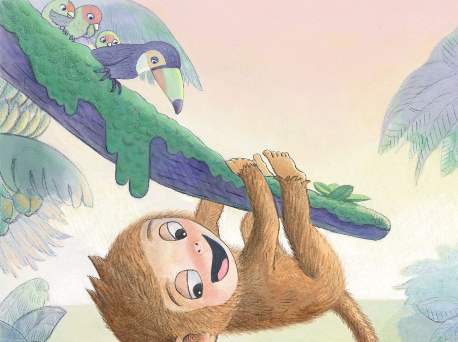
                                  https://www.instagram.com/julia.nsw/

                                  1 Reply Last reply Reply Quote 1
                                  • Johanna Kim
                                    Johanna Kim SVS OG last edited by

                                    Hi Friends,

                                    Here's the painted version.

                                    Some questions:
                                    Is there anything here that's bugging you (even if you don't know why)?
                                    Is Bongo cute enough?
                                    Is Clyde too scary for kids?

                                    Bongo_painting7s.jpg

                                    http://www.johannakim.com
                                    http://instagram.com/johannahkim/

                                    carlianne 1 Reply Last reply Reply Quote 2
                                    • Neha Rawat
                                      Neha Rawat last edited by

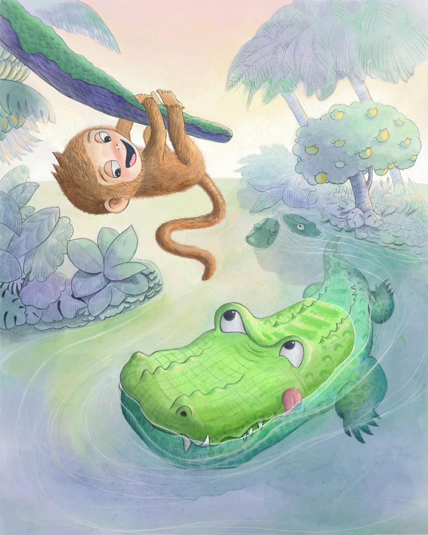
                                      @Johanna-Kim This is so cute! I love the soothing color palette and Clyde is perfect! I love Bongo's teasing expression. The way you've shown the underwater part and the distant foliage is super! I'm struggling to find anything to critique!

                                      https://www.nrbstudio.in/
                                      https://www.instagram.com/nrbstudio.in

                                      1 Reply Last reply Reply Quote 1
                                      • carlianne
                                        carlianne @Johanna Kim last edited by

                                        @Johanna-Kim I agree with Neha! It looks great!! I don't think Clyde looks too scary and you really nailed the teasing expression

                                        The only thing that causes me to pause is the branch that bongo is on. I was struggling to tell if it was part of a tree or a leaf for a while, maybe you could just clarify that.

                                        Check out my art and tutorials :)

                                        Instagram: www.instagram.com/carliannecreates/

                                        Youtube:
                                        https://youtube.com/c/CarlianneCreates

                                        Shop: www.carliannecreates.com

                                        1 Reply Last reply Reply Quote 1
                                        • D
                                          Diane Kond last edited by

                                          I love the look of the alligator in the back 🙂

                                          1 Reply Last reply Reply Quote 1
                                          • Johanna Kim
                                            Johanna Kim SVS OG last edited by

                                            Hey friends,
                                            Just want to say thanks again for all the help through my process. I believe that all your notes and encouragement helped to make this illustration far better than if I had worked on it on my own. But I know I still have lots to learn.

                                            @carlianne Thanks for that note about the branch. I made some changes (see detail) which I hope clarifies things. But even if not, I think it's time to submit this illo and move on to the next thing.

                                            Bongo_painting8-detail.jpg

                                            http://www.johannakim.com
                                            http://instagram.com/johannahkim/

                                            carlianne 1 Reply Last reply Reply Quote 1
                                            • First post
                                              Last post