Society of Visual Storytelling

    SVSLearn Forums

    • Register
    • Login
    • Search
    • Recent
    • Tags
    • Popular
    • Users
    • Groups
    • Search

    July Contest WIP—Thoughts?

    Projects
    art contest july wip covers
    10
    17
    1828
    Loading More Posts
    • Oldest to Newest
    • Newest to Oldest
    • Most Votes
    Reply
    • Reply as topic
    Log in to reply
    This topic has been deleted. Only users with topic management privileges can see it.
    • Dana Eastes
      Dana Eastes last edited by

      I like the perspective on "B". Where do I find the prompt for the July contest? thanks, Dana

      JoshSchouwstra 1 Reply Last reply Reply Quote 0
      • JoshSchouwstra
        JoshSchouwstra @Dana Eastes last edited by

        @Dana-Eastes Thanks for the input!

        The post for July's Art Contest prompt got a bit buried (lots of activity on the forums!), but here is a link that will hopefully work:
        https://forum.svslearn.com/topic/9685/july-contest-design-a-book-cover-for-the-wizard-of-oz/8

        Otherwise, you might need to do some forum digging. It's posted in announcements.

        1 Reply Last reply Reply Quote 0
        • JoshSchouwstra
          JoshSchouwstra @Heather Boyd last edited by

          @Heather-Boyd Great idea with the lion! Thanks for the input!

          And yes, the titling will be adjusted in the next phase 🙂 , just wanted to get the general idea of where the text would be so I could figure out some basic placement.

          1 Reply Last reply Reply Quote 1
          • deborah Haagenson
            deborah Haagenson last edited by

            I have to say that A is my choice, because the characters are in action, walking along. In B their backs are all to us and in C they are all looking at us, with no real purpose I don't think - Unless I missed something.

            1 Reply Last reply Reply Quote 0
            • Jeremy Ross
              Jeremy Ross @JoshSchouwstra last edited by

              Hi @JoshSchouwstra, I like B of the bunch.

              https://www.instagram.com/jeremyrayross
              https://www.jeremyrayross.com/
              https://twitter.com/jeremyrayross
              https://jeremyrayross.substack.com/

              1 Reply Last reply Reply Quote 0
              • Dima Eichhorn
                Dima Eichhorn @JoshSchouwstra last edited by

                @JoshSchouwstra I like B the best

                https://www.instagram.com/dima_eichhorn/

                1 Reply Last reply Reply Quote 0
                • JoshSchouwstra
                  JoshSchouwstra last edited by

                  Thanks guys!
                  I decided to go with a combination of the B and C.
                  OzCover_LINEART_JSchouwstra.jpg

                  Coley 1 Reply Last reply Reply Quote 8
                  • A
                    aprilshin last edited by

                    I love your characters!! Can't wait to see it with the text as well 😃

                    1 Reply Last reply Reply Quote 0
                    • deborah Haagenson
                      deborah Haagenson last edited by

                      Very nice line work!

                      1 Reply Last reply Reply Quote 0
                      • Coley
                        Coley @JoshSchouwstra last edited by

                        @JoshSchouwstra nice!

                        https://www.instagram.com/nicoleledrewmay/

                        1 Reply Last reply Reply Quote 0
                        • JoshSchouwstra
                          JoshSchouwstra last edited by

                          @deborah-Haagenson @Coley @aprilshin Thanks guys!

                          1 Reply Last reply Reply Quote 0
                          • cszoltan
                            cszoltan last edited by

                            Great choice Josh! the B version was a bit chaotic for the title to be clear. Rely dig the dramatic camera angle, you should try adding the tittle on top, maybe you will need to add more free space up there to be balanced.
                            Cant wait to see your progress!

                            C.S.Zoltan
                            Portfolio: www.behance.net/cszoltan
                            Instagram: www.instagram.com/c.s.zoltan

                            1 Reply Last reply Reply Quote 0
                            • JoshSchouwstra
                              JoshSchouwstra last edited by

                              @cszoltan Thanks!

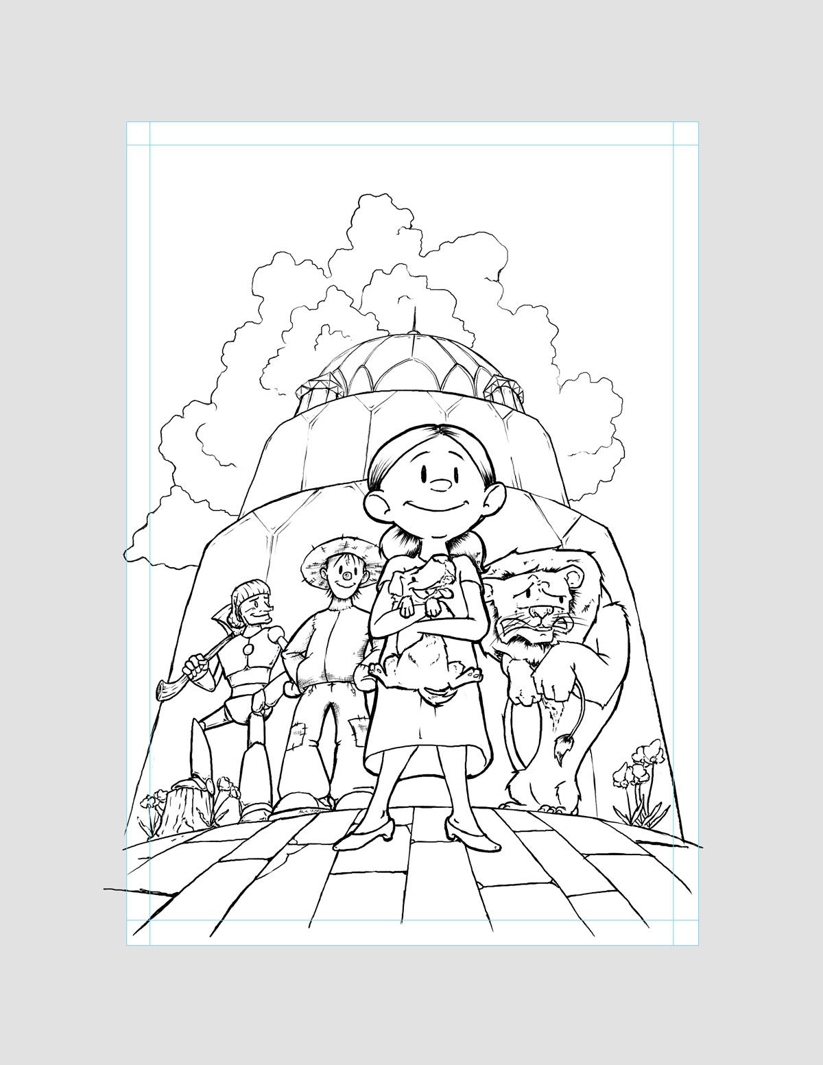
                              Here's the tentative final design (the final submission will have the guides off).

                              OzCover_FINALV2.jpg

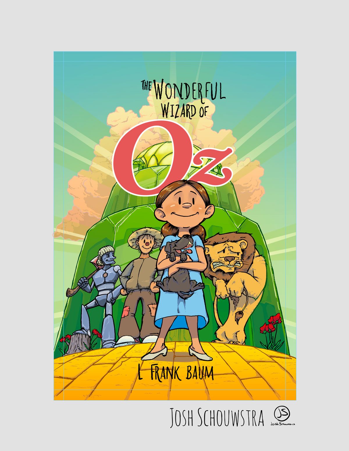
                              Though does anyone find the text to be lost in the design (thinking especially of the author's name)?
                              And as always, any other notes/critiques are welcome 🙂

                              1 Reply Last reply Reply Quote 5
                              • cszoltan
                                cszoltan last edited by

                                Rely like it how its coming along. It has a Comic Book-ish feel to it!
                                Btw, I know that the bleed it there to be cut of after printing, but what should we do with it, its more then 2 inch, I suppose that we don`t have to continue the image?

                                C.S.Zoltan
                                Portfolio: www.behance.net/cszoltan
                                Instagram: www.instagram.com/c.s.zoltan

                                JoshSchouwstra 1 Reply Last reply Reply Quote 0
                                • JoshSchouwstra
                                  JoshSchouwstra @cszoltan last edited by

                                  @cszoltan Thanks! I was hoping to try a more comic book style 🙂

                                  To answer your question on the bleed, the bleed is not the grey area. The grey area is there not only to frame the final comp a bit more, but also allow one to draw beyond the edge of the piece.

                                  OzCover_BLEEDEXAMPLE.jpg

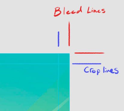
                                  As for what to do with the bleed area, I'd say to include it in the final image, since that is what I've done with other jobs that require bleed.

                                  Hope that helps!

                                  1 Reply Last reply Reply Quote 0
                                  • First post
                                    Last post