Serious critique on Akins WIP
-
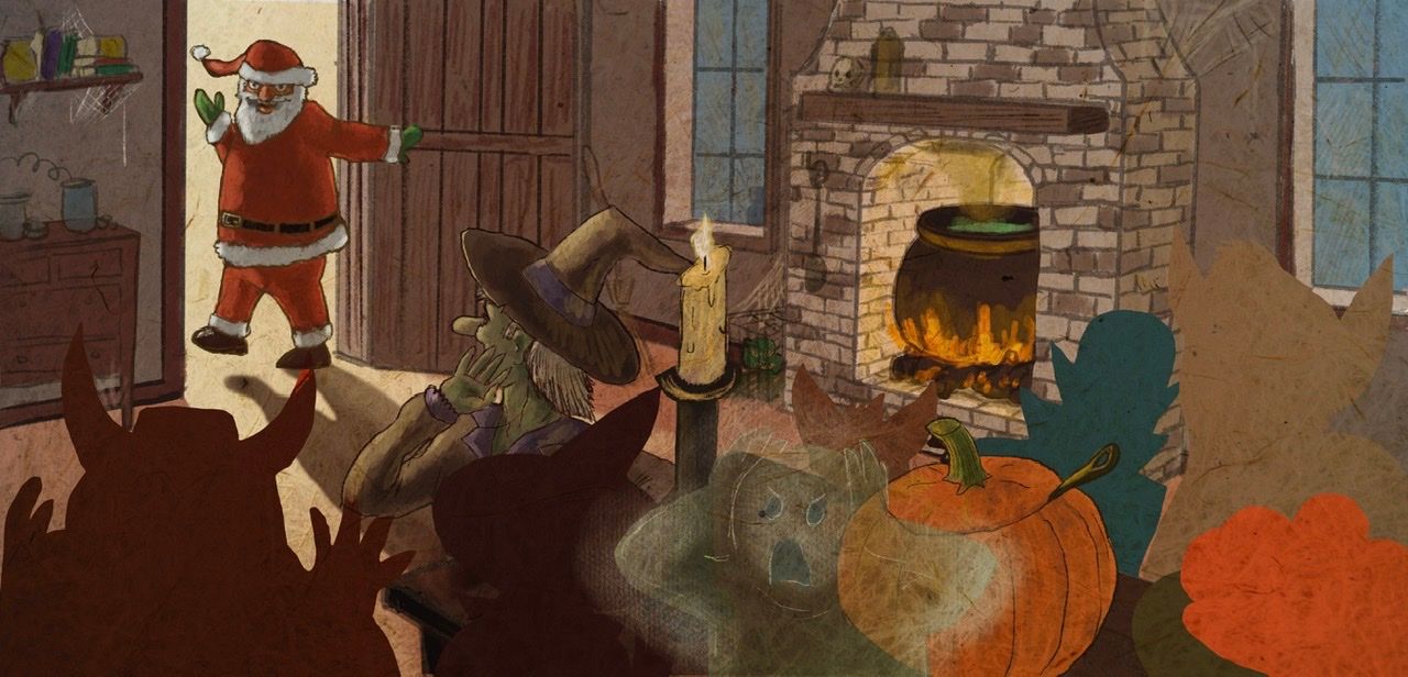
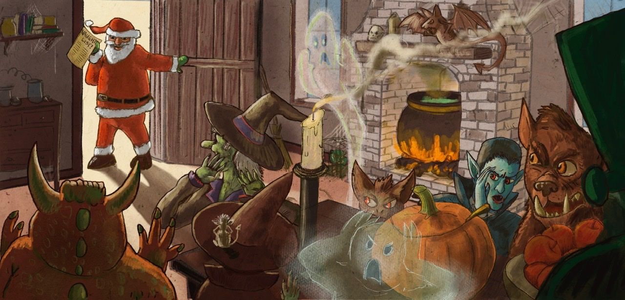
Before I get too much further, how is this composition? (And ignore Santa’s leg, I know I gotta fix it). How are the values? How’s the story. I still have to draw the other characters.
-
First impressions
Santa stands out well. My eye goes right to him.
It’s not clear to me what is happening in the story. I may be unfamiliar with the story so might not get it for that reason.
My eye wants to go to the right and keep going. Maybe make the right side darker to keep the focus on the left side.
I think your fireplace looks really good. And I’m interested in seeing the rest of the characters.
Edit: Face palm!!! I understand the story now. Lol. I had a long day yesterday, I didn’t realize this was part of the October contest.
-
The one thing that sticks out to me is that it looks like, based on his body position, Santa is leaving, and looking back for one last wave before pulling the door closed behind him. But if I'm reading the story correctly, he's just entered, ruining the spooky party with his Christmas cheer.
-
I was thinking about the monsters lined up in the foreground and i think you should mix up the sizing and position a little. Maybe one big one in the extreme foreground on the right to keep the focus in the room. Am I making sense?
-
@chrisaakins your fire place looks beautiful but it competes with Santa for attention.
It kind of looks like you could use more spread out characters to add some depth to the composition. Maybe a couple right inside the door or overlapping the fireplace, Idk. I agree that Santa looks like he’s leaving not coming. Maybe he could use more of a “surprise” posture.
Overall I think you have a good thing going. I look forward to seeing the end result. Good luck. -
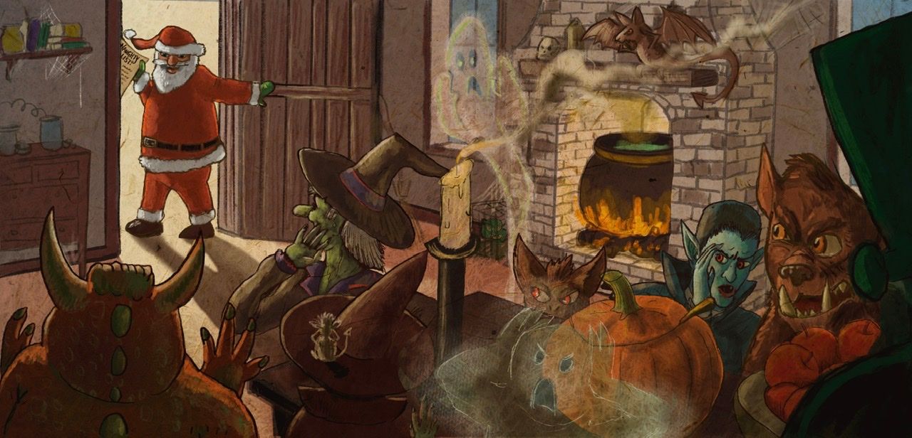
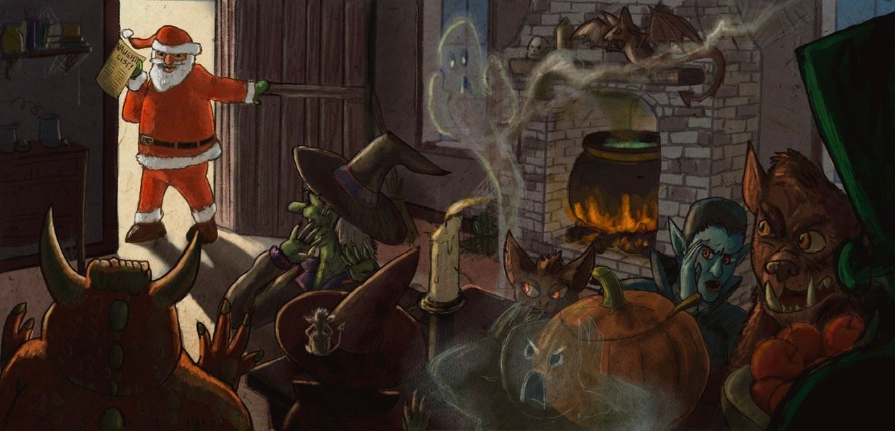
Okay, how’s this?
-
I fixed Santa’s position. Anybody see anything else?
-
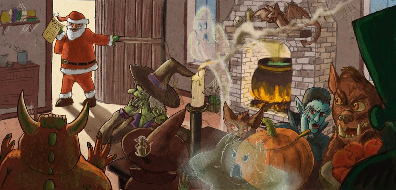
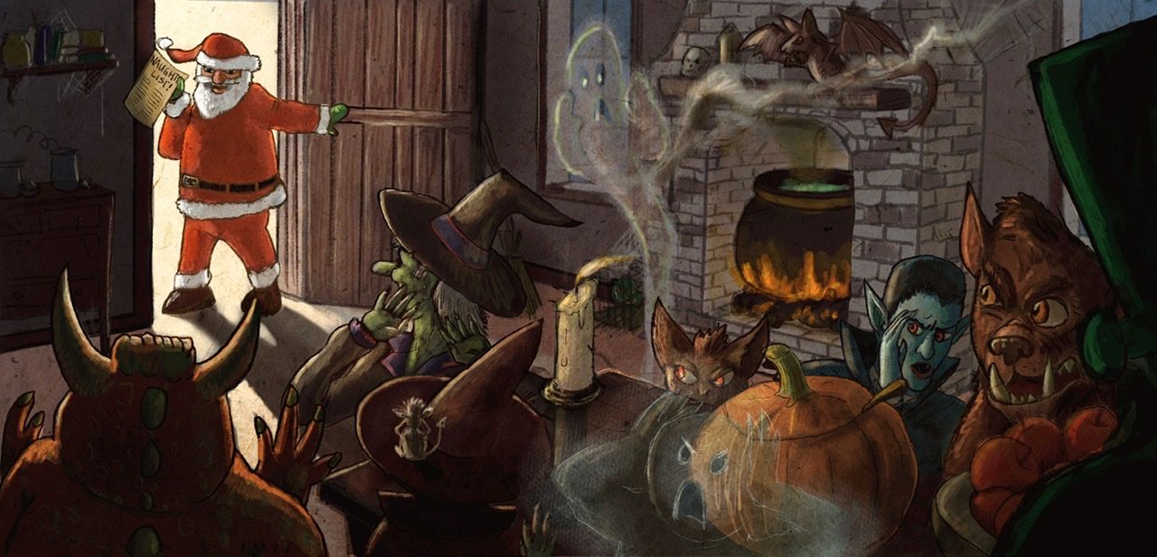
Made some last minute adjustments. Which is better, the brighter one or the more textured one?
-
@chrisaakins I'm drawn to the candle that splits the scene in half. Santa looks better. I would see how it looks if you punched up Santa's color a little. Idk, it may be too out of place. Keep going!
-
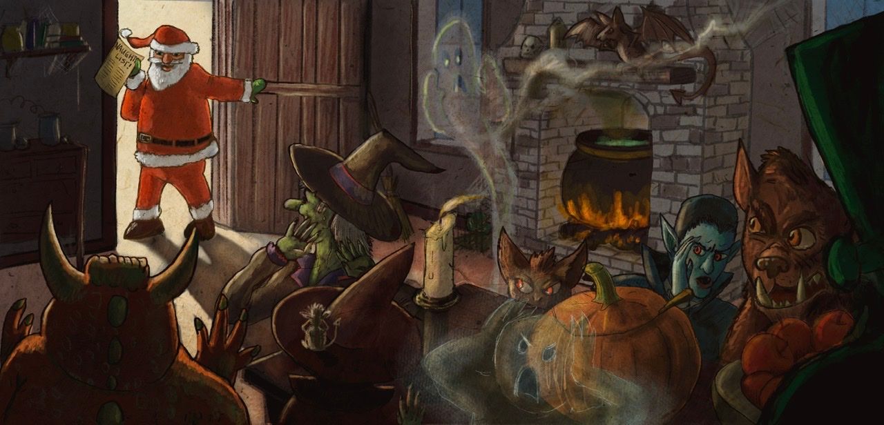
in my opinion its right now a bit messy and your main focal point which seems to be santa is challenged a lot by all the different things on the image. i would push the shadow/lights more, add rimlights and take the enviromental lightcolor into consideration to seperate them from him more.
here a quick messy rework to give you a hint at which direction i would push it to

-
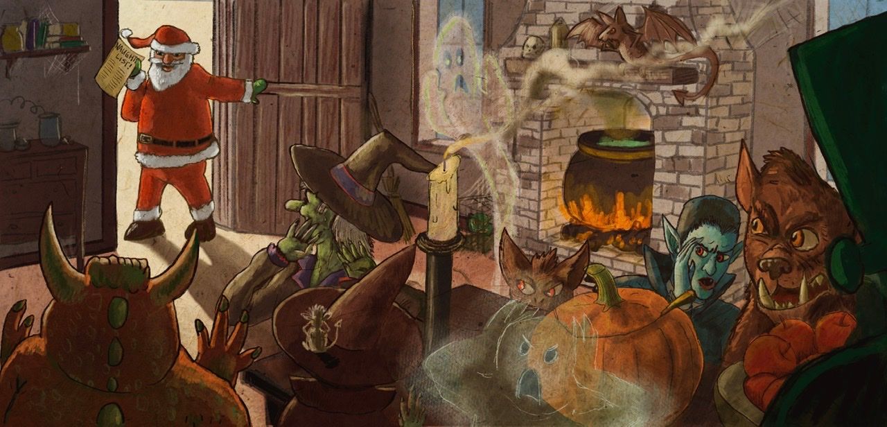
@Molambo I see what you mean. How’s’ this?
-
Ugh I think I went too dark. Maybe this? I think I have been looking at this too long.
-
@chrisaakins I like the candle lower.
-
I think I’m done? I feel like it’s not good enough but I think I need to be done.
-
@chrisaakins I like this one.
