How to make things not look airbrushy
-
@Annaaronson said in How to make things not look airbrushy:
Hello! I haven’t posted in while, glad to be back! I have been working on this piece all week. I haven’t used any airbrush at all... mostly pastel and pencil brushes but it still looks a bit too airbrushy for my taste- how do you avoid making things look overly airbrushed? I know it makes it look more amateurish, and I’d definitely like to avoid that! Any other feedback is welcome- but the airbrush feel is the main thing I’m trying to fix rn!
How have you solved this problem in your own work?
Thanks!
-Anna
without seeing the brushes its hard to tell if its the fault of em or how you work.
do they have hard edges? when yes you might have softened it to much out via opacity and the way you blend.
i think when you post the program and tools you used its easyer to help.quick way to "fix" the image itself is by sharpening it.
here a quick example of how it gives everything a harder edged look. you of course have to play around with it to not make it to strong but i emphasized it a bit so the difference is easyer to seetop original - down sharpened version - click on it for a better view.

-
@Molambo ohh that is a huge help!
Thank you! I did not know that you could do that. I started the piece traditionally and finished it digitally- it brings back some of that traditional feel. I will definitely be messing around with that. Thanks for sharing!! -
@Annaaronson The sharpening definitely helps, but I think the root problem is that you're being a bit shy when you paint on your lights and shadows. You make them quite soft, not as defined or contrasted as they could be, which gives the whole image a little bit of a "cloud" shading look, like everything is made of soft marshmallow if you will
") Which is not necessarily bad, it's a cute look but since it seems it's not what you're looking for, try more defined shapes and don't be afraid to go darker in your shadows for more contrast!
Which is not necessarily bad, it's a cute look but since it seems it's not what you're looking for, try more defined shapes and don't be afraid to go darker in your shadows for more contrast! -
@Annaaronson very sweet image..it has a lot of soul.
-
@djlambson Thank you !!
@NessIllustration That makes a lot of sense! I can toootttallly see marshmallowy now that you say that!! I definitely like a bolder image than what I am currently making. I am going to try to pump up my lights and shadows. Thank you so much for your help!
-
One trick that a favourite artist of mine (Daniel Lieske, if you’re interested) does while finalising his work is duplicating his flattened art, running it through a Find Edges filter, and setting that layer to Colour Burn on low opacity. It has the effect of sharpening up brushstrokes and creating an impression of depth on the painting surface, almost like thick paint. It helps a lot if your art is lineless, or your process doesn’t preserve your initial sketches very well.
-
Hi @Annaaronson
I have a tendency towards too much softness too. Aside from trying out texture brushes, I also sometimes just repaint certain edges on a normal layer above main art , even sometimes with a hard round brush or a chalky or pastel brush. But what i do is add more detail and harder edges to focal areas. And often, not always, those areas tend to be closer to the viewer and The softer edges tend to be farther. I actually looove playing with edges even tho I don't always get it right. It's one of my favorite things to do while painting! But I lean towards a more realistic style too. A more graphic style and one would perhaps have mostly hard edges. Anyhow hopefully that helps a bit
-
@blamillo and @Coley SUCH great thoughts. Thank you!
You guys got me thinking... edges, shadow, light- maybe it’s time to revisit "shadow and light for illustrators" so that’s what i did - and I restarted the piece
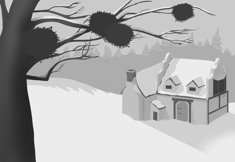
 so here is where I got today- local color. My daughter told me my mistletoe balls look like coronavirus so hopefully I can fix that as I add detail. Ha!
I’ll post as I go. Seriously thanks so much for everyone’s input.
-
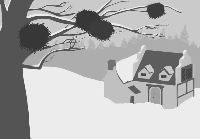
Whoops. Forgot a layer!
-
This is a very helpful thread because I, too, have problems with edges whether I'm doing traditional watercolor or digital. I've found that I do better if I pay attention to values so that there is a clear differentiation where the edge is, and if I'm braver about putting in my strokes! I read somewhere that we are more likely to put in soft edges if we stand too close to the painting (or zoom in too much) because the hard strokes stand out so much when you are close up and we are tempted to blend/soften them. They suggested standing back from the painting frequently (or zooming out) so that we see the hard edges at work with the whole painting.
As I said, I'm still working on this all myself!
-
The SVS Holy Trinity touched on this once. They mentioned this happened when you have a brushes opacity turned down.
Also, I found when I overwork an area it tends to loose the brush texture so I will lightly go back over that area with an actual texture brush on overlay to get the feel back. -
@demotlj Taking a step back and looking is something I forgot to do sooo often. Thanks for the reminder. I think I get super timid when it comes to my brush/ Apple Pencil strokes. I’m glad I’m not alone!
@burvantill I remembered them mentioning it which is why was trying to fix it. But didn’t really remember what they said. Thanks!
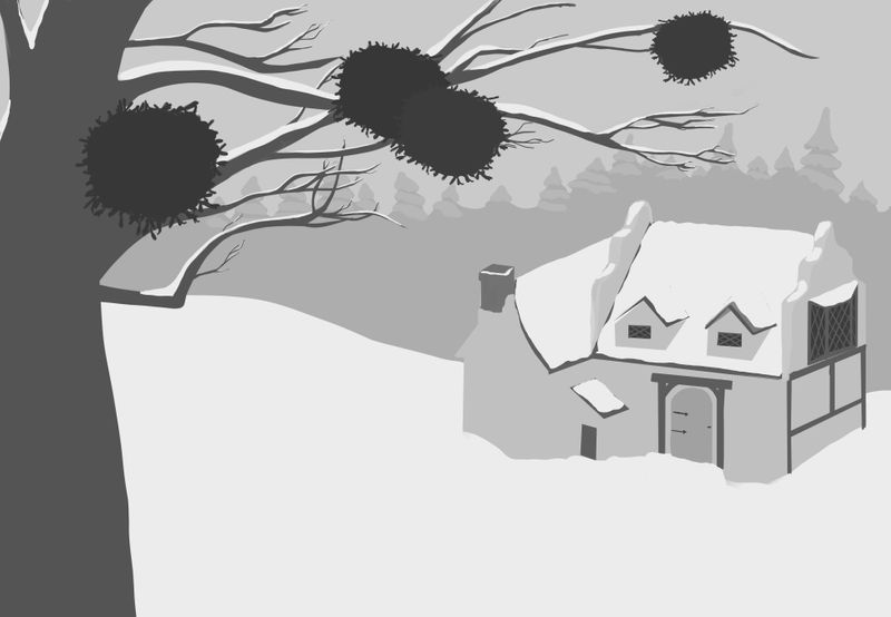
Here are the shadows I did today- I may still make them darker after I add the light and see how to contrast works. We shall see