thumbnails for a book cover - what do you think?
-
@miranda-hoover Thank you so much for your feedback. Very appreciated.
I did a super dirty draw over. do you think this improved the balance?
Thanks for the tip with mirroring.
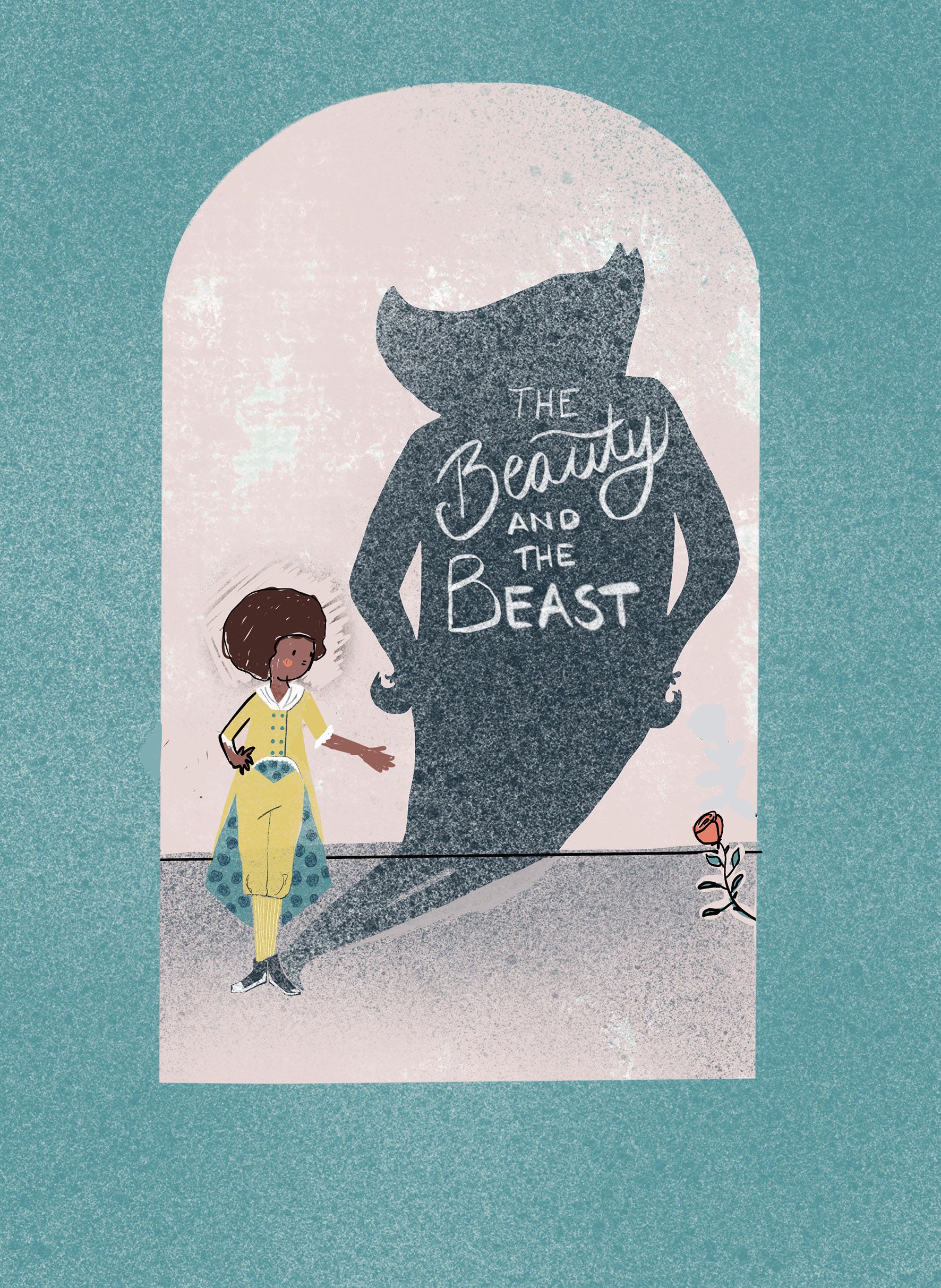
I will defiantly clean up the the texture of the beast and I guess I should look into the silhouette again as well. Not sure what to do yet, but I'll have a look.
any more feedback?
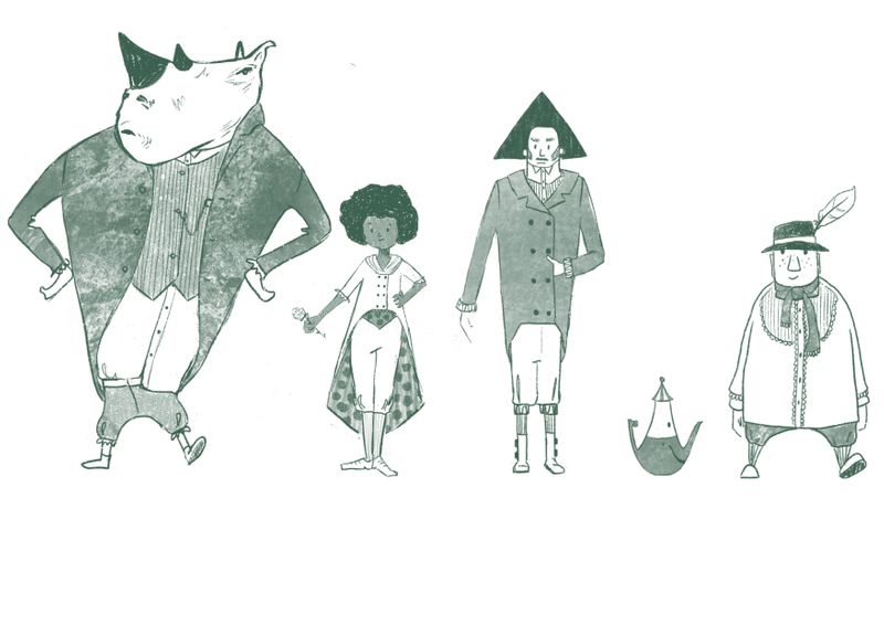
BTW: I love the Idea of a rhino. I am considering to redo the lineup with a rhino designed beast.
-
I had a hard time picking between these, I don't know what exactly this character or book is all about but they all look really promising!
They all have a different vibe to them and look like they tell slightly different versions of a story.
out of these however, I personally really liked c and d !
These thumbnails really made me stop and think about the story and the cover and the character and what they all mean!
that alone is amazing about your designs so great going! -
@doro_thea Okay, see the color choice for the suit makes more sense knowing that. I admittedly don't know much about princess stories, so I wouldn't have known about the yellow color of the attire at all. Oops!

And I didn't know that your Beast doesn't have horns per say. Either way, I would still think about exaggerating that part in your silhouette.
")
-
@doro_thea Yes! I think the balance is much better. I'd probably tilt the line of the floor a bit more towards the right--but that's probably just me getting nit-picky.
Looking great

-
@miranda-hoover Thank you! I'll also try the the tilting the floor, as I really like how your feedback influenced my design.
BTW tried out the rhino beast. And I am actually considering to rethink my line up, as i think it is so much fun
-
@Jacy13 I will look into how to exaggarate the "horns". I think this is really good feedback that the silhouette needs to be more interesting...
-
@krish-iyer Thank you so much for your opinion. What stood out for you on C and D? anything in specific?
-
@doro_thea Really cool! Definitely makes it unique!
-
@doro_thea is it just me or is the best really standing crooked?
-
@doro_thea I liked that they were both simple and like representations of the characters and in a way open to interpretation, I liked the silhouette style of c and how simple and neat d was
-
@Kori-Jensen yes, it is. will change
-
@krish-iyer Thanks for the explanation, I was really drawn to the silhouette style as well, so maybe I will make a second version later on.
-
@miranda-hoover Thanks for the great Idea
-
I worked some more on it. Any final feedback before I call this finished?
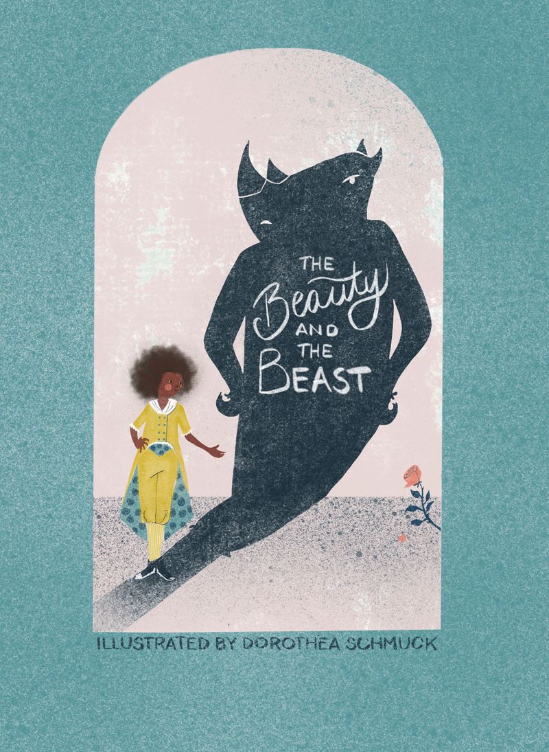
And thanks for everyone who commented so far. I really appreciate your feedback! -
Very nice I like the single rose in the corner
-
@miranda-hoover, @txels, @krish-iyer, @Jacy13, @Kori-Jensen and @powsupermum Thank you all for the feedback. I think this improved so much with all your input. Any last things that you think are irritating or need improving?
-
That's looking great! It's simple but so good , It's like the mix of my two favorite thumbnails! Great work!
-
looks amazing :D.
-
@doro_thea I like G the most and H a bit because you have the silhouette of the beast once again. I just realized how late I am to the feedback party but no worries you've got great help!
-
@doro_thea The only last couple of nitpicky things that I see are 1: there is a tangent where her shoes meet the shadow cast and 2: The texture you have kind of starts to make the face of your main character look a bit blurry. Other than those things, I think this cover is great! I think your beast's silhouette looks much better in this version. Perfect for a portfolio piece in my opinion
