• Recent
  • Tags
  • Popular
  • Users
  • Groups
  • Search
  • Register
  • Login
Society of Visual Storytelling

SVSLearn Forums

  • Register
  • Login
  • Search
  • Recent
  • Tags
  • Popular
  • Users
  • Groups
  • Search

Vignetti Yeti - looking for feedback in progress

Contest
17
40
1.8k
Loading More Posts
  • Oldest to Newest
  • Newest to Oldest
  • Most Votes
Reply
  • Reply as topic
Log in to reply
This topic has been deleted. Only users with topic management privileges can see it.
  • Nyrryl  Cadiz
    Nyrryl Cadiz SVS OG @Valerie Light last edited by 15 Feb 2021, 11:23

    @Valerie-Light my vote is on A. I love how simple and bare the background is. The Yeti’s silhouette is very clear and just pops right off the page.

    Portfolio: nyrrylcadiz.com
    Instagram: https://www.instagram.com/nyrryl_cadiz/
    YouTube: https://www.youtube.com/channel/UCbJCF1Im8ZO7hpGWTKOJMuA

    1 Reply Last reply Reply Quote 2
    • Jeremiahbrown
      Jeremiahbrown last edited by Jeremiahbrown 15 Feb 2021, 12:43 15 Feb 2021, 12:40

      I vote A. It feels more like a typical spot illustration and keeps the focus on the characters.

      Jeremiah Brown
      www.jeremiahbrownillustration.com
      https://www.instagram.com/jeremiah.brownillustration/

      1 Reply Last reply Reply Quote 1
      • KaraDaniel
        KaraDaniel last edited by 15 Feb 2021, 14:14

        I vote A 🙂

        instagram.com/sha_kara
        karadaniel.net

        1 Reply Last reply Reply Quote 1
        • Jacy13
          Jacy13 @Valerie Light last edited by 15 Feb 2021, 18:33

          @Valerie-Light I vote A as well 😃

          Deviantart: https://www.deviantart.com/jacy13
          Instagram: https://www.instagram.com/jacy13draws/?hl=en
          Portfolio: https://jacy13.artstation.com/

          1 Reply Last reply Reply Quote 1
          • Niels
            Niels last edited by 15 Feb 2021, 18:48

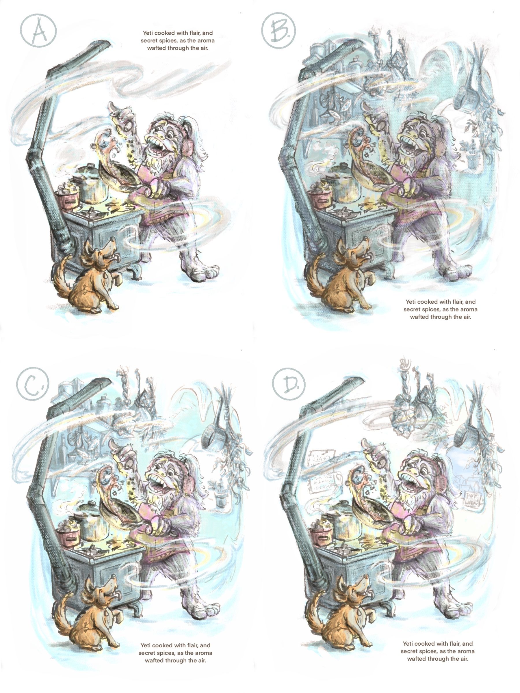
            I like D the most because of the different values in the picture. However I like how the chimney of the stove makes a natural border in image C. Maybe a mix of C and D would be an option? A stove-border like in C would probably mean that composition wise you’d have to ditch the stool with veg om the lower left though. The moving of the dog towards the right lower corner works quite well and makes more of a connection with the yeti this way.

            Instagram: www.instagram.com/novanbergen/

            1 Reply Last reply Reply Quote 1
            • KayPotter
              KayPotter last edited by 15 Feb 2021, 23:05

              I’m sticking with A because I think it’s the most ‘spot illustration-y’ :).

              1 Reply Last reply Reply Quote 1
              • shereen said
                shereen said last edited by 17 Feb 2021, 04:01

                I vote for A!

                1 Reply Last reply Reply Quote 0
                • E
                  Emma Echter last edited by 17 Feb 2021, 06:09

                  I vote A too 🙂

                  www.instagram.com/bold_archer

                  1 Reply Last reply Reply Quote 0
                  • Valerie Light
                    Valerie Light last edited by 17 Feb 2021, 19:55

                    All right, so many of you are encouraging me to do A, and I know that you're right about it being clear and readable and a traditional spot illustration, but something like C looks like so much more fun to me (and maybe a better addition to my portfolio). I decided to try some color roughs on a couple of different composition options.
                    If you all aren't sick of helping me design this by election, here are 4 variations of how to resolve the environment.
                    (PS I hope you vote for D) 2.17.21_Yeti_line_value.jpg.jpeg
                    www.valerielightillustration.com
                    www.instagram.com/valerie_light_illustration

                    E Jacy13 miranda-hoover 3 Replies Last reply 18 Feb 2021, 17:08 Reply Quote 3
                    • Asyas_illos
                      Asyas_illos last edited by 17 Feb 2021, 23:26

                      A and d are my faves I feel like with the colored background it’s just a little chaotic, great work though!

                      Asyasewardillos@gmail.com
                      www.Instagram.com/asyas_illos/
                      https://asyasewardillos.wixsite.com/mysite

                      1 Reply Last reply Reply Quote 1
                      • Jeremiahbrown
                        Jeremiahbrown last edited by 17 Feb 2021, 23:31

                        I agree with @Asyas_illos , A and D.

                        Jeremiah Brown
                        www.jeremiahbrownillustration.com
                        https://www.instagram.com/jeremiah.brownillustration/

                        1 Reply Last reply Reply Quote 1
                        • E
                          Emma Echter @Valerie Light last edited by 18 Feb 2021, 06:02

                          @Valerie-Light I still like A. I like the silhouette, without the background it is easy to read. And, is most definitely a spot illustration.

                          www.instagram.com/bold_archer

                          1 Reply Last reply Reply Quote 1
                          • chrisaakins
                            chrisaakins last edited by 18 Feb 2021, 13:53

                            @Asyas_illos I agree with @Valerie-Light that A is the one most like a spot illustration. I think it may be a winner, too. I called the last two so you better listen to me. 😉

                            Chris Akins
                            www.chrisakinsart.com
                            www.instagram.com/chrisakinsart/

                            Valerie Light 1 Reply Last reply 18 Feb 2021, 18:38 Reply Quote 1
                            • Jacy13
                              Jacy13 @Valerie Light last edited by 18 Feb 2021, 15:41

                              @Valerie-Light I like D 🙂

                              Deviantart: https://www.deviantart.com/jacy13
                              Instagram: https://www.instagram.com/jacy13draws/?hl=en
                              Portfolio: https://jacy13.artstation.com/

                              1 Reply Last reply Reply Quote 1
                              • miranda-hoover
                                miranda-hoover @Valerie Light last edited by miranda-hoover 18 Feb 2021, 17:09 18 Feb 2021, 17:08

                                @Valerie-Light D is great! It gives it depth and detail but still feels light and open. It also looks a lot like a spot illustration to me.

                                https://www.instagram.com/mirananemone

                                1 Reply Last reply Reply Quote 1
                                • Valerie Light
                                  Valerie Light @chrisaakins last edited by Valerie Light 18 Feb 2021, 18:41 18 Feb 2021, 18:38

                                  @chrisaakins Ooh, music to my ears!
                                  I think I may keep developing an A version and a D version together this week! I just feel like D is doing so much more storytelling, and I'm having a hard time giving up on that.

                                  www.valerielightillustration.com
                                  www.instagram.com/valerie_light_illustration

                                  1 Reply Last reply Reply Quote 0
                                  • Valerie Light
                                    Valerie Light last edited by 25 Feb 2021, 19:48

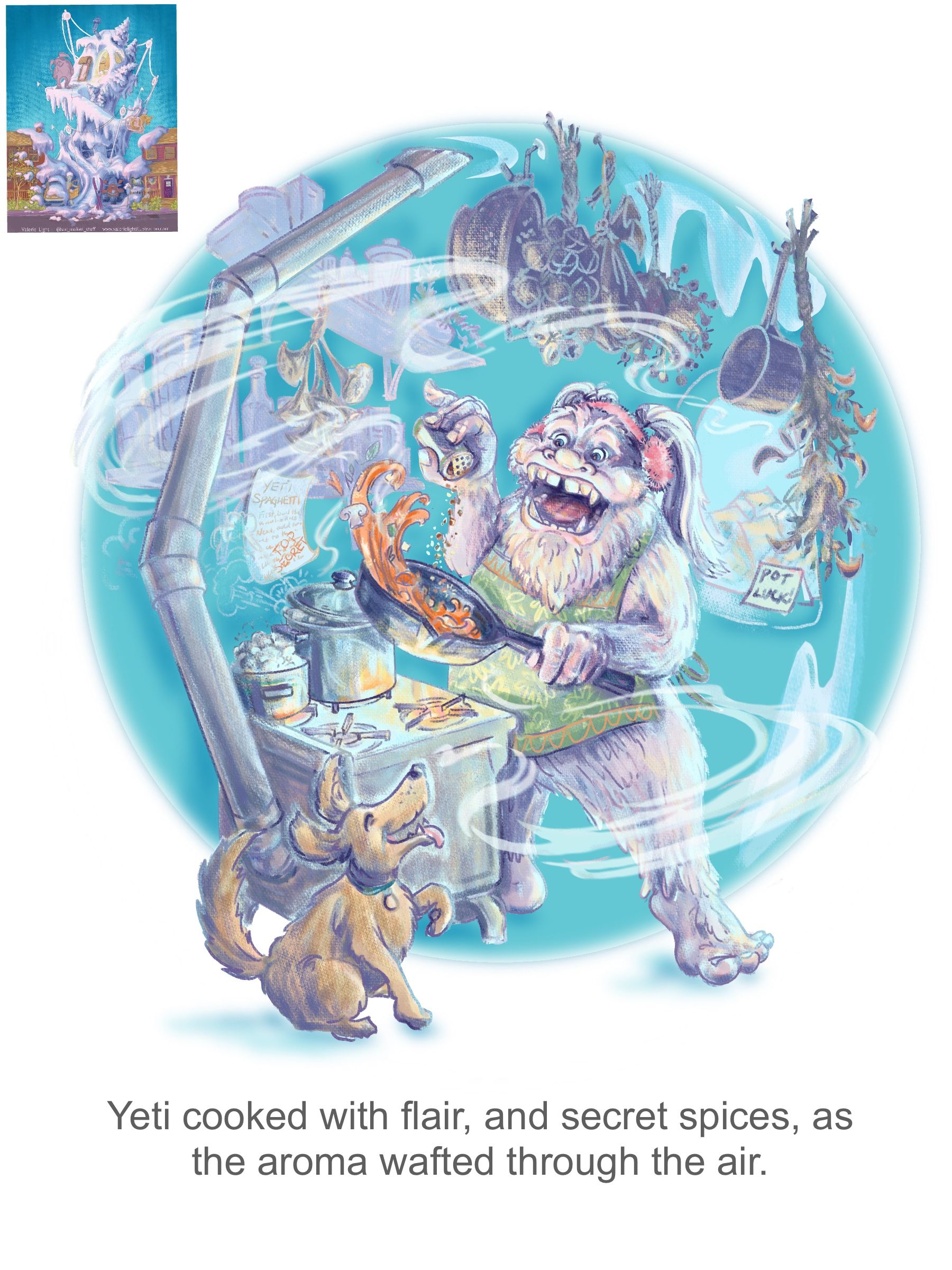
                                    Well, I stressed about this, overworked it for a while, ignored it for a bit, and then maybe figured something out today.
                                    It's looking like the light values are really blown out compared to what I see in Procreate on my ipad, so that definitely needs adjustment. (BTW the tiny image in the corner is a thumbnail of my yeti's house, and I want mood and color to coordinate between the two.)
                                    My main question is, Is the image readable? What would help that? As always, I welcome any feedback!
                                    2.25.21_Yeti_Spot_Progress.jpg.jpeg

                                    www.valerielightillustration.com
                                    www.instagram.com/valerie_light_illustration

                                    Melissa_Bailey 1 Reply Last reply 25 Feb 2021, 20:51 Reply Quote 0
                                    • Asyas_illos
                                      Asyas_illos last edited by 25 Feb 2021, 20:42

                                      I still feel like there is a lot going on. I think if you removed the shelves in the background it help it not feel so busy, and maybe dial down the saturation of the blues background? but this just my opinion. I really love your style I’m sure you can pull it off whatever decide to do!

                                      Asyasewardillos@gmail.com
                                      www.Instagram.com/asyas_illos/
                                      https://asyasewardillos.wixsite.com/mysite

                                      1 Reply Last reply Reply Quote 1
                                      • Melissa_Bailey
                                        Melissa_Bailey @Valerie Light last edited by 25 Feb 2021, 20:51

                                        @Valerie-Light you've got so much flair in this piece! Your yeti is really enthusiastic about her spaghetti!

                                        As you're refining this spot, consider what you really need to tell the story. If you don't need an element for the story, edit it out. Do you need things hanging from the ceiling to tell the story? Do you need shelves? Do you need a window? Do you even need a circle background?

                                        For me (and this is just one opinion), your piece would be stronger without these elements. They draw attention away from your happy yeti. The wafting aroma gets lost because it's competing for attention with the detail behind it. It even took me a minute to see the top-secret yeti spaghetti recipe, which is a fun little detail that should stay in.

                                        If your yeti needs a background color to stand out because she's so light, consider a lighter background in an interesting, organic shape. Perhaps mimicking the movement of the aroma? That might add more dynamism to the composition.

                                        So many ways you can go with this! Looking forward to seeing your finished entry!

                                        illustrator - author - smiley person
                                        mbaileyart.com
                                        instagram.com/mbaileyart/

                                        Valerie Light 1 Reply Last reply 25 Feb 2021, 21:40 Reply Quote 1
                                        • Valerie Light
                                          Valerie Light @Melissa_Bailey last edited by Valerie Light 25 Feb 2021, 21:40 25 Feb 2021, 21:40

                                          @Melissa-Bailey-0 @Asyas_illos
                                          Thanks for the feedback! I am constantly battling the urge to make everything I draw really detailed and complicated. Honestly I love doing it, but working toward making more readable images is important to me, too. Simplifying just isn't instinctive for me yet.

                                          I'm taking to heart what Lee, Jake, and Will said about this month's contest parameters- that storytelling details were key to doing this prompt successfully. And so I have this whole story in my head about this yeti who sets up her snow mountain in the suburbs, and is super excited to make friends with the new neighbors at the block party with her secret yeti spaghetti recipe. So I'm trying to describe the coziness of her snow house, how it's way above the neighbor's roofs, and how she loves cooking with all her yeti herbs & spices, etc, etc, as well as the words of the prompt itself.
                                          Is the answer just that I should not try to describe so many things?

                                          www.valerielightillustration.com
                                          www.instagram.com/valerie_light_illustration

                                          1 Reply Last reply Reply Quote 1
                                          21 out of 40
                                          • First post
                                            21/40
                                            Last post