Feedback please.
-
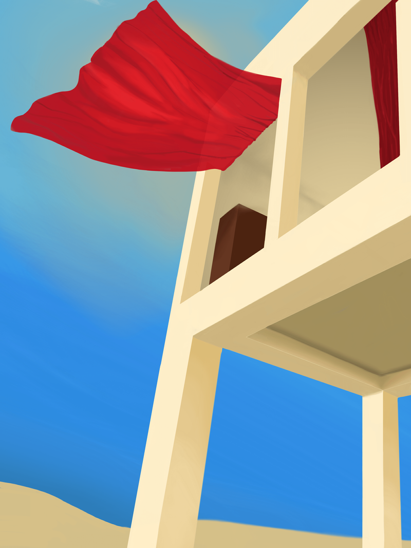
This is my first time ever asking for a critique so pardon me if I’m vague. My intention with this painting was to show a curtain blowing with the wind out of a building in a sunny desert at mid-day. In short, my issue with it is that I don’t feel like it’s finished yet, it’s lacking something, but I don’t know what to add to it. Maybe more ornamentation to the outside of the building itself? Is the sun effect lacking? Does it need more texture?
Any feedback, tips or tricks will be greatly appreciated. Many thanks.
-
@giorgiofeltrucci Hi. Your painting is very vector-esque but I don't completely think the lack of textures is necessarily the issue (although it can definitely help strengthen the piece) but my issue primarily regards the lack of storytelling.
It's just a curtain blowing in the wind in a very empty-looking desert. I think you can tell a story without using characters and let the landscape tell the story by itself, but the story here is rather mundane.
The dimensions of the portrait I also find somewhat limiting. I think the one thing that can improve this piece is by telling the audience (through objects in the portrait) what the significance of this setting is. What makes this place special? Why are we looking at the wind blowing through the curtain? Is the wind significant? Is the curtain significant? What is the significance of the house? What is the significance of the desert setting?
Essentially what makes the place the curtain is in special?
-
The forms of the buildings look believable enough. I would try to make the fabric match that level of believability.
-
@giorgiofeltrucci I agree with @Matthew-Oberdier . The structure and perspective of the building look great, but the curtains seem like they don't quite belong. Maybe try simplifying their forms by removing some of the lines and rendering to work with the simple forms of the building--I think it will also help the silhouette of the sun stand out a bit more. It also looks like your sand is a little inconsistent (only part is airbrushed). Keep up the good work

-
@Michael-Angelo-Go Thanks for taking the time to reply. I just remembered this is Society for Visual Storytelling forum and, accordingly, I should have predicated with the fact that I don’t want to tell a story with the piece, it’s just more technical feedback what I’m looking for.
-
@miranda-hoover thank you very much, @Matthew-Oberdier and your comments made me focus on the curtain and I can really see what you mean. I’ll be reducing the darker lines and just sticking with the bright highlights and gradating them to see if it does the trick

-
I really love the feel of this. And the color of the curtain is really striking and shows the lighting of the picture really well. My recommendation would be to consider where the curtain touches the top of the frame. It draws a lot of attention to that point, so I might crop it a bit more or give it more breathing room. Thanks for sharing.
")
-
@KathrynAdebayo Oh my God, I’m so glad you liked it! Thanks for the pointers, I’ll apply them, have a great day
-
I agree with the bit about the curtain looking a bit off but the overall angle of the building is nice and interesting. I will also add your background horizon line changes in-between building pillars. its quite sharp on the left side of the image and is much more blurry/soft on the right. Oh and the furniture in the room, I believe it is a book shelf, maybe add the actual shelves?
-
No prob. I’m glad you shared it. I like this kind of image because it makes you appreciate something simple. I just noticed one more thing... it looks like you have a bit of an optical illusion going on... The top level of the building rests on a beam that connects to the walls on the front and back of the building at different points. I think my description is vague, so if it’s not clear just let me know.
I can try to describe my thoughts better.