March WIP - Fairytale Flower - final touches
-
@carlianne 2 feels very regal and sophisticated, whole 4 has a more young naive adventurous feel. I think it has to do with muted shades vs. Bright tints if that makes sense.
-
@Meg-Clayburn that does thank you!
-
I think 2 is beautiful. I like the natural color pallet.
-
I like 2 and 4, 4 is so cheerful and cute but I also like the idea of an adventurer that can blend in from above and 2 feels sophisticated and graceful. I think I agree with Meg!
-
@carlianne I love 2 and 4.
-
I really like your colours, I think I like 3 and 4 the most

-
@carlianne I like 1 and 2 the best (leaning more towards 2). 4 is cute, but reminds me a lot of Tinkerbell so it doesn't seem as unique as the others. I also like 3, but it doesn't feel as adventure-y to me.
-
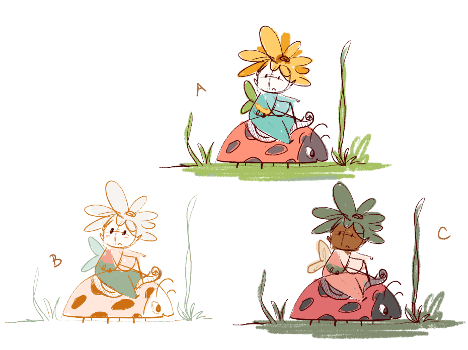
Thanks everyone for your feedback!! I decided to do some more color studies as I was exploring and I think that I want her to have a ladybug steed, and I was worried option 2 won't work well there. And also I wanted to explore the style for 3 a little more to see if I could make it work as a spot illustration.

obviously still rough, but let me know any thoughts here!
-
I love the ladybug steed! Very cute. I like all of them, but I like the complimentary colors of C. The values of the plant on her head and her face are close, so if you vary those, then I think that might work better. Great job!
-
@carlianne 2 and C. I think she’s empowering and full of adventure
-
I love your color palettes. I like the bright happy airy felling of A but can see C working into the story that she is well camouflaged from above (a bird snack?)
-
@carlianne i love C haha.
-
@carlianne Haha! You know I liked 4 the first time around, but now I like C. It's all about the contrast. I might intensify one color, though. Perhaps the green.
-

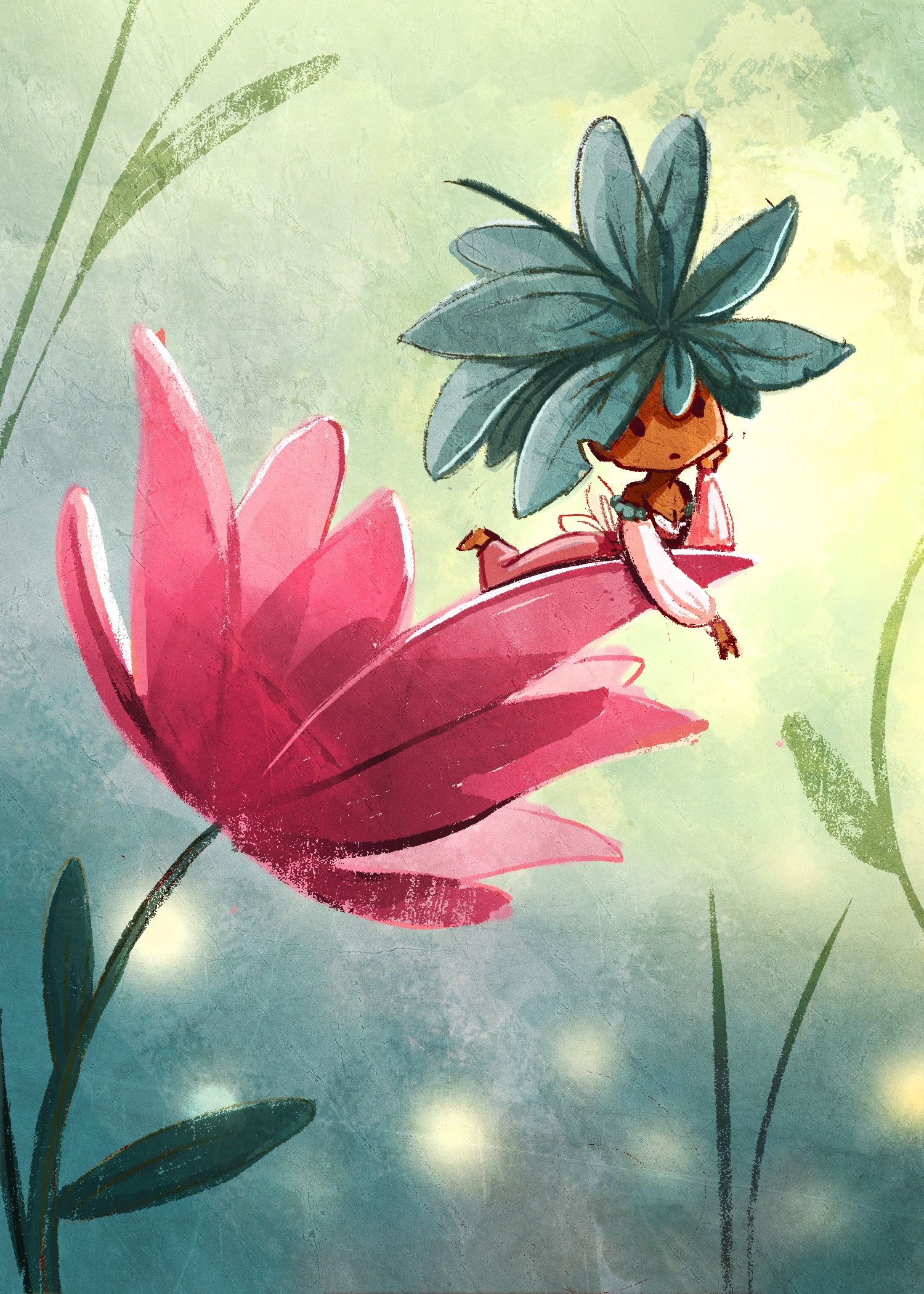
Not really for the contest but I wanted to practice drawing her and also wanted to practice doing some lighting
-
@carlianne Oh this is beautiful!

-
@carlianne C is fantastic!
 Love the ladybug.
 -
@carlianne This is so cute! I have a suggestion (I've not tried it before because I literally just thought of it)
I can see you've used an overlay texture on the whole image and it's looking great! Maybe just to make it look a teeny bit better, try creating a mask of the texture for each element (background, leaves, flower, fairy) in a different orientation so that it's not obvious to the view that you've just applied a short cut overall texture.
-
@carlianne said in March WIP - Fairytale Flower - color study stage:
Not really for
Beautiful, Beautiful, Beautiful!
-
@Neha-Rawat oh yeah that is what Lee says in his texture video! I should just stop being lazy

-
I love it!! I think this iteration shifted it into another gear altogether.