Society of Visual Storytelling

    SVSLearn Forums

    • Register
    • Login
    • Search
    • Recent
    • Tags
    • Popular
    • Users
    • Groups
    • Search

    Workin' on new website banner! A, or B?

    Artwork
    criti
    15
    19
    756
    Loading More Posts
    • Oldest to Newest
    • Newest to Oldest
    • Most Votes
    Reply
    • Reply as topic
    Log in to reply
    This topic has been deleted. Only users with topic management privileges can see it.
    • braden H
      braden H last edited by

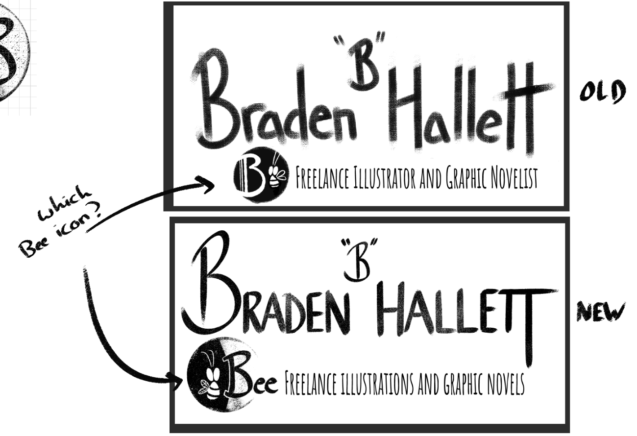
      I've been p[racticin' hand-lettering and need an updated banner. Do you guys prefer a simpler 'bee' stamp like in the top sample, or a more complicated version in the bottom sample?

      028f3914-7d14-4b0e-a15b-5fa2f8a0c44b-image.png

      ajillustrates Melissa_Bailey 2 Replies Last reply Reply Quote 1
      • ajillustrates
        ajillustrates @braden H last edited by

        @Braden-Hallett Simpler icon.

        https://ajillustrates.com
        https://www.instagram.com/aj.illustrates/

        1 Reply Last reply Reply Quote 2
        • Melissa_Bailey
          Melissa_Bailey @braden H last edited by

          @Braden-Hallett top sample would be my pick. Simpler is best. Much easier to read, especially in various sizes.

          illustrator - author - smiley person
          mbaileyart.com
          instagram.com/mbaileyart/

          1 Reply Last reply Reply Quote 1
          • lpetiti
            lpetiti last edited by

            The first one is the simplest, which I think will help it be seen at all different sizes. I like the design of the second one, but it might be too detailed for something the size of a business card.

            Website: laurenpetiti.myportfolio.com
            Instagram: @laurenpetiti

            "So the man who really loves God could...paint his pictures, even if no man ever saw them. He knows God looks upon them." - Francis Shaffer.

            1 Reply Last reply Reply Quote 1
            • BradAYoo
              BradAYoo last edited by

              Although I dig the second one more the two "e" gets too close to "freelance". I also think that even if you gave it more space the words cause a conflict of attention while reading.

              http://geobrd.com - https://www.instagram.com/geobrd/ - https://twitter.com/bradayoo

              1 Reply Last reply Reply Quote 2
              • chrisaakins
                chrisaakins last edited by

                @Braden-Hallett What’s with the “B” ? I think it makes it look cluttered. Is it absolutely necessary? It almost looks like a punctuation correction or a grade. (maybe it’s my teacher lens). But what do I know...

                I think either of the two look good although I am partial to the larger. I am a fan of logos.

                Chris Akins
                www.chrisakinsart.com
                www.instagram.com/chrisakinsart/

                burvantill 1 Reply Last reply Reply Quote 2
                • APHOTICMOTH
                  APHOTICMOTH Moderator last edited by

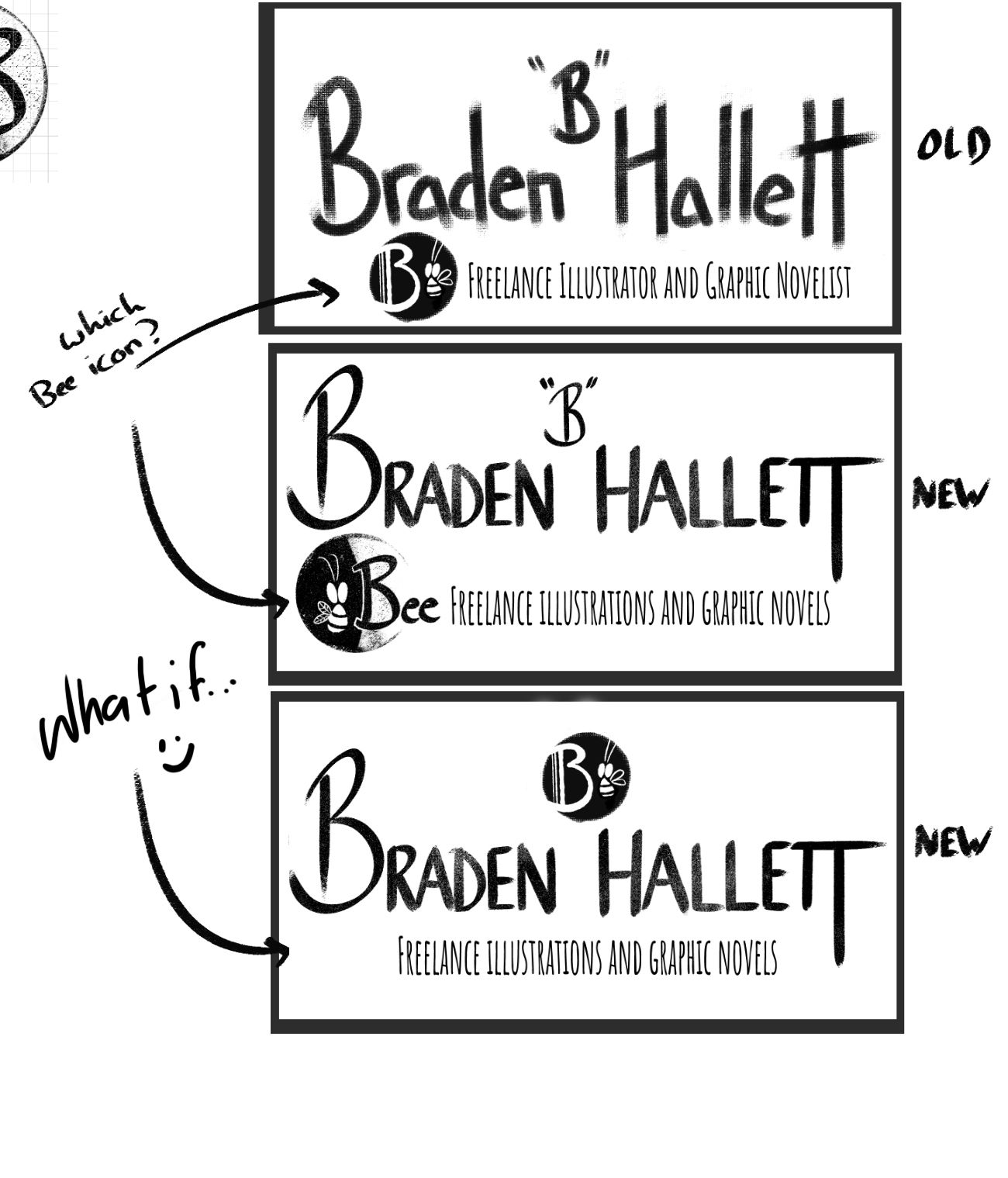
                  What if you combined the two banners. I made an example, I hope that is ok.
                  beeeee 1.jpg

                  All my links: https://APHOTICMOTH.carrd.co/

                  ajillustrates lizardillo 2 Replies Last reply Reply Quote 4
                  • burvantill
                    burvantill Moderator @chrisaakins last edited by

                    @chrisaakins @Braden-Hallett
                    I was thinking the same thing. Is the "B" a middle initial? If so, I think you should drop that B down into the name line and use just the little bee logo (just the image not the letter) floating over your name. It's subtle but I think people will get it.

                    Lisa Burvant
                    www.lisaburvant.com
                    Instagram & Twitter & SVS: @burvantill

                    1 Reply Last reply Reply Quote 1
                    • hakepe
                      hakepe last edited by

                      The idea looks great. I think that the logo could use a bit of hierarchy or a focal point. Now you have 2 competing elements the letter B and the "Bee logo" leaving the viewer a bit unsure as to what to look at. Have you tried something like this for example?

                      braden.jpg

                      Illustrator & Visual Artist
                      https://hakepe.myportfolio.com/

                      lizardillo M Jacy13 3 Replies Last reply Reply Quote 5
                      • lizardillo
                        lizardillo @hakepe last edited by

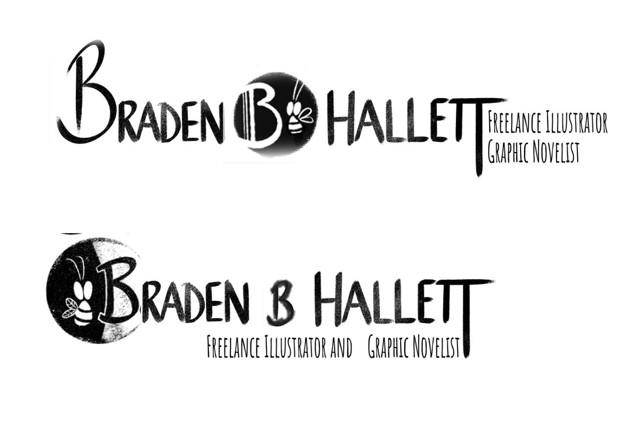
                        @hakepe I like the top version of this but with the 'Freelance Illustrator..' text position of the bottom one (although some tweaking may be required to not have the text and bottom of the B logo too close).

                        Website: lizardillo.co.uk
                        IG: instagram.com/lizardillo

                        1 Reply Last reply Reply Quote 1
                        • ajillustrates
                          ajillustrates @APHOTICMOTH last edited by

                          @CLCanadyArts Your what if nails it.

                          https://ajillustrates.com
                          https://www.instagram.com/aj.illustrates/

                          1 Reply Last reply Reply Quote 1
                          • M
                            Mara Price @hakepe last edited by

                            @hakepe said A, or B?

                            at the logo could use a bit of hierarchy or a focal point. Now you have 2 competing elements the letter B and the "Bee logo" leaving the viewer a bit unsure as to what to look at. Have you tried something like this for example?

                            hakepe, @Braden-Hallett
                            "A" and "B" are both nice options. "B" is my favorite because It feels open.

                            1 Reply Last reply Reply Quote 1
                            • lizardillo
                              lizardillo @APHOTICMOTH last edited by

                              @CLCanadyArts I like the bottom one of these 👍

                              Website: lizardillo.co.uk
                              IG: instagram.com/lizardillo

                              1 Reply Last reply Reply Quote 1
                              • Jacy13
                                Jacy13 @hakepe last edited by

                                @hakepe I really like the top version! I think this would be perfect.

                                Deviantart: https://www.deviantart.com/jacy13
                                Instagram: https://www.instagram.com/jacy13draws/?hl=en
                                Portfolio: https://jacy13.artstation.com/

                                1 Reply Last reply Reply Quote 1
                                • Neha Rawat
                                  Neha Rawat last edited by

                                  @Braden-Hallett I agree that the logo should have some hierarchy. I actually like @CLCandyArts solution.

                                  I also think you can drop the "freelance" from the text. You can mention that you're a freelancer in your "About" section of your website.
                                  Also this font is a little difficult to read coz it's so thin and there are too many words. Maybe if you decide to drop the "freelance", you can also try to reduce the height of the font so that it's not soo long for a small size font.

                                  I really like your logo though! 🙂

                                  https://www.nrbstudio.in/
                                  https://www.instagram.com/nrbstudio.in

                                  1 Reply Last reply Reply Quote 1
                                  • Nyrryl  Cadiz
                                    Nyrryl Cadiz SVS OG last edited by

                                    Hi Braden! This is just my personal opinion but I think you may be overdoing your banner. Not only do you have a bee insect and the word “Bee” on your logo, yuo also have the letter “B” on your banner as well. I think you need to sort it down to one Bee whether it be the insect, the word, or the letter. Please take this with a grain of salt. I’m sure you’ll make a great banner.

                                    Portfolio: nyrrylcadiz.com
                                    Instagram: https://www.instagram.com/nyrryl_cadiz/
                                    YouTube: https://www.youtube.com/channel/UCbJCF1Im8ZO7hpGWTKOJMuA

                                    1 Reply Last reply Reply Quote 1
                                    • hakepe
                                      hakepe last edited by

                                      Looking at my mocup again today, I would try to tweek the upper version a bit by making the letter B on the left smaller and moving the text "freelance....etc" below the logo. So simplifying it even more so that the "bee logo" is the first thing to standout. It is a nice logo, so you might give it some space and extra punch.

                                      Illustrator & Visual Artist
                                      https://hakepe.myportfolio.com/

                                      1 Reply Last reply Reply Quote 1
                                      • braden H
                                        braden H last edited by

                                        Oh wow! I woke up from a birthday sugar coma to a slew of awesome advice 😃

                                        Thanks everyone! I appreciate all the advice and mockups. I'm gonna implement these changes and I think it'll be much stronger for it. Who knew that graphic design would be a skill set all on its own? 😆

                                        K.Flagg 1 Reply Last reply Reply Quote 1
                                        • K.Flagg
                                          K.Flagg @braden H last edited by

                                          @Braden-Hallett Happy Birthday 🎂

                                          K.Flagg

                                          1 Reply Last reply Reply Quote 1
                                          • First post
                                            Last post