Another set of eyes please :)
-
Hey guys! So I'm currently working on the last piece in a mini series I've been doing over the last couple months. Some of you may have seen and also commented.
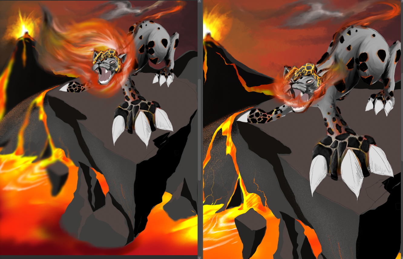
The series is called 'E-LEO-MENTA' and each illustration is of a lion belonging to one of the elements. Currently working on fire and I was hoping to get some opinions on this last one as I'm not 100% on a couple things.*My original thought was for the lion's mane to be made of flames (classic) with the tips turning to smoke. However with how the composition is set out, it was getting lost against the sky. I know I could adjust the sky's colours but I quite like how it is. So my next thought was to get rid of the mane entirely and make him a her?
*Secondly, as I've been filling it in with colour, the lava seems to me to be overpowering the rest of the drawing as it's obviously really bright against the dark rock but I don't want it to be a focus point. As I've chosen the lions colours to be grey and ashy to make them more sinister, I was thinking maybe to crop down the image so that the Lion/ness is focused on more.
*Should I rethink the composition altogether? Or am I overthinking it?
As you can see, it's not even close to being finished, but I wanted to ask now before i get to the end and then have to change it.
I've put the 2 options side by side.
Thanks in advance")
-
Hi @ChrisConnor, honestly, it feels very busy.
I think your intuition is spot on regarding the composition. I remember your lion in the grass piece, that was my favorite.
Look forward to seeing this piece.
-
@Jeremy-Ross thanks Jeremy! Yeah I feel like it is too. I was thinking maybe to cut out the lava pool at the bottom and stick to the volcanic rock with hints of lava streams... And maybe move the volcano over further in so it contrasts more against the lions head...?
Maybe I just need to step away from it today haha -
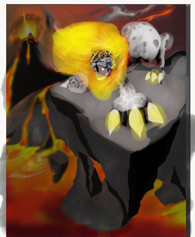
I really like this idea. I think you are having a value & saturation issue. If you desaturate and increase the value of the lava and saturate and lighten the mane and possibly a bit of the cat you might be able to continue with this. I did a REALLY bad draw over on my phone to show you what I mean.
Lisa Burvant
www.lisaburvant.com
Instagram & Twitter & SVS: @burvantill -
@burvantill ahh yes ok, thank you. Haha the visual helps a lot
-
@ChrisConnor agreeing with @burvantill about value and vocal point.
Really intriguing piece! For what it's worth, to me, this looks like a leopard instead of a lion -- perhaps it's the ash/lava looking like spots? Just wanted to share what this set of eyes saw.

illustrator - author - smiley person
mbaileyart.com
instagram.com/mbaileyart/ -
@Melissa-Bailey-0 thanks Melissa
Yeah I can see that, however I haven't finished adding the detail/texture to them yet so hopefully will look more like volcanic rock when I'm done with it haha. Might rethink placement on some of them.
-
I like the second one more, but without the mane it looks more like a leopard or panther to me so I would definitely add a mane. Maybe you could work around the background a bit so there is a ‘darker’ part behind the flaming mane (very cool idea btw) to work as contrast for the fire? I really like the way you textured the lava and the ‘splatter’ to the left of the lion.
Instagram: www.instagram.com/novanbergen/
-
I think the mountain on the left is what might be killing it. It's a huge point of interest with the highest level contrast, and all the magma flows that way - you can see even the magma trail is almost leading right into the lions face to make a sort of tangent that sticks out. If it stays the way it is, even when you get totally done with the lion, the volcano is probably going to rival it in terms of contrast ratio.
So it's visually flowing all that direction for no payoff because that's not the focal point.
What I might try is making it smaller and lowering it and putting some atmo between us and it so it lowers the contrast ratio. At the end of the day it's just communicating that it's making all the lava, right?
Also, I had a thought that might totally not work or not fit in with that you want, but have you considered making the lions' mane being made of lava? From a shape language perspective that could get really interesting and then also flow into the pool below.
-
Hi @Niels, yeah I was definitely thinking this about moving the volcano more into the frame to contrast against the head.
Thanks -
@jdubz thanks for this. Some good ideas for the mane. I quite like the idea of lava streaming out of its head. Will have to come up with some sketches.
As for that lava stream, I totally noticed that too when I posted this and was planning on cutting that out.
The volcano could definitely be made smaller too. I think you're right. And with it being higher on the page kinda takes the focus and power away from the lion.
Thanks!