COLOUR HELP - I'm stuck!
-
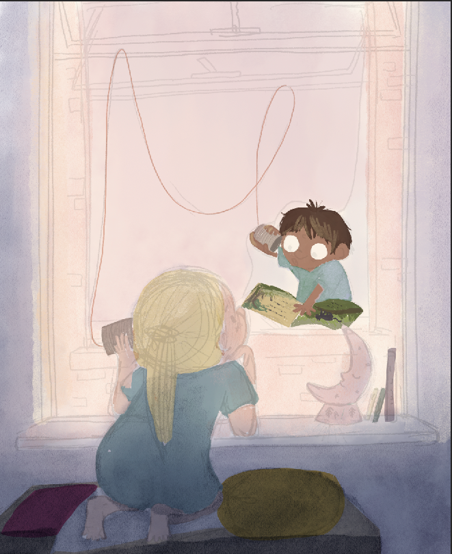
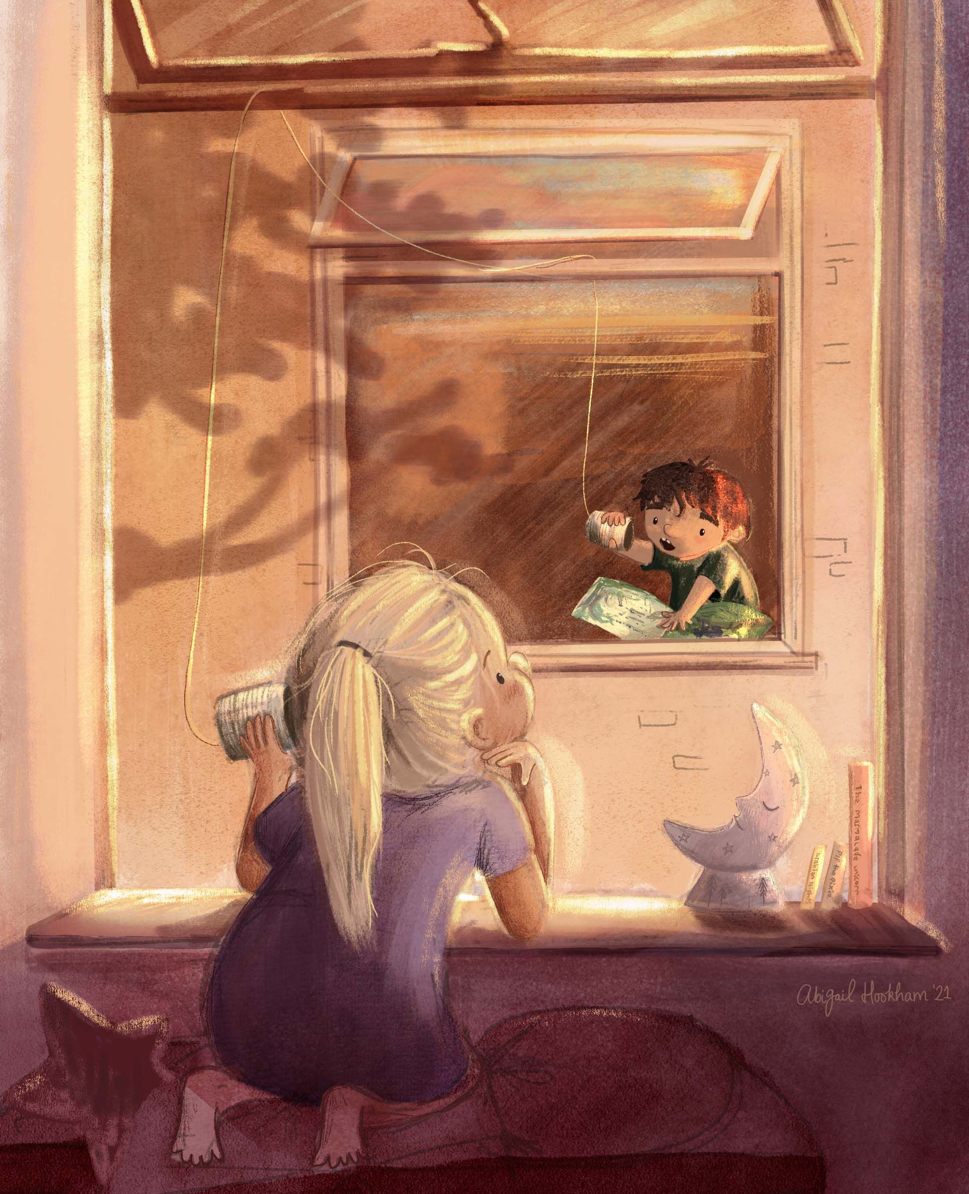
I don't know why I am so stuck with this, it's meant to look like sunset outside the girls bedroom, and I am just having one of those days where it doesn't matter how many times I redo it doesn't get better than this! And I'll admit I am even struggling to find a decent reference image to use for the lighting... I just had this idea in my head and now I'm just getting really frustrated!
-
I think the idea is adorable! I don't know that it has be sunset, does it? If you make it more night time with the light glowing from his window, highlighting the edges of her face, her moon light night light on and the brick building surrounding his window dark as well, with maybe some blue moon highlights hitting the edges of the bricks it should work great! Might be good to make darker faint details of his room hidden faintly behind him and have a small light illuminating him and his book. There! Have I given you WAY to much of my suggestions. Just suggestions ofcourse , feel free to totally ignore:)
-
@Larue Haha, it's funny because all of what you have said is what I am fighting! Night time scenes are my comfort zone - so I thought it best to light this one differently...hence the sunset - but it might have to be the case because I have a super tight deadline (3rd)!
-
@Abigail-Hookham I think this is a fun scene. A couple of things possibly to consider for sunset lighting in this setup:
-
I wonder if it might be more effective to either change the perspective between the buildings, increase the distance between the buildings, or possibly show a facing view of two floors high, with one character on each floor talking over the string and cans? The reason I say that is that it could be difficult to design signifcant direct lighting from a low angle sunset reaching between what appears to be two similar height buildings, so close together. Of course you can suspend the physics of lighting for effect.
-
The other major thing I see is the color temperature and shadow design. Much of the colors in the "lit" window seem to lean more cool to neutral, and largely low value contrast. I wonder if you moved to warmer color temps to simulate more of a rich golden hour effect, along with a bit more shadow contrast from lower angle of sunset, that it would create more of a feeling of a sunset?
-
-
@davido Thanks for your feedback - both are very good points. I will first have a go at changing the temperature of the colours and see if that helps my situation.
-
I think it's looking a bit more like morning light because of how soft it is.
Allow me to introduce you to my favorite illustrator ....Pascal Campion:
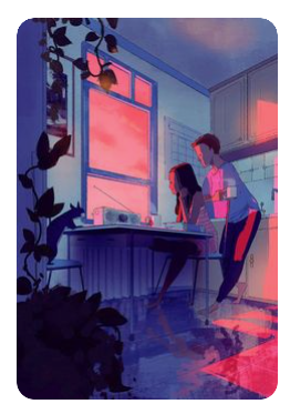
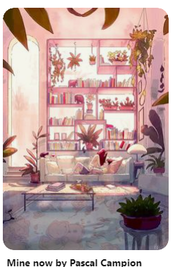


actually the second one there might be morning as well, but I included it because it was close to what you're doing now

-
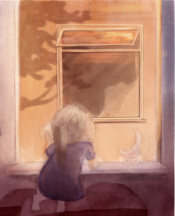
Update: Warming the colours up has helped a LOT. and This morning I managed to find some nice ref images to help too. Not too sure how I am going to paint the boy in the distant window yet but I will cross that bridge soon!
-
Just incase anyone wanted to see the outcome... here it is! Bu all means, there is a lot I could change, but given my tight deadline I didn't have the time. That being said, I am really happy with how it's turned out (especially from how it began!)
-
@Abigail-Hookham Love the changes you made! Looks great!
-
@Abigail-Hookham The changes definitely made this a stronger image. Thanks for sharing the updates.