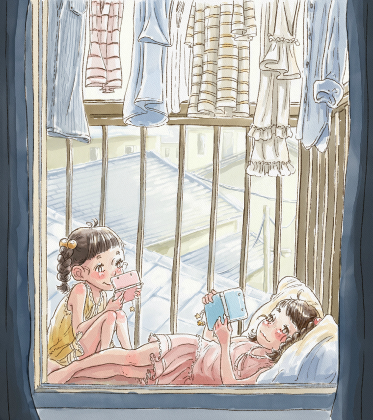
Request for critiques! Working hard on value & composition (^_^)b
-
Hi everyone!
I've been stalking the forms for a while now, but I've never gotten around to making my own post. I've been watching a lot of the video classes lately and have been trying to apply the concepts of value and composition to my artworks.
This particular piece was done digitally on Rebelle2 by Escape Motions. I tried really hard to make the foreground darker in value compared to the background, and add a bit of atmospheric perspective.
Is there anything you guys think would help to improve my painting, especially regarding composition and value? Do you have any comments about the color scheme/harmony (i've always struggled with it)? I'd love to know so that I can apply what I learn for next time! Thank you so much ^_^
-
I think its very beautiful, and so very close. I think that the background could be just a tad lighter so it doesn't compete with the girls. The colors are great, it is all very sweet.
-
To echo what @stringfellowart said, you're values are all very similar in the mid-light to light range. If you are working in Photoshop you can make a new layer on top set to color and fill it with black. This will make everything look grayscale so you can check the values then just hide the layer to see your colors. You can then adjust the saturation and darkness (ctrl-u on windows) of your other layers or a selection while the grayscale layer is on for a scary yet thrilling experience. You may not like the new color but it gives you and idea once you settle on a value. I learned that tIP here in the forum sometime last monthand it's been helpful for me.
Edit: Just noticed you didn't use photoshop. Sorry. I'm not familiar with the program you used but if you can make different types of layers there may be a way to still do this digital trick.